Not Found
Not Found
Not Found
Not Found
Not Found
Not Found
Not Found
Not Found
Not Found
Not Found
Not Found
Not Found
Not Found
Not Found
Not Found
Not Found
Not Found
Not Found
Not Found
Not Found

All comments

  • @NellyisDevv

    Submitted

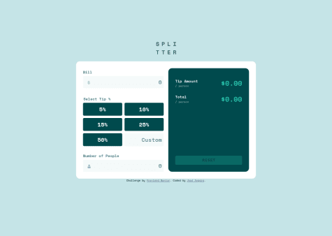
    • This challenge was pretty straight forward and I had a really fun time making it. It was a bit easier than the NFT component card in my opinion.

    • I think I did a pretty decent job making everything work I'm not sure if there is any part of my code I could have made much better from my current understanding.

    • Is there anything anyone thinks I can do to better improve my code. Or is there anything that would make my code much easier to read and or understand?

    @Nova988

    Posted

    Hello, nice card. I have some things to point out.

    • Try to put the card in a div box and center it with flexbox. Card is divided into pieces in the main component. If you create a div and replace the <main> styles on the div. Then center the card with flexbox on the <main>, your card should be centered. Now it is on the bottom of my screen plus I need to scroll down to see the card.
    • Change the font-weight of the price tag. It is to bold compared to the design.

    Hope it helps.

    Marked as helpful

    1
  • @Nova988

    Posted

    Hello,

    In 2022 you should try to avoid using var. Instead of var use let and const.

    Here you can read why you shouldn't use it : https://medium.com/@codingsam/awesome-javascript-no-more-var-working-title-999428999994.

    Hope it helps.

    0
  • @Nova988

    Posted

    Hello,

    You should look into responsiveness design. If you set the width to 950px, you can see that the dashboard is not fully in the window. You can try looking into grid with using minmax(). I also have a solution, not saying it is perfect, but maybe you can see how i have made it more responsive so it fits the window.

    Hope it helps.

    Marked as helpful

    1
  • @Nova988

    Posted

    Hello, Nice app!

    You style the cursor on the light/dark mode button to pointer. It will make it nicer

    0
  • @Nova988

    Posted

    Hello, nice card!

    • Try to add some padding between the image en text in the middle text box.
    • The change button needs to be an other color. I think you have the default color for the a tag.
    • Also add some box shadow on the payment button and add some spacing between the button and cancel order to fit the design.

    Hope it helps.

    0
  • @KristaCalleja

    Submitted

    I am having a hard time finding the correct color for the primary-button hover. And also how to arrange the elements in the middle text box (including image). Any tips appreciated.

    @Nova988

    Posted

    Hello,

    For the background color on hover: did you try opacity? And you need to reduce the width of the image in the middle text box. It is set to 100%

    Hope it helps

    Marked as helpful

    0
  • @Nova988

    Posted

    Hello,

    The background is not showing. Did you add it ?

    0
  • @Nova988

    Posted

    Nice card!

    Maybe just change the font-size and color of the socials text.

    0
  • @Nova988

    Posted

    Hello,

    Nice card just a few things you could change:

    • The background-color needs to be a different color.
    • Try to add some vertical padding on the Proceed payment button to match the design.

    Hope it helps!

    Marked as helpful

    0
  • @Nova988

    Posted

    Hello,

    You forgot some things:

    • Background image is not covering the whole background and it is repeating.
    • The description text needs to be a different color.
    • The 'change' button has a different font-weight and an underline.
    • The 'Proceed' button has a box-shadow and a different color.
    • You need to change the background of the annual plan container.
    • Try to center the card using flexbox.

    Hope it helps.

    Marked as helpful

    3
  • @Nova988

    Posted

    Hi,

    When i click the share button on mobile view. The card goes full width to adjust the size for the share menu. Maybe you can fix this?

    0
  • @Nova988

    Posted

    Hello,

    • Try to set the pointer cursor on the share button

    Nice Card! I have a question : How did you position the image in the card.

    0
  • @Nova988

    Posted

    Hello,

    • Stars are not next to text, try using flexbox to fix this.
    • Add the background images to the background, they are not showing.
    • Increase the font-weight of the header.
    • The content on the testimonials is the same, try to fix that.
    • place the verify buyer on the bottom of the name, not next to it.

    Hope it helps!

    0
  • @Nova988

    Posted

    Hello,

    • Try to add some padding between the cards and text at the top on mobile view.

    Marked as helpful

    0
  • @Nova988

    Posted

    Hello,

    Next time try to put the card in a container/wrapper instead of the main. It's not bad or anything but the main is not something you want to style directly most of the time. Anyways, try to use flexbox and min-height: 100vh on the body element to center the card. It should work if you do it correctly. The card is looking nice tough!

    Marked as helpful

    0
  • PecheMelba 610

    @PecheMelba

    Submitted

    Hi everyone,

    11th challenge, it's my first time using grid in a project. I enjoyed it. Feel free to give any advises or feedbacks. Thanks :)

    @Nova988

    Posted

    Hello,

    The color of the text needs to be a little darker grey/white. Other than that Good job!

    0
  • @Nova988

    Posted

    Hi,

    Nice card, try adding some opacity to the image so the purple will be lighter.

    Marked as helpful

    1
  • @Nova988

    Posted

    Hi,

    Is it just me or do you need to click 2 times on the question to open it for the first time? It works normal when i open it once.

    0
  • @Nova988

    Posted

    Hi,

    Looks good but I can't see the full card when i preview the site on my laptop. You need to change the height : 100vh to min-height: 100vh on the main element. Your code is now fixed, so it won't adjust the height with the content in it.

    Marked as helpful

    0
  • @Nova988

    Posted

    Hi,

    • Try to increase the width of the image, so it fits the design.
    • Use mix-blend-mode to make the image purple. You need to insert the image in a separate div and make the background-color of that div purple.
    • Add some padding on the right to the main container.

    Hope it helps

    0
  • @AbulHissam

    Submitted

    This is my first challenge.I am happy to take feedbacks.I am trying to change my career from QA to Front end dev.Any help on this is greatly appreciated.

    @Nova988

    Posted

    Hello,

    Nice card! I have some tips:

    • Make the number at the bottom a little bit bolder.
    • Use mix-blend-mode on the image to make the image the color of the design. It is easier and will look almost like the design.

    Marked as helpful

    0
  • Olabayoji 135

    @Olabayoji

    Submitted

    Is there a way to make the 2 middle cards resize as I resize the window? Only the 2 cards at the sides resize while resizing the window. Also, feedback would be highly appreciated. Thank you.

    @Nova988

    Posted

    Hi, Nice card. I think that you are looking for the properties flex-basis, flex-shrink and flex-grow. Hope that will help. You could also use grid for the structure of the cards, maybe that would make it a bit easier.

    0
  • @john-k-phillips

    Submitted

    I realised during this that I'm awful at background images, sizing, positioning and overflows.

    I would love some advice, guides/resources for practice!

    @Nova988

    Posted

    Hi, Yeah I'm also terrible at the background image part. Just wanted to note that the border is dotted and not solid. If you have something hit me up, because I also want to learn and practice a little bit more.

    Nonetheless nice design!

    1
  • @mikeweb30

    Submitted

    I am open for any correction. I am still developing my skills. Thank you and yeah Happy coding!!!.

    @Nova988

    Posted

    Hi, very nice design! Just try to add some more padding between the name and the image so it will fit the design.

    Hope this will help.

    1