Skip to content
  • Unlock Pro
  • Log in with GitHub
Profile
OverviewSolutions
14
Comments
6

Pablo Montoya Varela

@PaliTriesToDesignManizales, Colombia300 points

Newbe Front-End "Developer".

I’m currently learning...

HTML CSS JS

Latest solutions

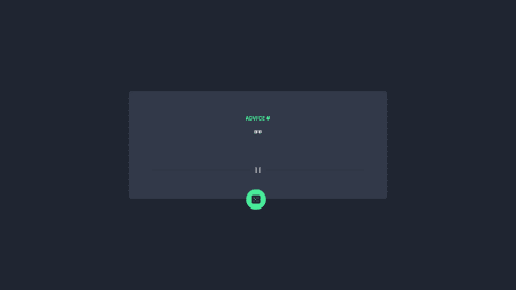
  • Advice Generator App. HTML, CSS, JS, API.


    Pablo Montoya Varela•300
    Submitted about 3 years ago

    0 comments
  • Sunnyside agency landing page. HTML | CSS | JS. Mobile First.


    Pablo Montoya Varela•300
    Submitted about 3 years ago

    1 comment
  • Profile card component. HTML | CSS. Mobile First.


    Pablo Montoya Varela•300
    Submitted about 3 years ago

    0 comments
  • Sunnyside agency landing page. HTML | CSS | JS. Mobile First.


    Pablo Montoya Varela•300
    Submitted about 3 years ago

    1 comment
  • Clipboard Landing Page / HTML, CSS / Mobile First.

    #itcss

    Pablo Montoya Varela•300
    Submitted about 3 years ago

    1 comment
  • Fylo dark theme landing page. HTML / SCSS / JS GSAP


    Pablo Montoya Varela•300
    Submitted about 3 years ago

    1 comment
View more solutions

Latest comments

  • Brian Yeadon•70
    @brianyeadon
    Submitted about 3 years ago

    Responsive 3-column card: Mobile First, Flexbox, and Custom Properties

    1
    Pablo Montoya Varela•300
    @PaliTriesToDesign
    Posted about 3 years ago

    Hello! This solution looks great.

    I would just point out one small thing that I learned from Coder Coder on YouTube. On your section-body-text class you are using both top an bottom margins. According to Coder Coder, it would be better if you get used to adding either margin-top or margin-bottom to your elements but not both. From my pov, it is better adding margin-bottom to each element. i.e:

    .section-icon {
         margin-bottom: 2rem;
         ...
    }
    
    .section-heading {
         margin-bottom: 2rem;
         ...
    }
    
    .section-body-text {
         margin-bottom: 2rem;
         ...
    }
    
    Marked as helpful
  • ibimina•490
    @ibimina
    Submitted about 3 years ago

    Responsive Tip calculator app using grid css & flexbox and javascript

    1
    Pablo Montoya Varela•300
    @PaliTriesToDesign
    Posted about 3 years ago

    Hello!

    For the desktop version it seems like there's an issue with the input icons. You can avoid using position: absolute as you can actually set a background image to the inputs:

    background-image: url(/images/icon-dollar.svg);
    background-repeat: no-repeat;
    background-position-y: center;
    background-position-x: 1rem;
    

    Hope this helps. c:

    Marked as helpful
  • Mawira•70
    @RodgersX
    Submitted about 3 years ago

    Responsive card using pure css

    #vue#vuetify
    1
    Pablo Montoya Varela•300
    @PaliTriesToDesign
    Posted about 3 years ago

    Hello!

    Try adding position: relative to your advice-card div. Then, you could adjust your refresh-btn with the bottom: property but most important (I think), try this with your right: or left: property: right: 50%; transform: translateX(50%);.

    This should center your button horizontally relative to your card.

    Marked as helpful
  • riverCodes•300
    @riverCodes
    Submitted about 3 years ago

    Responsive Stats Preview Card Component

    #accessibility
    1
    Pablo Montoya Varela•300
    @PaliTriesToDesign
    Posted about 3 years ago

    Hello!

    Actually I think it looks pretty good. Congrats.

    On your .image-container media query you can reduce border-top-left-radius: 0; border-top-right-radius: 1rem; border-bottom-right-radius: 1rem; to border-radius: 0 1rem 1rem 0;

    Marked as helpful
  • Bence Zámbó•510
    @zambobence
    Submitted about 3 years ago

    Card Component Main using flexbox

    2
    Pablo Montoya Varela•300
    @PaliTriesToDesign
    Posted about 3 years ago

    Hello!

    I faced the same challenge with the background images. After researching a little bit in google I found out that you can use more than one image as a background image. Something like this: background-image: url(/yourImage), url(/anotherImage); and then add properties to position correctly both images. I am not an expert but I hope it gives you just enough to find out the solution.

    Marked as helpful
  • Rachael•200
    @rachaelhrlm
    Submitted about 3 years ago

    QR Code component solution (React/TypeScript/Tailwind)

    #react#tailwind-css#typescript
    2
    Pablo Montoya Varela•300
    @PaliTriesToDesign
    Posted about 3 years ago

    Congrats! I like your solution.

    I would add just one more thing: box-shadow to the card. Nothing important.

    c:

    Marked as helpful
Frontend Mentor logo

Stay up to datewith new challenges, featured solutions, selected articles, and our latest news

Frontend Mentor

  • Unlock Pro
  • Contact us
  • FAQs
  • Become a partner

Explore

  • Learning paths
  • Challenges
  • Solutions
  • Articles

Community

  • Discord
  • Guidelines

For companies

  • Hire developers
  • Train developers
© Frontend Mentor 2019 - 2025
  • Terms
  • Cookie Policy
  • Privacy Policy
  • License

Oops! 😬

You need to be logged in before you can do that.

Log in with GitHub

Oops! 😬

You need to be logged in before you can do that.

Log in with GitHub

Oops! 😬

You need to be logged in before you can do that.

Log in with GitHub

Oops! 😬

You need to be logged in before you can do that.

Log in with GitHub

Oops! 😬

You need to be logged in before you can do that.

Log in with GitHub

Oops! 😬

You need to be logged in before you can do that.

Log in with GitHub

Oops! 😬

You need to be logged in before you can do that.

Log in with GitHub

Oops! 😬

You need to be logged in before you can do that.

Log in with GitHub

Oops! 😬

You need to be logged in before you can do that.

Log in with GitHub

Oops! 😬

You need to be logged in before you can do that.

Log in with GitHub

Oops! 😬

You need to be logged in before you can do that.

Log in with GitHub

Oops! 😬

You need to be logged in before you can do that.

Log in with GitHub

Oops! 😬

You need to be logged in before you can do that.

Log in with GitHub

Oops! 😬

You need to be logged in before you can do that.

Log in with GitHub

Oops! 😬

You need to be logged in before you can do that.

Log in with GitHub

Oops! 😬

You need to be logged in before you can do that.

Log in with GitHub

Oops! 😬

You need to be logged in before you can do that.

Log in with GitHub

Oops! 😬

You need to be logged in before you can do that.

Log in with GitHub

Oops! 😬

You need to be logged in before you can do that.

Log in with GitHub

Oops! 😬

You need to be logged in before you can do that.

Log in with GitHub

Oops! 😬

You need to be logged in before you can do that.

Log in with GitHub

Oops! 😬

You need to be logged in before you can do that.

Log in with GitHub

Oops! 😬

You need to be logged in before you can do that.

Log in with GitHub

Oops! 😬

You need to be logged in before you can do that.

Log in with GitHub

Oops! 😬

You need to be logged in before you can do that.

Log in with GitHub

Oops! 😬

You need to be logged in before you can do that.

Log in with GitHub

Oops! 😬

You need to be logged in before you can do that.

Log in with GitHub

Oops! 😬

You need to be logged in before you can do that.

Log in with GitHub

Oops! 😬

You need to be logged in before you can do that.

Log in with GitHub

Oops! 😬

You need to be logged in before you can do that.

Log in with GitHub

Oops! 😬

You need to be logged in before you can do that.

Log in with GitHub