Latest solutions
Testimonials Component
#sass/scssSubmitted 3 months agoI want feedback on the cleanliness of my code, the architecture, and the responsiveness of the page. What can I do better?
I'd also like to hear what you think about the "pseudo private properties" that I implemented. Is this concept good to use? Is it misguided? Will it cause problems later down the line that I'm not thinking of?
Four Card Feature
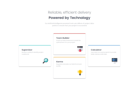
#sass/scssSubmitted 3 months agoI'd like feedback on the organization and cleanliness of my code. Does my responsive design work? Is everything readable and make sense? Could I have structured the grid for the cards better?
Product Preview Card Component
#sass/scssSubmitted 3 months agoThe main areas I'd like input on is the mobile-first design, image swapping and the cleanliness of my sass code.
Social Links Profile Component
Submitted 4 months agoIs everything correct? Is it efficient and clean?
Blog Preview Card Challenge
Submitted 4 months agoI want feedback on the responsiveness of the website. Do you think I did a decent job with starting with the mobile design first?
Latest comments
- @nitinrs95@TheRoboRobin
I'm impressed how near perfect this is in recreating the challenge. I think your code is really clean and organized. I like the structure of the mixin that you built to handle the variations of the cards as well.
If I were to have a criticism, it would be that the spacing feels a little off at your 68.75em breakpoint. It's smack against the top of the screen and you could maybe reduce the gap between for this breakpoint. Also the color you chose for the header on the dark blue card is too dark in my opinion, just a bit unreadable.
Again, great job!
Marked as helpful - @nitinrs95@TheRoboRobin
Looks great! I like the way you are thinking when it comes using the mixins for your breakpoints.
But I think that your responsive design is a little lacking. The site starts to break between 1440px and 900px. It's off center and none of the elements adjust to the space available. While the challenge does just pertain to the 1440px and 375px, It's good to think about the breakpoints between that.
Otherwise, I think you could fix the curve in your top border by just lowering its size by 1px.
Marked as helpful - @Henzo238@TheRoboRobin
Looks great! Code is well organized. You might add a little more spacing to your media query for your larger design. It feels really tight towards the top.
Marked as helpful - P@LiJunXiang1234@TheRoboRobin
Woah! I love the main page that you've created. Very clean and fits within the design feel for each of the projects. If I had anything to say about the challenge itself, it would be that you should maybe adjust the line height a bit. Bodies of text are too squished together. Otherwise, great job!
- @mohammed1215What are you most proud of, and what would you do differently next time?
responsive design
@TheRoboRobinI like the way that you handled the responsiveness with the width. But at some point the content feels maybe a bit too big for the space. Maybe add some queries addressing font-size and spacing would help? Great job though!
Marked as helpful - @Rajsinghh2907@TheRoboRobin
It looks great! I would maybe make the text a bit bigger on the original. I would say that it might be a bit small.
I also think that the way you handled making your image responsive is interesting!
Otherwise, I think your code is well-structured. Keep up the good work!


