The project was good to practice my flexbox skills. The overlay effect over the image was the obstacle. I made a research and I found a solution, but I would like to know if there is a better way to do this effect.
-About your font question, I agree with srayala42! Downloading the fonts would unnecessarily add more size to your folder! If you are new to this approach, this link shall help you with it: https://www.youtube.com/watch?v=qgmLDPLApBY
Can't wait to see more projects from you! Keep it up 😁
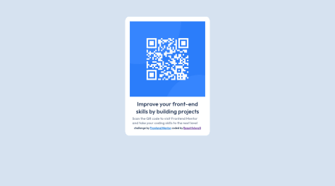
On this project, media queries are not mandatory! Simply setting the width of the QR Code to like 300px should make it look great on all devices! 🎊
I also would like to point out that the styles are not shown when i preview your website! I am not sure what is the cause of that problem, but probably something with the file placement in the github folder or other issue happened while uploading! 🤔
In addition to what Hatem mentioned, consider decreasing the width & height of the main; also try to slightly decrease your font-sizes. 🎇
Keep up the great work! 🔝🔝
Regarding the font size and colors, make sure you check out the style-guide file within the project's downloaded zip-file! It should contain all the information you need to know about the colors & fonts. It must be one of them 🎨
Also for your text element, you set its (margin: 80px auto 80px auto;) If you replace that with just (margin: 80px auto), it will generate the same result! 🎊
Keep up the great work!🔝 I hope you find this to be helpful 😁
Responding to your question, to center a div vertically you simply set its parent's display to flex, then you set its align-items to center; if you want to center it horizontally, set the justify-content to center.
-You already used this method on your project, which is awesome!; however, there is a shorter way to center a div horizontally and vertically! Simply set its parent's display to grid, then add the (place-items: center) property to the parent! This leads to the same result with one less line of code!
Keep up the great work! Hope you find this helpful! 😎
Awesome work! 🔝🔝
Your hard work it clearly displayed on this project! 🤩
I have some tips for your website:
Setting the footer's text-align to center; 😉
When you set the max-width of the main-box to 43%, this compressed the content inside it because the width will decrease the more the screen size decreases! If you set the max-width to like 600px (300px for the media query), now the main-box will hold its ground in smaller screen sizes! 🤗
When you set the height of the main-box to 25rem, the main-box cannot give more space for its content when the screen size decreases, resulting in content overflowing! If you replace the height with min-height (In desktop & in media query), it will adaptively increase the height of the main-box under pressure! 😎
Keep up the awesome work! I hope you find this helpful 😁
For a first project, this is fabulous work! 🔝🔝
I do have some suggestions for you: 🤔
Try setting the border-radius of the QR Box & the image as the same value (for example 20px) would be more consistently looking . Using pixels for border-radius is common practice! 😎
Setting the image's weight and height with different values will make it look a bit uneven! try just setting the width to 100% and not setting the height to a specific value. If you follow that by removing the margins of the image, it should take the size of the QR Box! 👌
To set some space between the image and the QR Box, simple add a padding (for example 1rem) to the QR Box. 😎
I hope you would find these improvements helpful! 🎇
Keep up the awesome work! 🔝🔝
I wonder, is it possible to position the main div in the exact center of the viewport, while keeping the row of text at the bottom of the page?
I don't want to center it using position: absolute, as there are side effects on small screens in landscape mode - elements can overlap, and the top of the main div is hidden and it's not possible to scroll up to see the top. (The second issue happens also when centering with flexbox properties justify-content: center and align-items: center, that's why I didn't use them either.)
Awesome work there mate!
I do have one tip for you which was very hard to recognize! In some screen sizes of the desktop version, the home section is not perfectly aligned with your nav bar.
Other than that, I think your solution is one of the best I've seen so far! I also love the way your hamburger menu smoothly slides up and down XD
this one I did with React and Scss for the first time, but this mini-app should work as intended.
If you spot anything weird, feedback is always appreciated!
Awesome work right here bro!
I have some tips for your design:
Try to add some left & right padding to your header and sections. That way when the screen shrinks, there will be some space between the elements and the screen, which will make it look not as compressed.
I recommend setting the max-width of your media query to more like 1000px. Otherwise, the elements on your web page will not have enough space, which results in paragraphs overflowing and images not full appear.
Other than that, your design is absolutely amazing!
I think the only tip I would give you is to try to implement the colors and font sizes recommended in the style-guide file more accurately. That will substantially improve your design!
This was a pretty challenging project for me especially the lightbox and image sliding features but I think overall it came together nicely even though my code isn't really as clean as I'd like it to be. Any feedback or suggestions are much appreciated!
Awesome work there mate!
I just want to point out a few things to adjust:
When the images are clicked, it logs to the console the image tag. You must have forgot to remove it after coding XD
When the cart has some items and i start incrementing the counter from outside, the items in the cart react to that without clicking on the add to cart button. Its really not that big of a deal, but it would be more efficient to only set the quantity of the cart items after clicking the add to cart item.
Thats all I have for now. These are just some minor things, but over all your solution is fantastic!
I want suggestions for optimizing this app I built with React, primarily since I used the context API which would cause a lot of rerenders. Suggesting resources to achieve these would also be appreciated.
Awesome work bro!
I do have some ideas for improvement:
On the mobile version, when the sidebar is displayed, the navbar is still accessible. It is not really a huge problem, but its also not considered common practice.
When an item is added to the cart, the counter in the bottom is automatically set to 0. Moreover, when another quantity is chosen, it adds to the existing quanity. The problem with this is that the user will not be able to decrease the quantity in the cart. He / She will be forced to delete the items, then repeat the process. The fix for this is to set the items in the cart to the number in the counter instead of adding them.
Try adding some hover effects & set the (cursor: pointer) to the images & the add to cart button. These are minor things but they really make a difference for the user experience.
Amazing work right there bro!
I do have some suggestions for you:
The ::after element in the desktop version, you grasped the concept, you just need to place it. A quick fix for that is to reverse the width & height properties on the desktop (set the width to 100% & height to 8 px). From there you can set the top to 50% & the left to 100%. I hope that fixes it.
Try to reduce the width of the main image (setting the max-width is best) & implement the color of the header next to the image.
Thats all I have for you! Other than that, You did a great job and your hard work really shows.
I'm not sure what I did, but everything in the header component doesn't work after it goes from mobile view to desktop view. The rest of the functionality works.
Hello there! Thats amazing progress you've made out there!
Responding to your question, the problem with your header in the desktop version is that it is underneath your main section. Now a quick fix for that is to simply add the "z-index: 999;" css property to your header. This way, it will always be above your main. However, It is not a very clean way to build the website because your header and main will still be overlapping, its just that now the header will be above the main. The approach that you should take is to not make them overlap with each other at all.
I hope this helps a little. Please check out my solutions and react / comment to them. It really helps!
Awesome work! I do have some small suggestions that might help:
When the main image is clicked on, it directs to a dead page. This might be due to a file that has not been uploaded properly.
The cart is overlapping the navigation bar. Positioning it a little bit down would make it better.
When an item is added to the cart, the counter in the bottom is automatically set to 0. Moreover, when another quantity is choses, it adds to the existing quanity. The problem with this is that the user will not be able to decrease the quantity in the cart. He / She will be forced to delete the items, then repeat the process. The fix for this is to set the items in the cart to the number in the counter instead of adding them.
On the mobile version, the size of the image is slightly huge. A quick fix for that is to set its max-width to like 500px and the centering the image.
These are just minor adjustments. Other than that, your website is great & your hard work is clearly displayed. I hope this feedback helps. Please check out my solutions & react / comment to them. It really helps!
Hello there! You did amazing on this project :D
I do have some improvement suggestions:
I recomment to add the (cursor: pointer;) css property to the images. It makes a huge difference for the user's experience.
When the main image is clicked, there should be a close icon to click so that the user can return to the page. Unfortunately, the icon doesn't appear and there is no way back except to refresh the page.
When there are no items added to the cart, it should display "Your cart is empty." Try replacing the checkout button with this paragraph when the cart is empty.
4.The remaining would be minor adjustments.
Regardless of these tips, your website is awesome & your hard work is clearly displayed. I really hope this feedback helps. Please check out my solutions and react / comment to them. It really helps!
Great work right there! I do have some observations I'd like to share with you:
While hovering on the thumbnail images, I noticed that it was shaking. The reason its doing that is because normally it doesn't have a border, so when you hover the border is added, which increases the size of the image. A quick fix for that is to actually add the border to the image before hovering, and make its color transparent. Then when you hover, just change the border's color to orange and it will hopefully not shake.
I noticed that the images overlapp with the header in the mobile app. I don't have a fix for that but I just wanted to point it out in case you didn't notice.
Other than that, I think you did a great job on this project! Keep it up and I hope this feedback will be beneficial!

