@JLee2011

jack fikolson aka frontfliper
@areklazAll comments
- @areklaz
Why do you want to center it without flex? It's the simplest way.
The best practice is basically using responsive units like rem, em or %. But it doesn't mean you can't use px at all. Try to use rems as font-size and margin/padding just like you (almost) did here.
- @ddky16@areklaz
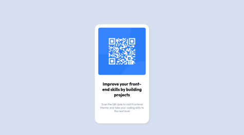
Hello. I really liked this challenge because of those buttons.
You should really try on the buttons { mix-blend-mode: screen; } - read about it.
You can check out my .css for this challenge to see how much less code i have there because of this simple trick :). You simply doesn't have to set it all manually while on hover.
Marked as helpful - @GARGithub@areklaz
Not really but you can delete flex and flex-direction from .card 100vw in .main width is not needed. Height: 100vh is enough .card img height: auto - not needed
I don't know if there is something more to get rid of :D
- @virag-ky@areklaz
Hi :). I can see a bit of a problem with your buttons on hover.
The simplest solution will be setting the height and width of the button in px and getting rid of the padding if you really want to leave the font weight on hover.
It can be also done with pseudo elements but since they have the same content inside it will be easier and faster the 1st way.
- @mohamedkhaled4053@areklaz
Cool, but a bit too wide :)
- @ApplePieGiraffe@areklaz
Wow. I wish i could have such skills and become senior master extra developer like you.
- @areklaz@areklaz
u suck
- @Doniyor-Programmer@areklaz
Almost