Not Found
Not Found
Not Found
Not Found
Not Found
Not Found
Not Found
Not Found
Not Found
Not Found
Not Found
Not Found
Not Found
Not Found
Not Found
Not Found
Not Found
Not Found
Not Found
Not Found

All solutions

  • Submitted


    • FLUID responsiveness (layout and fonts)
    • well structured and organized code
    • good accessibility
    • pixel-pretty-close
    • @font-face integration
    • SEMANTIC html, scss, vanillaJS

    What is your opinion, especially on the the HTML5 markup on the .testimonial-card? Note: I've used '.author-container' in order to place the author's avatar within its pseudeo-element ::before. Is there anything, in your mind, to improve the structure/ organization in the code?

    As always, I appreciate ANY kind of feedback :)

    Special thanks to @pikamart, who helped me with his feedback on the previous challenge. This community is awesome.

  • Submitted


    • @font-face integration
    • pixel-pretty-close
    • clean and efficient code
    • good accessibility
    • flexbox & grid

    This project brought me to a whole new level and I am excited to share my solution to you'll! One thing that I have to admit, though: I have used some magic numbers in order to position the svg images correctly and without losing their shadows etc. Because most of the provided images were only for desktop, some design software skills (Figma, Adobe XD etc) can help here, so that you can export the svg's from the design files properly (it's not as easy as it sounds, in my experience).

    If you don't know, what I mean by magic numbers: https://css-tricks.com/magic-numbers-in-css/

    All in all, this is a great challenge to level up your HTML and CSS skills, that for sure!

    What is your opinion? :)

  • Submitted


    • SEMANTIC html5, css3/ scss, vanillaJS
    • customized svg images/ codes
    • smooth transitions on nav-menu, tab-menu/ slider and accordion (faq)
    • hamburger-menu animation (as always)
    • almost pixel perfect (I used the design images, not the desig files for PRO members, yet)
    • clean and efficient code

    This challenge was a bit tricky though, because some of the provided images didn't have the blue background shapes as they have in the design images - so that I had to create the shapes by myself with Adobe XD (I edited svg images with XD the first time).

    After all, I tried my best best and I highly appreciate any feedback/ suggestions. You can be as harsh as you like on me. What do you like the most? What can I improve? I want to go moon with my skills, so that I can help others better, too:)

  • Submitted


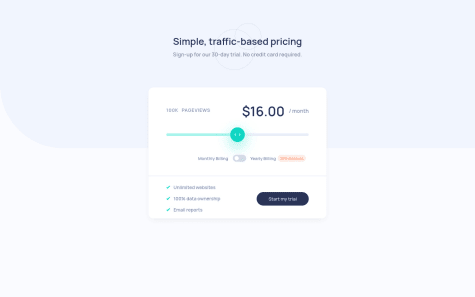
    This project was really fun, I love how the different values play together with the range slider. What is your opinion on my approach, especially regarding to the range-slider and its cross-browser compatibility?

  • Submitted


    I could have done a pixel perfect solution with a better keyframes solution for slide-in and slide-out.

    Thus, if you have a better slide-in and slide-out method with just using css3 and without jQuery, please let me know! :)

  • Submitted


    Fluid responsiveness with just one media query by using percentages!

    If you like my solution, you may also like to have a look at my other projects in my GitHub repositories.

    What is your opinion on my workflow?

    I appreciate any feedback you are giving to me.