
@marcus-hugo

Dmitry
@dmitrymitenkoffAll comments
- @dmitrymitenkoff
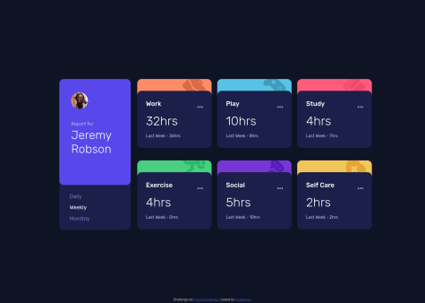
Great job, Marcus. The landing page looks great and is responsive to the changes in the viewport dimensions.
With regard to your question about
position: absolute, there could be a number of reasons for the absolutely positioned elements to move around (I assume you ask about these in particular). What helps me is to think about positioning elements in terms of containing blocks - these are the boxes absolutely positioned elements are relative to. One thing to remember is that these containing blocks are not necessarily direct parents of absolutely positioned elements. These are the elements whose position is set toposition: relative. So to answer your question: try finding the relatively positioned box in your code, and then, by using thetop,left,bottom,rightproperties, you can "glue" the absolutely positioned element to wherever on the page you want, relative to the parent element, which is pretty much what you've done in your media query onmain!I often find myself fighting with SVGs! If I know that I may want to change the colour of an SVG element (eg, on hover), I normally include an inline version of my SVG directly into my HTML instead of using an
<img>tag. This way, I can change the SVG property calledfillin CSS (it's like a color property), you can find more examples here.With your JS email validation function, you could try redesigning it a little bit, like so:
function checkEmailValue(email) {
const result = /^(([^<>()[\]\\.,;:\s@"]+(\.[^<>()[\]\\.,;:\s@"]+)*)|(".+"))@((\[[0-9]{1,3}\.[0-9]{1,3}\.[0-9]{1,3}\.[0-9]{1,3}\])|(([a-zA-Z\-0-9]+\.)+[a-zA-Z]{2,}))$/;
if (result.test(email.value.trim())) {
  // returns true if email is valid
 // show success, eg green border
} else {
 // validation failed - returns false
 // do something, eg red border and error message
}
You can then call this function directly in your event listener, like so:
form.addEventListener('submit', function(event) {
    event.preventDefault();
    checkEmailValue(email);
});
I recently learnt about a Constraint Validation API (built in JS) that works beautifully with HTML5. Here's more information about this method, if you decide to try it in one of your future projects:
Hope this is helpful. Keep up the great work, Marcus!
Marked as helpful - @imxbartus@dmitrymitenkoff
Well done, imxbartus! The app looks really cool.
My only suggestion would be to use CSS custom properties (mainly to make your life easier!).
Other than that - awesome job!
Cheers.
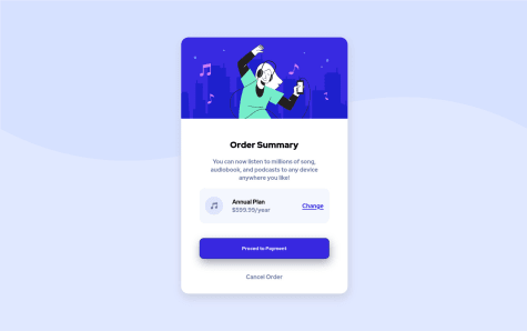
- @Ranjan-Kumar-Verma@dmitrymitenkoff
Well done, Ranjan. The component looks really great.
I think your code base is well structured, and it was easy for me to follow the logic. To make it a little bit more succinct, you could try using CSS custom properties.
One thing I'd suggest is not skipping heading levels in your HTML. For example, I'd use
<h1>for the Order Summary and<h2>for the Annual plan. More information is here and here.Also, in mobile view, there's a little bit of white space at the bottom of the viewport visible. I'd suggest uncommenting the height property on the body element in your CSS - this should rid of the white gap at the bottom.
Other than these two minor things, great job and happy coding :)
Cheers
Marked as helpful - @CarlPericles18@dmitrymitenkoff
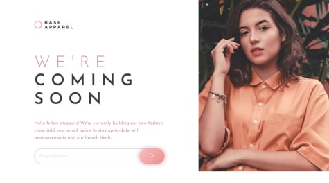
Great job on completing the challenge, Carl.
Your JavaScript logic seems to be working as expected - well done.
I see you used two divs with two feature photos in the HTML file. I think you could improve your HTML by using the
<picture>HTML element to make it more responsive. You can read more about this element here.I also notice the
<input>element doesn't have an accompanying<label>element, which is required for those users who use screen readers, for instance. If you want / need to hide the label (eg due to your design constraints), you can visually hide it but make it still available for the assistive technologies. Here's more info about this.Hope it helps! Cheers
Marked as helpful - @tomiwaorimoloye@dmitrymitenkoff
Hi Tomiwa,
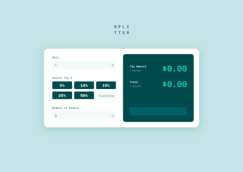
This is an awesome project - great job! I'm not a JS expert, but your code looks maintainable, you avoid repetition, provide good (and useful) comments and separate the concerns. I've just recently completed the same challenge, and I was really interested in the way you implemented the Tip selection section. I used (and struggled quite a bit with) radio inputs. I notice you opted into using the real button element with data value attributes. This is such a cool way of doing the 'select' section. I wonder if there are any accessibility issues with this approach?
Once again, well done!! Cheers
Marked as helpful - @ryancalacsan@dmitrymitenkoff
Hi Ryan, Great job on designing the form and making it responsive. I also liked how you went about implementing form field validation. One thing you may want to look into is adding labels to each input, as these should always accompany their respective input fields. Here's what MDN says specifically about the label element: "All elements within a form must have a
<label>that identifies its purpose. This applies to all types of <input> items, as well as<button>,<output>,<select>,<textarea>,<progress>and<meter>elements, as well as any element with the switch ARIA role." MDN.On the other hand, I realise the design doesn't want visible labels present. In this case, you can visually hide labels from users but not from assistive technologies. Here's a useful article on CSS-Tricks that will guide you through the implementation of the technique: HTML Inputs and Labels: A Love Story.
Hope this is helpful.
Keep up the great work!
Cheers
Marked as helpful - @dmitrymitenkoff@dmitrymitenkoff
Hey Amon, Thanks very much for your detailed feedback. I refactored the JS function as you suggested - thanks for that as I'd spent ages trying to figure that out!
Cheers:)
- @encoreOax@dmitrymitenkoff
Hi encoreOax, your solution looks awesome. Great job on completing your very first challenge. In this case, I'd also choose the anchor element as its sole purpose to lead to a new page to complete the payment process as opposed to submit a form (in which case I tend to go for the actual button element). Here's a link to an article on CSS Tricks on when to choose links vs buttons: https://css-tricks.com/a-complete-guide-to-links-and-buttons/. Hope it helps. Have a lovely day.
- @dmitrymitenkoff@dmitrymitenkoff
Hey Teegamtee, thanks for your feedback.
You're quite right to comment on the lack of responsiveness, I've added a breakpoint for a tablet view as well. I originally ignored adding other breakpoints simply because this particular design is just a component and I thought following the provided figma designs would suffice. But I can see how it could've been upsetting to have a mobile view displayed on a large screen.
In terms of responsiveness in general, I thought it was more than just having a number of breakpoints but rather using relative units, min and max values, mobile first, web safe fonts, etc.. Please feel free to share any resources or point me in the right direction if I should incorporate other features of responsive design in the future - I'd be keen to learn more!
Cheers and have a lovely day