Not Found
Not Found
Not Found
Not Found
Not Found
Not Found
Not Found
Not Found
Not Found
Not Found
Not Found
Not Found
Not Found
Not Found
Not Found
Not Found
Not Found
Not Found
Not Found
Not Found

All solutions

  • Submitted


    I have solved this challenge before using vanilla JS. This is my solution using React

    However, there is a bug in my code. When the page is first loaded , and with the first click on any question, the question toggles correctly. But after that, I need to click twice on each question to toggle and I don't know why !!.

    My code is not good for such simple functionality. I would apprecicate feedback on how to fix the bug and improve my code.

    Thank.

  • Submitted


    This is my third project using React. I have not learned any new concepts from my last project. I practiced rendering lists dynamically using an array and map method. I also used CRA tool (Create React App).

    I had a problem though and I was not able to solve it. I was not able to use the local fonts available in the assets folder. I tried many times but always failed. I guess I had a problem with the path to the font file. In the end, I imported both fonts in this challenge from Google Fonts.

    I will try again to use local fonts in my future challenges.

    I have placed the omelet photo in the same folder of the component responsible for rendering the photo. I read it's good practice to keep all resources belonging to a certain component inside that same component which sounds logical and keep everything organized and easy to access and manage.

  • Submitted


    This is my second project using React and its the first time I render a list inside a component 😄.

    I chose not to pass props to render social media network name and link address.Instead, played a little with Javascript and accomplished what I want to do.

    After my second project using React, I start to have questions about how to structure project folders/files and how small one component can be.

    I'm still exploring this subject and read some articles about it.

  • Submitted


    This is my first React project ever. I used create-react-app tool.

    I'm still learning React and keep making progress. I chose to complete the project using only 1 component as this was just a static view project.

    I'm so excited to continue learning and doing more projects. Learning React feels like learning a new language.

  • Submitted


    Hello everyone 👋, I'm Mohammed and this is my solution to this nice challenge.

    This challenge was my first interaction with drag-and-drop API. I enjoyed doing the challenge very much.

    Built with 🛠

    What I learned

    • DOM traversing, DOM attribute manipulation
    • Drag and drop API

    Continued development

    • Drag and drop API
    • Background images sizes

    Useful resources

    Author

    • Twitter -[https://twitter.com/javascriptor1]
  • Submitted


    I have used padding and margin so many times in this challenge. I played with it a lot and I can say I understand what padding and margins are. I feel very comfortable using both of them and troubleshooting any bug or misalignment of any element on the page.

    I also continued to use CSS grid and great progress has been made in understanding basic properties and how to use them.

    Most importantly for this challenge, I just found out how easy is to make these curvy shapes sections on a modern startup website 😃.

    By doing this challenge, I have completed 40 exercises on FEM. Working with elements, alignment, and positioning was not easy when I started. However, I can see the big progress I have made in the last 6 months.

    It's time to move on and start learning React. I will be starting next week, and I hope I made the same progress I did with CSS.

    I would appreciate it if React developers here share with us how best to learn React in 2024, especially with new frameworks working with it like Vite and Next JS.

    Built with 🛠

    • Semantic HTML5 markup ✔
    • CSS grid 🔳
    • CSS custom properties 🎨
    • CSS Flexbox 🎁
    • Mobile-first workflow 📱
    • PixelPerfect chrome extension 👌
    • Responsively
    • Web ToolBox

    What I learned

    • Create web page sections with curve shapes

    Continued development

    • Passing arguments to functions
    • Working with CSS :nth-child() selector

    Useful resources

    Author

    • Twitter -[https://twitter.com/javascriptor1]
  • Submitted


    Hello everyone 👋, I'm Mohammed and this is my solution to this nice challenge.

    This challenge was very easy to solve. FAQ is a very common component of lots of web pages and this challenge is very good to make you ready and gain the required skills.

    Box shadow is still a problem for me. I can't figure out how to match the design😢

    I will briefly talk about my current process of solving FEM challenges and I hope it will help and inspire other beginners (like me 😊). To make this process actionable so others can follow, I will list the steps I take to solve the challenge-

    1- I download the challenge resource file and extract it in a special folder so I can use it in the future if needed without having to re-download it again.

    2- After the files were extracted, I read about the requirements to solve the challenge.

    3- After reading the requirements, I open the design folder to see the final product both for mobile and desktop screens. I also take note of the number of active state elements so I don't forget to do it while solving the main challenge.

    4- After I see both photos for screen designs, I take some notes on how best to do the HTML markup and how to structure the elements in the page. This is a very very important issue and help in later steps. I pick up the best semantic tags which serve the purpose of the content.

    5- I then create CSS styling and Javascript files, link them to the HTML file, initialize a new git repo, and make an initial commit on the master branch.

    6- Then I do the actual markup of all texts in the challenge file for mobile screens. for example, if a text is best displayed as an H1 tag, I wrap the text in h1 tag using a shortcut in VScode, etc.. I also add images and icons at this stage. then I create a new git branch for mobile design before I start styling.

    Note: I always do mobile-first solution and don't combine mobile and desktop styling at the same stage.

    7- After I finish the markup stage, I go to the styling stage targeting mobile screens. I use a live server on VScode, go live and open the page in my Chrome, then use the Pixel perfect extension to load the design file for the mobile screen as an overlay on top of my actual page. I make sure the overlay image is exactly 100% on top of my HTML page. I make sure I choose the right screen resolution which is 375px.

    8- At this stage, I use the Responsively app to see how the page will look like on different screen sizes. I usually have the following screen sizes opened at the same time:

    • iPhone SE 375px Fem design size for mobile
    • iPhone Pro Max 428px
    • iPad mini 768px
    • iPad Air 820px
    • iPad Pro 1024px
    • My screen size 1366px
    • MacBook Pro 1440px Fem design size for desktop

    9- After I finish the mobile screen design, I commit all changes, check to master branch, then merge the mobile-design branch with the master branch.

    10- I then create a new branch for desktop design, load the design image as an overlay on Chrome using the extension, and start coding on a custom screen size of 1440px I created for this purpose.

    11- I repeat step 9 with the desktop branch. Then I create a new branch to style active state elements and I repeat step 9 after I finish all requirements.

    Note: I will add a new git branch in the future for accessibility, SEO, and performance so I improve this area also.

    12- I move to the Javascript part of the challenge after I create a new git branch for it.

    13- After I solve the Javascript part, I commit and merge into the master branch and my solution is ready for deployment.

    14- I do final checks to make sure all things are working as they should, then I deploy to Netlify.

    15- I then upload my solution to FEM website

    This is a brief process overview I developed over time. I know it’s not perfect for sure but it's a good start for a beginner like me with big room for improvement in the future.

    This process does not take into account frameworks or libraries I might use in my solution. In case I did use such frameworks (like Tailwindcss for example), I install them at the initial stage.

    I love to hear from you. Please let me know how can I improve my process OR share your process so we all benefit from each others.

    Built with 🛠

    What I learned

    • DOM traversing

    Continued development

    • Box shadow in CSS
    • background images sizes

    Useful resources

    Author

    • Twitter -[https://twitter.com/javascriptor1]
  • Submitted


    Hello everyone 👋, I'm Mohammed and this is my solution to this nice challenge.

    As I did in the previous challenge, I did not use Flexbox for the general layout of the challenges. Instead, I used CSS grid as I needed to practice and do more exercises on CSS grid to improve.

    Warning⛔⛔ The code I wrote is not perfect. At some point in my solution, I lost control over the alignment of some elements, so I ended up positioning them relatively which is very random and the right way to go.

    As I'm learning now, I like to play a lot with the code. I change and do things differently so I can learn new concepts and tools. So you might find some code NOT clean or not written in a way that follows best practices.

    I will briefly talk about my current process of solving FEM challenges and I hope it will help and inspire other beginners (like me 😊). To make this process actionable so others can follow, I will list the steps I take to solve the challenge-

    1- I download the challenge resource file and extract it in a special folder so I can use it in the future if needed without having to re-download it again.

    2- After the files were extracted, I read about the requirements to solve the challenge.

    3- After reading the requirements, I open the design folder to see the final product both for mobile and desktop screens. I also take note of the number of active state elements so I don't forget to do it while solving the main challenge.

    4- After I see both photos for screen designs, I take some notes on how best to do the HTML markup and how to structure the elements in the page. This is a very very important issue and help in later steps. I pick up the best semantic tags which serve the purpose of the content.

    5- I then create CSS styling and JavaScript files, link them to the HTML file, initialize a new git repo, and make an initial commit on the master branch.

    6- Then I do the actual markup of all texts in the challenge file for mobile screens. for example, if a text is best displayed as an H1 tag, I wrap the text in h1 tag using a shortcut in VS code, etc.. I also add images and icons at this stage. then I create a new git branch for mobile design before I start styling.

    Note: I always do mobile-first solution and don't combine mobile and desktop styling at the same stage.

    7- After I finish the markup stage, I go to the styling stage targeting mobile screens. I use a live server on VS code, go live and open the page in my Chrome, then use the Pixel perfect extension to load the design file for the mobile screen as an overlay on top of my actual page. I make sure the overlay image is exactly 100% on top of my HTML page. I make sure I choose the right screen resolution which is 375px.

    8- At this stage, I use the Responsively app to see how the page will look like on different screen sizes. I usually have the following screen sizes opened at the same time:

    • iPhone SE 375px Fem design size for mobile
    • iPhone Pro Max 428px
    • iPad mini 768px
    • iPad Air 820px
    • iPad Pro 1024px
    • My screen size 1366px
    • MacBook Pro 1440px Fem design size for desktop

    9- After I finish the mobile screen design, I commit all changes, check to master branch, then merge the mobile-design branch with the master branch.

    10- I then create a new branch for desktop design, load the design image as an overlay on Chrome using the extension, and start coding on a custom screen size of 1440px I created for this purpose.

    11- I repeat step 9 with the desktop branch. Then I create a new branch to style active state elements, and I repeat step 9 after I finish all requirements.

    Note: I will add a new git branch in the future for accessibility, SEO, and performance so I improve this area also.

    12- I move to the JavaScript part of the challenge after I create a new git branch for it.

    13- After I solve the JavaScript part, I commit and merge into the master branch and my solution is ready for deployment.

    14- I do final checks to make sure all things are working as they should, then I deploy to Netlify.

    15- I then upload my solution to FEM website

    This is a brief process overview I developed over time. I know it’s not perfect for sure but it's a good start for a beginner like me with big room for improvement in the future.

    This process does not take into account frameworks or libraries I might use in my solution. In case I did use such frameworks (like Tailwindcss for example), I install them at the initial stage.

    I love to hear from you. Please let me know how I can improve my process OR share your process, so we all benefit from each other's.

    Built with 🛠

    What I learned

    • CSS grid for the general layout of the project
    • Working with input of type range and how to style it interactively

    Continued development

    • Working with CSS grid
    • Pass arguments for callback functions with addEventlistner

    Useful resources

    Author

    • Twitter -[https://twitter.com/javascriptor1]
  • Submitted

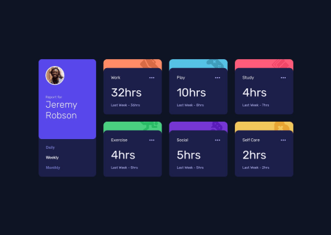
    Time tracking dashboard solution

    #accessibility#animation
    • HTML
    • CSS
    • JS

    1


    Hello everyone 👋, I'm Mohammed and this is my solution to this nice challenge.

    Starting from this challenge, I decided to stop using Flexbox for the general layout of all future challenges. Instead, I will use CSS grid as I need to practice and do more exercises on CSS grid to improve.

    I will briefly talk about my current process of solving FEM challenges and I hope it will help and inspire other beginners(like me 😊). To make this process actionable so others can follow, I will list the steps I take to solve the challenge:-

    1- I download the challenge resource file and extract it in a special folder 📁 so I can use it in the future if needed without having to re-download it again.

    2- After the files were extracted, I read 📖 about the requirements to solve 🤔 the challenge.

    3- After reading the requirements, I open the design folder to see the final product both for mobile and desktop screens. I also note down the number of active state elements so I don't forget to do it while solving the main challenge.

    4- After I see both photos for screen designs, I take some notes 📝on how best to do the HTML markup and how to structure the elements in the page. This is very very important ⚠ issue and help in later steps. I pick up best semantic tags which serve the purpose of the content.

    5- I then create a css styling and javascript files , link them to the html file then I initialize a new git repo and make initial commit on the master branch.

    6- Then I do the actual markup of all texts in challenge file for mobile screens. for example , if a text is best displayed as H1 tag , I wrap the text in h1 tag using a shortcut in vscode,etc.. I also add images and icons at this stage. then I create a new git branch for mobile-design before I start styling.

    Note : I always do mobile-first solution and I don't combine mobile and desktop styling at same stage.

    7- After I finish the markup stage , I go to styling stage targeting mobile screens. I use live server on vscode , I go live and open the page in my chrome , then use Pixel perfect extension to load the design file for mobile screen as overlay on top of my actual page. I make sure the overlay image is exactly 100% on top of my html page. I make sure I choose the right screen resolution which is 375px.

    8- At this stage, I use Responsively app to see how the page will look like on different screen sizes. I usually have the following screen sizes opened at the same time:

    • Iphone SE 375px Fem design size for mobile
    • Iphone Pro Max 428px
    • Ipad mini 768px
    • Ipad Air 820px
    • Ipad Pro 1024px
    • My own screen size 1366px
    • MacBook Pro 1440px Fem design size for desktop

    9- After I finished mobile screen design , I commit all changes, checkout to master branch , then merge mobile-design branch with master created before.

    10- I then create a new branch for desktop design , load the design image as overlay on chrome using the extension and I start coding on custom screen size of 1440px I created for this purpose.

    11- I repeat step 9 with desktop branch.

    Note : I will add a new git branch in future for accessibility,SEO and performance so I improve this area also.

    12- I move to Javascript part of the challenge after I create a new git branch for it.

    13- After I solve the javascript part , I commit and merge into master branch and my solution is ready for deployment.

    14- I do final checks to make sure all things are working as it should , then I deploy to netlify.

    15- I then upload my solution to FEM website

    This is a brief process overview I developed over time. I'm know its not perfect for sure but its good start for a beginner like me with big room for improvement in future.

    This process does not take into account frameworks or libraries I might use in my solution. In case I did use such frameworks (like tailwindcss for example), I install them at initial stage.

    Built with 🛠

    What I learned 🧐

    • CSS grid for general layout of the project
    • working with json files to import data and update the DOM

    Continued development

    • Working with CSS grid
    • Fetch, JSON in Javascript
    • Pass arguments for callback functions with addEventlistner

    Useful resources

    Acknowledgments

    This work was inspired by the solution of Melvin

  • Submitted


    Hello Everyone,

    This is an easy challenge I did today. Positioning of elements was the main skill tested in this challenge.

    • Semantic HTML5 markup
    • CSS custom properties
    • Flexbox
    • Mobile-first workflow
    • Animate.css v4 (https://https://animate.style//) - CSS Animation Library
  • Submitted


    A new challenge was solved today using Tailwindcss.

    I got stuck on an issue that was not requested in the design. When the theme is in dark mode, the YouTube logo takes the dark background which makes it not look good. So, I applied a white background for the YouTube logo even in dark mode for the last card div. I did this by nesting the icon inside the span element.

    However, I faced a problem which I could not solve. There is a white border on the top left corner which I could not remove. This white border appeared from all sides, but I applied a border with the same dark background color around the element. This trick partially solved the problem for me.

    I would appreciate it if anyone could tell me how to remove this white border around the image.

    Note: Please check the icon on the last card on the page where the problem exists.

    Any feedback would be highly appreciated.

  • Submitted


    Hello everyone 🤚, I'm Mohammed and this is the solution for the Tip calculator app solution. It's the second time I have tried to match the exact design, and I greatly enjoyed this experience😃.

    After going through this process, I think it was a huge mistake not to solve all the challenges using the pixel-perfect design process. The reason that let me change my mind is the knowledge and learning I accumulated 🚀 while solving the challenge. Never expected I would learn in such a professional way🙏✔.

    I encourage everyone to learn the process and start solving all challenges while trying to match the design exactly as it is in the design.

    You might find it very difficult to do it, but you will learn new things as you go and it's really worth learning.

    I have used the Pixel-perfect chrome extension👌 while solving the challenge. Very nice and easy-to-use 👍 tool.

    For the JavaScript part, despite the calculator looking very simple ➡, it requires lots of work to be done to achieve the best results 😭. It took me lots of time to solve it.

    I left checking the amount field input value when the user entry negative value as I got tired already 😢

    Warning 🚫⛔:

    I have changed my code several times to make it work, so be careful not to take my code as perfect or ideal to follow.

    I pray for all innocent people in Gaza who are going through a real genocide and I wish they have peace and safety.

    Thanks all and see you in the next challenge ✌🙏🤚

  • Submitted


    This is the first time I have tried to match the exact design. I used perfect pixel chrome extension.

  • Submitted

    Advice generator app

    #fetch
    • HTML
    • CSS
    • JS
    • API

    0


    This is a very light challenge if you know how to get data via API call and work with Promises.

    I did some tests and found this API max quote ID is 224 meaning if you supply any number above 224 , then you will get an error.

  • Submitted


    Hello Everyone, I'm glad to upload a new challenge after a break of 80 days.

    At start, I was surprised when I found myself forgetting 80% of what I learned before my long vacation. However, after few hours, I start to remember it all gradually and after 2 days, I can say I will be on the right track again.

    This challenge will teach you how to create an input checkbox to make a toggle switch which we always see in pricing grids in professional companies.

    As before, I neglected some small details (like background images, size of the dollar sign beside prices, etc ..).

    I would appreciate it if I could get feedback on the accessibility issues.

    Thanks, MKF

  • Submitted


    This is the first challenge I solve which asks for a dropdown menu.

    In order to maximize my learning experience, I have solved the dropdown menu problem in 2 different way : 1- using CSS only - This was my first time solution to use CSS to take action like opening a dropdown menu. 2- Using Javascript which is the regular way where we use addEventListener on the targeted element.

    For the first method using CSS, the main issue you need to understand is the fact that the hover effect can be used to change the status for different elements, not the element where you hover over. if you have two divs - the first one is black and the second one is green. You can hover over the black box and change the color of the second green box to red for example.

    I have neglected many small details in this challenge like fonts, colors, or some alignment issues. This is my second challenge at the junior level and I'm trying to deeply understand how things really work behind the scenes, and not just come up with a solution. I started already a new Javascript course and I do hope to learn new things to make my JS code look and work better, namely, I want to write a clean code

  • Submitted


    This is a chartjs challenge. It's one of the most powerful and popular chart libraries for Javascript applications.

    A small fix is needed for my solution to match the design: removing the label from the tooltip.

    Also, I need to revisit this challenge again so I can use the JSON file to dynamically update the chart.

  • Submitted


    Another nice and fun challenge was completed. I'm still unable to work with Grid unless I open devtools to show the Grid visually in front of me.

    I advise all beginners (like me) to do this challenge many times till mastery. why? Because this is almost like a real website with a responsive mobile menu - a pattern and a problem you will see very often in the work of web development.