
@javascriptor1

Mohammed Fakih
@javascriptor1All comments
- @javascriptor1
I have updated my solution to this easy challenge. Original solution a year ago had an overflow for mobile design.
- @javascriptor1@javascriptor1
UPDATE
I have fixed the problem in my code. Its working fine now.
- @javascriptor1@javascriptor1
UPDATE.
I have solved the challenge again using React. However, there is a bug in my code.
When the page first loads, and with first click , the question toggles correctly. But after that, I need to click twice on each question to toggle.
I also feel my code is not perfect and could be done better. I would appreciate any feedback on my solution.
Thanks
- @StarChan013@javascriptor1
Hi Vanessa,
Congratulations on completing your second project. Excellent job. Here are some remarks which I hope you found helpful:
HTML
- You have done a good job using semantic HTML elements. There is one tag in the ingredients section which should be change from
ulto 'ol' ;
<ul class="instructions__list">As this is an ordered list , the
olshould be used.-
For alt text related to images inside HTML , and as per W3C website , you should avoid "Superfluous information in the text alternative. Usually, there’s no need to include words like “image”, “icon”, or “picture” in the alt text. People who can see will know this already, and screen readers announce the presence of an image".
-
The last row in the Nutrition section table should not have a border bottom. You have to remove the border-bottom by using
.nutrition__table tr::last-childselector and assign valuenoneto border-bottom
CSS
-
The main container should be a little wider. This affects some content and causes extra lines for some
pelements like the one underh1tag. Instead of 2 lines like the design, your paragraph spans into 4 lines. -
For responsiveness, you said in a reply to one comment the following :
"I used 1440px cause was the number in the guide styler!"
When I started learning about responsiveness, and start doing FEM challenges here, I got confused just like you about the two designs ( 375 & 1440px) which appear in all challenges style guides.
The design folder for all challenges is shipped with at least 2 photos :
1- For mobile devices ( width is 375px).
2- For desktop computers ( width is 1440px).
However, your solution should be responsive even for devices that fall between these 2 sizes like 500px, 800px, and 1200px.
These 2 designs are working as a guide for you on how the mobile design should look like and how the desktop design should look like.
For example, in this challenge, The image on top should take full width (100%) on mobile devices. So you should make your design considering this and set a breakpoint as to where to break into desktop design.
If we check your solution again , try to view the design on 799px using dev tools in chrome, then go up to 800px where you set a breakpoint for desktop design.
You will see a big photo until 799px then a small container when you switch to desktop design( you set it max @ 35% of screen width). Sô, here is a problem. The screen is 800px and the container is only 35% wide of the screen which is very small.
So, To code it right, whenever you break into the desktop design, the page should look like the same one provided in the design folder for desktop view.
I hope it's clear now for you.
- There are some declarations in CSS which have no effect as they are default values. Examples of this are the following ( see the last commented two declaration) :
.table__infos {
    font-family: var(--secondary-font);
    color: var(--wenge-brown);
    /* font-size: 16px; */
    /* font-weight: 400; */
}
When you finish styling, try to clean up your CSS files by removing all declarations which have no effect.
Best of Luck and keep coding.
Regards,
MKF
Marked as helpful - You have done a good job using semantic HTML elements. There is one tag in the ingredients section which should be change from
- @Nouran-Aly@javascriptor1
Hi Nouran,
Congratulations on completing the challenge. Here are some notes which I hope you find helpful in improving your code :
HTML
- Use semantic elements like
maininstead ofdiv. When you create a web HTML page, you are authoring a document that should convey a meaning. So always think semantically and check what content each part of the document contains and choose the semantic element accordingly. Here are a few examples to make this clear ;
1- use the
maintag for the main part of the document instead ofdiv. A main landmark identifies the primary content of the page. You can read more on main tag here2- use the
timetag when your document contains a date/time.3- use the
abbrtag for any abbreviations like HTML & CSS in your document.CSS
- The font required for the challenge is available with downloaded resources under the assets folder. Try to use font-face instead of importing the font from the Google fonts website.
-For mobile view @ (375px), there will be no margin from the right/left of the card. This is because you set a fixed width for the card(375px). The width should be less than 375px for mobile design so the card will have the required space from right/left. When you reduce the width to say 334px , the image needs to have
width:100%so it does not get outside of the card.Keep coding and good luck.
MKF
Marked as helpful - Use semantic elements like
- @tringakrasniqi@javascriptor1
Hi Tringa,
Congratulations on completing the challenge. Here are some notes which I hope you find helpful in improving your code :
HTML
- Use semantic elements like
maininstead ofdiv. When you create a web HTML page , you are authoring a document that should convey a meaning. So always think semantically and check what content each part of the document cotnain and choose semantic element accordingly. Here are few examples to make this clear ;
1- use
maintag for the main part of the document instead ofdiv2- use the
timetag when your document contains a date/time.3- use
abbrtag for any abbreviations like HTML & CSS in your document.- Even when using
aria-label, you still have to use thealtattribute. An aria attribute can be used as an additional text alternative but doesn't replace the requirement for an alt attribute.
CSS
-
For the font family, you have imported the font from Google and also used the locally hosted font in the assets folder. One should be enough unless you did this intentionally.
-
For font-weight , I can see you have used
boldwhich is equal to 700. You also used 900. The requirement is to use 600,800 only. -
The styling for body tag is overcomplicated and I guess you should consider re write it again. Here is a very simple and straightforward styling for the body tag if you want to place content in the middle of the page :
display: flex;
justify-content: center;
align-items: center;
min-height: 100vh;
-For mobile view (375px), the
h1content breaks into new line. Reduce the font-size used for mobile view.Keep coding and best of luck.
MKF
Marked as helpful - Use semantic elements like
- @Madeline0421@javascriptor1
Hello @Madeline0421,
Great job. Your solution looks identical to the design. Amazing. Here are some notes which I hope will help you in your next challenge ;
-
The font used in this challenge is provided to you with resources files. While it is okay to get the font from Google Fonts or any other provider, try to use locally hosted fonts. use the
@font-facedeclaration for this purpose. Here is a great resource for best practices related to fonts web.dev. Also, the requirement is to use 600,800 weight only but you include all from 300 up to 800. -
To reset the margin, it's better to do it on the root element thus you don't need to write
margin: 0;under html, body,h1, and p tags. The reset usually looks like this :
* {
margin:0;
}
This will reset the margin for all elements on the page which is what we want usually.
-
Use the
footersemantic tag for attribution instead ofdivand don't include it under themaintag as it is not part of the main content. -
You have aligned .card div items in the center despite the content of the page being on the left !!!!!. Think about alignment always before you align everything in the center. Remove this line from your CSS and everything will be aligned correctly to the left😀:
align-items: center;There is no need to do
align-self: start;for 3 or 4 elements to get them back to left-
Avoid setting fixed width and height for main contents like .card. View your solution on mobile and you will find it is not responsive. I did not see any line in your CSS for media queries. Never mind if you are still learning - just get into it and you will love it at the end once you understand it.
-
flex direction is row by default. No need to include
flex-direction: row;when you want flex row. -
For the date inside the card , its better to wrap it like this :
 <p>
          Published
          <time datetime="2023-12-21"> 21 Dec 2023</time>
 </p>
Make only the date/time part of the
timetag-
You forgot to apply the hover state on the h1 element.
-
border: 3px white;this line has no effect at all and it's not valid. To be valid, you should add a border style for the shorthand to work like3px white solid
Best of luck and keep going.
Regards,
Mohammed
-
- @Madeline0421@javascriptor1
Hello Madeline0421,
Good work. I have cloned your repo, updated the code then opened a pull request so you can check how I addressed the issues you raised in your comment.
Here are some notes about it:
- how to remove the white space at the top
The white space is a result of setting a fixed height on the container and then displaying it as flex with center alignment on both axes.
By removing the fixed height , and adding the right padding , you can control the white space.
- Structure the font the same as the preview (move the font on a third line).
You have to use padding from right and left to control such behavior. When you add more padding on X axe, the space available to display the text gets reduced which will result in moving to the third line.
I hope these notes will help.
Keep coding and good luck. Rgds, Mohammed
Marked as helpful - @renzrph@javascriptor1
Hi Renz,
Nice job. However, the logic of the application needs to be re-written as the app is not functioning as it's supposed to. Here are some notes about your solution:
-
You have placed the header in the wrong location. The header which contains the TODO word in addition to the image(for theme switching) should be on top of the upper BG photo, not on the BG plain color. This issue matters because when users visit your application website from desktop , then change to light Mode , the moon will not be seen as it has the same color of background in light Mode.
-
After adding 6 todos, the application stops displaying any additional entries. It's wrong to hard code the todos in the HTML ( from item1 to item6) as you did. This process should be completely dynamic.
-
Add one todo, then mark it as completed, then delete it. If you try to add other todos after this operation, it will be marked as completed by default.
-
Its wrong to listen o click event to add todos in this case. The add todo should work after pressing Enter key. This needs to be written from scratch.
Wrap the input in a form so you catch the ENTR key without doing any extra coding and listen for
submitevent. You will have to prevent default behavior though.-
When you check for todo as completed , you should be able to uncheck it again. This is not working in your application. Once a todo is checked completed , you can't undo this opreation.
-
Don't place the
headerundermaintag. -
Place todos in
ultag and uselito create each todo as part of a unordered list. -
Use
buttontag for switching between light and dark mode.
I hope these notes will help you to improve your code.
Keep going and good luck.🚀
MKF
Marked as helpful -
- @javascriptor1@javascriptor1
Update:
The theme now loads from local storage. If a user switches to LightMode, It will persist after refreshing the page.
- @MelvinAguilar
PayAPI multi-page website (Next.js + TypeScript + Tailwind + ESLint)
#backbone#next#tailwind-css#typescript#lighthouse@javascriptor1Hi Melvin,
Excellent work as usual. Loved the transition effect very much.
I noticed you removed the underline for contact us on the hero section. It's visible on the design.
Another side note regarding the title of the readme file - it is showing Time tracking dashboard solution so you may update the title accordingly.
Amazing work. Thanks for your contributing a high quality works on FEM. 👏
Keep up the good work. MKF
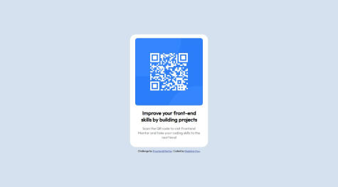
Marked as helpful - @CheFernandez99@javascriptor1
Hello,
Congratulations for completing this challenge. Here is my feedback on your solution which I hope it will help improve your code:
HTML
1- Use semantic tags always to reflect element's content meaning (like
<main> <footer>).
Avoid non-semantic elements like<div> <span>. Use these two elements for grouping/styling purposes.Apply this in your code by replacing the parent div with main tag. Same for footer.
2- Start with h1 tag instead of h2 as its level 1 heading to make your age accessible
3- Enhance the alt text for the QR code. Instead of
alt="QRcode", you can write a more descriptive text like :QR code for frontend mentor website.4- wrap QR abbr in the paragraph with
<abbr>tag like this:<p>Scan the <abbr title="Quick Response">QR</abbr> code to visit Frontend Mentor and take your coding skills to the next level</p>CSS
5- The required font is Outfit but you have included three more fonts by mistake I guess:
<link href="https://fonts.googleapis.com/css2?family=Fraunces:opsz,wght@9..144,400;9..144,500;9..144,600;9..144,700&family=Montserrat:wght@200;300;400;500&family=Outfit:wght@400;700&family=Overpass:wght@400;700&display=swap" rel="stylesheet">This usually occurs when you add a font in google website and don't remove it after you finish. When you visit google font website next time , your old selection will stay there and will be added to the fonts you add recently.
6- As per style guide, font-size should be 15px which was not applied. Changing to 15px will make the page look like design in terms of Paragraph.
7- You can remove width:300px from h2 tag - it has no effect.
8- Instead of adding a style which can be inherited for each child element,apply the style to the parent instead:
For example , you want to align h2 and p text to center. Instead of applying styling to each tag , do it once for Child div which is parent:
text-align: center;text-align is a property that gets inherited to child elements.
9- Avoid capitalizing class names -> parent instead of Parent.
10- Finally, increase the padding in child container div.
Keep coding and best of luck.
MKF
- @PeaceNaza
A responsive web HTML5 and CSS design using grid.
#accessibility#lighthouse#sass/scss#styled-components#web-components@javascriptor1Hi Peace,
Nice job. Here are some notes about your solution :
- HTML
1- For HTML , always use semantic tags and avoid using generic tags like div and span as much as possible unless you have no other options. Example , instead of div tag you have used for container , use main tag and use H1 instead of P tag for the first senetence. I have opened a PR for this purpose. Please check your github repo for this project for more info.
2- Add alternative text alt to the image so you make it accessible. People with disabilities like blindess can't see images. They rely instead on screen reader to consume and interact with the content. Alt is the texts that represent the image in your page. Write a text which can express what is this photo and convey the meaning for it. For this challenge , you can use something like
alt="QR code for frontend mentor website"- CSS
3- Media query you wrote is redudant and has no effect as its the same styling which is already applied for the container on different screen sizes. Remove it or change the style if you want to have some changes for mobile screens.
4- Another repeated styling which can be removed is the
margin-top: 4rem;for container. You have already addedmargin: 4rem;5- for P tag ,
font-weight: 400;also can be removed as this is the default value. Same fordisplay: block. p tag is a block level element by default.Best of luck
Marked as helpful - @MelvinAguilar@javascriptor1
I also forgot to mention I could not see the thin line in your solution between questions.
I wonder how do you solve this usually? do you use <hr> tag? or border-bottom? Or other approaches?
- @MelvinAguilar@javascriptor1
Hi Melvin,
Excellent solution as always. Your native solution draws my attention to the fact that CSS selectors like:
:is and :not can work as if condition combined with HTML attributes which makes it possible to get rid of JS code when you have two options to choose from.
Thanks for your excellent contribution to FEM. I enjoy looking at your code always.
Regards, MKF
- P@Marianellag1@javascriptor1
Hi Marian ,
Excellent work. One requirement is missing. If you check the readme file again, you will see this requirement :
- Navigate the questions and hide/show answers using keyboard navigation alone
You have used non interactive element (div tag) which users can't navigate through a keyboard. The functionality can be achieved using the details tag.
You forgot to apply the active state element when hovering over the question.
In addition, the question is not aligned in the middle between the two lines.
Also, avoid using figure tag for logos as it's not the best or right option. Unless you have figure caption to be combined with the photo, don't use a figure and use img tag or inline svg directly.
Best of luck
- @nmrtsnh@javascriptor1
Hi Namrata,
Excellent job.
1- Hover active state for social media was not made.
2- No email checking on the subscription button.
3- You should use a header tag instead of a nav.
4- Where does this code take the user?
<button class="btn">Get Started For Free</button>use anchor tag instead of buttons for links with href attribute.
5- Wrap contact information on footer inside address tag.
Good luck
- @Deepali25-K@javascriptor1
Hi DEEPALI ,
Excellent work. I just uploaded my solution to this challenge today. Here are my notes which I can share with you about your solution :
1- For anchor links, always use anchor tag <a> and don't use button. Look at your code below:
<button class="cta-button">Get Started For Free</button>Where does this button take the user?? No where. Buttons are used to take action like subscribe or submit a form. If you are sending the user to a link , use a with href attribute.
2- For contact information in the footer, use the address html tag and wrap all information inside it.
3- The color of the logo on top should be black, not dark cyan. You have to change it inline or via CSS.
4- The hover state effect for social media icons is not correct.
5- You have not applied any checking in JS whether an email is valid or not but relied on built-in browser checking. Do this checking in JavaScript and display the error message as required.
6- For the main, it's supposed to wrap the main part or section of the page as per my understanding. This website is made of different sections and it's not correct to wrap everything in the main element including the footer 😊
7- The Facebook icon is a little aligned to the left in comparison to the above section. This is very subtle and hardly noticeable. These elements are supposed to have the same padding/margin, so they are aligned perfectly on the same vertical line.
Good luck and happy coding.