
@alihaydar28

Jeroen Leijnse
@jrleijnseAll comments
- @jrleijnse
Hey there! Great job completing your first challenge! 🎊
I have some suggestions for your code that might interest you.
HTML 📄:
- Instead of using the
<div>tag for your containers, try using some semantic HTML to provide more meaning to it, for better SEO. For example, instead of using<div>you could use the<main>or<section>tag. For the element with the classname attribution you could use the<footer>tag. - If an
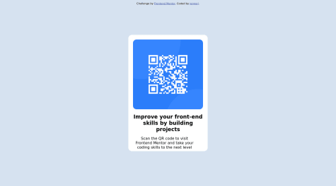
<img>like in this case the QR-code, leads to a website or links to someplace else, try to provide a more descriptive text of that in yourALTtext, for example: QR code that leads to frontendmentor.io
CSS 🎨:
- Removing the margin-top from the
<h1>element and removing all margin from the<p>element and then adding some padding to the<div class="text">should fix your issue. - To make your project more responsive and adaptable (in this case as well: especially when you start building bigger and bigger projects), I would suggest to use rem instead of px. This basically means that all sizing will be calculated in relation to the root element (rem). To set the standard font-size for the root element, you can provide a font-size inside the HTML element inside your CSS. For example:
html {font-size: 15px;}.
For more information on this topic, you can read the following article: PX or REM in CSS? 📘
- To make your solution responsive for different devices and screen widths, you can create a media query inside your CSS file and set the breaking point (i.e. the moment your media query gets triggered based on the width of the viewport). For example:
@media (max-width: 375px) { ***Place your CSS code here, just like you would in a regular CSS file***}.
For more information on this topic, you can read the following article: Media queries 📘
- An easy way to quickly and automatically center your
<main>element inside the<body>of your page, is by setting the following properties onto the<body>element inside your CSS like so:body { min-height: 100vh; display: flex; flex-direction: column; justify-content: center; align-items: center; }
I hope you find my suggestions useful, and above all: the solution you provided is very good!
Keep it up and happy coding! 😃
Marked as helpful - Instead of using the
- @takieeldeen@jrleijnse
Hey there! Great job completing your first challenge! 🎊
I have some suggestions for your code that might interest you.
HTML 📄:
- Instead of using the
<div>tag for your containers, try using some semantic HTML to provide more meaning to it, for better SEO. For example, instead of using<div>you could use the<main>or<section>tag. For the element with the classname attribution you could use the<footer>tag. - If an
<img>like in this case the QR-code, leads to a website or links to someplace else, try to provide a more descriptive text of that in yourALTtext, for example: QR code that leads to frontendmentor.io
CSS 🎨:
-
For a better file structure (especially when you start building bigger and bigger projects), place your CSS code in a separate file (for example: style.css) and move the code located within the
<link>tag and placing it inside of your<head>tag in your HTML. For example: <link rel="stylesheet" href="./style.css"/>. -
To make your solution responsive for different devices and screen widths, you can create a media query inside your CSS file and set the breaking point (i.e. the moment your media query gets triggered based on the width of the viewport). For example:
@media (max-width: 375px) { ***Place your CSS code here, just like you would in a regular CSS file***}.
For more information on this topic, you can read the following article: Media queries 📘
I hope you find my suggestions useful, and above all: the solution you provided is very good!
Keep it up and happy coding! 😃
- Instead of using the
- @Khazri71@jrleijnse
Hey there! Great job completing your first challenge! 🎊
I have some suggestions for your code that might interest you.
HTML 📄:
- Instead of using the
<div>tag for your containers, try using some semantic HTML to provide more meaning to it, for better SEO. For example, instead of using<div>you could use the<main>or<section>tag. For the element with the classname attribution you could use the<footer>tag. - If an
<img>like in this case the QR-code, leads to a website or links to someplace else, try to provide a more descriptive text of that in yourALTtext, for example: QR code that leads to frontendmentor.io
CSS 🎨:
- To make your project more responsive and adaptable (in this case as well: especially when you start building bigger and bigger projects), I would suggest to use rem instead of px. This basically means that all sizing will be calculated in relation to the root element (rem). To set the standard font-size for the root element, you can provide a font-size inside the HTML element inside your CSS. For example:
html {font-size: 15px;}.
For more information on this topic, you can read the following article: PX or REM in CSS? 📘
- An easy way to quickly and automatically center your
<main>element inside the<body>of your page, is by setting the following properties onto the<body>element inside your CSS like so:body { min-height: 100vh; display: flex; flex-direction: column; justify-content: center; align-items: center; }
I hope you find my suggestions useful, and above all: the solution you provided is very good!
Keep it up and happy coding! 😃
Marked as helpful - Instead of using the
- @kingAuthor1212@jrleijnse
Hey there! Great job completing your first challenge! 🎊
I have some suggestions for your code that might interest you.
HTML 📄:
- If an
<img>like in this case the QR-code, leads to a website or links to someplace else, try to provide a more descriptive text of that in yourALTtext, for example: QR code that leads to frontendmentor.io - Try using the font that is provided in the style-guide file. You can do this by generating the font using the link in the styling-guide and paste the
<link>inside of the<head>in your<HTML>.
CSS 🎨:
- For a better file structure (especially when you start building bigger and bigger projects), place your CSS code in a separate file (for example: style.css) and move the code located within the
<link>tag and placing it inside of your<head>tag in your HTML. For example: <link rel="stylesheet" href="./style.css"/>. - To make your project more responsive and adaptable (in this case as well: especially when you start building bigger and bigger projects), I would suggest to use rem instead of px. This basically means that all sizing will be calculated in relation to the root element (rem). To set the standard font-size for the root element, you can provide a font-size inside the HTML element inside your CSS. For example:
html {font-size: 15px;}.
For more information on this topic, you can read the following article: PX or REM in CSS? 📘
- To make your solution responsive for different devices and screen widths, you can create a media query inside your CSS file and set the breaking point (i.e. the moment your media query gets triggered based on the width of the viewport). For example:
@media (max-width: 375px) { ***Place your CSS code here, just like you would in a regular CSS file***}.
For more information on this topic, you can read the following article: Media queries 📘
I hope you find my suggestions useful, and above all: the solution you provided is very good!
Keep it up and happy coding! 😃
- If an
- @siriusdave@jrleijnse
Hey there! Great job completing your first challenge! 🎊
I have some suggestions for your code that might interest you.
HTML 📄:
- Instead of using the
<div>tag for your containers, try using some semantic HTML to provide more meaning to it, for better SEO. For example, instead of using<div>you could use the<main>or<section>tag. For the element with the classname attribution you could use the<footer>tag. - If an
<img>like in this case the QR-code, leads to a website or links to someplace else, try to provide a more descriptive text of that in yourALTtext, for example: QR code that leads to frontendmentor.io
CSS 🎨:
- To make your project more responsive and adaptable (in this case as well: especially when you start building bigger and bigger projects), I would suggest to use rem instead of px. This basically means that all sizing will be calculated in relation to the root element (rem). To set the standard font-size for the root element, you can provide a font-size inside the HTML element inside your CSS. For example:
html {font-size: 15px;}.
For more information on this topic, you can read the following article: PX or REM in CSS? 📘
- To make your solution responsive for different devices and screen widths, you can create a media query inside your CSS file and set the breaking point (i.e. the moment your media query gets triggered based on the width of the viewport). For example:
@media (max-width: 375px) { ***Place your CSS code here, just like you would in a regular CSS file***}.
For more information on this topic, you can read the following article: Media queries 📘
I hope you find my suggestions useful, and above all: the solution you provided is very good!
Keep it up and happy coding! 😃
- Instead of using the
- @Pinnacle007@jrleijnse
Hey there! Great job completing your first challenge! 🎊
I have some suggestions for your code that might interest you.
HTML 📄:
- If an
<img>like in this case the QR-code, leads to a website or links to someplace else, try to provide a more descriptive text of that in yourALTtext, for example: QR code that leads to frontendmentor.io - Try using the font that is provided in the style-guide file. You can do this by generating the font using the link in the styling-guide and paste the
<link>inside of the<head>in your<HTML>.
CSS 🎨:
- To make your project more responsive and adaptable (in this case as well: especially when you start building bigger and bigger projects), I would suggest to use rem instead of px. This basically means that all sizing will be calculated in relation to the root element (rem). To set the standard font-size for the root element, you can provide a font-size inside the HTML element inside your CSS. For example:
html {font-size: 15px;}.
For more information on this topic, you can read the following article: PX or REM in CSS? 📘
- To make your solution responsive for different devices and screen widths, you can create a media query inside your CSS file and set the breaking point (i.e. the moment your media query gets triggered based on the width of the viewport). For example:
@media (max-width: 375px) { ***Place your CSS code here, just like you would in a regular CSS file***}.
For more information on this topic, you can read the following article: Media queries 📘
- An easy way to quickly and automatically center your
<main>element inside the<body>of your page, is by setting the following properties onto the<body>element inside your CSS like so:body { min-height: 100vh; display: flex; flex-direction: column; justify-content: center; align-items: center; }
I hope you find my suggestions useful, and above all: the solution you provided is very good!
Keep it up and happy coding! 😃
- If an
- @jengori@jrleijnse
Hey there! Great job completing your first challenge! 🎊
I have some suggestions for your code that might interest you.
HTML 📄:
- If an
<img>like in this case the QR-code, leads to a website or links to someplace else, try to provide a more descriptive text of that in yourALTtext, for example: QR code that leads to frontendmentor.io - Try using the font that is provided in the style-guide file. You can do this by generating the font using the link in the styling-guide and paste the
<link>inside of the<head>in your<HTML>.
CSS 🎨:
- To make your project more responsive and adaptable (in this case as well: especially when you start building bigger and bigger projects), I would suggest to use rem instead of px. This basically means that all sizing will be calculated in relation to the root element (rem). To set the standard font-size for the root element, you can provide a font-size inside the HTML element inside your CSS. For example:
html {font-size: 15px;}.
For more information on this topic, you can read the following article: PX or REM in CSS? 📘
- To make your solution responsive for different devices and screen widths, you can create a media query inside your CSS file and set the breaking point (i.e. the moment your media query gets triggered based on the width of the viewport). For example:
@media (max-width: 375px) { ***Place your CSS code here, just like you would in a regular CSS file***}.
For more information on this topic, you can read the following article: Media queries 📘
- An easy way to quickly and automatically center your
<main>element inside the<body>of your page, is by setting the following properties onto the<body>element inside your CSS like so:body { min-height: 100vh; display: flex; flex-direction: column; justify-content: center; align-items: center; }
I hope you find my suggestions useful, and above all: the solution you provided is very good!
Keep it up and happy coding! 😃
Marked as helpful - If an
- @juliatibes@jrleijnse
Hey there! Great job completing your first challenge! 🎊
I have some suggestions for your code that might interest you.
HTML 📄:
- Instead of using the
<div>tag for your containers, try using some semantic HTML to provide more meaning to it, for better SEO. For example, instead of using<div>you could use the<main>or<section>tag. For the element with the classname attribution you could use the<footer>tag. - If an
<img>like in this case the QR-code, leads to a website or links to someplace else, try to provide a more descriptive text of that in yourALTtext, for example: QR code that leads to frontendmentor.io - Try using the font that is provided in the style-guide file. You can do this by generating the font using the link in the styling-guide and paste the
<link>inside of the<head>in your<HTML>.
CSS 🎨:
- To make your project more responsive and adaptable (in this case as well: especially when you start building bigger and bigger projects), I would suggest to use rem instead of px. This basically means that all sizing will be calculated in relation to the root element (rem). To set the standard font-size for the root element, you can provide a font-size inside the HTML element inside your CSS. For example:
html {font-size: 15px;}.
For more information on this topic, you can read the following article: PX or REM in CSS? 📘
I hope you find my suggestions useful, and above all: the solution you provided is very good!
Keep it up and happy coding! 😃
- Instead of using the
- @JoachimvdP@jrleijnse
Hey there! Great job completing your first challenge! 🎊
I have some suggestions for your code that might interest you.
HTML 📄:
- Instead of using the
<div>tag for your containers, try using some semantic HTML to provide more meaning to it, for better SEO. For example, instead of using<div>you could use the<main>or<section>tag. For the element with the classname attribution you could use the<footer>tag.
CSS 🎨:
- To make your solution responsive for different devices and screen widths, you can create a media query inside your CSS file and set the breaking point (i.e. the moment your media query gets triggered based on the width of the viewport). For example:
@media (max-width: 375px) { ***Place your CSS code here, just like you would in a regular CSS file***}.
For more information on this topic, you can read the following article: Media queries 📘
I hope you find my suggestions useful, and above all: the solution you provided is very good!
Keep it up and happy coding! 😃
Marked as helpful - Instead of using the
- @Takinda@jrleijnse
Hey there! Great job completing your first challenge! 🎊
I have some suggestions for your code that might interest you.
HTML 📄:
- Instead of using the
<div>tag for your containers, try using some semantic HTML to provide more meaning to it, for better SEO. For example, instead of using<div>you could use the<main>or<section>tag. For the element with the classname attribution you could use the<footer>tag. - If an
<img>like in this case the QR-code, leads to a website or links to someplace else, try to provide a more descriptive text of that in yourALTtext, for example: QR code that leads to frontendmentor.io
CSS 🎨:
- To make your project more responsive and adaptable (in this case as well: especially when you start building bigger and bigger projects), I would suggest to use rem instead of px. This basically means that all sizing will be calculated in relation to the root element (rem). To set the standard font-size for the root element, you can provide a font-size inside the HTML element inside your CSS. For example:
html {font-size: 15px;}.
For more information on this topic, you can read the following article: PX or REM in CSS? 📘
- An easy way to quickly and automatically center your
<main>element inside the<body>of your page, is by setting the following properties onto the<body>element inside your CSS like so:body { min-height: 100vh; display: flex; flex-direction: column; justify-content: center; align-items: center; }
I hope you find my suggestions useful, and above all: the solution you provided is very good!
Keep it up and happy coding! 😃
Marked as helpful - Instead of using the
- @eritson254@jrleijnse
Hey there! Great job completing your first challenge! 🎊
I have some suggestions for your code that might interest you.
HTML 📄:
- Instead of using the
<div>tag for your containers, try using some semantic HTML to provide more meaning to it, for better SEO. For example, instead of using<div>you could use the<main>or<section>tag. For the element with the classname attribution you could use the<footer>tag. - If an
<img>like in this case the QR-code, leads to a website or links to someplace else, try to provide a more descriptive text of that in yourALTtext, for example: QR code that leads to frontendmentor.io
CSS 🎨:
- To make your project more responsive and adaptable (in this case as well: especially when you start building bigger and bigger projects), I would suggest to use rem instead of px. This basically means that all sizing will be calculated in relation to the root element (rem). To set the standard font-size for the root element, you can provide a font-size inside the HTML element inside your CSS. For example:
html {font-size: 15px;}.
For more information on this topic, you can read the following article: PX or REM in CSS? 📘
- To make your solution responsive for different devices and screen widths, you can create a media query inside your CSS file and set the breaking point (i.e. the moment your media query gets triggered based on the width of the viewport). For example:
@media (max-width: 375px) { ***Place your CSS code here, just like you would in a regular CSS file***}.
For more information on this topic, you can read the following article: Media queries 📘
- An easy way to quickly and automatically center your
<main>element inside the<body>of your page, is by setting the following properties onto the<body>element inside your CSS like so:body { min-height: 100vh; display: flex; flex-direction: column; justify-content: center; align-items: center; }
I hope you find my suggestions useful, and above all: the solution you provided is very good!
Keep it up and happy coding! 😃
Marked as helpful - Instead of using the
- @MONEMALI9@jrleijnse
Hey there! Great job completing your first challenge! 🎊
I have some suggestions for your code that might interest you.
HTML 📄:
- Instead of using the
<div>tag for your containers, try using some semantic HTML to provide more meaning to it, for better SEO. For example, instead of using<div>you could use the<main>or<section>tag. For the element with the classname attribution you could use the<footer>tag. - If an
<img>like in this case the QR-code, leads to a website or links to someplace else, try to provide a more descriptive text of that in yourALTtext, for example: QR code that leads to frontendmentor.i - Try using the font that is provided in the style-guide file. You can do this by generating the font using the link in the styling-guide and paste the
<link>inside of the<head>in your<HTML>.
CSS 🎨:
- To make your project more responsive and adaptable (in this case as well: especially when you start building bigger and bigger projects), I would suggest to use rem instead of px or other units. This basically means that all sizing will be calculated in relation to the root element (rem). To set the standard font-size for the root element, you can provide a font-size inside the HTML element inside your CSS. For example:
html {font-size: 15px;}.
For more information on this topic, you can read the following article: PX or REM in CSS? 📘
- To make your solution responsive for different devices and screen widths, you can create a media query inside your CSS file and set the breaking point (i.e. the moment your media query gets triggered based on the width of the viewport). For example:
@media (max-width: 375px) { ***Place your CSS code here, just like you would in a regular CSS file***}.
For more information on this topic, you can read the following article: Media queries 📘
- An easy way to quickly and automatically center your
<main>element inside the<body>of your page, is by setting the following properties onto the<body>element inside your CSS like so:body { min-height: 100vh; display: flex; flex-direction: column; justify-content: center; align-items: center; }
I hope you find my suggestions useful, and above all: the solution you provided is very good!
Keep it up and happy coding! 😃
- Instead of using the
- @yassi22@jrleijnse
Hey there! Great job completing your first challenge! 🎊
I have some suggestions for your code that might interest you.
HTML 📄:
- If an
<img>like in this case the QR-code, leads to a website or links to someplace else, try to provide a more descriptive text of that in yourALTtext, for example: QR code that leads to frontendmentor.io
CSS 🎨:
- An easy way to quickly and automatically center your
<main>element inside the<body>of your page, is by setting the following properties onto the<body>element inside your CSS like so:body { min-height: 100vh; display: flex; flex-direction: column; justify-content: center; align-items: center; }
I hope you find my suggestions useful, and above all: the solution you provided is very good!
Keep it up and happy coding! 😃
Marked as helpful - If an
- @princess-ctrl@jrleijnse
Hey there! Great job completing your first challenge! 🎊
I have some suggestions for your code that might interest you.
HTML 📄:
- Instead of using the
<div>tag for your containers, try using some semantic HTML to provide more meaning to it, for better SEO. For example, instead of using<div>you could use the<main>or<section>tag. For the element with the classname attribution you could use the<footer>tag. - If an
<img>like in this case the QR-code, leads to a website or links to someplace else, try to provide a more descriptive text of that in yourALTtext, for example: QR code that leads to frontendmentor.io
CSS 🎨:
- To make your project more responsive and adaptable (in this case as well: especially when you start building bigger and bigger projects), I would suggest to use rem instead of px. This basically means that all sizing will be calculated in relation to the root element (rem). To set the standard font-size for the root element, you can provide a font-size inside the HTML element inside your CSS. For example:
html {font-size: 15px;}.
For more information on this topic, you can read the following article: PX or REM in CSS? 📘
- An easy way to quickly and automatically center your
<main>element inside the<body>of your page, is by setting the following properties onto the<body>element inside your CSS like so:body { min-height: 100vh; display: flex; flex-direction: column; justify-content: center; align-items: center; }
I hope you find my suggestions useful, and above all: the solution you provided is very good!
Keep it up and happy coding! 😃
Marked as helpful - Instead of using the
- @MichaelAgyebeng@jrleijnse
Hey there! Great job completing your first challenge! 🎊
I have some suggestions for your code that might interest you.
HTML 📄:
- Instead of using the
<div>tag for your containers, try using some semantic HTML to provide more meaning to it, for better SEO. For example, instead of using<div>you could use the<main>or<section>tag. For the element with the classname attribution you could use the<footer>tag. - If an
<img>like in this case the QR-code, leads to a website or links to someplace else, try to provide a more descriptive text of that in yourALTtext, for example: QR code that leads to frontendmentor.io
CSS 🎨:
- To make your project more responsive and adaptable (in this case as well: especially when you start building bigger and bigger projects), I would suggest to use rem instead of px or other unites. This basically means that all sizing will be calculated in relation to the root element (rem). To set the standard font-size for the root element, you can provide a font-size inside the HTML element inside your CSS. For example:
html {font-size: 15px;}.
For more information on this topic, you can read the following article: PX or REM in CSS? 📘
- An easy way to quickly and automatically center your
<main>element inside the<body>of your page, is by setting the following properties onto the<body>element inside your CSS like so:body { min-height: 100vh; display: flex; flex-direction: column; justify-content: center; align-items: center; }
I hope you find my suggestions useful! The solution you provided is very good!
Keep it up and happy coding! 😃
Marked as helpful - Instead of using the
- @javier1793-op@jrleijnse
Hey there! Great job completing your first challenge! 🎊
I have some suggestions for your code that might interest you.
HTML 📄:
- If an
<img>like in this case the QR-code, leads to a website or links to someplace else, try to provide a more descriptive text of that in yourALTtext, for example: QR code that leads to frontendmentor.io - Try using the font that is provided in the style-guide file. You can do this by generating the font using the link in the styling-guide and paste the
<link>inside of the<head>in your<HTML>.
CSS 🎨:
- To make your project more responsive and adaptable (in this case as well: especially when you start building bigger and bigger projects), I would suggest to use rem instead of px. This basically means that all sizing will be calculated in relation to the root element (rem). To set the standard font-size for the root element, you can provide a font-size inside the HTML element inside your CSS. For example:
html {font-size: 15px;}.
For more information on this topic, you can read the following article: PX or REM in CSS? 📘
- To make your solution responsive for different devices and screen widths, you can create a media query inside your CSS file and set the breaking point (i.e. the moment your media query gets triggered based on the width of the viewport). For example:
@media (max-width: 375px) { ***Place your CSS code here, just like you would in a regular CSS file***}.
For more information on this topic, you can read the following article: Media queries 📘
I hope you find my suggestions useful, and above all: the solution you provided is very good!
Keep it up and happy coding! 😃
Marked as helpful - If an
- @AlexisMtzSa@jrleijnse
Hey there! Great job completing this challenge! 🎊
I have some suggestions for your code that might interest you.
CSS 🎨:
- To make your solution responsive for different devices and screen widths, you can create a media query inside your CSS file and set the breaking point (i.e. the moment your media query gets triggered based on the width of the viewport). For example:
@media (max-width: 375px) { ***Place your CSS code here, just like you would in a regular CSS file***}.
For more information on this topic, you can read the following article: Media queries 📘
- An easy way to quickly and automatically center your
<main>element inside the<body>of your page, is by setting the following properties onto the<body>element inside your CSS like so:body { min-height: 100vh; display: flex; flex-direction: column; justify-content: center; align-items: center; }
I hope you find my suggestions useful, and above all: the solution you provided is very good!
Keep it up and happy coding! 😃
Marked as helpful - To make your solution responsive for different devices and screen widths, you can create a media query inside your CSS file and set the breaking point (i.e. the moment your media query gets triggered based on the width of the viewport). For example:
- @nehrachetan83@jrleijnse
Hey there! Great job completing your first challenge! 🎊
I have some suggestions for your code that might interest you.
HTML 📄:
- Instead of using the
<div>tag for your containers, try using some semantic HTML to provide more meaning to it, for better SEO. For example, instead of using<div>you could use the<main>or<section>tag. For the element with the classname attribution you could use the<footer>tag. - If an
<img>like in this case the QR-code, leads to a website or links to someplace else, try to provide a more descriptive text of that in yourALTtext, for example: QR code that leads to frontendmentor.io - Try using the font that is provided in the style-guide file. You can do this by generating the font using the link in the styling-guide and paste the
<link>inside of the<head>in your<HTML>.
CSS 🎨:
- To make your project more responsive and adaptable (in this case as well: especially when you start building bigger and bigger projects), I would suggest to use rem instead of px. This basically means that all sizing will be calculated in relation to the root element (rem). To set the standard font-size for the root element, you can provide a font-size inside the HTML element inside your CSS. For example:
html {font-size: 15px;}.
For more information on this topic, you can read the following article: PX or REM in CSS? 📘
- An easy way to quickly and automatically center your
<main>element inside the<body>of your page, is by setting the following properties onto the<body>element inside your CSS like so:body { min-height: 100vh; display: flex; flex-direction: column; justify-content: center; align-items: center; }
I hope you find my suggestions useful, and above all: the solution you provided is very good!
Keep it up and happy coding! 😃
- Instead of using the