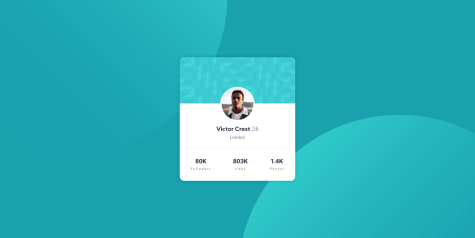
Grady• 80
@grady2002
Submitted
Please help correct my mistakes if any
Looking to hire developers?
@mesutcifci
@grady2002
Submitted
Please help correct my mistakes if any
@mesutcifci
Posted
Hi Grady Congrats!
Everything looks good.
you can add cursor : pointer property to social media icons.
may be you can reduce font-size in mobile view.
you should give meaningful class names to html elements. c1 and c2 are not good.
if you use it the right way html5 semantic tags are good. I think you used the footer element in the wrong place.
instead of placing it under the body, if you want you can place script tag to head section with ```defer```` attribute. If you dont know what is defer just google it.
nesting css selectors like this .container .c2 .shift is not best practice. You should avoid this beacuse such use makes it difficult to read code and causes performance problems.
@YusufWebDev
Submitted
im not sure why the background images are not showing up , ive commited this repository twice via github but the background images does not appear.
i am going attempt this same challenge using css grids.
as always , i welcome you critique.
thank you.
@mesutcifci
Posted
Hi Yusuf.
Background images don't loading because the path is wrong. Change path with this url("../images/bg-desktop.svg") and background will show.
Also you should remove overflow:hidden property from container element.
@MehmetCanBOZ
Submitted
Hi guys, any advice can help me a lot. Happy coding...
@mesutcifci
Posted
Hi Mehmet, Congrats!
Here is some advises to you:
-Check color, font-weight, font-size of texts. There are different from the original.
-When i shrink the page , i saw only Supervisor and Calculator cards shrink, maybe you can find better solutions. For idea check my solution click
@Ajdevise
Submitted
@mesutcifci
Posted
Hey Adjevise Congrats.
We have three elements tagged as Fullstack, but when I click on the Fullstack tag I see only two jobs are listed.
@mea-cuIpa
Submitted
Any feedback about code is highly appreciated!
@mesutcifci
Posted
Hi mea-cuIpa congrats,
We have three elements tagged as fullstack, but when I click on the Fullstack tag I see only two jobs are listed.
@sunnyandkate
Submitted
I tried a different way to solve this challenge, because I don' t have that much experiences yet in JavaScript. Somehow it does not work on mobile. maybe someone has a solution to this. any other feedback is very welcome
@mesutcifci
Posted
Hey Kate,
I realized something, click respectively Front-end, HTML and Senior then remove HTML. Normally there is only one job with the senior tag but you will see two job listed.
@ByKyZo
Submitted
@mesutcifci
Posted
Hi Alex Congrats.
I think you should check width, height and position of background images on mobile view.
@DilanLopz23
Submitted
I appreciate the feedback
@mesutcifci
Posted
Hi Dilan Congrats!
Here is some advice for you from me:
-you should check: font-size, border-radius
-your phone design looks bigger than original design you should make smaller
-to fixed broken design of input and button elements write this line of code border 0px or if you want, you can add custom border.
-open responsive design mode on your browser and look ```1018px`` you will see your images overflow.
-look 2000px on responsive mode. You will see the phone is stretch. To prevent this you can add max-width property.
-also if you check mobile design you will see the phone don't shrink
I know implemented these changes could be hard but if you work hard i think you can develop yourself and design.
@Kijimai
Submitted
First stab at this assignment, I appreciate any help!
@mesutcifci
Posted
Hi Jibby congrats.
right: -18%
Your layout is overflow beacuse of this line ofcode. To prevent overflow you can add ``` overflow-x: hidden`` to html element. Also maybe you can think another approach of positioning background images.
@emrecirakoglu
Submitted
My first challenge and I'm waiting feedbacks.
@mesutcifci
Posted
Hi Emre congrats!
-I think you should check background images on desktop version design. It is overlapping each others.
-If you get stuck to keep position of background images you can create another elements and you can set position of elements to absolute. Then you can set background image to these elements. Finally if you set width and height of these element with relative unit e.g percentage, vh, vw the background images keeps their positions and If you shrink the screen, the background images will also shrink.
@RajMhatre20
Submitted
In the "stay productive" section how can I change the color of SVG on hover?. Also is there any better way to change the SVG color on hover other than which I used?. Feedback on form validation is also welcomed
@mesutcifci
Posted
Hey, Raj
Can you examine my solution? I think you will find answer there.
If you don't understand the solution, please ping me. I explain.
@lttn-16
Submitted
Any comment would be appreciate!!
@mesutcifci
Posted
Hey Thanh, Congrats!
I have some advices to you:
-Could you check bg-pattern-desktop is too big than original design
-I realize when i click arrow the illustrations also moved maybe you can prevent this
-When i shrink screen, question section overlap on illustraions maybe you can check responsive design again(for see overlaping you can look 1010px wide)
-on mobile design maybe you can change border-radius
@frankiefab100
Submitted
When I was working on this project, the layout was perfect but it changed when it was hosted on vercel.
Please any advice on how to recreate this?
@mesutcifci
Posted
Hey frankie,
Could you send screen shot before and after? Also if there are could you disable your browser exensions?
@aaronpaulgz
Submitted
Any feedback is welcome :D Happy new year eve :D
@mesutcifci
Posted
Hi aaronpaulgz well done! Some components looks differents from original design.
-header logo big from original -you should review email input element border-color, height and width
Except these everything looks like fine to me.
@Hikmahx
Submitted
Any feedback would be appreciated. Thank you!
@mesutcifci
Posted
Hi. Well done! Your buttons looks on my device like this. click for screenshot
Also the error message disappears after a while but error logo appears.
@gbasbu
Submitted
How to make it better? Your feedbacks are most important to me. Thanks.
@mesutcifci
Posted
Hello, Görkem. Well done! I realized that you are only creating desktop and mobile view. I think you can configure this layout for tablet view. Also may be some transition effect will be good. Happy coding.
@ApplePieGiraffe
Submitted
Hello, everybody! 👋
This was a fun, simple challenge which I enjoyed! I added a cool little (and surprisingly simple) 3d hover effect to the card component (thanks to Dev Ed, once again). 😆
And for those tricky background SVGs? I ended up using a combination viewport width and height units and percentages to have the SVGs subtly change their position when the screen is resized. IDK if they match the design exactly but they look okay! 😂
Feedback is welcome and appreciated, of course! 😊
Happy coding! 😁
@mesutcifci
Posted
Hi. Congratulations.
I'm trying to do this challenge too. I trouble with background images position 😄 Your solution is perfect.
I want to use this in my code but i don't want just copy paste. Also i want to understand what's the idea on this solution.
Could you explain me how your code(background-position) works.
Thanks.
@nayem567
Submitted
Give Feedback :) Thanks
@mesutcifci
Posted
Hi. Congratulations. I realize your cards have same picture. I think you should change them :).