


Anna• 1,060
@annaindistress
Submitted
Looking to hire developers?
@mohammedbahnini
@annaindistress
Submitted
@mohammedbahnini
Posted
You need just an overflow-x-hidden on the body otherwise you did a geat job .
@LeandroJr730
Submitted
What are you most proud of, and what would you do differently next time?
I am proud of doing "the buttons" using lists because I didn't know how to use lists properly, so it took a long time but it worked. Next time I will try to focus more on selecting the right classes to change the style atributtes, because this is why I took a long time to do the buttons.
What challenges did you encounter, and how did you overcome them?
I had to search a lot about lists and inline-blocks because none of these approaches were working the way I wanted. But after some hard time trying different things it finally worked.
What specific areas of your project would you like help with?
My code is probably longer than needed and it could be more organized. Some tips would be gratifying. I also need some help with the @media. When I zoom in my "buttons" don't work properly, but I don't know how to fix it.
@mohammedbahnini
Posted
Hi, first of all, congratulations on completing this challenge, I saw your code source and noticed some notes :
Marked as helpful
@annaindistress
Submitted
@mohammedbahnini
Posted
Great job .
@jumiranda5
Submitted
@mohammedbahnini
Posted
One of perfect solutions out there .
@marcfranciss
Submitted
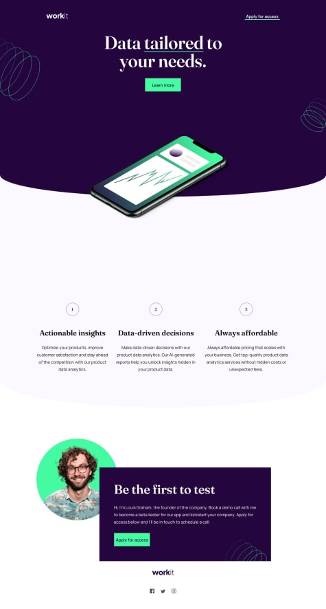
**What did you find difficult while building the project? I find it difficult to set the cellphone between two divs. Also, setting up the twirly background images.
**Which areas of your code are you unsure of? I'm unsure of the approach to make the correct placement of the cellphone and the twirly background patterns.
**Do you have any questions about best practices? Definitely. Please advise on the correct approach on the said cellphone and twirly background patterns. Thank you!
@mohammedbahnini
Posted
Hi there , I like your solution , but there are some notes :
Marked as helpful
@nsimba15
Submitted
@mohammedbahnini
Posted
Hi , your solution looks great , one thing I've noticed it's a little bit broken for tablet target , otherwise , you did a great job .
Marked as helpful
The challenge was fun and pretty straight forward.
I would say the most challenging part would be getting the hero section's sizing just right. Otherwise, the colour overlay over the footer image was a neat trick to learn as well.
If you have any feedback regarding sizing and making the hero section responsive - let me know!
@mohammedbahnini
Posted
Great solution for this challenge, although I noticed remarks you can improve:
But I liked the way you combine media-queries and images for the hero section, really good idea.
Have a great journey.
@dodrin
Submitted
Hello, I'm a Junior Full Stack Web Developer with a passion for design and front-end development. I used React and Tailwind CSS to get better at them. I appreciate your feedback!
@mohammedbahnini
Posted
Hi, nice result for this challenge, although I have some points you can improve:
Marked as helpful
@FluffyKas
Submitted
Hey guys,
Seemingly a simple newbie challenge but along the way I found a lot of little details that proved to be a bit tricky, like the image placement in the hero area or the decorative numbers. It was a lovely design that I really enjoyed working on.
If you see anything out of place or anything I could improve on, don't hesitate to point out (:
Have a great day!
@mohammedbahnini
Posted
Hi, first of all your solution is great, one thing I've noticed, in larger screens the hero section has a too much space between images and text, otherwise your solution is great, especially with the transition effect on scroll down. You can check my solution and give me your feedback, that would be nice from you.
@Kulyk-Volodymyr
Submitted
@mohammedbahnini
Posted
The most satisfying result, almost perfect.
@codingbeary
Submitted
Please let me know what should I improve :)
@mohammedbahnini
Posted
For the calculate button you need to add a z-index to apply the hover effect all over the button , right now its only applying the top half of the button , otherwise the result is great .
Marked as helpful
@RoanMacmillan
Submitted
Hey 👋
My first guru project, let me know what you think.
Still feel like there is quite a bit to improve on, especially refactoring the checkout component as it became a bit too long, but for now happy with it as I spent quite a bit longer on this than anticipated.
Any feedback is appreciated!
@mohammedbahnini
Posted
Hi there , i didn't see your code , but the result is pixel perfect , i have nothing to add .
@MarleyReyna
Submitted
Let me know how I can improve :)
@mohammedbahnini
Posted
Just wow , the result is so magnificent and pixel prefect .
@rachaelhrlm
Submitted
What can I do to improve?
@mohammedbahnini
Posted
This is simply perfect .
Marked as helpful
@soumya495
Submitted
Please let me know your views on this project, Thank You 😁
@mohammedbahnini
Posted
I like your solution , the presentation , the styling , it's almost pixel perfect , you have just to take a look in the html issues , otherwise you did a great job .
@danielswift10
Submitted
Learning new things each time I take up a Project on Landing Page. Here's the Responsive Fylo Landing Page using HTML & CSS Flexbox. Kindly do well to check through my design, codes, and most importantly its responsiveness on all screen widths.
One more thing I'll like to say, please when comparing the design, kindly click on the live URL to preview the site as to get the full picture about the project.
Lastly, Feedback on this project will be highly welcomed. Thanks.
Happy Coding!
@mohammedbahnini
Posted
I like the solution you came up with , but i have some notes :
@SevroAuBarca
Submitted
Me costo bastante, no salio como quería sinceramente, tuve muchos problemas con la imagen en versión desktop, simplemente los estilos no le afectaban, cualquier feedback se lo agradeceria porque tuve bastantes problemas con este xc
@mohammedbahnini
Posted
I like your solution a lot , i have one thing to add , in mobile version when the sidebar is showen add overflow : hidden to the body , to prevent scrolling down , otherwise you did a good job .
@DekiDex
Submitted
Any feedback is appreciated.
@mohammedbahnini
Posted
I did not know how to make an img fully white , thankk you so much for the solution , today i learned something new and thanks to you . Beside that , you need just a liitle of enhancements (sizes , accessibilty and html issues , desktop full with , btns sytle, ....)
Marked as helpful
@PavlinaPs
Submitted
@mohammedbahnini
Posted
I like your solution , is almost pixel-prefect , I suggest you fix the accessibility and html issues , i guess thay are quit basic , but i repeat your solution is great . Happy coding .
@FahimEcho
Submitted
@mohammedbahnini
Posted
wow i like your solution , you did a great job , keep coding.
@Honko-o
Submitted
@mohammedbahnini
Posted
Hi there , check my solution you might get a little help , even i am not a super star in css , but i hope it helps a little bit . (https://www.frontendmentor.io/solutions/accordion-card-component-SyQxOIwS5)
Marked as helpful
@viniciosragazzi
Submitted
@mohammedbahnini
Posted
I like the way you used the transitions and animations , you could use the same thing to fade out the rating component , but in general you did a great job , i really like it . Happy coding .
@jennstirpe
Submitted
@mohammedbahnini
Posted
Your solution is very nice , but something that i noticed :
@roy-eugene049
Submitted
Had to outsource inspiration and help for this one.
@mohammedbahnini
Posted
First of all , i really like your solution , however there are somethings need somme correction :