Skip to content
  • Unlock Pro
  • Log in with GitHub
Profile
OverviewSolutions
4
Comments
8
Muskan Fatima
@muskan-fatim

All comments

  • Aonullahi•10
    @Aonullahijimoh
    Submitted about 1 month ago
    What are you most proud of, and what would you do differently next time?

    I will make sure I calm down during coding exercise because my impatient cost me more headache and time was consumed.

    What challenges did you encounter, and how did you overcome them?

    The box radius for the body was not implementing until I made more researches on YouTube and asked my friends before I realized where the mistake was

    What specific areas of your project would you like help with?

    My button is touching both right and left end of my page which is not suppose too. Even after applying margin, it still didn't change.

    Order summary component responsive landing using media quary

    2
    Muskan Fatima•160
    @muskan-fatim
    Posted about 1 month ago

    Hi Aonullahi! 👋

    First of all, great job on completing the challenge and sharing your solution publicly! It's clear you're putting effort into learning and improving your frontend skills, and that's really encouraging to see. 🙌 Here's some detailed feedback based on your work:


    ✅ What’s Working Well:

    • Semantic HTML: You’ve done a nice job using semantic elements like <main>, and <section> where needed. This helps with both accessibility and maintainability.
    • Responsiveness: The layout holds up well on smaller screen sizes. Using media queries to adjust the component shows good awareness of responsive design.
    • Design Accuracy: The component mostly stays true to the original design. Colors, fonts, and structure feel pretty close, which shows attention to detail.

    🛠️ Suggestions for Improvement:

    1. Accessibility Enhancements:

    • Make sure your buttons use proper HTML elements (<button> instead of <a> if not linking somewhere) and that they include aria-labels or visible text to clarify their function.
    • Consider adding alt text for the image to improve screen reader support.
    • Ensure that text contrast ratios meet accessibility guidelines (use a tool like WebAIM Contrast Checker).

    2. Semantic HTML:

    • Consider wrapping the entire component in a <main> tag if it's the primary focus of the page.
    • Use headings (<h1>, <h2>, etc.) appropriately to guide the page structure for screen readers and improve document hierarchy.

    3. Layout & Responsiveness:

    • On very large screens, the component looks centered, but you could explore adding a max-width and centering it vertically as well for an extra polished feel.
    • Adding a small padding/margin around the main container would improve spacing, especially on mobile.

    4. Code Quality:

    • The CSS could be improved by grouping related styles and commenting sections for clarity.
    • Try using CSS custom properties (--primary-color, --font-size-base, etc.) for easier theming and reuse.
    • Avoid hardcoding widths (like width: 300px) unless necessary—use relative units (em, rem, %) for better responsiveness.

    Keep it up, Aonullahi! You're on the right track, and each project like this strengthens your skills. Keep challenging yourself, and don't hesitate to revisit old projects with fresh eyes—they're a great way to see how much you've grown. Looking forward to your next build! 🚀

  • benjach•30
    @benjach
    Submitted about 1 month ago

    html y css

    1
    Muskan Fatima•160
    @muskan-fatim
    Posted about 1 month ago

    Hi there! 👋

    I just checked out your solution, and I wanted to say—well done on completing the challenge! 💪 Your use of HTML and CSS shows a solid understanding of the fundamentals, and it’s great to see you actively building and sharing your work. Every project like this is a step forward, and you’re clearly on the right path.

    Keep exploring, keep refining, and don’t hesitate to revisit old projects to see how far you’ve come—you’ll be amazed! Looking forward to seeing what you create next. 😊

    Marked as helpful
  • Dev-Bolarinwa•60
    @Dev-Bolarinwa
    Submitted about 2 months ago
    What specific areas of your project would you like help with?

    anywhere that need changes

    Blog preview card

    1
    Muskan Fatima•160
    @muskan-fatim
    Posted about 2 months ago

    Hi there! 👋

    You’ve made a great start on the Blog Preview Card — well done for completing the challenge! 🎉 I checked out your solution, and I noticed a few small CSS issues that you might want to improve for next time:

    Some spacing and alignment could be more consistent — for example, adjusting padding or margins can help center the content better and make it feel more balanced.

    The layout could be more responsive — you might want to try using max-width and flex or grid properties to make sure the card looks good on all screen sizes.

    The hover effect and image styling could be a bit smoother — maybe try using border-radius, transition, or overflow: hidden on the container instead of just the image itself.

    If you’d like, I’d be happy to help with fixing or cleaning up the CSS. You’ve got the right idea, and just a few tweaks could take it to the next level! 💪

    Keep up the great work — every project is a step forward! 🚀

  • P
    j3dd3rs•90
    @j3dd3rs
    Submitted about 2 months ago
    What are you most proud of, and what would you do differently next time?

    That I managed to figure out a few problems by myself by searching around. I also managed to come back to it the following day a bit more rested to finalise the last bit on the image overlay I think needed adding, or at least made it look better.

    What challenges did you encounter, and how did you overcome them?

    Getting the image to properly display with an overlay. I googled around and found some solutions. Also on how to display two types of images. I couldn't find the best responsive way for only loading the one image, instead settling for classes to sort it.

    What specific areas of your project would you like help with?

    Is there a way to make the image responsive part better?

    Responsive Product Card with Flexbox

    2
    Muskan Fatima•160
    @muskan-fatim
    Posted about 2 months ago

    Hi there! 👋 First off — your card design looks awesome! Super clean and nicely styled — great work on sticking with it and solving issues one by one. That’s the best way to grow as a developer 💪

    About your question on the image responsiveness — I totally understand what you were aiming for, and you did a great job figuring it out with classes. One idea that might help simplify things and make it more responsive is to apply your image styling on the container that holds the image, instead of the image itself.

    Another approach that could really help here is using the <picture> element. It lets you load different images for different screen sizes, like this:

    <picture>
      <source media="(min-width: 600px)" srcset="image-desktop.jpg">
      <img src="image-mobile.jpg" alt="Product image">
    </picture>
    

    This way, the browser automatically chooses the best image to load based on screen size — no extra CSS classes needed! Plus, it helps with performance, since it avoids loading both images.

    Also, make sure your image (or its container) has styles like:

    width: 100%;
    height: auto;
    object-fit: cover;
    

    That way, the image scales nicely inside flexible containers.

    You should feel really proud that you pushed through and solved it with your own research — that’s huge! Keep experimenting and building. You’re clearly on the right path. 🚀

    Marked as helpful
  • Yasin Zahir•40
    @YasoJan
    Submitted about 2 months ago
    What are you most proud of, and what would you do differently next time?

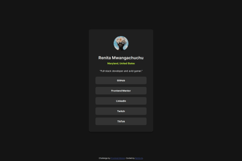
    I’m most proud of how clean and close to the design I got using just pure HTML and CSS, without reaching for Flexbox or Grid. It was a great back-to-basics challenge to focus solely on structure, spacing, and styling fundamentals.

    Next time, I’d like to structure the layout with Flexbox or CSS Grid instead of using div-based manual centering. I want to start building that muscle now so I’m ready for more complex layouts as I progress through the Frontend Mentor learning path.

    What challenges did you encounter, and how did you overcome them?

    The main challenge was getting the text to match the line breaks from the original design exactly. At first, the breaks didn’t align with the preview image, so I experimented with inserting manual <br> tags, then adjusted the line-height to make the spacing match visually.

    It wasn’t a complex issue, but it taught me how sensitive typographic layout can be—especially when trying to replicate a design pixel-perfect.

    What specific areas of your project would you like help with?

    I'd love feedback on:

    Whether I should have used Flexbox or Grid for better structure—even in such a simple layout.

    If there are more elegant ways to manage text alignment and line breaks without resorting to manual <br> tags.

    Tips for handling line-height and vertical spacing consistently across responsive breakpoints.

    I’m also open to any general feedback on my CSS practices and file organization!

    QR Code Component By Yasin Zahir

    #pure-css
    1
    Muskan Fatima•160
    @muskan-fatim
    Posted about 2 months ago

    Hi Yasin! 👋 You did a great job with the QR code component — it looks really clean and well-structured! Just wanted to share some beginner-friendly thoughts on the areas you asked about:

    1. Flexbox vs Grid: Since this layout is very simple and centered, Flexbox is a great choice. It’s perfect for aligning things in one direction (like centering the card on the page). Grid is more useful when you’re working with more complex layouts with rows and columns. So no worries — using Flexbox here makes sense!

    2. <br> Tags for Text Breaks:

    You're right to look for cleaner ways! Instead of using <br>, it’s usually better to use CSS to control line breaks and spacing. You can try adjusting max-width, text-align, or even splitting the text into multiple elements (like two <p> tags) to control layout more smoothly.

    1. Line-Height & Vertical Spacing: A helpful way to keep spacing consistent is to use rem units instead of px, and try using a CSS reset or base styles to make things consistent across devices. Also, using a spacing scale (like multiples of 0.25rem) can help keep things tidy and predictable.

    2. General CSS Practices & File Structure: Your CSS looks quite organized! As your projects grow, it helps to separate styles into sections using comments (like /* Typography /, / Layout */, etc.). You can also consider using BEM naming for classes, which makes your code easier to read later.

    Keep it up — you're doing great, and asking the right questions! 🚀

  • Renita M•40
    @renitam
    Submitted about 2 months ago
    What are you most proud of, and what would you do differently next time?

    Built with semantic HTML, custom CSS, and Vanilla JavaScript to meet the challenge specs. No frameworks—just clean, lightweight code. Deployed via GitHub Pages for quick and easy access. Focused on responsive design and functionality using native JavaScript.

    What challenges did you encounter, and how did you overcome them?

    I had some trouble with my @media css statements. I forgot they go after the original css, not before. Also, I was trying to implement color variables for easier coding and realized too late into the challenge that I had to store variables under :root {}, so there was some repetition there.

    What specific areas of your project would you like help with?

    I wanted to make the cursor match the Figma without substituting it for an image file, because I feel like that's doing a lot. Any suggestions?

    Update

    I went ahead and used the cursor: url(), pointer property, but there's some lag in how it renders. As if the cursor is glitching from one spot to another upon hover. Any advice on how to fix?

    Responsive Social links profile | Vanilla JS

    2
    Muskan Fatima•160
    @muskan-fatim
    Posted about 2 months ago

    Hey! Awesome job on your solution! 👏

    I noticed you mentioned wanting to make the cursor match your Figma design without using an image file (which I agree is a great idea to keep things clean and lightweight).

    Here’s a suggestion you might find helpful:

    Instead of using an image, you can create a custom cursor using just HTML, CSS, and JavaScript. For example:

    <!-- HTML -->
    <div id="custom-cursor"></div>
    
    /* CSS */
    #custom-cursor {
      position: fixed;
      width: 20px;
      height: 20px;
      border: 2px solid #000; /* Adjust to match your Figma design */
      border-radius: 50%; /* You can customize this with clip-path for unique shapes */
      pointer-events: none;
      z-index: 9999;
      transition: transform 0.1s ease;
    }
    
    // JavaScript
    const cursor = document.getElementById('custom-cursor');
    document.addEventListener('mousemove', (e) => {
      cursor.style.left = `${e.clientX}px`;
      cursor.style.top = `${e.clientY}px`;
    });
    

    This lets you style your cursor however you want without needing to import any image files. You can even add hover effects or animations if you like. Let me know if you’d like help customizing it to match your Figma style exactly!

    Keep up the great work 💻✨


    Marked as helpful
  • Wesam-Harb•330
    @Wesam-Harb
    Submitted about 2 months ago

    conference-ticket-generator-mai

    1
    Muskan Fatima•160
    @muskan-fatim
    Posted about 2 months ago

    ✨ Awesome work, Wesam! I just checked out your Conference Ticket Generator and I have to say — you did an amazing job! The design feels clean and polished, and your use of layout and styling is really impressive.

    Here are a few points I appreciated and some thoughts that might help you or others:

    ✅ Semantic HTML:
    Your use of semantic elements like <header>, <main>, and <section> really helps structure the content clearly. It adds to the accessibility and SEO-friendliness of the page — great job!

    ✅ Accessibility:
    I noticed that your form fields have clear labels and everything is keyboard accessible. One tiny suggestion would be to double-check color contrast ratios — just to ensure readability for all users.

    ✅ Responsive Layout:
    The design adapts well on different screen sizes — smooth transitions and clean spacing throughout. Really good attention to detail on responsiveness!

    ✅ Code Quality:
    Your code is well-organized and easy to follow. I especially liked how reusable and modular your classes are — it’s easy to maintain and scale.

    🌟 Differences from the original design:
    Your implementation stays close to the original brief but still has a nice personal touch — I love that! It’s great to see creativity while still respecting the overall structure.


    Overall, I honestly learned from your solution — it inspired me to revisit mine and try improving things like layout structure and responsiveness. Keep up the awesome work! 👏💪

    Marked as helpful
  • mikedeleon9•120
    @mikedeleon9
    Submitted about 2 months ago
    What are you most proud of, and what would you do differently next time?

    Most proud of the responsiveness. I would like to incorporate a sign up and some backend

    What challenges did you encounter, and how did you overcome them?

    making the menu disappear when the window was resized. I set up useEffect to handle the change in size of the window then update the functions.

    What specific areas of your project would you like help with?

    I would need help setting up a backend.

    Responsive Blog Landing Page

    #react#vite#tailwind-css
    1
    Muskan Fatima•160
    @muskan-fatim
    Posted about 2 months ago

    Hi @mikedeleon9! Great effort on the solution—here’s some feedback that might help improve it further:

    1. Semantic HTML

    • What’s good: You’re using some appropriate tags like <header>, <nav>, and <section>, which is great.

    • Suggestions: Consider replacing generic <div>s with more semantic elements where possible, like:

      • <main> for the main content area
      • <article> for individual blog post previews
      • <footer> at the bottom instead of just a styled <div>

    2. Accessibility

    • Text contrast: Some of the text—especially lighter gray on white—may not meet WCAG standards for contrast. Consider darkening the text slightly.

    • Alt text: Make sure all images (e.g., profile or post thumbnails) include meaningful alt attributes.

    • Navigation: It looks visually clear, but ensure keyboard navigation and screen readers can access it easily (you might consider skip links or proper labeling).

    • Strengths: Layout adapts decently to different screen sizes, and the hamburger menu works well.

    • Areas to improve:

      • On smaller screens, some padding/margin values make text feel a bit tight (especially in the hero section).
      • Consider increasing font size for better mobile readability.

    4. Typography & Clarity

    • Font Size: Currently, the body font is quite small—this affects readability, especially on desktops. Bump it up a bit (16px or more is a good base).
    • Wording Improvements: This section needs revision for grammar and clarity:

      “free open simple or powerful tolling” Try rewriting it as: “Free and open-source tooling that’s both simple and powerful.”

    5. Code Structure

    • Organization: Your HTML and CSS are fairly clean, but some class names could be more descriptive. Instead of .box1, .box2, use .blog-card, .hero-content, etc.

    • Reusability: Look into using utility classes or even a CSS framework like Tailwind or Bootstrap for scalability, unless you're building everything custom.

    6. Design Consistency

    • Spacing and alignment: Some areas (like the blog card section) could benefit from more consistent spacing—both between elements and around the edges of the viewport.

    • Hover states: Adding subtle transitions or hover effects on buttons and blog cards could make the UI feel more interactive and polished.

    Marked as helpful
Frontend Mentor logo

Stay up to datewith new challenges, featured solutions, selected articles, and our latest news

Frontend Mentor

  • Unlock Pro
  • Contact us
  • FAQs
  • Become a partner

Explore

  • Learning paths
  • Challenges
  • Solutions
  • Articles

Community

  • Discord
  • Guidelines

For companies

  • Hire developers
  • Train developers
© Frontend Mentor 2019 - 2025
  • Terms
  • Cookie Policy
  • Privacy Policy
  • License

Oops! 😬

You need to be logged in before you can do that.

Log in with GitHub

Oops! 😬

You need to be logged in before you can do that.

Log in with GitHub

Oops! 😬

You need to be logged in before you can do that.

Log in with GitHub

Oops! 😬

You need to be logged in before you can do that.

Log in with GitHub

Oops! 😬

You need to be logged in before you can do that.

Log in with GitHub

Oops! 😬

You need to be logged in before you can do that.

Log in with GitHub

Oops! 😬

You need to be logged in before you can do that.

Log in with GitHub

Oops! 😬

You need to be logged in before you can do that.

Log in with GitHub

Oops! 😬

You need to be logged in before you can do that.

Log in with GitHub

Oops! 😬

You need to be logged in before you can do that.

Log in with GitHub

Oops! 😬

You need to be logged in before you can do that.

Log in with GitHub

Oops! 😬

You need to be logged in before you can do that.

Log in with GitHub

Oops! 😬

You need to be logged in before you can do that.

Log in with GitHub

Oops! 😬

You need to be logged in before you can do that.

Log in with GitHub

Oops! 😬

You need to be logged in before you can do that.

Log in with GitHub

Oops! 😬

You need to be logged in before you can do that.

Log in with GitHub

Oops! 😬

You need to be logged in before you can do that.

Log in with GitHub

Oops! 😬

You need to be logged in before you can do that.

Log in with GitHub

Oops! 😬

You need to be logged in before you can do that.

Log in with GitHub

Oops! 😬

You need to be logged in before you can do that.

Log in with GitHub

Oops! 😬

You need to be logged in before you can do that.

Log in with GitHub

Oops! 😬

You need to be logged in before you can do that.

Log in with GitHub

Oops! 😬

You need to be logged in before you can do that.

Log in with GitHub

Oops! 😬

You need to be logged in before you can do that.

Log in with GitHub

Oops! 😬

You need to be logged in before you can do that.

Log in with GitHub