Not Found
Not Found
Not Found
Not Found
Not Found
Not Found
Not Found
Not Found
Not Found
Not Found
Not Found
Not Found
Not Found
Not Found
Not Found
Not Found
Not Found
Not Found
Not Found
Not Found

All comments

  • Avi Roy 150

    @sudeep2003

    Submitted

    During the project, I encountered a few challenges that I found difficult:

    Ensuring that the QR code component looked and functioned well on various screen sizes and devices was a bit tricky. I had to use CSS media queries and adjust the layout to make it responsive.

    While I tried to maintain clean and well-structured code, there are a few areas where I am unsure or have concerns:

    1. CSS Complexity: In some parts of the CSS code, especially for styling the QR code itself, it might have become a bit complex. I wonder if there are better ways to organize and optimize the CSS for maintainability.

    2. Compatibility: Although I did some testing, I'm not entirely confident about the cross-browser compatibility of the project. It would be great to know if there are specific areas I should focus on to improve compatibility with various browsers.

    Yes, I have a few questions regarding best practices:

    1. CSS Best Practices: Are there any recommended best practices for organizing CSS in larger projects? I want to ensure that my stylesheets are maintainable and scalable.

    2. Accessibility: I want to access all projects.

    Any guidance or advice on these best practices would be greatly appreciated!

    @najeeb-anwari

    Posted

    Hi Avi Roy,

    I really like your design! However, when viewing it on mobile in landscape mode, some content is cut off. I wanted to share a potential solution that I used in a similar situation.

    In the same project, I dealt with this issue and implemented a solution using CSS Grid properties directly on the body element. This approach helped ensure that the content always had enough space to display properly. You can check out my solution here for reference.

    However, if you're not familiar with CSS Grid, another option could be to consider adding a min-height property to the body element or the specific container. This can also help address the issue.

    Consider trying out these approaches based on your familiarity with CSS Grid or min-height, and don't forget to test on various devices to ensure a seamless experience.

    Keep up the good work!

    0
  • Avi Roy 150

    @sudeep2003

    Submitted

    During the project, I encountered a few challenges that I found difficult:

    Ensuring that the QR code component looked and functioned well on various screen sizes and devices was a bit tricky. I had to use CSS media queries and adjust the layout to make it responsive.

    While I tried to maintain clean and well-structured code, there are a few areas where I am unsure or have concerns:

    1. CSS Complexity: In some parts of the CSS code, especially for styling the QR code itself, it might have become a bit complex. I wonder if there are better ways to organize and optimize the CSS for maintainability.

    2. Compatibility: Although I did some testing, I'm not entirely confident about the cross-browser compatibility of the project. It would be great to know if there are specific areas I should focus on to improve compatibility with various browsers.

    Yes, I have a few questions regarding best practices:

    1. CSS Best Practices: Are there any recommended best practices for organizing CSS in larger projects? I want to ensure that my stylesheets are maintainable and scalable.

    2. Accessibility: I want to access all the projects.

    Any guidance or advice on these best practices would be greatly appreciated!

    @najeeb-anwari

    Posted

    Hi Avi Roy,

    I really like your design! However, when viewing it on mobile in landscape mode, some content is cut off. One potential solution could be to add a min-height property to the body element. This would ensure that the content always has enough space to display properly.

    By the way, I've encountered a similar issue before and implemented this solution in my project. You can check it out NFT Preview Card Component Using Flexbox.

    Consider implementing the min-height property, and don't forget to test on various devices to ensure a seamless experience.

    Keep up the good work!

    0
  • @najeeb-anwari

    Posted

    Hello Durga Prassad,

    I appreciate your design work; it looks great! However, I have a few suggestions that might help improve it further:

    • Semantic HTML: Consider wrapping your content in the <main> tag to enhance its semantic structure.

    • Mobile Responsiveness: It appears that the mobile design has some issues, as it consistently displays two columns regardless of the screen size. Additionally, content gets cut off when viewed in landscape mode. To address this, I recommend the following:

      • Start with a mobile-first approach.
      • Utilize media queries to adjust the layout for different screen sizes.
    • Optimize HTML Tags: Try to minimize the number of HTML tags you use and apply styles systematically from top to bottom for cleaner code.

    If you'd like, you can check out my solution for a similar problem Results summary component solution using Grid. Feel free to review and provide feedback.

    Great work so far, and keep up the good work!

    0
  • @najeeb-anwari

    Posted

    Hello Charles Lughas, I hope this is helpful. Your design is great but here is what I think you should do to solve some issues.

    • The meta tag to display the site properly based on user's device is written wrong. To solve the issue change the meta tag to this <meta name="viewport" content="width=device-width, initial-scale=1.0">
    • Wrap the contents with <main> tag to make it more semantic.
    • Do not use percentage for border-radius. Use fixed units like px or rem.
    • Always use device toolbar on developer tools to test your design on different device or screen sizes.
    • If you want, you can check my solution to understand how I did it. https://www.frontendmentor.io/solutions/nft-preview-card-component-using-flexbox-HJD8mOq89

    Marked as helpful

    1
  • @najeeb-anwari

    Posted

    Hello Siddhi Nandaniya, I hope you are doing great. Your design is not bad but here is what I think you should do to solve some of the issues.

    • The images takes up to much space because they are so big
    • You need to set the svg images as the background of the body tag instead of making it absolute.
    • Set the backgournd-image using url() function. Set size of the image using background-size and also position the images as the required design using background-position.
    • To change mobile background images to desktop background images, use media queries.
    • If you want , you can check out my solution to understand how I did it. https://www.frontendmentor.io/solutions/profile-card-component-using-flexbox-83ibOV7fgW

    I hope this is helpful. Happy coding!!!

    Marked as helpful

    1
  • @najeeb-anwari

    Posted

    If you want make the content centered vertically and horizontally, wrap your content in main tag and then apply following styles

    • CSS main { min-height: 90vh; display: flex; justify-content: center; align-items: center; }

    • Your HTML should like like this.

    <main> move your content inside this tag </main>
    0
  • @najeeb-anwari

    Posted

    Hi Naveen! I hope this is helpful. Your design is not bad but here is what I think you should do to make this design even better.

    • Move you CSS styles to a separate file.

    • Move the content to main tag to make it more semantic.

    • Add a alt text to your image.

    • Try to use a meaningful class name for example instead of .block1 you could use .card since it is a card shape.

    • Add below tag to head tag to make your html responsive. <meta name="viewport" content="width=device-width, initial-scale=1.0">

    • Try to use min-width instead of max width like this: @media screen and (min-width:768px) { // Your styles for larger screen size than tablet's screen size }

    0
  • @najeeb-anwari

    Posted

    Hi Kenny. Your design is good. But I think you should try to make your designs as mobile for approach not desktop first. In my desktop screen the stats card is not centered vertically there is smaller gap between the bottom edge of the screen and the card. I think if you give some padding to the body that will be fixed. in 1200px screen size the card is still in mobile view. I think you should decrease the max-width to 900px maybe or lower like 768px. I hope this helps.

    0
  • Finney 3,030

    @Finney06

    Submitted

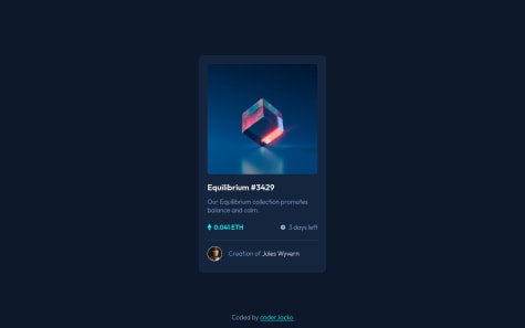
    I'm having difficulty trying to do the active state for the image on the NFT preview card component. Feedbacks on it will be appreciated.

    @najeeb-anwari

    Posted

    Hello Finney, I hope you are doing great. I hope this is helpful for you. Your design is nice but here is what I think you should do to make it better.

    • Add your main content to main tag and add the attribution to the footer to make it more semantic. You can simply use main tag instead of div with wrapper class.
    • Avoid using section here because that requires heading. Try to make it simple.
    • No need for using margin: 0 auto; in .wrapper selector because flexbox is already making it center.
    • Your card is cut off in mobile landscape view. To fix that use min-height instead instead of height for your wrapper selector.
    • No need for query media here just use max-width: 350px for the .card selector.
    • On smaller screen there is no gap between the screen edges and the content. You can add some margin to wrapper selector or add some padding to the body.

    To make the hover effect on the image you can do as follow.

    • In your html file do the following:
    <div class="img-container">
      <img class="image" src="images/image-equilibrium.jpg" alt="image-equilibrium">
      <div class="overlay"><img src="./images/icon-view.svg" alt="View"></div>
    </div>
    
    • In your CSS file add the following styles the following:
    .img-container {
        position: relative;
        display: flex;
        cursor: pointer;
    }
    
    .overlay {
        display: flex;
        justify-content: center;
        align-items: center;
        position: absolute;
        background-color: hsla(178, 100%, 50%, .5);
        border-radius: 15px;
        width: 100%;
        height: 100%;
        opacity: 0;
        transition: .4s;
    }
    
    .img-container:hover .overlay  {
        opacity: 1;
    }
    
    • I don't want to explain the above code just look at and try to understand what is going on.
    • If you want to know how I did it, here is my project https://www.frontendmentor.io/solutions/nft-preview-card-component-using-flexbox-HJD8mOq89

    Marked as helpful

    1
  • @MahmmoudKhaled

    Submitted

    • Can you please give me a feedback about best practices I should follow ?
    • is it better to design for desktop first or mobile first ?
    • which is better with responsive design fr unit or percentage ? Great Thx to you all .

    @najeeb-anwari

    Posted

    Hello Mahmoud, I hope this is helpful for you.

    • It is always good to use mobile first approach for designs. Use media queries to add styles to specific screen sizes if necessary.
    • We can't say which one is better. All unit sizes has its usages. If you are familiar with grid, fr is used to take up available free space minus the gutters or gaps. But in other hand if for example we use width: 50%; , that means 50% of the element's parent size.
    • Your design is perfect. It is good practice to use CSS custom properties for colors and also add README.md file to describe your project. Customize the README-template.md file to use it.
    2
  • @coderrJacko

    Submitted

    I used @keyframes for ::before and ::after pseudo elements to create a transition on hover effect, but I didn't know how to make the transition smooth when the image gets "unhovered". If you know how to do that, I would appreciate the answer.

    General feedbacks are also welcome.

    @najeeb-anwari

    Posted

    Hi Mr. Jacko, I hope this is helpful for you. I recommend that you append <div class="overlay"> and make the overlay class absolutely positioned to your card-hero container.

    • Make the position relative as so .card-hero { position: relative; }

    • Add transition and set width and height to 100% and set opacity to 0 as so

    .overlay { pisition: absolute; transition: .4s; width: 100% ; height: 100%; opacity: 0 }.

    • Set the hover effect like .card-hero:hover .overlay { opacity: 1; }

    Marked as helpful

    1
  • Kyle 50

    @CaptainKaveman

    Submitted

    How can I get my function onclick to check if a radio button has been selected? I added an else statement to alert the user, but it added that alert no matter the condition and it still removed the hidden class displaying the thank you page.

    @najeeb-anwari

    Posted

    Hello Kyle. I hope these helps you and be useful for you. Here are some of Issues I found on your codes:

    • There are lots of repeated code in your project. Try not to repeat your self. There is no need to add margin and padding or width and height for every single element.
    • The component is cut off in desktop and mobile screen sizes. Try chrome developer tools press Ctrl + Shift + M and test your webpage in different devices or screen sizes. The best practice is that you first develop the page for small screen size, then add or change styles on larger screen sizes if required.
    • Try to use specific selector as possible. You set the styles for h1 and p tags directly which is not good practice. You can instead be more specific like .card h1 { // your code }or .card h2 { // your code }
    • There is no need to set the position of the card absolute. Just use flexbox in main tag to make it center.
    • Don't use width and height for the card because if the content grows behind the size of the card the content will overflow. And also in smaller screen sizes the card will be at exact size and there will be scroll bar. Try to use max-with instead or max-height (or don't use height at all. As the content grows the height of the container will also increase.).
    • No need to use padding for the star class just use the flexbox to make it center.
    • I think there are lots of code for those rating buttons. My idea is that you use flexbox and don't use margin in .rating-system class. You also no don't need margin for every single child element of the card. You can instead remove those margins and add padding to the .card class. You can take a look at my project to compare it and understand how I did it.
    • https://www.frontendmentor.io/solutions/interactive-rating-component-using-flexbox-SJTd4xFU9

    And here are some resources you may like:

    • theodinproject.com is another website where you can learn web development. It has practical and project based environment which you may like.
    • http://flexboxfroggy.com/ is an interactive game to practice your flexbox skills.

    Marked as helpful

    1
  • @najeeb-anwari

    Posted

    Hello Emanuele, I hope this is helpful for you. Your design is not bad but try to fix these issues:

    • Move attribution to footer tag to make it more semantic.
    • Don't Use back ticks in your html only use that in JavaScript that is why you have 4 HTML validation errors.
    • On 375px screen size the rating buttons wraps to next line don't use wrap flex because it doesn't match the required design.
    • Try to use mobile first design approach. First design it for mobile size than if required change the content size.
    • The active state of the button is not working. The possible solution would be that you make a class name "active" and add the required styles then make a click event listener in your JavaScript file. Inside handler function write code to add ".active" class to the target element.
    • If you want to check my solution, this is my solution https://www.frontendmentor.io/solutions/interactive-rating-component-using-flexbox-SJTd4xFU9 . Read my code to understand it.
    • If you want to practice your flexbox skills check out this http://flexboxfroggy.com/
    • And also check this out if you want to learn JavaScript https://javascript.info/

    Marked as helpful

    2