Not Found
Not Found
Not Found
Not Found
Not Found
Not Found
Not Found
Not Found
Not Found
Not Found
Not Found
Not Found
Not Found
Not Found
Not Found
Not Found
Not Found
Not Found
Not Found
Not Found

All comments

  • Michael 210

    @MSPayneII

    Submitted

    Hello All,

    Here is my first guru-level project. I plan on refactoring the code soon to resolve the accessibility issues of the <a> tags within my buttons.

    Nelson 2,380

    @nelsonleone

    Posted

    Congrats on completing this challenge sir , please can I ask for a favor, please can you help me pay for pro so that I can do it.

    i can't afford it

    0
  • Nelson 2,380

    @nelsonleone

    Posted

    FEM , what's wrong with your screenshot feature

    0
  • Nelson 2,380

    @nelsonleone

    Posted

    You can track it , using the active tab , each form section should have an isActive property , to determine which one is being displayed, there are so many way to build it tho. , this is just an opinion of mine.

    0
  • Nelson 2,380

    @nelsonleone

    Submitted

    Hello Everyone

    Submitting my solution to the MULTI STEP FORM CHALLENGE Tools Used In Building The Project

    • Styled Components For Styling
    • Redux-Toolkit For Global State Management
    • Firebase For Authentication And Cloud Storage

    Things I Saw As Challenge When Building

    • My component Input starting facing a bug of loosing focus after every input due to re-render.

    • Using Styled Components can feel like doing too much sometimes...lol

    Your Thoughts are welcome

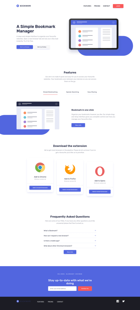
    Multi Step Form (React built(vite), Styled-Components styled

    #accessibility#react#redux-toolkit#styled-components#firebase

    1

    Nelson 2,380

    @nelsonleone

    Posted

    I will fix the page landmark error soon

    0
  • SEBASTIAN 170

    @BashS117

    Submitted

    In the realization of this project it was a bit difficult for me to position its components, but with a little patience I always manage it, I think that several things can be deleted from the css. Any suggestions on where to put the styles? Is it better in the css of the parent component or is it better in the css of the component?

    Nelson 2,380

    @nelsonleone

    Posted

    Congrats on completing the challenge ,

    Am just writing based on your question , how you sort and arrange your files is your choice, there's no rule for that.

    But you need to make sure it would be easy for someone else to navigate through your files and understand how you did stuff

    0
  • Nelson 2,380

    @nelsonleone

    Posted

    Screenshot looks weird

    0
  • Nelson 2,380

    @nelsonleone

    Posted

    HELLO......congrats on completing this challenge, well done🎊 🎊

    Hope this comment was helpful and made meaning to you Have fun coding

    You can add different images e.g hero-image-mobile and hero-image-desktop depending on the viewport using the <picture> tag.

    You can read more about it in the MDN docs , or w3school.

    It allows you to specify different images for you content as the screen-sizes varies.

    Hope this comment was helpful....have fun coding

    Marked as helpful

    0
  • @felipetn1989

    Submitted

    Learned to use an anonymous function inside the addEventListener command to call another function previously defined. Used "for" to create the click events for each of the arrows and questions.

    Feedback is welcome!

    Nelson 2,380

    @nelsonleone

    Posted

    HELLO......congrats on completing this challenge, well done🎊 🎊 I have some tips on how you can write neater and less code , you can improve your solution , or work better on the next one.

    The Faq , can be done using the <dl><dt>``<dd> tags for accessibility purposes.

    Based on your solution(how you did it) You can use buttons to create the questions, the arrow doesn't need to be the toggle , it's just for design purposes mainly or to show the faq article state

    Then use a loop to display what you want to display.

    const questions =  document.queryselectorAll('.question')
    const answers = document.querySelectorAll('.answers')
    questions.forEach((question,index) ,() => {
      question.addEventlister('click',() => {
        answer[index].style.display ="block"
      }
    })
    

    The index simply means the index in which the button(question causing the click event is) the answer in that same index should do your task

    As for the arrow , you can create a class that has tranform :rotate(180deg) The in that clicked event target the arrow in the same index and give it that className

    Hope this comment was helpful and made meaning to you Have fun coding

    Marked as helpful

    0
  • Nelson 2,380

    @nelsonleone

    Posted

    HELLO......congrats on completing this challenge ....well done

    Here's what i noticed about your solution , it looks nice .

    But the blue design behind the image ....yours , you gave it a border radius all around it .

    You can see to use border-bottom-left-radius and increase the height of the element.

    Hope this comment was helpful , have fun coding🎊🎊

    Marked as helpful

    1
  • @teddyBearCoder

    Submitted

    Hello, my first solution here , i wanted to use swiperjs for the testimonial area, but i was facing a difficulty.

    Rate it

    Nelson 2,380

    @nelsonleone

    Posted

    HELLO.......congrats on completing this challenge....well done 🎊 🎊

    Just a little something i noticed, for accessibility purposes, don't forget to add your alt text. If the image doesn't send a message(just for design purposes) you can set alt="" and aria-hidden="true"

    Hope this comment was helpful , have fun coding

    Marked as helpful

    0
  • Nelson 2,380

    @nelsonleone

    Posted

    HELLO......congrats on completing this challenge...well done🎉 🎉

    Based on your question , you can add it using a SwiperJS ,

    Or manually creating it yourself creating two buttons for the prev and next testimonial.

    Then use JS to show the testimonial based on the index which you will implement.

    The buttons will increment/ decrement that index, therefore switching the testimonials.

    Hope this comment was helpful , if you need more detailed explanation , you can indicate

    You can also read more on the SwiperJs tool.

    0
  • Heli 40

    @Heli-Aghara

    Submitted

    I want to know if fonts are looking smaller on mobiles? I have checked it , it seems small to me. what do you think? Should I change font-size?

    Nelson 2,380

    @nelsonleone

    Posted

    **HELLO.....congrats on completing the challenge, well done🎉 🎉 **

    Based on your question , for some design purposes, and good user experience , You can see to increasing the font a lil bit , and increasing the line-height of your paragraphs.

    Your solution is nice .

    1
  • Nelson 2,380

    @nelsonleone

    Posted

    HELLO.....congrats on completing this challenge, well done. 🎊 🎊

    Bro, hwfar , check your close modal icon, It's going behind the modal, you can see to move it up a bit ,

    It's an action button , so it's should always seems to appear on the element it's controlling. (z-index). This is just incase you are working on a different approach

    Marked as helpful

    0
  • Sebastian 510

    @sebix0nus

    Submitted

    I have a problem with the implementation of green slider progress for chrome, in firefox we have the ability to do this via "::-moz-range-progress". In firefox everything works as it should

    Is there any way to do something like this in chrome? People have added it through a gradient or in JS, but maybe there is a simpler method?

    Nelson 2,380

    @nelsonleone

    Posted

    HELLO......congrats on completing this challenge...well done 🎊 🎊

    Based on your question , see to add ::-webkit-range-progress and remove the default apperance-webkit-apperance:none.

    Secondly, you forgot to add an alt text to your image. If the image doesn't send a message(just for design purposes) you can add alt="" and set aria-hidden="true". So screen-readers (AT) won't stress on what it it.

    Hope this comment was helpful , have fun coding

    0
  • P

    @mateusbelicio

    Submitted

    👋🏻 Hello everyone. This is my solution for the Advice generator app.

    In this project I added:

    • A loading animation when the user clicks the button to generate a new advice;
    • An error message if there is a failure to load the new advice.

    Feel free to leave your feedback on my solution.

    Thanks! 😁

    Nelson 2,380

    @nelsonleone

    Posted

    HELLO......congrats on completing this challenge, well done 🎊 🎊

    Just one thing , the loading animation is nice , but sometimes it doesn't have time to play or when it starts playing , and the advice is fetched, it causes some little glitch ,

    You can see to set a setTimeout on the fetch so the loading animation can have little time to play .

    Hope this comment was helpful , have fun coding

    Marked as helpful

    1
  • Nelson 2,380

    @nelsonleone

    Posted

    HELLO.......congrats on completing this challenge....well done 🎊 🎊

    Just a little something i noticed, for accessibility purposes, don't forget to add your alt text. If the image doesn't send a message(just for design purposes) you can set alt="" and aria-hidden="true"

    This will allow screen-readers(AT) not to stress on the image.

    But in your solution , the GIF/dice is an action figure. So, you can set a good alt text describing it e.g alt="New Advice" or alt="See another advice"

    Hope this comment was helpful, have fun coding

    Marked as helpful

    0
  • P
    CJ Cameron 320

    @CJCameron13

    Submitted

    First project after a bit of a hiatus so I felt rusty and parts of the code feel sloppy. However, it works. Struggled the most with font sizing, and using the appropriate size for different screen sizes. I started with vh units but that made the font unreasonably small on smaller viewports. I decided to go with rem units and a couple extra media queries.

    Any tips and suggestions are most definitely welcome!

    Nelson 2,380

    @nelsonleone

    Posted

    HELLO.....congrats on completing this challenge. 🎊 🎊 well done.

    Based on what you said onfont size , you can use clamp() function . It is a css built in function that allows you to specify different font-size for different viewport .

    You can read more about the clamp() in the MDN docs. Here's a tool i use, it allows you to specify your viewport(start(e.g mobile) , end) FLUIDTYPOGRAPHY

    Hope this comment was helpful, have fun coding

    Marked as helpful

    0
  • i_d_s_l 270

    @ilvdrskn

    Submitted

    hello everyone! In my solution, I used flexbox to center the block with the cards. The cards themselves are made using grid.

    Nelson 2,380

    @nelsonleone

    Posted

    HELLO......congrats on completing this challenge .....well done 🎊 🎊

    i just have one thing to say , It's based on the little car images. Visually , they don't send much message(for design purposes).

    It would be nice to set aria-hidden="true" on them so screen-readers(AT) won't stress on what they are. Thereby increasing your solution accessibility rate.

    Hope this comment was helpful, have fun coding

    Marked as helpful

    1
  • Nelson 2,380

    @nelsonleone

    Posted

    HELLO......congrats on completing this project...well done

    Based on your question , you can achieve that by setting a width on them and aspect-ratio. Aspect-ratio simply means( without setting a height) your width and height should be the same,

    Therefore allowing you to perfectly give a border-radius:50% making them rounded

    icons{
      width:.5em;
      aspect-ratio:1/1;
      padding:.3em;
    

    hope this comment was helpful , have fun coding }

    0
  • Nelson 2,380

    @nelsonleone

    Posted

    HELLO......congrats on completing this challenge.....well done 🎊 🎊

    Based on your question , you can center the page by setting

    body{
     display:flex;
      align-items:center;
      justify-content:center;
     width:100vw;
     min-height:100vh;
    }
    

    Another thing , for accessibility purposes <ul> <ol>` tags should only content <li> tags scripts and template.

    Hope this comment was helpful , have fun coding

    0
  • Nelson 2,380

    @nelsonleone

    Posted

    HELLO......congrats on completing this challenge,...well done 🎊 🎊

    Here's something i noticed about your solution , hope it was helpful.

    Firstly, don't forget to add alt text to your images. It helps user and screen-readers(AT) know more about what the image is.

    If the image is just for design purpose(doesn't send a message across), you can use empty alt="" and set aria-hidden="true" so that screen-readers won't stress on what it is.

    Secondly, your blog section, You can set a max-width:.. to it , so it doesn't grow further, limits it from scaling all the way across the page.

    Hope this comment was helpful , have fun coding 🎊

    0
  • Nelson 2,380

    @nelsonleone

    Posted

    HELLO......congrats on completing this challenge....well done 🎊 🎊 🎊

    I have some tips you might want to hear. Firstly, the star icon, it doesn't send a message(just for design) don't you think? So...it would be nice to set alt="" and aria-hidden="true" so that screen-readers(AT) won't stress to know what it is.

    Secondly, you can perfectly position your content in the middle of the page by setting

    body{
     display:flex;
     align-items:center;
     justify-content:center;
     width:100vw;
     min-height:100vh;
    }
    

    **Hope this comment was helpful and you found meaning in i ** Have fun coding

    Marked as helpful

    0
  • Nelson 2,380

    @nelsonleone

    Posted

    HELLO.....congrats on completing this challenge ....well done 🎊 🎊

    Here's little tip you might want to know.

    Firstly, it's good practice to wrap your main content in a <main>. other than a <div>.

    Secondly, you can have multiply images based on the viewport using the <picture>. You can read more about it in the MDN docs, w3schools ,and w3docs.

    Also, avoid setting heights on your content unless there's need to , you can use padding and margins to scale up your content.

    Hope this comment was helpful, have fun coding

    0
  • @Developer-X-0001

    Submitted

    Hmm 😀 I have a better hand on making webs now, however if I missed something or did anything wrong. Kindly correct me.

    Nelson 2,380

    @nelsonleone

    Posted

    HELLO.....congrats on completing the challenge. well done 🎊 🎊

    Here's something you might want to know , you can simply use CSS to style you text, other than during it in you mark-up(html).

    Like

    text-transform:uppercase;
    letter-spacing: .....e.g 4px;
    

    Hope this was helpful , have fun coding.

    Marked as helpful

    0