@YossefMagdy
Latest solutions
Newsletter sign-up form with success message with react-tailwindCSS
#react#tailwind-css#viteSubmitted about 2 years agoAge-calculator-app with react-redux/styled-components/vite
#react#redux#redux-toolkit#vite#styled-componentsSubmitted over 2 years agoREST countries with react/tailwindcss
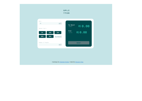
#axios#react#react-router#tailwind-cssSubmitted over 2 years agoTip calculator app with html-sass/scss-javascript
#accessibility#bem#sass/scssSubmitted over 2 years agoSunnyside agency landing page with css-grid-layout
#accessibility#sass/scssSubmitted over 2 years ago
Latest comments
- @tan911
Hello @YossefMagdy,
Here's my recommendation for improving this app if you have some free time,
- Keyboard support. User should be able to use keyboard to navigate this app.
- The image should be positioned so that it is both horizontally and vertically centered.
- Your app should be responsive.
Despite this, excellent job on the task!
Hope this will help improve, Thanks!
- @Uriasmanu@tan911
Hello @Uriasmanu,
css:
- Instead of giving your body element precise width and height definitions, you may utilize the display flex attribute to automatically center the content.
- Employ specify width in the main class for your cards.
- You place the button and card using absolute position everywhere. For positioning the content and the button, I advise using flex or grid.
More info:
Hope this will help, Thanks!
Marked as helpful - @AlexanderMontoya@tan911
Hello @AlexanderMontoya,
It placed I think bacause you defined your quotation image in an absolute position. The z-index and opacity will not solve the problem unless if you defined your text also. To address your error, you can use the quotation image as background image of your 'testimonial one' class and placed it wherever you want using background-position.
more info:
Hope this will help, Thanks!
Marked as helpful - P@ucod3@tan911
👋Hello, @ucod3, and congratulations on completing this challenge🎉. Here's my suggestion and to answer some of your questions as well.
- In tailwindcss you can refactor your classes by using layers in your main css file, instead of styling your buttons individually with the same classes, just put your one style in 'style.css'.
- I think the ratings styles of clicked button will confused your user of selecting it and also the functionality there is broken.
more info:
adding custom style in tailwind
Hope this will help, Thanks!
- @ereljapco@tan911
It's okay to import 'notificationList' directly to the component's who needs it. Also you can pass 'notificationList' as props. However when passing it as props I think it's read not a notificationList, the code looks like this,
import Header from './components/header/Header';
import Notifications from './components/notifications/Notifications';
import notificationsList from './data/notificationsList';

export default function App() {
  const [read, setRead] = useState(notificationsList);

  return (
    <main className="main">
      <section className="notifications">
        <div className="c-notifications">
          <Header setRead={setRead}  notificationsList={read} />
          <Notifications />
        </div>
      </section>
    </main>
  );
}
You use 'useState' with initial value of 'notificationsList'. You don't need to pass 'notificationList' itself instead use the 'read' variable to pass data into your children component.
Marked as helpful - @Decimo-10@tan911
Hello @Decimo-10, Here's my suggestion that might improve your applications also to answer some of your questions as well.
- I think you should, and they should be inside the fieldset if you want to make "Select Tip %" a label. Also you can use
input="radio"for every percentage and hide it via visually-hidden class or sr-only class instead of normal button element and don't forget to add label to every input radio button. - You can use javascript to handle the validations for the input type text. If you do this, then you have to check if the input value can be converted by a number or not. If it is, do the calculations otherwise just give an error message there. When providing an error message you can add aria-describeby to your input element with the same value to the id of your error message or to your span element. This will benificial to your audience who use screen readers.
<div class="label-wrapper"> <label for="bill-input" class="input__label">Bill</label> <span id="your-error" class="input__error-message">Can't be zero</span> </div> <input type="text" id="bill-input" aria-describedby="your-error" class="input__field" placeholder="0" inputmode="numeric" pattern="[1-9][0-9]*\.?[0-9]*">Marked as helpful - I think you should, and they should be inside the fieldset if you want to make "Select Tip %" a label. Also you can use