Skip to content
  • Unlock Pro
  • Log in with GitHub
Profile
OverviewSolutions
12
Comments
17
P
Haley Underwood
@underhr

All comments

  • P
    Coder-Liz•560
    @Coder-Liz
    Submitted 4 months ago

    Time tracking dashboard

    #sass/scss
    1
    P
    Haley Underwood•190
    @underhr
    Posted 4 months ago

    Awesome!

  • P
    Coder-Liz•560
    @Coder-Liz
    Submitted 4 months ago
    What are you most proud of, and what would you do differently next time?

    I am proud to have completed this project using SCSS, and next time I will strive to make my code even cleaner.

    What challenges did you encounter, and how did you overcome them?

    I deployed this project on Netlify, and when I previewed the site, I noticed that the popup message showed up first. I double-checked my code and discovered that I had mistakenly added the 'active' class to my overlay and popup wrapper elements. To fix this, I simply removed the 'active' class name from these elements.

    newsletter signup with success message

    #sass/scss
    1
    P
    Haley Underwood•190
    @underhr
    Posted 4 months ago

    looks really good! good job

  • P
    Mustapha•200
    @Mustapha909
    Submitted 4 months ago
    What are you most proud of, and what would you do differently next time?

    For this challenge, I'm most proud of:

    Successfully implementing a responsive layout that adapts well to different screen sizes.

    Using pure HTML and Sass helped reinforce your understanding of styling with preprocessors.

    Debugging layout issues and ensuring the interactive pop-up works smoothly.

    Next time, I might:

    Plan a more structured approach before coding to avoid layout issues later.

    Experiment with CSS animations or transitions to make the pop-up appear more smoothly.

    What challenges did you encounter, and how did you overcome them?

    1️⃣ Positioning the Pop-up

    Challenge: The pop-up was not positioned correctly on mobile breakpoints. Solution: Adjusted absolute positioning, used CSS media queries, and tested different flex/grid layouts to ensure responsiveness.

    2️⃣ Making the Component Fully Responsive

    Challenge: The layout didn't adapt well to certain screen sizes. Solution: Used flexbox/grid, fine-tuned media queries, and optimized spacing for better mobile compatibility.

    3️⃣ Handling Hover and Click States

    Challenge: Ensuring the pop-up appears correctly on both hover (desktop) and click (mobile). Solution: Implemented conditional Sass styles and tested behavior across devices.

    What specific areas of your project would you like help with?

    One challenge I faced was positioning the pop-up correctly on mobile. The goal was to make it span the full width and appear at the bottom of the screen, but I couldn’t get it to work as intended. I couldn't fully resolve this issue despite experimenting with different CSS approaches. If you have any suggestions or feedback, I’d love to hear them!

    Article-preview-component using sass

    #sass/scss
    1
    P
    Haley Underwood•190
    @underhr
    Posted 4 months ago

    it looks great! the only thing i would say is to make the container a bit wider. good job though!

    Marked as helpful
  • Simon Hickling•530
    @SimonHickling
    Submitted 4 months ago

    Design card using HTML CSS & JavaScript

    2
    P
    Haley Underwood•190
    @underhr
    Posted 4 months ago

    Many things. I'm no professional so take what I say with a grain of salt

    1. Your images likely aren't showing up because you've used a folder name with a space. From what I know, this can cause problems. I recommend never using spaces when creating folder or files for development, use "-" as a replacement. You can change the name to Task1 or Task-1, but either way you don't need to include "../Task 1" at all, as this is leaving & entering the same folder. Instead of

    src="../Task 1/images/drawers.jpg" ,use

    src="images/drawers.jpg" for all images.

    1. To center the card properly, remove
    .container {
        margin-top: 33vh;
    }
    

    & add

    body {
        display: flex;
        justify-content: center;
        align-items: center;
    }
    
    1. Your colors are also off. They're available in the "style-guide.md" file, so I highly recommend using those, rather than trying to guess. Definitely go back & update the text & background colors to make the design look much more similar.

    2. Check the smaller details, like the size of the profile image, the all caps in "SHARE", things like that to add the finishing touches.

    Keep in mind I didn't test this code out myself, this is just based on observations, so go back & try this out & fix what's needed. other than those big things, your positioning & javascript is good! you managed to make your javascript much simpler than i did to accomplish the same thing, so kudos.

    Happy coding!

  • P
    Aakash Dasgupta•360
    @a-d14
    Submitted 5 months ago
    What are you most proud of, and what would you do differently next time?

    I'm proud of how modular and reusable I made my SASS code. This was my first project with SASS. I would try to plan the project better next time so I do not write too much unnecessary code and then later delete it.

    What specific areas of your project would you like help with?

    I am unable to make the image in the header look exactly like the specification. I tried using scale() but if there is a better solution please let me know. Thank you.

    Responsive Landing Page using SASS and Css Grid

    #sass/scss
    1
    P
    Haley Underwood•190
    @underhr
    Posted 5 months ago

    the only thing I would say is to make the tablet header image bigger, probably make it fit the screen size. otherwise looks really good!

  • P
    Nishanth Venkatesan•1,030
    @nishanth1596
    Submitted 5 months ago
    What specific areas of your project would you like help with?
    1. There is an overlay on the footer image, I dont know how to find the overlay values from figma file not to apply it.
    2. How to give hover background color for the footer button here?

    Responsive meet landing page

    #react#tailwind-css#typescript
    2
    P
    Haley Underwood•190
    @underhr
    Posted 5 months ago

    This isn't a coding answer, but I had the same problem with the footer. What I did was put the 3 pictures in Figma, & added a fill of the color at 90% opacity. Not a perfect solution probably but it works good!

  • Arunkutty06•20
    @Arunkutty06
    Submitted 5 months ago

    Results summary component

    1
    P
    Haley Underwood•190
    @underhr
    Posted 5 months ago

    here are some things i noticed:

    -remove border from "Continue" button

    -add border radius to right side of container

    -center the container

    -"76" & "Great" should have 100% opacity & be white

  • Johnyyyy43•40
    @Johnyyyy43
    Submitted 5 months ago

    qr code solution using css and html

    1
    P
    Haley Underwood•190
    @underhr
    Posted 5 months ago

    definitely not the same project but this is cool too lol

  • Tonny Blair•470
    @Tonny-Blair-Daniel
    Submitted 5 months ago

    Testimonials Grid Section using HTML and CSS

    2
    P
    Haley Underwood•190
    @underhr
    Posted 5 months ago

    Im not the best at looking at code someone else wrote and telling them exactly what's wrong with it, but I can tell you a couple of things:

    For the body element, change the height from auto to 100vh. This will ensure that the body is as tall as the browser screen, so the content inside can be vertically centered properly.

    Two of the profile pictures (Daniel & Patrick) are missing a border

  • Alessiosan•110
    @Alessiosan
    Submitted 5 months ago

    Open FourCardFeatureSection in the repository

    1
    P
    Haley Underwood•190
    @underhr
    Posted 5 months ago

    looks really good!

  • Cosmin•290
    @cosminbordianu
    Submitted 6 months ago
    What specific areas of your project would you like help with?

    I would greatly appreciate help with a few aspects of my project:

    1. Is declaring default font size 62.5% good practice?
    2. I added a background color to a link whenever it is hovered, but after clicking the link, the background color remains stuck on the hovered color. Is there a way to fix this using HTML and CSS, or does it require JavaScript?

    Social link card using Grid and Flexbox

    1
    P
    Haley Underwood•190
    @underhr
    Posted 6 months ago

    looks good! I'm not sure about the 62.5% but it looks right, & i didn't personally see the buttons stay the hovered color, but maybe just because they don't actually go anywhere so it doesn't really let me click it.

    the only thing i would say is from the side by side, it could be a little larger. besides that, looks awesome!

    Marked as helpful
  • Anto Joy Nellissery•80
    @antojoy23
    Submitted 6 months ago

    Product preview card component with html and css

    1
    P
    Haley Underwood•190
    @underhr
    Posted 6 months ago

    looks really good!

  • AlessandroIdolo•80
    @AlessandroIdolo
    Submitted 6 months ago

    Recipe page, html and css

    1
    P
    Haley Underwood•190
    @underhr
    Posted 6 months ago

    overall it looks nearly identical, though the box should be smaller. i think yours is 800px for regular desktop view(i think), whereas the design guide is 736px. but it looks great!

  • Opeoluwa•310
    @opeoluwa7
    Submitted 6 months ago

    I built this social links profile with pure html and css

    1
    P
    Haley Underwood•190
    @underhr
    Posted 6 months ago

    looks really good! id recommend just going back & slightly changing the size of a couple things like making the name & location a bit larger, making the main box a little wider, etc. just side by side comparisons, but overall very nice!

  • Nishant Shigwan•70
    @Nishant45678
    Submitted 8 months ago

    Social link profile component using flexbox

    1
    P
    Haley Underwood•190
    @underhr
    Posted 8 months ago

    the image is slightly too small, & the button text is slightly too big, & I think it should be bold. apart from that, it looks awesome!

  • adam arrafi•80
    @carrotass8
    Submitted 8 months ago

    Responsive Landing Page Using CSS Grid, Another flexbox

    1
    P
    Haley Underwood•190
    @underhr
    Posted 8 months ago

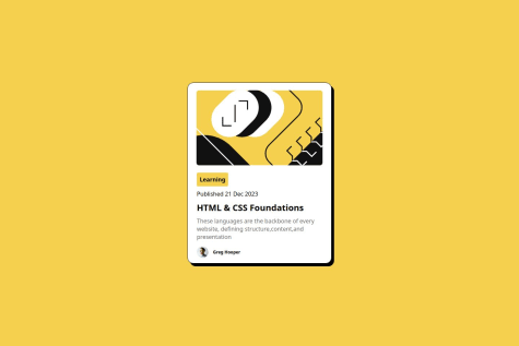
    It looks good, the only thing is the spacing & the positioning of all of the text being slightly off. the "learning" block also seems slightly too large

  • OldAssassin24•20
    @OldAssassin24
    Submitted 8 months ago
    What are you most proud of, and what would you do differently next time?

    I am proud of myself for staying till the end of this project, as my previous self would not have been able to see this to the end.

    The thing I would do differently is to always ask questions on Google as there are many answers that can be found there.

    What challenges did you encounter, and how did you overcome them?

    The problem I encountered was using online fonts.

    The solution to this problem was basically to copy and paste 😅 and learn from that experience.

    QR Code Component Solution

    1
    P
    Haley Underwood•190
    @underhr
    Posted 8 months ago

    really good! the only big difference is in the size, as yours is smaller, but other than that it looks the exact same! good job

Frontend Mentor logo

Stay up to datewith new challenges, featured solutions, selected articles, and our latest news

Frontend Mentor

  • Unlock Pro
  • Contact us
  • FAQs
  • Become a partner

Explore

  • Learning paths
  • Challenges
  • Solutions
  • Articles

Community

  • Discord
  • Guidelines

For companies

  • Hire developers
  • Train developers
© Frontend Mentor 2019 - 2025
  • Terms
  • Cookie Policy
  • Privacy Policy
  • License

Oops! 😬

You need to be logged in before you can do that.

Log in with GitHub

Oops! 😬

You need to be logged in before you can do that.

Log in with GitHub

Oops! 😬

You need to be logged in before you can do that.

Log in with GitHub

Oops! 😬

You need to be logged in before you can do that.

Log in with GitHub

Oops! 😬

You need to be logged in before you can do that.

Log in with GitHub

Oops! 😬

You need to be logged in before you can do that.

Log in with GitHub

Oops! 😬

You need to be logged in before you can do that.

Log in with GitHub

Oops! 😬

You need to be logged in before you can do that.

Log in with GitHub

Oops! 😬

You need to be logged in before you can do that.

Log in with GitHub

Oops! 😬

You need to be logged in before you can do that.

Log in with GitHub

Oops! 😬

You need to be logged in before you can do that.

Log in with GitHub

Oops! 😬

You need to be logged in before you can do that.

Log in with GitHub

Oops! 😬

You need to be logged in before you can do that.

Log in with GitHub

Oops! 😬

You need to be logged in before you can do that.

Log in with GitHub

Oops! 😬

You need to be logged in before you can do that.

Log in with GitHub

Oops! 😬

You need to be logged in before you can do that.

Log in with GitHub

Oops! 😬

You need to be logged in before you can do that.

Log in with GitHub

Oops! 😬

You need to be logged in before you can do that.

Log in with GitHub

Oops! 😬

You need to be logged in before you can do that.

Log in with GitHub

Oops! 😬

You need to be logged in before you can do that.

Log in with GitHub

Oops! 😬

You need to be logged in before you can do that.

Log in with GitHub

Oops! 😬

You need to be logged in before you can do that.

Log in with GitHub

Oops! 😬

You need to be logged in before you can do that.

Log in with GitHub

Oops! 😬

You need to be logged in before you can do that.

Log in with GitHub

Oops! 😬

You need to be logged in before you can do that.

Log in with GitHub

Oops! 😬

You need to be logged in before you can do that.

Log in with GitHub

Oops! 😬

You need to be logged in before you can do that.

Log in with GitHub

Oops! 😬

You need to be logged in before you can do that.

Log in with GitHub

Oops! 😬

You need to be logged in before you can do that.

Log in with GitHub

Oops! 😬

You need to be logged in before you can do that.

Log in with GitHub

Oops! 😬

You need to be logged in before you can do that.

Log in with GitHub

Oops! 😬

You need to be logged in before you can do that.

Log in with GitHub

Oops! 😬

You need to be logged in before you can do that.

Log in with GitHub

Oops! 😬

You need to be logged in before you can do that.

Log in with GitHub

Oops! 😬

You need to be logged in before you can do that.

Log in with GitHub

Oops! 😬

You need to be logged in before you can do that.

Log in with GitHub

Oops! 😬

You need to be logged in before you can do that.

Log in with GitHub

Oops! 😬

You need to be logged in before you can do that.

Log in with GitHub

Oops! 😬

You need to be logged in before you can do that.

Log in with GitHub

Oops! 😬

You need to be logged in before you can do that.

Log in with GitHub

Oops! 😬

You need to be logged in before you can do that.

Log in with GitHub

Oops! 😬

You need to be logged in before you can do that.

Log in with GitHub

Oops! 😬

You need to be logged in before you can do that.

Log in with GitHub

Oops! 😬

You need to be logged in before you can do that.

Log in with GitHub

Oops! 😬

You need to be logged in before you can do that.

Log in with GitHub

Oops! 😬

You need to be logged in before you can do that.

Log in with GitHub

Oops! 😬

You need to be logged in before you can do that.

Log in with GitHub

Oops! 😬

You need to be logged in before you can do that.

Log in with GitHub

Oops! 😬

You need to be logged in before you can do that.

Log in with GitHub

Oops! 😬

You need to be logged in before you can do that.

Log in with GitHub

Oops! 😬

You need to be logged in before you can do that.

Log in with GitHub

Oops! 😬

You need to be logged in before you can do that.

Log in with GitHub