Skip to content
  • Unlock Pro
  • Log in with GitHub
Profile
OverviewSolutions
21
Comments
26
yas-avocad
@yas-avocad

All comments

  • Ham•340
    @hmac100
    Submitted 12 months ago
    What are you most proud of, and what would you do differently next time?

    I think it turned out okay - don't currently know enough to assess how I'd do it differently - perhaps use Javascript for the overlay .

    What challenges did you encounter, and how did you overcome them?

    The overlay was the main issue - not sure if I should say this - but checked out W3Schools and they had the exact solution for an overlay with icon using just HTML and CSS.

    What specific areas of your project would you like help with?

    In this particular challenge I reckon the class naming could have been clearer , but generally speaking , other options for creating more concise code.

    nftPreviewCardComponent

    1
    yas-avocad•360
    @yas-avocad
    Posted 12 months ago

    Hey!

    You should set a max-width to your p element, so that when the size of the browser gets smaller, the container doesn't get narrower and narrower. You can probably set the max-width to the same width as the image.

    :)

  • PhilippeItsMe•130
    @PhilippeItsMe
    Submitted about 1 year ago
    What are you most proud of, and what would you do differently next time?

    I found my way through the difficulties... but I took my around 10 hours to do it... It was a little bit above my competencies... but I learn some new tips.

    What challenges did you encounter, and how did you overcome them?

    The number with the cercle and the line on top... no ideas how to do it... i had to copy-paste a solution... not pround of it... but i didn't even understand the code that I copy... I have a lot more to learn...

    What specific areas of your project would you like help with?

    My line on top the the cercle with the number is re apparing above the nav. logo !?!? why and how can I take it out ?

    meetLandChallenge

    #accessibility
    3
    yas-avocad•360
    @yas-avocad
    Posted about 1 year ago

    Hey!

    You should reference this video: https://www.youtube.com/watch?v=G3e-cpL7ofc

    For tips on the circle, skip ahead to the 'CSS position'/'Relative and Absolute' sections

  • P
    marcel-schmidt-dev•480
    @marcel-schmidt-dev
    Submitted about 1 year ago

    Huddle-landing-page-with-single-introductory-section

    1
    yas-avocad•360
    @yas-avocad
    Posted about 1 year ago

    Hey!

    You can add a transition to the buttons to make them ease into the colors. I usually set transition: color .15s, background-color .15s. Don't add it to button:hover- add it to button. That way, you'll get the effect hovering in and hovering out.

  • Siddhant Khot•210
    @Siddhantkhot
    Submitted about 1 year ago

    Responsive landing page

    #semantic-ui
    1
    yas-avocad•360
    @yas-avocad
    Posted about 1 year ago

    Hey!

    The responsiveness on your design in desktop view is weird- the text container gets smaller and smaller and smaller, until it hits the media query size. You can set a min-width and a max-width to stop that from happening.

    Be sure to set it on the text elements. So, on the p and h elements, rather than on the entire container.

    Marked as helpful
  • Duy Anh Le•120
    @leanhduy
    Submitted about 1 year ago
    What are you most proud of, and what would you do differently next time?

    Most proud of: Be able to complete the whole challenge and be able to breakdown and apply styling from the design (Figma) to the css code

    Would do differently next time: Read the guidance (if any) before jumping into implemententing the solution, since it provides lots of useful info to ease up the implementation progress.

    What challenges did you encounter, and how did you overcome them?

    The most challenging thing is to figure out the distance between elements (padding, margin, etc.) when looking at the Figma design. Since I have little experience with Figma, the only thing I can do is to look at info like X, Y, W, H between elements and manually calculate the distance between them.

    What specific areas of your project would you like help with?

    Are there any other ways in Figma to calculating the distance between elements without having to look at the X, Y, W, H of elements then calculate them manually?

    Mobile First design by using media queries

    1
    yas-avocad•360
    @yas-avocad
    Posted about 1 year ago

    Hey!

    In Figma, you can click on an element once to get it highlighted (or double click to highlight one element inside a container), then hold the option key on your keyboard. With the option key down, you can hover around the design to see the distances between things.

    :)

  • Moniruzzaman Monir•760
    @ad-monir2001
    Submitted about 1 year ago
    What challenges did you encounter, and how did you overcome them?

    I have faced a problem with the background image of the desktop bottom. I have not overcome that, If you can help to solve this.

    Social Prof Section

    1
    yas-avocad•360
    @yas-avocad
    Posted about 1 year ago

    For the background, you can use background-position: to position the two images. For the bottom one, I used bottom right

    :)

  • seshadrianadasu•170
    @seshadrianadasu
    Submitted about 1 year ago

    responsive social master proof

    1
    yas-avocad•360
    @yas-avocad
    Posted about 1 year ago

    Hey!

    For the background, you should add background-repeat: no-repeat

    You can also add both of the images in your background: element and separate them with commas.

    Marked as helpful
  • Kari5745•150
    @Kari5745
    Submitted about 1 year ago
    What are you most proud of, and what would you do differently next time?

    I did this completely by myself. Some time ago, this would've been totally impossible for me.

    What challenges did you encounter, and how did you overcome them?

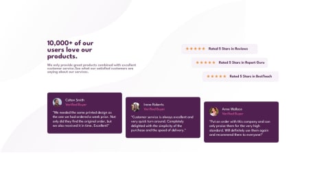
    The most difficult part was moving the comment boxes and rating boxes so that they are not totally aligned.

    For the comment boxes I followed KimDoesCode and used margin top 2 rem and 3 and it worked, but for the rating boxes it didn't.

    Somehow the rating boxes were aligned to the center and didn't move so I used margin-left: 0 for the first box; and margin-right: 0 for the third box.

    What specific areas of your project would you like help with?

    I still have troubles aligning objects.

    Social Proof Challenge 1st attempt

    1
    yas-avocad•360
    @yas-avocad
    Posted about 1 year ago

    Hey!

    For the boxes, I ended up using a container that nested all three ratings elements and another container that nested all three purple testimonial elements.

    So for the ratings, I had a container called rating-container. Then the three rating elements were all labeled the same as ratings.

    I set a width for my main container (rating-container) of 540px and used flex, align-items:center, justify content: center.

    Then, to align each individual item, I used the nth-child() element and the align-self element. The nth-child() element individually targets each of the 3 separate ratings boxes. Align-self overrides the flex directions from the main container.

    So, in the end it looks like this:

      .ratings:nth-child(1) {
        align-self: flex-start;
      }
    
      .ratings:nth-child(2) {
        align-self: center;
      }
      
      .ratings:nth-child(3) {
        align-self: flex-end;
      }
    

    And I used the same technique for the purple testimonial boxes too.

    Marked as helpful
  • lumbagoo•130
    @lumbagoo
    Submitted about 1 year ago
    What specific areas of your project would you like help with?

    I am generally happy of what I came with in this challange. However I did not know how to add the bottom background. I will appreciate any tips and advices for future.

    Social proof section challange with Flexbox and SASS

    1
    yas-avocad•360
    @yas-avocad
    Posted about 1 year ago

    Hey!

    For the background, you have:

    .intro {
      background: no-repeat url("../img/bg-pattern-top-desktop.svg");
    }
    

    Instead of background, you can use background-image. With this element, you can input the 2 urls:

    background-image: url(top....), url(bottom...)
    

    Then, add background-repeat and background-position. For background-position, you can target the top and the bottom image in the same tag:

    background-position: 0px 0px, right bottom
    

    :)

    Marked as helpful
  • ISAAC EDZORDZI FIAVOR•110
    @ISAAC-EDZORDZI-FIAVOR
    Submitted about 1 year ago
    What are you most proud of, and what would you do differently next time?

    I'm improving in my css.

    What challenges did you encounter, and how did you overcome them?

    my Grid layout is not allowing not to give margin left to the grid-container. top , right, bottom are all working except for the left.

    What specific areas of your project would you like help with?

    some of the font colors are confusing me

    Testimonial Grid Section

    2
    yas-avocad•360
    @yas-avocad
    Posted about 1 year ago

    Hey!

    1. Be careful, because each box has a box-shadow element in the original design.

    2. And also take note of your border-radius property. I would probably set it in px rather than rem, so that you can choose a more accurate value that is less rounded.

    3. I find that your CSS a little hard to follow with the classes set as item1, item2, etc. Maybe use the names of the people to keep track :)

    4. This one was really challenging for me- I used flex box around Daniel and Jonathan and around Jeanette and Patrick. Then, I used flex box around those (I'm not sure if it's the best way since it took forever to get right). But, I think with the grid that you used, you lose the ability to fine-tune the margins between each element.

    5. The font colors use alpha- so hsla or rgba - color: rgba(250, 250, 250, .7);. So this is the white, with opacity set at .7

    I hope this helps. I would encourage you to maybe ask the discord on how to better align the boxes. :)

  • S.Aloui•300
    @Souheib-Aloui
    Submitted about 1 year ago
    What are you most proud of, and what would you do differently next time?

    Nothing in particular to be honest.

    What challenges did you encounter, and how did you overcome them?

    Making sure the height of the container is appropriate was confusing ( since it depends initially on the content ) . Played around with some value and happy with the outcome .

    What specific areas of your project would you like help with?

    Any feedback would be appreciated :)

    responsive four section card challenge with grid & flexbox

    1
    yas-avocad•360
    @yas-avocad
    Posted about 1 year ago

    Hey!

    Responsiveness works well, but you should set a minimum width on some of your elements.

    I set a

     max-width: 420px;
     min-width: 311px;
    

    on my title, subtitle, and cards, so that the elements don't just get squeezed when I shrink the browser to the smallest size.

    Looks good :)

  • jordanj03•70
    @jordanj03
    Submitted about 1 year ago
    What are you most proud of, and what would you do differently next time?

    I am proud of using responsive font-size and making the website good on (mostly) any device I would improve my usage of media queries

    What challenges did you encounter, and how did you overcome them?

    The hardest challenge was making the page responsive, however, once I read the pathway information it became much easier :)

    What specific areas of your project would you like help with?

    How can I improve the responsiveness

    Responsive product preview card

    2
    yas-avocad•360
    @yas-avocad
    Posted about 1 year ago

    Hey! I would say that you don't need 3 media queries for this project. I ended up only using 1- just for the tablet/mobile view. And when it transitioned from mobile to desktop, my desktop view didn't change as the screen got bigger and bigger.

    Also, I think setting the percentages for height/width are what makes the button and other content overflow when in mobile view.

    :) I'm still trying to figure out responsiveness, so I'm not so sure.

    Marked as helpful
  • P
    Lawrence•180
    @lawlawson
    Submitted about 1 year ago
    What are you most proud of, and what would you do differently next time?

    I'm proud of how close to the design I managed to get this implementation of this project to look.

    What challenges did you encounter, and how did you overcome them?

    Two main challenges came from the header image, which I wasn't able to manage to fit 100% of the width on mobile view without the text below being affected, so I decided to leave the image as is on desktop view. The other issue came from not being able to use the styles I wanted within the table of the nutrition section. I ended up creating this section with a table and implementing the styling how I wanted it to be.

    What specific areas of your project would you like help with?

    Any ideas about how to implement the image on mobile as full width outside of the container but within the container on desktop would be valuable. Also, how to add styling to HTML tables so that I can create dividing lines between table rows, as I wasn't able to figure this out or find a suitable solution.

    Recipe page solution using HTML & CSS

    1
    yas-avocad•360
    @yas-avocad
    Posted about 1 year ago

    Hey! Looks good :)

    I also tried to use the HTML tables, but couldn't control it the way that I wanted to, so I also did what you did of using multiple <div> elements.

  • anisbeny•120
    @anisbeny
    Submitted about 1 year ago
    What are you most proud of, and what would you do differently next time?

    I'm proud of my code being readable and maintainable with a minimum number of lines of code.

    What challenges did you encounter, and how did you overcome them?

    Nothing to report

    What specific areas of your project would you like help with?

    Nothing to report

    Responsive social links profile using flexbox

    1
    yas-avocad•360
    @yas-avocad
    Posted about 1 year ago

    Hey!

    1. You should move the transition: ease-in-out 0.3s to .social-links rather than have it in .social-links a:active. When you have the transition under active, the transition only applies to the first half of the activity, so that's why the color snaps back when you move the mouse away.

    2. Also, instead of having it ease-in-out, you should write the code like this:

    transition: color .15s,
    background-color .15s;
    

    This way, the text color and background color transition together at the same time.

    1. For style, your border-radius can be a little less. Try using 10-12px for the container rather than 20px.

    2. Also for style, you can increase the padding around the main container. Maybe try 38px-42px. This will give the contents more room to breath and get you closer to the targeted design.

    :)

  • Mohammad Al-Sallal•100
    @mohasallal
    Submitted about 1 year ago

    Flex Only

    1
    yas-avocad•360
    @yas-avocad
    Posted about 1 year ago

    Hey!

    Looks like you set the display as grid and then tried to control it using flex properties. To get the card centered, you can add this to your body tag:

      display: flex;
      flex-direction: row;
      justify-content: center;
      align-items: center;
      min-height: 100svh;
    

    Also, you can make the PFP smaller and adjust the padding on the buttons to better match the design.

    :)

  • AlexStraton•70
    @AlexStraton
    Submitted about 1 year ago
    What are you most proud of, and what would you do differently next time?

    I;m happy to have used grid, but I found it tricky to make it responsive with grid.

    What challenges did you encounter, and how did you overcome them?

    Responsiveness was tricky so I tried different approaches and different screen sizes but then different problems started to come up.

    What specific areas of your project would you like help with?
    1. How do I add the filter on the image to make it red like in the example? Best I could do was to use the sepia filter.

    2. Why isn't grid responsive? When I used flexbox in my media query it worked, but if I used grid, the page didn't change at all.

    3. How can I get the .words-section to stay static and not sun into the image in the media query?

    4. How can I get the .grid to stack when minimizing the screen? I tried using flexbox and grid but nothing worked.

    Stats profile card

    1
    yas-avocad•360
    @yas-avocad
    Posted about 1 year ago

    Hey!

    • For the '10K', '314', and '12+M', rather than using <span>, you should use <p> or <div> instead. <Span> is best used to target a specific part in a <p> or <div>, like what you did for making the word 'insights' purple. Then, set the same class for all of numbers (10k, 213, 12+M) class=numbers. You can do the same for the units too (companies, queries, ...) This is important because it makes your code simpler and easier to read.

    • For the image filter, I ended up adding an empty <div> under the <img> in my HTML. I nested both of them in another <div> and then styled it like this in CSS.:

      background-color: rgba(94, 0, 144, 0.8);
      width: 540px;
      height: 446px;
      position: absolute;
      opacity: .7;
      border-top-right-radius: 8px;
      border-bottom-right-radius: 8px;
      max-width: 100%;
    
    • Also, to make the dark background, you can add background-color: #0A0C1C under body in CSS.

    (Can't offer much help in the responsiveness, but hope these other tips help :) )

  • Miriam Kilangi•70
    @Miriam2245
    Submitted about 1 year ago
    What are you most proud of, and what would you do differently next time?

    Everything feels different when doing one project to another so it was great doing this again.

    What challenges did you encounter, and how did you overcome them?

    The challenges i faced were centering a div within another div which I didn't overcome so I look forward to get help from you guys as you always do. Another is how align texting can affect the word-spacing in a paragraph but am glad i overcome it.

    What specific areas of your project would you like help with?

    I need help on how to make responsive websites, I tried but still I get confused a bit, I'll be more than grateful for a person who'll help but anything a link to the best tutorial or some explanations, am looking forward for that😊. Another thing is naming the divs, its kinda weird but naming the div so they can be easily understood by a person reading my code is a challenge since my first project, i'll appreciate help on that matter too. Lastly am looking forward on the things that you think I should work on to become better also recommend things that I should learn for now. I cant wait to hear from y'all😁

    Blog Preview Card using HTML and CSS

    1
    yas-avocad•360
    @yas-avocad
    Posted about 1 year ago

    Hey!

    I'm still trying to learn about responsive layouts, but I think for this one, you don't need to worry about it, since the design doesn't change structure as you go from the desktop design to the mobile design. For responsiveness here, you can probably use rem units over pixels, because rem units adjust the size of the text based on the size of the screen (as well as for the default browser text size). Pixels are absolute and don't change in size.

    I agree, naming div's is weird in the beginning, but it gets easier. You can change names like p1 to publish-date, p2 to subtitle or card-description. Having more descriptive names helps you to stay organized when you start working on bigger projects.

    Also, for your box-shadow, you don't need any blur. (The third value for blur can be set to 0.)

    box-shadow: 10px 10px 0px rgba(0, 0, 0, 1);

    :)

  • PhilippeItsMe•130
    @PhilippeItsMe
    Submitted about 1 year ago
    What are you most proud of, and what would you do differently next time?

    What a ride ! Yes ! I found a way to put my box in the middle of the windows. Yes ! Now, I manager size font with REM

    What challenges did you encounter, and how did you overcome them?

    Tks to Discord and it's great community.

    I had a lot of feed-back. To be honest, as I am new in coding, there a still a lot that I didn't even understand.

    However, programming is FUN

    What specific areas of your project would you like help with?

    I didn't succeed centering the "Greeg Hooper" : /

    blogPreviewChallenge

    2
    yas-avocad•360
    @yas-avocad
    Posted about 1 year ago

    For 'Greg Hooper' and his profile image, you can use vertical-align: middle for both of those elements. Or if you're using flex, try align-items: center.

    Also, you can use border-width: to control the width of the border- you can make it thinner.

    And don't forget to set line-height: for the paragraph in content. That's how you get the spacing in-between each line so the text has some space to breathe.

    :)

    Marked as helpful
Frontend Mentor logo

Stay up to datewith new challenges, featured solutions, selected articles, and our latest news

Frontend Mentor

  • Unlock Pro
  • Contact us
  • FAQs
  • Become a partner

Explore

  • Learning paths
  • Challenges
  • Solutions
  • Articles

Community

  • Discord
  • Guidelines

For companies

  • Hire developers
  • Train developers
© Frontend Mentor 2019 - 2025
  • Terms
  • Cookie Policy
  • Privacy Policy
  • License

Oops! 😬

You need to be logged in before you can do that.

Log in with GitHub

Oops! 😬

You need to be logged in before you can do that.

Log in with GitHub

Oops! 😬

You need to be logged in before you can do that.

Log in with GitHub

Oops! 😬

You need to be logged in before you can do that.

Log in with GitHub

Oops! 😬

You need to be logged in before you can do that.

Log in with GitHub

Oops! 😬

You need to be logged in before you can do that.

Log in with GitHub

Oops! 😬

You need to be logged in before you can do that.

Log in with GitHub

Oops! 😬

You need to be logged in before you can do that.

Log in with GitHub

Oops! 😬

You need to be logged in before you can do that.

Log in with GitHub

Oops! 😬

You need to be logged in before you can do that.

Log in with GitHub

Oops! 😬

You need to be logged in before you can do that.

Log in with GitHub

Oops! 😬

You need to be logged in before you can do that.

Log in with GitHub

Oops! 😬

You need to be logged in before you can do that.

Log in with GitHub

Oops! 😬

You need to be logged in before you can do that.

Log in with GitHub

Oops! 😬

You need to be logged in before you can do that.

Log in with GitHub

Oops! 😬

You need to be logged in before you can do that.

Log in with GitHub

Oops! 😬

You need to be logged in before you can do that.

Log in with GitHub

Oops! 😬

You need to be logged in before you can do that.

Log in with GitHub

Oops! 😬

You need to be logged in before you can do that.

Log in with GitHub

Oops! 😬

You need to be logged in before you can do that.

Log in with GitHub

Oops! 😬

You need to be logged in before you can do that.

Log in with GitHub

Oops! 😬

You need to be logged in before you can do that.

Log in with GitHub

Oops! 😬

You need to be logged in before you can do that.

Log in with GitHub

Oops! 😬

You need to be logged in before you can do that.

Log in with GitHub

Oops! 😬

You need to be logged in before you can do that.

Log in with GitHub

Oops! 😬

You need to be logged in before you can do that.

Log in with GitHub

Oops! 😬

You need to be logged in before you can do that.

Log in with GitHub

Oops! 😬

You need to be logged in before you can do that.

Log in with GitHub

Oops! 😬

You need to be logged in before you can do that.

Log in with GitHub

Oops! 😬

You need to be logged in before you can do that.

Log in with GitHub

Oops! 😬

You need to be logged in before you can do that.

Log in with GitHub

Oops! 😬

You need to be logged in before you can do that.

Log in with GitHub

Oops! 😬

You need to be logged in before you can do that.

Log in with GitHub

Oops! 😬

You need to be logged in before you can do that.

Log in with GitHub

Oops! 😬

You need to be logged in before you can do that.

Log in with GitHub

Oops! 😬

You need to be logged in before you can do that.

Log in with GitHub

Oops! 😬

You need to be logged in before you can do that.

Log in with GitHub

Oops! 😬

You need to be logged in before you can do that.

Log in with GitHub

Oops! 😬

You need to be logged in before you can do that.

Log in with GitHub

Oops! 😬

You need to be logged in before you can do that.

Log in with GitHub

Oops! 😬

You need to be logged in before you can do that.

Log in with GitHub

Oops! 😬

You need to be logged in before you can do that.

Log in with GitHub

Oops! 😬

You need to be logged in before you can do that.

Log in with GitHub

Oops! 😬

You need to be logged in before you can do that.

Log in with GitHub

Oops! 😬

You need to be logged in before you can do that.

Log in with GitHub

Oops! 😬

You need to be logged in before you can do that.

Log in with GitHub

Oops! 😬

You need to be logged in before you can do that.

Log in with GitHub

Oops! 😬

You need to be logged in before you can do that.

Log in with GitHub

Oops! 😬

You need to be logged in before you can do that.

Log in with GitHub

Oops! 😬

You need to be logged in before you can do that.

Log in with GitHub

Oops! 😬

You need to be logged in before you can do that.

Log in with GitHub

Oops! 😬

You need to be logged in before you can do that.

Log in with GitHub

Oops! 😬

You need to be logged in before you can do that.

Log in with GitHub

Oops! 😬

You need to be logged in before you can do that.

Log in with GitHub

Oops! 😬

You need to be logged in before you can do that.

Log in with GitHub