Not Found
Not Found
Not Found
Not Found
Not Found
Not Found
Not Found
Not Found
Not Found
Not Found
Not Found
Not Found
Not Found
Not Found
Not Found
Not Found
Not Found
Not Found
Not Found
Not Found

Submitted

Easybank - Mobile first, Sass, BEM, Intersection Observer API, Webpack

P
tedikoβ€’ 6,560

@tediko

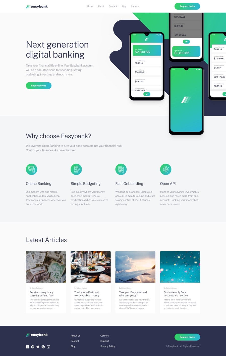
Desktop design screenshot for the Easybank landing page coding challenge

This is a solution for...

  • HTML
  • CSS
  • JS
3intermediate
View challenge

Design comparison


SolutionDesign

Solution retrospective


HelloπŸ‘‹!

That was a relatively simple challenge but still there was a room to try some new things and learn new approaches. The hardest thing to do was setting these mockups backgrounds and to fit it with design. List of things I learned or used creating this project:

  • Added touch-enabled mobile navigation. It's hard to reach for the hamburger menu on larger phones so I added a menu that is enabled by touchmove feature. Swipe from left to right to open menu on mobiles. Read more about touch-events.
  • Implemented Skip to content link. Skip links are little internal navigation links that help users move around a page. It is used as an accessibility enhancement that lets keyboard users and screen readers jump from the top of the page to the content without have to go through other elements on the page first. Read more about skip-to-content links.
  • Applied load events to prevent animating content before assets has downloaded. In short it is using JavaScript to listen for a load event, and make use animation-play-state to pause our animations until the assets has downloaded. This one I found in Anna solution, so special thanks to her. Read more about load-events
  • Instead of repeat code for reusable elements i write some helper classes to reuse them throughout the project. I created classes for headings, paragraphs, container. This saves time as well as unnecessary code repetition. I will definitely try to improve in this aspect.
  • Added sticky nav menu using Intersection Observer API. In short, this API is a native way of detecting if an object has entered the viewport. My observer looking at .kv section, and if that section is no longer interacting with viewport it triggers my header to appear. Read more about Intersection Observer.
  • I used Sass at-rules @for which is a simple for loop to transition my header__nav-item's while my mobile menu is open. Read more about @for

You can find more about the things I used in the project in the README on github. I just wanted to point out new things here.

I think I need to work more on my BEM and also Sass. I should nest more instead of adding classes for every element. I know I am writing too much code and can be optimized further. No specific questions here but any additional feedback will be appreciated!

Thanks! 😁
Community feedback

P
ApplePieGiraffeβ€’ 30,545

@ApplePieGiraffe

Posted

Hi, tediko! πŸ‘‹

I'm a little late to comment on this challenge! πŸ˜… But it looks amazing (just about pixel-perfect) and your attention to detail has been just great on so many levels! πŸ‘

I actually kind of like the hover effect of the article cards near the bottom of the page (although something small that might be nice was if the images of the article cards were clickable, as well, to make it easier to go to those articles). And I'm really liking the hover effect on the buttons and the in/out transition of the mobile menu! πŸ˜€

As you would sayβ€”good luck with that, have fun coding! πŸ’ͺ

1

P
tedikoβ€’ 6,560

@tediko

Posted

@ApplePieGiraffe Hello, APG! It's always gets nicer when someone notices the smaller details in a project!

Noted! I will definitely make images or even whole cards clickable for my future projects. I think it is more intuitive for the user than searching for the clickable heading element πŸ˜…

Thank you for feedback and have fun coding too!

1
Anna Leighβ€’ 5,135

@brasspetals

Posted

Hi, tediko! πŸ‘‹

Finally sneaking in some time to take a look at this one. Excellent job, as usual! The hero animations on both layouts are nice and smooth. I really like the "feel" of the mobile one. The hover effect on the "request invite" buttons is also really cool, and the mobile menu animation is excellent! πŸ™Œ

Glad my load event woes (and the slower internet which allowed me to catch them πŸ˜‚) were helpful! Thanks for the shoutout!

While understandably not everyone's cup of tea, the hover effect on the cards is really neat, and I'm sure will come in handy in other situations or future projects! Maybe in a situation where you need to select a card or element in a series for a quiz, questionaire, or something to that effect.

Looking forward to the next one!

Edit: Forgot to mention - the keyboard accessibility is also great!

1

P
tedikoβ€’ 6,560

@tediko

Posted

@brasspetals Hey, Anna! 😊 Thank you for kind feedback. At the end of the day it's important to play with the code, not everything will always fit but with each project we learn something new thanks to trial and error.

1
P
Matt Studdertβ€’ 13,611

@mattstuddert

Posted

Awesome work again, Tediko! Another great solution, and it's nice to see you experimenting with new ideas and techniques with each new project. Also, good to see you using prefers-reduced-motion to remove animations for anyone who has enabled that setting and playing with clamp() for fluid typography.

I'd tend to agree with @palgramming re: the card hover effect for the articles. An effect on the item being hovered is enough. Fading out the others makes them less readable and could be seen by some to be distracting. Different people will have different opinions on this, though!

Keep up the great work! πŸ™Œ

1

P
Patrickβ€’ 14,325

@palgramming

Posted

@mattstuddert "prefers-reduced-motion" wow I did not even know that was a setting #Thanks

0
P
tedikoβ€’ 6,560

@tediko

Posted

@mattstuddert Thanks, Matt! I agree with this opinion about hover effect. I like trying new things and sometimes I'm adding too much to things that should be kept simple :D Thanks for feedback!

1
P
Patrickβ€’ 14,325

@palgramming

Posted

@tediko will since it was big and in the main flow of the page I think that is why is was so distracting cause you were trying to scroll and then something else was happening so it was like a fight for control

0
P
Matt Studdertβ€’ 13,611

@mattstuddert

Posted

@tediko, you're welcome! These challenges are the perfect place to push the boundaries and figure out what works and what doesn't. It's awesome to see you experimenting and trying new techniques! πŸ‘

1
P
Patrickβ€’ 14,325

@palgramming

Posted

Looks really good but right at the start at desktop width on a desktop I find the hover change on the cards really distracting when I make the window mobile size and scroll it returns to a nice experience. Its just my opinion and I am not a big animation person so my opinion might be in the minority and you are much more skilled than I am

1

P
tedikoβ€’ 6,560

@tediko

Posted

@palgramming Thank you for feedback.

0

Please log in to post a comment

Log in with GitHub
Discord logo

Join our Discord community

Join thousands of Frontend Mentor community members taking the challenges, sharing resources, helping each other, and chatting about all things front-end!

Join our Discord