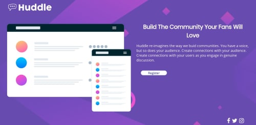
Huddle landing page using Holy Grail Flexbox layout

Solution retrospective
I used the Holy Grail Layout with Flexbox. I designed starting with the browser and added a media query to change the layout based on different sized screens.
Some elements like the button and the footer icons are still off when viewed on mobile devices. And the button isn't the correct size.
I know my CSS code could probably be neater but I am still trying to get the hang of things first. Any suggestions on how to tighten up the layout so that it looks better on mobile. It would be greatly appreciated.
Please log in to post a comment
Log in with GitHubCommunity feedback
- @mattstuddert
Hey Shakira, nice work on this project! As you've mentioned some elements are still a little off, but the overall layout is looking good for all screen sizes. My main recommendation would be to just go through it one more time matching your solution up to the design to make those refinements. Accuracy is a key part of being a front-end developer, so it's a skill that's well worth taking some time to build.
Keep up the great work!
- @adarshcodes
try adding padding to the button, increase the font size of the heading. Nice work👍👍👍


Join our Discord community
Join thousands of Frontend Mentor community members taking the challenges, sharing resources, helping each other, and chatting about all things front-end!
Join our Discord