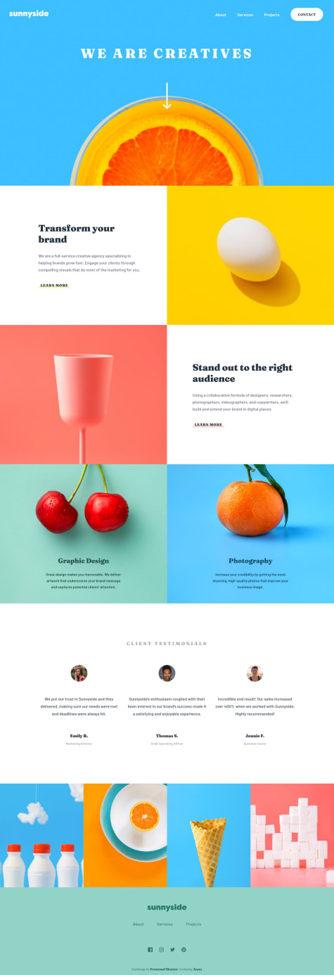
Not Found
Not Found
Not Found
Not Found
Not Found
Not Found
Not Found
Not Found
Not Found
Not Found
Not Found
Not Found
Not Found
Not Found
Not Found
Not Found
Not Found
Not Found
Not Found
Not Found

All comments

  • Anna Leigh 5,135

    @brasspetals

    Submitted

    Hi, everyone! 👋 It feels great to finally submit this solution. I’ve wanted to do this challenge since I started doing Frontend Mentor projects. It was definitely a learning experience (see: README), and hopefully I’ve made up for the lack of effects in my Sunnyside solution. 😆

    The parallax effect is only on desktop and tablet. It’s also turned off, along with all animations and page transitions, for those who prefer reduced motion. 👍

    Questions:

    • This was my first time implementing a “tabbed” interface. I opted to use button elements for the tabs. Is there a better and/or more accessible way to create tab functionality?
    • I’m concerned that the image animations on the tabbed Events section are getting messed up if the image doesn’t load before the animation triggers. Is there a way to preload images from picture elements in a way that’s responsive and also works with multiple srcsets? Update: I refactored this section a bit, making some tweaks to the animations and putting all content in the DOM rather than dynamically loaded. The flashing issue is now fixed. Huge thanks to Dave and Christopher for their help on this! 🙏
    • How is the form accessibility on the booking page? I don’t believe the second page was included in the report.
    • Sadly, I didn't manage to style the AM/PM selector like the design because I used select and option elements. Do you know of a better method that would be both accessible and match the dropdown in the design?
    • Not sure how I feel about the menu list being parallax on desktop. Does it look too wonky or have I just been staring at it for too long? 😂

    Thanks for taking the time to look at my solution! Feedback is always greatly appreciated. 😄

    P

    @BurritoDoggie

    Posted

    Heyy Anna!

    You are back at it again with a wonderful challenge!! This is actually the first time I have had seen someone do this project and I actually really like it~ This made my day better, and I hope these comments make your day better! ^^

    Keep Coding!

    (== ^ . ^ ==)

    1
  • Anna Leigh 5,135

    @brasspetals

    Submitted

    Hi, everyone! 👋 This one is a bit of a “simpler” solution - meaning I didn’t add many animations or effects. I had lots of ideas for this one, but most ended up getting tossed. Instead the big focus was on Svelte and component-based development.

    Questions:

    • How would you handle a design like this on large screens (1920px+)? Add a max-width to the entire page and keep it centered? Add another media query? For now I’ve just left it, but letting it expand into oblivion doesn’t look great. 😕 "Solved": Went with max-width.
    • I used a local variable in conjunction with a Svelte variable to determine the color of the "underline" in the LinksUnderlined component (yellow/pink). I feel like there’s probably a simpler way to do this in Svelte? Solved: Used the method in this REPL for a cleaner solution.
    • Is there a way to “disable” a Svelte transition? In order for the transitions I used for the mobile menu to not fire on page load for 800px+ screens, I added a class to disable animations. This feels like a very janky solution to the problem. 😆
    • How’s my Svelte in general? Any input on improvements and best practices?
    P

    @BurritoDoggie

    Posted

    Hey Anna!!

    I'm excited to see another challenge from you! 😃 I happened to access your challenge mobile today, and it fit my screen perfectly! I also love the hamburger 🍔 menu! 😍 But sadly I have no knowledge of Svelte to help you with your code. 😕 I just wanted to drop in and say great job!

    Keep Coding!

           = ^ . ^ =
    
    1
  • Anna Leigh 5,135

    @brasspetals

    Submitted

    Hi, everyone! This is my first Svelte project, so I'm sure there's much to be improved upon. Still getting used to component-based structure/development, but so far I like it!

    Safari continues to plague me. In this project, the .invalid and focus styles for the input are not showing up in Safari, and I can't figure out why. Any insight into this will be greatly appreciated! The CSS mouse animation also had some serious issues in Safari, so I opted to have the original svg icon be displayed both in Safari and for those who prefer reduced motion. Solved: Turns out my Safari was out of date! 😅 Everything works in 15.4 👍 Well, almost. Keyboard tabbing doesn't seem to pick up the maker logo in the header as a link. The outlines also display oddly on the attribution links when tabbing through them. 🤦‍♀️

    The animated mouse is heavily inspired by (read: blatantly stolen from and lightly tinkered with) Ryan Mulligan's CSS Site Scroll Micro Animation. Full list of resources in the README.

    Please let me know what you think, especially if you see anything that can be improved upon. Feedback is always welcome! 😄

    P

    @BurritoDoggie

    Posted

    Hey Anna!

    I am really happy to see you have posted another project! :) I absolutely love it!!! All of the effects made it even better! I love the mouse animation the best! I enjoy looking at projects from you! Cheers!

    Keep Coding!

      :)
    
    1
  • @AmbreenAkmal

    Submitted

    This is my first challenge and I want you to give me a feedback and suggestion about my project. So that it will be helpful. Is there any question you may ask.

    P

    @BurritoDoggie

    Posted

    Heyy!

    It's great to see you have completed a challenge! I was looking through your code, and in your CSS I saw colors you did not need such as pink, orange, and many more. Only add colors that you need for the project! 🙂 It keeps the code neat and tidy! 😊

    Keep Coding!

                                                              (==  ^ . ^ ==)
    
    0
  • Anna Leigh 5,135

    @brasspetals

    Submitted

    Hi, everyone! It has definitely been a minute, but after a very long coding break I'm back! 👋 I'm excited to be submitting my first premium challenge solution as a Pro member. Having the design files has been a massive time saver! 😄

    Since it's been so long, I decided to stick with plain, old CSS and JS for this project - bit of a "warm up". 😅

    While the project was pretty straightforward, I did run into a rather odd bug. In Safari, I noticed the podcast svgs were blurry. After some testing, it seems that svgs that have a filter and are also in an img tag are blurred. If the filtered svgs are inline, they display just fine. The only suggestions I found online were to add -webkit-transform: translate3d(0,0,0) or -webkit-filter: blur(0px);. Unfortunately, neither worked in this case.

    Since the grey filter on the podcast svgs in the starter code didn't quite match the color in the design files anyway, I ended up editing the svg files directly to remove the filter and manually change the color to match the design. However, if anyone has a simpler solution to the Safari svg blurring issue, please let me know! Have any of you ever encountered it before?

    P

    @BurritoDoggie

    Posted

    Hey Anna!!

    I love it when people like you take on big projects and make them look great! It looks amazing and I would love to see more projects from you!!

    Keep Coding! :)

    2
  • P

    @BurritoDoggie

    Posted

    Hello there!

    Amazing job here! You did really well on this challenge! One thing you could add here is a div on the image at the top. Then you can add border-radius to the top corners. Great effort!

    Keep Coding!

    :)

    (If you found this helpful you can let me know by marking this helpful or by giving this a thumbs up!)

    Marked as helpful

    2
  • P
    Briuwu 700

    @Briuwu

    Submitted

    Hello~! (≧∇≦)ノ

    I've finally decided to move on to Junior level JS challenge, and this is the first one! I'm really excited to do the other junior level challenges! I still can't do the design pixel perfect, but I'm trying my best!

    Please check this one out, if you have any feedback or suggestions! Please do let me know! Thank you so much!

    P

    @BurritoDoggie

    Posted

    Hi!

    I like it, I love it! Amazing job with the JavaScript! I'm still trying to learn JS and you are like a Guru! Looking forward to seeing more projects from you!

    Keep Coding!

    :)

    (If you found this helpful you can let me know by giving this a thumbs up or by marking this helpful!)

    Marked as helpful

    2
  • P

    @BurritoDoggie

    Posted

    Hello!

    Beautiful code! It even fits every device! I love the hover effects you added on the buttons! I actually learned something new while looking at your code!

    Keep Coding!

    :)

    (If you found this helpful you can let me know by giving this a thumbs up or by marking this helpful!)

    2
  • P

    @BurritoDoggie

    Posted

    Hello there!

    Pixel Perfect! It is amazingly close to the original! Beautiful work! I really wish I could give you some advice on code but I'm still learning. Honestly, I think that I could actually learn from your code!

    Keep Coding!

    :)

    (If you found this helpful you could let me know by giving this a thumbs up or by marking this helpful!)

    2
  • Alucard 870

    @Alucard2169

    Submitted

    Any kind of Feedback would be appreciated.

    HTML and SCSS

    #sass/scss

    3

    P

    @BurritoDoggie

    Posted

    Hello!

    I love your work!!! I did the same challenge but you did a much better job! it's very unfortunate but I don't know too much code so I won't be able to help you improve your code. But if this helps you can look at the report above!

    Keep Coding!

    :)

    (If you found my feedback helpful you can let me know by marking this helpful or by giving this a thumbs up!)

    Marked as helpful

    2
  • P

    @BurritoDoggie

    Posted

    Hello!

    I'm very happy to look at your project! I am also currently working on the same challenge! I love it and think it is amazing! You can add the font Red Hat Display to make it more stylish!

    Keep Coding!

    :)

    (if you found my feedback helpful you can let me know by giving this a thumbs up or marking it as helpful!)

    Marked as helpful

    1
  • P

    @BurritoDoggie

    Posted

    Hello!

    Very Beautiful! I usually have a problem with flexbox but you did a perfect job! Looking forward to seeing more from you!

    Keep Coding!

    1
  • Nicaisse 340

    @abanicaisse

    Submitted

    Every time more than 2 accordions are open at the same time, the design is f*cked up, I failed to fix that issue. If you got any idea on how I can fix that, plz lemme know !!

    P

    @BurritoDoggie

    Posted

    Hi there!

    I loved all the animations you added in! Great effort! I'm sorry but I'm new to coding so I can't give any feedback on your code. But if it helps you, go ahead and look at the report above!

    Keep Coding!

    :)

    Marked as helpful

    1
  • P

    @BurritoDoggie

    Posted

    Hey!

    I love all the effort put into this challenge and enjoyed every detail you added! I tried taking up the same project but I found it too hard. Reviewing your code could help me improve mine!

    Keep Coding!

    :)

    3
  • P

    @BurritoDoggie

    Posted

    hello there!

    I absolutely love it! Beautiful work! Some people might find this a small challenge but I think all effort is amazing! Looking forward to seeing more from you!

    Keep Coding!

    :)

    Marked as helpful

    2
  • Dana 140

    @danakendybayeva

    Submitted

    Do you have any recommendations on how I can improve it?

    P

    @BurritoDoggie

    Posted

    Hi!

    I love your effort! It literally put a smile on my face! I enjoy looking at others' code! I actually came here because I was stuck on my JS and your project made me feel happy! You inspire me to continue learning!

    Keep Coding!

        (@@)
         \__/
    
    1
  • P

    @BurritoDoggie

    Posted

    Hello!

    I'm happy to see a great coder change simple projects into an awesome challenge! Your effects are very nice and simple, but I still like them! There is some thing special about your effects. A lot of people do effects on this challenge but you did yours in a surprising way!

    Keep Coding!

    (♡ω♡ ) ~♪

    1
  • P

    @BurritoDoggie

    Posted

    Hello!

    What a cool project you did! I love all your hard work and effort you put into this challenge! I am really happy to see coders like you do great work! I can't help with any code issues since I'm not great at coding, but the 'report' above can help you!

    Keep Coding!

    ( ◜‿◝ )♡

    2
  • @H0bG0blin9g

    Submitted

    I think the purple colour on the overlay does not match that of the design which seems to be much more vibrant, not sure why. Also I had issues with the responsiveness on the desktop version - whenever the width of the page was sized smaller, it would add padding at the top and bottom of the image instead of letting the image fill the whole height of the component. So what I did was set the breakpoint to show the mobile version just before that issue occurs. Any ideas how to fix this so that it is actually responsive?

    P

    @BurritoDoggie

    Posted

    Hi!

    The project you took on was simple and you made it look great! I am very happy to see people do accurate work like you! I would like to see you make more challenges look awesome! You can look a the 'report' above to improve your code 🙃!

    Keep Coding!

    (๑♡⌓♡๑)

    1
  • @ArturdaSilvaRezende

    Submitted

    This is my first project made with React, I didn't study all the hooks, I decided to work on this project to put into practice some concepts I've learned so far. I would like to know if my code is clean, where can I improve, I appreciate the feedback, it's a good study for everyone.

    P

    @BurritoDoggie

    Posted

    Hey!

    I love it when people like you take on big projects and make them look great! You did an amazing job with the different effects! You made the pictures of the people bigger than the original, and I think it looks better!(I don't know if it was on purpose but I like it 😅) I found a tiny little typo at the top. Instead of creative you spelled it criative. It does not bother me though!

    Keep Coding!

    (◍•ᴗ•◍)❤

    Marked as helpful

    2
  • @Zhi-Jian-Tiow

    Submitted

    Hi everyone, this is a fun challenge for me as it is my first time using JQuery to make the web page more interactive. Appreciate any comments on my solutions. Thanks!

    P

    @BurritoDoggie

    Posted

    Hey!

    You did beautiful! I absolutely love it and think it's very cool! The effects on the buttons were very fun indeed! You can look at the 'report' above to fix any code! I want to see more projects from you!

    Keep Coding!

    (●♡∀♡)

    Marked as helpful

    1
  • P

    @BurritoDoggie

    Posted

    Hi!

    You did great! It fit my screen very well! I think you are a great coder! You had only one HTML issue! Great job! I would like to see more challenges by you! You can look at the 'report' above to improve your code 🙃.

    Keep Coding!

    ( ˘ ³˘)♥

    2
  • @patrickAubry1984

    Submitted

    Hi

    This is my first challenge after learning HTML and CSS. It went pretty good and took me about 4 hours to complete.

    I'm pretty much satisfied with the end result exept for the "attribution" placement. I was not able to place it outside of the card.

    If there's some things I need to change or that can be adjusted for a better code please let me know. I want to get better at this.

    Thank you

    Patrick

    P

    @BurritoDoggie

    Posted

    Hello!

    I can't believe you did that in 4 hours! My eyes went big when I saw that! I did a different challenge and it took me days! On top of that I need someone else's help! You are so efficient! I think you are a awesome coder,and you are a total pro compared to me! I want to see more challenges from you!

    Keep Coding!

    ꒰⑅ᵕ༚ᵕ꒱˖♡

    1
  • CoderPr0 645

    @CoderPr0

    Submitted

    My first Junior level project, this looked quite simply but I've actually struggled quite allot. As for the mobile nav, I feel like there is (or should be) a simpler way to do it but I'm not quite sure how. If anyone could give me any tips on easier/faster methods it I would really appreciated it.

    P

    @BurritoDoggie

    Posted

    Hey!

    You did wonderful! It looks sooooooo good and it fit my screen! I love the way the Loop studios thing followed you! It was really fun it press the different images and see them turn lighter! Please continue to do more challenges!

    Keep Coding!

    ( ◜‿◝ )♡

    Marked as helpful

    2