Not Found
Not Found
Not Found
Not Found
Not Found
Not Found
Not Found
Not Found
Not Found
Not Found
Not Found
Not Found
Not Found
Not Found
Not Found
Not Found
Not Found
Not Found
Not Found
Not Found

All comments

  • Rayane 1,935

    @RayaneBengaoui

    Submitted

    Hello everyone ! 🙂

    Very cool challenge ! I love the work from the designer on this one !

    I learned a few things such as using the <picture> tag to adjust images and the mix-blend-mode property to get the "orange" effect on one of the images. Also, I've used the new and recommended way of doing import with SASS with @use instead of @import which behave really differently because it's not a global scope anymore.

    I would like to have any feedback on the project and especially on how I structured my SCSS files. I divided them by (abstracts | components | layout). But at the end, I didn't really used the components folder, thus , I could have simplified the layout folder.

    Have a nice day ☀️

    drallas 375

    @Drallas

    Posted

    Hello Rayane

    Congrats on finishing this Challenge! 👍

    I think your solution looks pretty close to the Figma design with a nice transition between when you switch over to / from desktop layout. Not sure if shrinking the images itself is the best solution, i opted myself to keep them 'static'.

    I finished this one yesterday evening and used your solution as an inspiration to refactor mine. The tip for the 'mix-blend-mode property to get the "orange" effect' was very helpful since i struggled to get that right and with a linear-gradient I couldn't get it look as the Figma design. I also refactored to get rid of @import using @use now. Btw I noticed that your SCSS is showing in FF Inspector, mine isn't; how does that work?

    I used SASS for the first time this challenge and went 'all in' on structure; perhaps too much when i look at your SASS folder structure that's a bit simpler. I think it's ok to split up the SASS CSS into small components, not having to search so much to find a specific piece of code.

    I hope it helps!

    Enjoy coding the next one.

    Greetings, Drallas

    2
  • @SrCienpies

    Submitted

    Hello! The most difficult part for me was the profile image, i am using absolute position and percentages to center the image, is there any better solution for this part of the card?

    Thanks!

    drallas 375

    @Drallas

    Posted

    Hello Diego

    Nice card implementation!

    I also used absolute to place the image. You could try with margin left & top.. I Just opened my project for this and i get the picture in the center like that too. Perhaps you could give it a try and see if it works for you.

    0
  • drallas 375

    @Drallas

    Posted

    He Mohammad

    You're Desktop site looks good, but your Tablet and Mobile are not showing up nice. It's easier to start Mobile first and then apply CSS exceptions for Tablet and Desktop. https://zellwk.com/blog/how-to-write-mobile-first-css/

    0
  • Sven 295

    @Sven72

    Submitted

    Hi, how can I optimize the rendering of the logos? And it would be great if someone could tell me how to optimize the JS. Best, Sven

    drallas 375

    @Drallas

    Posted

    Hi Sven

    Good work, I'm working on this one at the moment.

    I just flexbox (space-around) on the parent div with the logo img files. And then for each logo nth-child i set a height. Those values are all in the Figma file.

    You mobile version seems to have no BG image set!

    I hope it helps..

    Greetings. Drallas

    1
  • drallas 375

    @Drallas

    Posted

    Hello Hachi

    Well done Hachi mostly it looks pretty much like the design, but 'the devil is in the details'! It's also recommended to use rem and not px value for accessibility On my 38" screen the card grow really big when I take it fullscreen. Perhaps limit the max size of the cards a bit..

    Greetings... Drallas

    1
  • @YusufWebDev

    Submitted

    my first attempt at this . i used css grids. because i am eye-balling all the padding and margins, its very tedious to get the correct spacing.

    Please suggest an application i can use to measure padding and margins.

    As always, please feel free to give your positive critique

    drallas 375

    @Drallas

    Posted

    Hey Yusuf

    Just completed this one myself too.

    • Your CSS structure is very nice, but too many !importants! (i used 0 importants) :)
    • Your BG images are not showing up, the url for GH pages is without fw slash!
    • Your Sizing is a bit off / bigger than the design.
    • Also the positioning is a bit off.

    I hope it helps and you can refactor it a bit..

    Greetings.

    0
  • drallas 375

    @Drallas

    Posted

    Hello Max

    It's just a big too big and did you noticed that the mobile card is slighty smaller than the desktop one?

    I don't think two divs are needed!

        <div class="bg-body-1"></div>
        <div class="bg-body-2"></div>
    

    You can be set multiple background images on one div, positioning is tricky..

    background-image: url(./images/bg-pattern-top.svg), url(./images/bg-pattern-bottom.svg);
        background-position: ???;
        background-repeat: no-repeat, no-repeat;
    

    It's hard and requires tweaking the values. left -??rem top -??rem, right -??rem bottom -??rem the exact values I leave for you to figure out, that's part of the fun!

    0
  • drallas 375

    @Drallas

    Posted

    Hello Damian

    Seems very good to me, very nice and clean code too. Card size is only a bit bigger than the design, but I'm sure you can refactor it to be closer to the design.

    0
  • Laxmi 10

    @Laxmi-Hirabayi

    Submitted

    In order to make background for the page, I used position: absolute; property but that is not looks fine, and also i felt difficulty in making background using .svg files.So please help me with this, it would be much appreciated

    drallas 375

    @Drallas

    Posted

    Hello Laxmi

    I'd recomment using background-image and background-position to set to images correctly.

    background-image: url(./images/bg-pattern-top.svg), url(./images/bg-pattern-bottom.svg);
        background-position: ???;
        background-repeat: no-repeat, no-repeat;
    

    It's hard and requires tweaking the values. left -??rem top -??rem, right -??rem bottom -??rem the exact values I leave for you to figure out, that's part of the fun!

    Card design is also a bit bigger then design!

    0
  • Grady 80

    @grady2002

    Submitted

    i think it is not vertically aligned properly .. please help it would be much appreciated

    drallas 375

    @Drallas

    Posted

    Hello Grady

    It's an component but you built it as page.. sizing is off your component is too big. Did this one myself today i tried to make it into an component that could be fit into a bigger page. Perhaps consider refactoring it into an component (Single price grid component)!

    0
  • @Enoah35

    Submitted

    This is my second solution using most of the feedbacks I got. Hopefully it is more readable, and better structured. Again if you can give criticism, tips or things I should avoid doing I am all ears. Thank you!

    drallas 375

    @Drallas

    Posted

    Hello

    I think your responsive design still deserves some consideration to make it a more seamless transition. Layout is a bit off, it might be better to tweak it a bit to closer to the design!

    1
  • @antoniotullyspinozzi

    Submitted

    Gradually teaching myself HTML / CSS, first time handling Grid.

    My main complication I encountered was with the container shadow. The only way I could figure out how to do it was to create it in its own div. The end effect is fine but I am sure there must be another way of coding it, so would appreciate a heads up with that please.

    Also would like some feedback on how I handled the site's responsiveness.

    Thanking you.

    drallas 375

    @Drallas

    Posted

    Hello Antonio

    Nice solution... I'm working on this one at the moment, also using grid layout...

    I noticed a view things border-radius: 0.4375rem 0.4375rem 0.4375rem 0.4375rem; could be shortened to border-radius: 0.4375rem; The mobile version keeps on expanding vertically if i increase the viewport, i think it would be better to fix it like the desktop version.

    • better to use rem over px unless you have good reason for px!
    • box shadow code is a bit long 0px 15px 30px 0px rgba(0,81,171,0.15); will do fine. I'm a bit lazy so used a cssboxshadow generator with the values from the Figma file, just aplied it on the grid container.

    I hope it helps.

    1
  • drallas 375

    @Drallas

    Posted

    Hello Ibrahim

    On a wide screen over around 1535 px the four cards end up horizontally aligned. i think a max width on .section can prevent that. There are 2 more 'breaks' going from desktop to mobile, i don't know if i like them, myself i opted for just one break since a tablet layout was not required. https://drallas.github.io/Four-card-feature-section/.

    Good look with the refactoring this solution..

    1
  • @YusufWebDev

    Submitted

    this is my second attempt for this challenge.

    this time ive decided to use css grids for the first time . WOW WOW. so much simpler to create the layout. i really enjoyed this challenge this time around. it has motivated me alot.

    as always.. your critique is welcomed.

    drallas 375

    @Drallas

    Posted

    Hello Yusuf

    While switching from Desktop to Mobile the mockup image and text are falling outside the visible range on the right. Try to slowly decrease their size and then switch over at a better moment. Perhaps my (imperfect) solution helps. https://drallas.github.io/Huddle-Landing-Page/

    Mobile the design is off-centre to the right, 'perhaps' you have somewhere set a bigger width that the mobile viewport!? (Hint .page-grid). Mobile is also not showing the bg-mogile.svg.

    You can also use the Pesticide extension to make borders quickly visible, then those issues show up easier.

    I prefer the social icons from the design, your pop a bit too much for my taste. Perhaps looks at other solution what icons to use.

    Also consider when you are using px or rem..

    Good luck making it better!

    1
  • drallas 375

    @Drallas

    Posted

    Hello Orlando

    When i compare the design it a bit off compared to the original, looking at that are enough things you could visually improve. Mobile you're showing the bg-mobile.svg in a different position that the design....

    To be consistent convert the remaining px values also to rem..

    But overall i think it's good and solid work.

    0
  • P
    ApplePieGiraffe 30,545

    @ApplePieGiraffe

    Submitted

    Hello, everybody! 👋

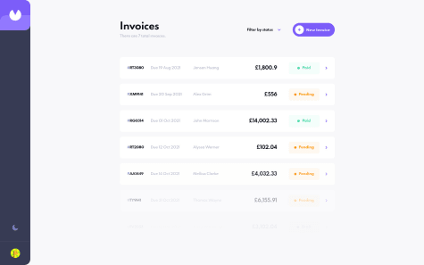
    This is my 30th solution on Frontend Mentor! 🎉 (And my first Guru level challenge submission.) 😎 This was definitely a tricky challenge, but I got to learn and try out many new things! 😀

    I used React and Next.js to build the site, styled-components to style it, Formik (and Yup) to handle the forms in this challenge, and Framer Motion to add some page transitions and animations. 😄

    There were quite a few things I had to learn in order to complete this challenge, and I'm not sure if I did them all correctly. 😥 Looking back, there are a few things I wish I would have differently, but it's a learning experience! 🙂

    If anyone could share some resources on how to manage and organize larger projects like this, I'd really appreciate it! 👍 Lots of resources that I find only focus on specific things (like creating a popup or using certain features of a tool) and not so much how to approach and think about an entire app. 🙃

    If you'd like to learn more about my project, see the README in my Git repo (where I also list a few quirks in my solution).

    Feedback welcome and appreciated! 😊

    Happy coding! 😁

    BTW, click on the sidebar avatar for the attribution.

    Invoice App | React, Next.js, styled-components, Formik, Framer Motion

    #framer-motion#react#styled-components#next

    16

    drallas 375

    @Drallas

    Posted

    Hello APG

    This is a great version of the Invoice App, i couldn't find big issues playing with the invoices and testing the responsive layouts.

    Only thing i noticed is that the new invoice animation vs edit invoice animation are at different speeds. To open and close an existing invoice takes a bit long... but the animations are sweet! :)

    Looking forward to solve this challenge myself someday.

    1
  • Jed Salmon 100

    @Jed-Salmon

    Submitted

    Is there a better way to apply the background circles and make them responsive?

    I thought they looked fine while previewing the results in the browser, but the design comparison slider clearly shows I have done something wrong...

    drallas 375

    @Drallas

    Posted

    Hello Jed

    I think it's better to apply the background circles using background-image: url(./images/bg-pattern-top.svg), url(./images/bg-pattern-bottom.svg); directly in CSS.

    You can find my solution on my GitHub. https://github.com/Drallas

    I hope it helps!?

    1
  • Martin 95

    @Martingf56

    Submitted

    This is my solution, I have a question which is a better metric for padding. Rms or percentages?

    drallas 375

    @Drallas

    Posted

    Hello Martin

    The social media icons are a bit small.

    The logo is a bit bigger than the design, but doesn't matter it looks good.

    Resizing to mobile your image gets very small, after the switch to mobile its increasing in size again. I tried to make it more seamless, https://drallas.github.io/Huddle-Landing-Page/ perhaps it helps.

    I see you got the background size / placement almost right, I will redactor my own solution after seeing this!

    1
  • drallas 375

    @Drallas

    Posted

    Hi Mehmet

    I was also on this one today, just finished it. As Mesut wrote you should check color, font-weight, font-size of texts, currently it looks a bit to far off the original.

    I noticed you used Flexbox, personally this seemed a perfect one to for CSS Grid, Flexbox could be used too of-course.

    Shrinking card could be prevented by giving them a fixed width, i don't think that they only need to resize on breakpoint for this challenge.

    0
  • drallas 375

    @Drallas

    Posted

    Hello Mehmet

    Any specific area where you need some help!?

    0
  • drallas 375

    @Drallas

    Posted

    Hello Bruna

    Nice solve of the challenge. I think that the breakpoint for Mobile at 13xx is a bit early and the cards look enormous after the switch. Perhaps first letting the cards properly shrink more and then jump to mobile at a lower value.

    see : https://frontend-mentor-social-proof-section-beta.vercel.app/

    0
  • drallas 375

    @Drallas

    Submitted

    This is my 3rd newbie challenge submit and I enjoyed the process of hacking this card component together. Building such a 'simple' card component isn't easy for a 'Newbie' and it requires some time to think over before trying to do it properly.

    Feedback would be welcome How is the responsive experience; what can / should I improve (*see Note)? I try to use BEM but still have doubt if i used it correctly Anything else that I missed or should improve.

    Note: Related to BEM I recommend this video: https://www.youtube.com/watch?v=iyR6RXUZFQ8 it's quite good and explains it in visual detail.

    Where I struggle is how should elements be named when there are multiple levels of nesting.

    <div class="card__mid">
              <div class="card__text">
                <div class="card__name">Victor Crest <span> 26</span></div>
                <div class="card__location">London</div>
              </div>
            </div>
    
    drallas 375

    @Drallas

    Posted

    Hi Tom

    Thank you for your feedback on BEM.

    My class="card-top" has background-image(s) background-image: url(./images/bg-pattern-card.svg); I'm not sure how i could replicated that with a 'linear gradient' or a :before pseudo element; but I'm learning so i will do some research it a bit, perhaps it opens my eyes.

    The margin-right value is removed, this was the first time that i used transform so I'm still figuring out what works best.

    1
  • drallas 375

    @Drallas

    Posted

    The background images could also be set via background-image:

    background-image: url(./images/bg-pattern-top.svg), url(./images/bg-pattern-bottom.svg);
        background-position: ????? ;
        background-repeat: no-repeat, no-repeat;
    
    0
  • drallas 375

    @Drallas

    Posted

    Oh the link in your profile to GitHub seems broken.

    https://github.com/BETO-CORTES (404 error) https://github.com/who-Is-Beto (works)

    0