
@trander123

Ahmad_Mana
@UserAhmad2001All comments
- @UserAhmad2001
Hello pal👋👋👋👋
It's easy actually, Assuming you have stored your app's data in an Array of objects like this one
{content: "Lorim", checked: true"}.You have to create two states,
- One for storing all the data.
- The other for storing the data that you want to view to the user.
Whenever you want to view all the data the data in the two states should be the same, If you want to only view the completed TODOS then filter the data in the first state and set the second state to the filtered data, and you can do the opposite with the filter method and view only the active TODOs. here is my solution for this challenge.
Hope I delivered the idea
Good luck with the project and Happy Coding
- @Shady-Omar@UserAhmad2001
Hey man👋👋👋
🎉🎉🎉Congrats on completing the landing page challenge🎉🎉🎉
I just wanted to tell you that the waves image should be on top the first section.
Overall your solution looks impressive, Keep going and Happy Coding😉😉
- @kairat-kempirbaev@UserAhmad2001
Hello, Kairat👋👋👋
🎉🎉🎉Congrats on completing the countries API challenge🎉🎉🎉
If I had to give any valuable feedback, Then it would be:
- To remove any
marginfrom the container element, Your website is acting weird on the mobile mode in small sizes. - And make your flags bigger with lesser space between them.
- Also the Where in the world text and Search field and Filter country should be aligned with the Other elements.
Overall your website looks amazing, Keep going and Happy Coding
Marked as helpful - To remove any
- @yanniro2@UserAhmad2001
Hello, Niroyan
🎉🎉Congrats on completing the Intro section challenge🎉🎉 I checked your website and it looks amazing, I specially loved how smooth the transitions were in the nav items and the Learn More Button, If you want to make your solution exactly like the design you can remove the
box-shadowfrom the navigation bar and add somemargin-bottomto the text beside the image.Thanks for your time and Happy Coding😉
- @salj8009@UserAhmad2001
Hey jorge 👋
CONGRATS ON COMPLETING THE CHALLENGE
YOU DID AN AMAZING JOB 🥳
I got some small tips for you:
- You should reduce the width of the month & year & cvc fields to be nore like the design.
- Also make sure the user can't write more than he is allowed in the number fields.
- Add
cursor: pointer;to the buttons.
This is my Solution, it should give you a vague hint of what you should be doing.
IF YOU HAVE ANY QUESTIONS, I'M HERE
HAPPY CODING
Marked as helpful - @abdallahifox@UserAhmad2001
Hey Abdallah
ON small screens, your website looks a bit off, the padding on the navigation bar is too much and there should be some padding on the image.
You might want to fix those issues.
However overall you did an amazing job, Keep it up
- @Noid3ah@UserAhmad2001
Hello Oshane 👋
If you want to keep the image from scaling down horizontally, you could use the css property object-fit like this :
-
object-fit: contain ;in this state the top and bttom of the image will remain in place. -
object-fit: cover ;in this state the right and left of the image will remain in place.
Try it out, If you have any questions, Feel free to ask
Marked as helpful -
- @elaineleung@UserAhmad2001
AMAZING
I like the details, good work.
- @DavidMorgade@UserAhmad2001
Hello David
Congrats on completing the rock paper scissors challenge,
I got a small tip for you:
if you want to add the shades to the design, here's how
- nest the rock_paper_scissors images inside a container
- add below styling to the container:
box-shadow: inset 0 0.3rem 0 2px rgb(64 64 64 / 25%) , 0 0.5rem 0 0px rgb(162 21 47); border: 1.6rem solid #dc3550; ``` - @abdulkareemh@UserAhmad2001
Salaam alaikum
Hello Abdulkareem
You are right, I struggled quite a bit myself at that part.
If you want an easier way to achieve a responsive result, You should use a
transform: translate() ;css property to style the phones image, It Works like magic:.home-section-images{ flex-basis: 50%; width: 100%; position: relative; } .home-section-images .phones-img{ width: 100%; position: relative; left: 100%; transform: translate(-83%,-15%); z-index: -1; } .home-section-images .phones-bg{ width: 400%; position: absolute; left: 100%; transform: translate(-25%,-25%); z-index: -10; }Assuming that you used a flex display to align the home section texts and images
Hope i was of help to you, Tell me if you have any questions.
Happy Coding, And Best Regards
Ahmad
- @Queen-codes@UserAhmad2001
Greetings my Queen 👋😁
If you want to edit the zooming when an IP address is inputted, You can do that by changing the second parameter of the setView method:
var map = L.map('map');

map.setView([Longitude, Latitude]  , *Zooming Intensity * );
You can also set some animations to the zooming, for more in-depth info you should go check out their documentation page.
Hope i was of help to you, Your Highness
Happy Coding
- @correlucas@UserAhmad2001
Hi @Lucas👋
I'm Ahmad, A Front-end developer and One of your fans😄
I had a question for you, If you don't mind of course.
Do you get any job offers from frontendmentor?
I'm currently job-hunting, and I was wondering if frontendmentor is worth investing my time in?
Best Regards
Ahmad.
Marked as helpful - @rennerCostaa12@UserAhmad2001
Hello Renner 👋,
Congrats on completing the easy bank landing page challenge 🥳
I too solved this challenge, it was a good experience.
Your site is both responsive & beautifully styled, and I got some tips for you to make it even better:
-
On medium-sized devices the phone's image is going out of the boundary, use a media query to fix that.
-
On pc at maximum screen size, Your website isn't taking the full width of the screen, consider removing max-width from the (body & HTML) elements and setting their width to 100% in the styling.
-
Consider using GitHub pages to publish your websites, It's easier to use and safer random website publishers.
I hope i was of help to you, Happy Coding
-
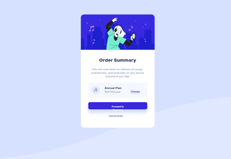
- @Lemirq@UserAhmad2001
Hello vihaan,
Congrats on your solution for the order summary challenge 🥳
Your solution is well-designed and responsive, I couldn't have made it better.
Hope you don't mind, I got a small tip for you:
You should always include a <html lan='en'> tag in your HTML, It may not make a change in modern browsers but some old browser versions might face some issues processing your code without it.
As web developers, we have to make our websites as accessible as possible
- @leubomfim@UserAhmad2001
Hello Leonardo,
Congratulations on completing the countries API challenge 🥳
Your solution is responsive and beautifully designed, I got a tip for you to make it even better.
use the select and option elements in your region list for a more semantic code like this:
<select>
<option value='country value' > Country name </option>
<option value='country value' > Country name </option>
<option value='country value' > Country name </option>
</select>
Hope i was of help, Happy Coding
- @sbinala@UserAhmad2001
Hello sbinnala 👋
I see that you have also completed the rock paper scissors challenge. I noticed that you didn't add the shades to the buttons design, I was also stuck at that part for a long time. 😅😅
If you want to add it to the design, here's how you do it:
- nest the rock_paper_scissors images inside a container
- add below styling to the container:
box-shadow: inset 0 0.3rem 0 2px rgb(64 64 64 / 25%) , 0 0.5rem 0 0px rgb(162 21 47); border: 1.6rem solid #dc3550;Marked as helpful - @asdfjennifer@UserAhmad2001
Hello jennifer I took a quick look at your solution I saw that you have only used some basic types of display like inline or block You shoud use "flex" and "grid" display more often, i use them all the time. doing that makes the design easier and more responsive (looks good on different screen sizes).
plus there are some html mistakes you should solve ex: 1.at the process payment button, you nested a button inside an anchor link doing that complicates the design process, you should either put a link or a button . 2.at the change text you nested a span inside the anchor link that's unneeded. 3. you put some un-semantic tags header for img, and section as a container.
best regards ahmad