
@VanessaAz

y4rb0w
@YavanhaAll comments
- @Yavanha
Hello Vanessa
First of congratulation on completing this challenge you did really good
I reviewed your code and this is what I can see:
- Instead of doing the job by yourself to switch the image from the desktop to the mobile version use the picture element.
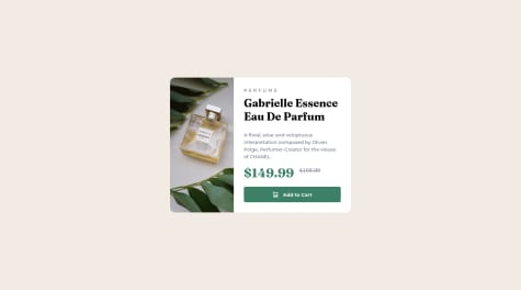
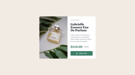
what you did : <img class="main-img desk-img" src="images/image-product-desktop.jpg" alt="perfume image"/> <img class="main-img mob-img" src="images/image-product-mobile.jpg" alt="perfume image"/> What you can do : <picture> <source srcset="images/image-product-mobile.jpg" media="(max-width: 599px)"> <source srcset="images/image-product-desktop.jpg" media="(min-width: 600px)"> <img class="main-img mob-img" src="images/image-product-mobile.jpg" alt="perfume image" /> </picture>- Try to make good use of the semantic html, for example in this challenge the article element would be a good fit:
what you did :
<main>
   ....
</main>

what you can do:

<main class="main-container">
 <section class="product-section">
  <h1>Title</h1>
  <article class="product-container">
      just an example
  </article>
</section>
</main>
Always question yourself if there is not already a meaninfull element that does the job. In other words an element that represents what I want to display better than a div or other meaninless elements.
- On the css side avoid pixels, use rem instead here a tricks to easily use rem by reseting the font-size of your html element to 62.5 % html element 62.5% font-size.
That's it, well done again and you need some in depth understanding, feel free to reply :)
Happy conding
Marked as helpful - @Eyelin@Yavanha
Hello @Eyelin
Very nice job you did there !
I went through your code, here is what I think you can do better :
-
fixed height are a not a good idea, when you really need to fixe the height use min-height instead, to let the element always grow if needed.
-
Try to start with the mobile first approach, you wil often see that it uses lots of default values meaning that it's easier for you to handle. Then add all the complexity of the desktop version in a media querry. In this way you will override way less properties.
-
Make a good use of the html semantics (article, section, aside, h1-6...)
otherwise it's a good project that you built there.
good luck for the next one.
ofc, if you need more in depth understanding feel free to repply :)
Marked as helpful -
- @mauger1998@Yavanha
For the second part with the the Thank you card, you need to inject it dynamically through javascript when tu the "form" is submitted.
I invite you you check out my solution :y4rb0w solution
It's not the best one, but still I think you can find some answers :)
If you need more in depth understading, feel free to reply :)
- @mauger1998@Yavanha
Hello,
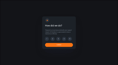
The issue here is that you're declaring the same function five times. So it's the last function that remain that id used. Either use one function to handle the click or change the name of your functions.
I would go with the first way :
something like that:
div class="numbers">
      <div id="click1" class="one stars" onclick="changeColor(event)">1</div>
      <div id="click2" class="two stars" onclick="changeColor(event)">2</div>
      <div id="click3" class="three stars" onclick="changeColor(event)">3</div>
      <div id="click4" class="four stars" onclick="changeColor(event)">4</div>
      <div id="click5" class="five stars" onclick="changeColor(event)">5</div>
    </div>
let currentNumber = undefined; function changeColor(event) { if(currentNumbers) { currentNumber.classLists.remove("clicked"); } event.target.classList.add("clicked"); event.stopPropagation(); currentNumber = event.target; }so here you add the clicked class to the element that triggerd the click (event.target) then you stop the propagation of the event (no other element will catch the click ) and finally you keep a soft copy of the element that is currently clicked to reset it later;
hopefully it helps
Marked as helpful - @ViniciusSordi@Yavanha
Hello
Good job! It's very good.
For the JS part, don't worry, it will come.
I've noticed something though, you are doing a long job to change the image in the carousel.
From what I've seen, you're using a loop to get the right index for the image to display.
Here is a much simpler solution:
for the next image, it will look something like:
let currentImage = 0 // as global var
const images = [
    "images/image-product-1.jpg",
    "images/image-product-2.jpg",
    "images/image-product-3.jpg",
    "images/image-product-4.jpg",
]


const next(eltHtml) {
  currentImage = (currentImage + 1) % images.length ;
  eltHTML = images[currentImage]
}

const prev(eltHtml) {
    if (currentImage === 0) {
        currentImage = images.length ;
    }
    currentImage = (currentImage - 1) % images.length ;
     eltHTML = images[currentImage]
}
It's simple to understand, if you look closely, I simply add 1 or remove 1 and then the % images.length part handles the edge.
currentImage being 0, next will provide (0 + 1 % 4) = 1
currentImage being 3 (last item) next will provide ( 3+ 1 % 4) = 0
there is just a particular case with the prev you need to handle the negative part with this :
    if (currentImage === 0) {
        currentImage = images.length ;
    }
That's it,
Hoppefully it helps a bit (sorry for the english)
Marked as helpful - @ly-math@Yavanha
Hello,
Very nice job you did there.
I just quickcly went throught your code and here few things that I would do :
- avoid working as much as possible with fixed height, use min-height instead.
.container { display: grid; place-items: center; max-width: 50rem; height: 100vh; // min-height: 100vh margin: 1.9rem auto; padding: 0 1rem; }- there is a nice trick for units, is to reset the font size of the html element to 62.5%. This way is easier for you to calculate in rem (10px = 1rem).
- for the image what you can do is setting max-width: 100% and the height to auto to correctly fit the container.
.img img { width: 100%; // max-width: 100% and height : auto; display: inherit; }- always go for a mobile first approach it wil be easier for you to add complexity in the media queries for larger screen.
Hopefully, this is clear enought that you can understand and helps you a little
Marked as helpful - @Jorshuaa@Yavanha
Hello,
first of all congratulations for the challenge.
I looked at your code and it seems to me that you started with the desktop version before the mobile version. When doing so it's hard to maintain your code for example:
Instead:

@media (max-width: 375px) {
.container {
  display: block ;
}

}
.container {
  display : flex ;
}
}

do this:

@media (min-width: 376px) {
    .container {
        display: flex ;
     }
}
The second solution allows you to use the default values of the div ( display: block) and add the complexity in the media query and most importantly avoid rewriting your properties that you have declared.
Also avoid using fixed values for width and height.
Finally, use the right properties for the right job:
transform is not used to center your container.
Hopefully this will help you a little.
Good luck
- @Yavanha@Yavanha
I had an issue with the background image I fixed it