
@ryanthayes

Benjamin B.
@benjaminbilgehanAll comments
- @benjaminbilgehan
I suggest adding antialiased font smoothing to improve the clarity and sharpness of the text.
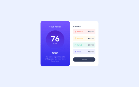
* {
  margin: 0;
  padding: 0;
  font: inherit;

/*  I suggest adding antialiased font smoothing to improve the clarity and sharpness of the text.  */
   -webkit-font-smoothing: antialiased;
    -moz-osx-font-smoothing: grayscale;
}
Additionally, in order to center them when viewed on mobile devices with a width of less than 500px, a margin has been added.
.results-summary { display: flex; flex-direction: column; align-items: center; background-color: var(--clr-white); margin:0 auto; /* Added this to center the content when viewed on mobile devices */ max-width: 375px; }Marked as helpful - @ryanthayes@benjaminbilgehan
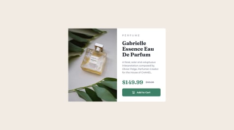
If you proceed to modify the font size of the p.product__category (reducing it) and the p paragraph, you should obtain a perfect match.
<p class="product__category">Perfume</p>and<p>A floral, solar and voluptuous interpretation composed by Olivier Polge, Perfumer-Creator for the House of CHANEL.</p>good job! I am very impressed by the work you have done.
Marked as helpful - @Oluwaseyi-dev@benjaminbilgehan
To center a div using Flexbox, you can use the "display", "justify-content", and "align-items" properties. Here's an example:
<div class="container">
  <div class="box">This box will be centered.</div>
</div>
.container { display: flex; justify-content: center; align-items: center; height: 100vh; } .box { width: 200px; height: 200px; background-color: #ccc; }In this example, we create a container div with the "display" property set to "flex". We also set the "justify-content" and "align-items" properties to "center". This centers the child element (the "box" div) both horizontally and vertically within the container.
The "height: 100vh" property is added to the container to ensure that the container takes up the full height of the viewport. You can adjust the height to fit your needs.
The "box" div has a fixed width and height, and a background color to make it visible. You can replace this with your own content or styling.
I hope this helps! Let me know if you have any more questions.
Marked as helpful - @waldvoid@benjaminbilgehan
Hi! It sounds like you're working on a layout using Flexbox.
Your approach is a good one. Creating a container div with a fixed width and setting the height to 100vh will ensure that the container fills the entire viewport. Then setting the display property of the container to "flex" will allow you to use Flexbox to position the child elements.
To center the child elements, you can set the "justify-content" and "align-items" properties of the container to "center". This will horizontally and vertically center the child elements within the container.
Here's an example code snippet to get you started:
***HTML:
<div class="container">
  <div class="item">Child element 1</div>
  <div class="item">Child element 2</div>
  <div class="item">Child element 3</div>
</div>
***CSS
.container {
  width: 600px;
  height: 100vh;
  display: flex;
  justify-content: center;
  align-items: center;
}

.item {
  width: 200px;
  height: 200px;
}
In this example, the container has a fixed width of 600px and a height of 100vh. The "display" property is set to "flex" and the "justify-content" and "align-items" properties are set to "center". The child elements (with class "item") have a fixed width and height.
I hope this helps you get started! Let me know if you have any more questions.
also beni follow etmeyi unutma, benim icin bir zevkti. -Bilgehan
Marked as helpful - @wd-shahab@benjaminbilgehan
nice job buddy!
here are some tips inside the body add
height:100vh;so it can center the card in the middle of the box. When you use flex you have to give a height of 100vh so flex can center the div element in the middle of the screen along with your code.body { display: flex; justify-content: center; align-items: center; font-family: Outfit; background-color: hsl(212, 45%, 89%); height:100vh; /* I added this line of code here. to make it centered*/ }Marked as helpful - @ecemgo@benjaminbilgehan
Hello,
I added the following CSS code to the "main" element to position it in the center of the screen and ensure that it is responsive on all devices:
main {
  position: absolute;
  top: 50%;
  left: 50%;
  transform: translate(-50%, -50%);
  max-width: 738px;
  /* Set the maximum width of the card */
  width: 100%;
  /* Set the width of the card for smaller screens */
  padding: 20px;
  /* Add some padding to the card; it is up to you */
}
I used absolute positioning to center the "main" element on the monitor, and adjusted the height to 120vh for devices with a minimum width of 38rem. This should ensure that the card is centered and 100% responsive on all devices, regardless of their screen size.
- @rileydevdzn@benjaminbilgehan
Great job!
You may want to consider using CSS to make your text appear brighter. This is just an additional suggestion.
For instance, you can use the following CSS for the "p" element:
mix-blend-mode: normal; opacity: 0.6;
For a perfect pixel solution, you can use Google Chrome extensions like GoFullPage to take a snapshot of the Figma design and apply it to your browser using "Perfect Pixel." This way, you can easily achieve the pixel-perfect approach when viewing your design live on your browser.
Furthermore, I suggest using HSLA for your variables, which allows you to adjust the saturation, brightness, and opacity easily. This is a useful tip for your future development.
I recognise your talent and encourage you to keep up the excellent work!
Marked as helpful - @barbaradamasdev@benjaminbilgehan
hi there,
when i was checking the page on 550px i see that the image is not covering all div. so i added .rightColumn { background-size: cover; }
under @media screen and (min-width: 470px) and (max-width: 1140px)
upi can also add .rightColumn height:40%;
anyway please check the code below this is a really quick fix for you to understand media rule. Overall is a good job but you have to have a good understanding for media rules. https://www.w3schools.com/cssref/css3_pr_mediaquery.php
@media screen and (max-width: 470px) { .data { flex-direction: row; }
.content {
    height: 70%;
}
.rightColumn {
        background-size: cover;
    height:50%

}
}
@media screen and (min-width: 780px) { .data { flex-direction: row; }
.content {
    height: 50%;
    border:1px solid red;
}

  .rightColumn {
        background-size: cover;
        height:100%;
}
}
@media screen and (min-width: 1140px) { .data { flex-direction: row; }
.content {
    height: 40%;
    border:1px solid blue;
}
.rightColumn { background-size: cover; height:100%; } }
pay attention to the .rightColumn class in the media rules for each device screen sizes.
for the backgroudn image please use below
background-image: url('../images/image-header-desktop.jpg');
that works !!
It is kinda late here and these are my humble opinions for you. ;) good luck. also
Marked as helpful - @FloratobyDev@benjaminbilgehan
Hey i have check your github. and it look like you are missing the container dimentions. Have you tried to give the exact width and height values from the figma your output will might be identical ?
.container {
    width: 300px;
    height: 300px;
and for the QR code image give
.image-container { width: 75px; height: 75px; - @earlyronnie@benjaminbilgehan
you should use @media (max-width:640px) for mobile responsive. bigger then 640px just keep the desktop version for any type of screen size. try to inspect with chrome dev tool.
on figma design width and height of the container are given.
@media (max-width:640px) { .container { width: 343px; height: 611px; }
Marked as helpful