Not Found
Not Found
Not Found
Not Found
Not Found
Not Found
Not Found
Not Found
Not Found
Not Found
Not Found
Not Found
Not Found
Not Found
Not Found
Not Found
Not Found
Not Found
Not Found
Not Found

All comments

  • Johnnyā€¢ 470

    @johnnysedh3lllo

    Submitted

    Hey guys, here i am again attempting another Frontend Mentor Challenge and i can't begin to describe how impactful this community has been to my growth. All the comments and suggestions helped me gain a substantial amount of confidence when i was working through the HTML/CSS projects when i first started here and i learned so much from the way other people did things and the broadened my view on things and i just want to say thank you to everyone here for being part of this community, because without you there would be no community and without this community, where would i be?

    so if you're reading this right, i just want you to know i grateful for you being here. and yes this was a thank you speech šŸ˜ but if you do have any comments about my HTML Structuring especially in regards to my choice of Semantic Elements to use, BEM naming, CSS, or JavaScript and you believe there is a better way i could've done things, please leave a comment, suggestion or recommendation (whatsoever), thank you very much.

    Lucas šŸ‘¾ā€¢ 104,580

    @correlucas

    Posted

    Nice work my friend! I'm back!

    0
  • Lucas šŸ‘¾ā€¢ 104,580

    @correlucas

    Posted

    Great project Jessica, keep it up!

    1
  • Abdul Khalidā€¢ 69,140

    @0xabdulkhalid

    Submitted

    šŸ‘¾ Hello, Frontend Mentor Community,

    This is my solution for the Loopstudios Landing Page.

    • Scored 98.6% on Google Pagespeed Insights! šŸ¤©
    • Comes with Custom navbar w/ scroll-in & scroll-out animation šŸ”„
    • Accessible hamburger menu w/ ES6 šŸ”
    • Actually i delayed to post this solution, this was completed about 5 months ago āŖ
    • Minified the css files to improve site performance šŸš€
    • Used Prettier code formatter to ensure unified code format āš™ļø
    • Layout was built responsive via mobile first workflow approach šŸ“²
    • Had a lots of fun while building this challenge ! šŸ¤ 
    • Feel free to leave any feedback and help me to improve my solution šŸ’”

    .

    šŸ‘Øā€šŸ”¬ Follow me in my journey to finish all junior challenges to explore solutions with custom features and tweaks

    Ill be happy to hear any feedback and advice !

    Lucas šŸ‘¾ā€¢ 104,580

    @correlucas

    Posted

    Congrats for the Mentor of the year!

    0
  • Adrianoā€¢ 33,950

    @AdrianoEscarabote

    Submitted

    šŸ‘Øā€šŸ’» Hello everyone!

    I thoroughly enjoyed working on this project and using gitflow for the first time. The organizational structure it offers is compelling, making me feel more confident in developing branches with specific goals. I plan to invest more time in mastering gitflow to enhance my skills.

    As for the project, I'm pleased with the outcome. Despite not being a highly complex app, the experience was rewarding and beneficial. It allowed me to revisit Next.js concepts, contributing significantly to my professional growth.

    Technologies used:

    • Next
    • Typescript
    • TailwindCSS
    • Redux
    • Jest

    If you have any suggestions for code improvements, please feel free to share!

    Thanks! šŸ˜Š

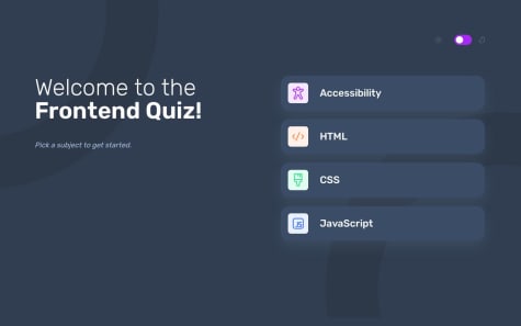
    Frontend quiz app w/ (Next + Tailwind + Typescript) šŸ‘Øā€šŸ’»

    #jest#next#tailwind-css#typescript#redux-toolkit

    2

    Lucas šŸ‘¾ā€¢ 104,580

    @correlucas

    Posted

    Simply the best!

    0
  • @CaioSchwab

    Submitted

    this project was a problem for me in terms of responsibility but I did my best and here is the result.

    I hope you like it and if you have any tips leave them in the comments. šŸ˜

    Age calculator app

    #accessibility

    1

    Lucas šŸ‘¾ā€¢ 104,580

    @correlucas

    Posted

    Brabo

    0
  • Lucas šŸ‘¾ā€¢ 104,580

    @correlucas

    Posted

    I'm here bro! Will be back soon!

    10
  • @MelvinAguilar

    Submitted

    Hi there šŸ‘‹, Iā€™m Melvin and this is my solution for this challenge. šŸš€

    šŸŽ Features:

    šŸ› ļø Built With:

    • React JS. āš›ļø
    • React Hook Form. šŸ“
    • Framer Motion. šŸŽ¬
    • TailwindCSS. šŸŽØ
    • npm - prettier - prettier-plugin-tailwindcss. šŸ“¦

    Any suggestions on how I can improve and reduce unnecessary code are welcome!

    Thank you. šŸ˜ŠāœŒļø

    Fylo dark theme landing page (React JS + Tailwind CSS + Framer Motion)

    #accessibility#framer-motion#lighthouse#react#tailwind-css

    16

    Lucas šŸ‘¾ā€¢ 104,580

    @correlucas

    Posted

    Keep going bro! You gotta won this year. šŸ˜Ž

    1
  • Daniloā€¢ 110

    @daaaan12

    Submitted

    Este cĆ³digo Ć© para uma pĆ”gina da web simples que exibe um componente "Stats Preview Card". A pĆ”gina da web Ć© escrita em HTML e CSS e consiste em um cartĆ£o que exibe algum texto e uma imagem. O arquivo HTML contĆ©m a estrutura necessĆ”ria para a pĆ”gina da web, incluindo os links para a folha de estilo e as imagens. O arquivo CSS contĆ©m todos os estilos para a pĆ”gina da web, incluindo o layout, cores, tipografia e design responsivo.

    O arquivo HTML contĆ©m uma seĆ§Ć£o head que inclui alguns metadados sobre a pĆ”gina da web, como o conjunto de caracteres, viewport e tĆ­tulo. A seĆ§Ć£o body contĆ©m o conteĆŗdo principal da pĆ”gina da web, que Ć© envolvido em um elemento div com o nome de classe card. O elemento card consiste em dois elementos filhos: container-texto e container-img. O elemento container-texto contĆ©m o texto principal do cartĆ£o, incluindo um cabeƧalho, um parĆ”grafo e algumas estatĆ­sticas. O elemento container-img contĆ©m uma imagem que Ć© exibida no lado direito do cartĆ£o.

    O arquivo CSS contĆ©m vĆ”rios estilos para diferentes elementos da pĆ”gina da web, incluindo o cartĆ£o, container-texto, container-img e vĆ”rios elementos de texto. Os estilos definem o layout da pĆ”gina da web, as cores usadas e a tipografia. O arquivo CSS tambĆ©m inclui uma consulta de mĆ­dia que ajusta o layout da pĆ”gina da web para telas menores.

    AlĆ©m dos principais arquivos HTML e CSS, o cĆ³digo tambĆ©m inclui uma importaĆ§Ć£o de fonte que carrega duas Fontes do Google, Inter e Lexend Deca, que sĆ£o usadas para a tipografia da pĆ”gina da web.

    This code is for a simple webpage that displays a "Stats Preview Card" component. The webpage is written in HTML and CSS and consists of a card that displays some text and an image. The HTML file contains the necessary structure for the webpage, including the links to the stylesheet and the images. The CSS file contains all the styles for the webpage, including the layout, colors, typography, and responsive design.

    The HTML file contains a head section that includes some metadata about the webpage, such as the character set, viewport, and the title. The body section contains the main content of the webpage, which is wrapped inside a div element with the class name card. The card element consists of two child elements: container-texto and container-img. The container-texto element contains the main text of the card, including a heading, a paragraph, and some statistics. The container-img element contains an image that is displayed on the right side of the card.

    The CSS file contains several styles for different elements of the webpage, including the card, container-texto, container-img, and various text elements. The styles define the layout of the webpage, the colors used, and the typography. The CSS file also includes a media query that adjusts the layout of the webpage for smaller screens.

    In addition to the main HTML and CSS files, the code also includes a font import that loads two Google Fonts, Inter and Lexend Deca, that are used for the typography of the webpage.

    Lucas šŸ‘¾ā€¢ 104,580

    @correlucas

    Posted

    Boa! Continue no foco irmĆ£o!

    1
  • Adrianoā€¢ 33,950

    @AdrianoEscarabote

    Submitted

    šŸ‘Øā€šŸ’» Hello everyone!

    I am extremely satisfied with the results of my second Vue project! I have gained a wealth of knowledge and believe that completing this project was an invaluable experience. As for Storybook, I plan to further enhance my understanding and invest more time in fully utilizing this tool. In summary, I am thrilled to have successfully completed this project and to have expanded my knowledge of Vue.

    In addition to all the functionality required by the mentor front-end I added:

    • Pre-loading with Vue Spinner
    • Documentation of components using Storybook
    • Map localization with Leaflet

    If you have any suggestions for code improvements, please feel free to share!

    Thanks! šŸ˜Š

    Lucas šŸ‘¾ā€¢ 104,580

    @correlucas

    Posted

    O mais brabo!

    1
  • Lucas šŸ‘¾ā€¢ 104,580

    @correlucas

    Posted

    Hello @Bonker009, nice start, you did a great first challenge, now you need only to fix the alignment, see the tip bellow:

    Try this to align the card to the center, basically the min-height:100vh will make the body have the screen size and make the rest of the content to align to that. A great resource to learn flexbox and manage these kind of alignment is this website, you can access here: FLEXBOX GUIDE - https://css-tricks.com/snippets/css/a-guide-to-flexbox/

    body {
        min-height: 100vh;
        display: flex;
        align-items: center;
        justify-content: center;
        flex-direction: column;
    }
    

    Keep it up =)

    Marked as helpful

    1
  • Camila Bā€¢ 20

    @camsbs

    Submitted

    Putting together that webpage took a bit of time, but it was all worth it. I had so much fun working on it and feel like I learned a lot in the process.

    Lucas šŸ‘¾ā€¢ 104,580

    @correlucas

    Posted

    Oi Camila, tudo bem?

    Tenho algumas dicas pra vocĆŖ:

    1.Vi que vocĆŖ usou em e rem e isso Ć© mto bom, usando essas medidas relativas ao invĆ©s de px se vocĆŖ tiver que escalar o tamanho dos elementos depois ou o usuĆ”rio der zoom na tela, todos itens vĆ£o crescer proporcionalmente, eu sĆ³ te recomendo usar uma medida sĆ³, nesse caso vc pode usar sempre REM. Outra dica Ć© usar um plugin do VSCODE chamado PX TO REM, que converte automaticamente todos elementos escritos em PX para REM, basta selecionar e apertar alt + z. Aqui o link: https://marketplace.visualstudio.com/items?itemName=sainoba.px-to-rem

    2.O seu componente jĆ” estĆ” com o design pronto, um bom exercĆ­cio pra melhorar seu cĆ³digo, seria criar a estrutura mais limpa o possĆ­vel e reduzir seu cĆ³digo ao mĆ”ximo. Por exemplo, vocĆŖ pode segurar todo conteĆŗdo em um bloco sĆ³ usando (<main> ou <div>) nesse caso vamos usar <main> por que Ć© uma tag semantica. Se vocĆŖ notar, nem precisa adicionar nenhum div alĆ©m da principal pra segurar o conteĆŗdo (img, h1 e p). A estrutura ideal e mais limpa possĆ­vel pra esse desafio Ć© essa aqui:

    <body>
    <main>
     <img src="./images/image-qr-code.png" alt="QR Code Frontend Mentor" >
    <h1>Improve your front-end skills by building projects</h1>
    <p>Scan the QR code to visit Frontend Mentor and take your coding skills to the next level</p> </main>
    </body>
    

    Para reduzir o CSS, vocĆŖ pode excluir todas as classes e selecionar todos elementos no CSS com o seletor direto para cada um deles, nesse caso (img, div, main, h1 e p). Faltou tambĆ©m colocar o alt text pra imagem ser reconhecida por leitores de tela.

    2.VocĆŖ definiu o tamanho do card com max-width e isso Ć© bom, pois deixa o container responsive, mas por conta de vc ter colocado o width dentro do html, a imagem ficou com aquele tamanho fixo, o ideal seria vc usar max-width: 100% pra imagem ter o tamanho de 100% do elemento pai e nĆ£o crescer mais do que isso e diminuir juntamente com o resto de acordo com a tela. Lembre-se de usar sempre max-width quando vc quiser que um elemento tenha um tamanho limite e possa diminuir, ou seja, responsivo, use width somente quando vc quiser que ele tenha tamanho fixo.

    img {
        max-width: 100%;
    }
    

    3.Para separar os elementos, vc pode usar sempre padding-bottom ou margin-bottom para separar verticalmente os elementos, desse jeito vc adiciona esse propriedade de cima pra baixo e quando precisar mudar algo basta olhar o elemento de cima. Para criar um espaƧamento de padding uniforme com a imagem vc pode definir um padding pro container de 16px por exemplo pra criar uma borda interna entre todos elementos, desse jeito vc so precisa se preocupar com os paddings verticais.

    Aqui minha soluĆ§Ć£o caso vocĆŖ queira usar como referĆŖncia: https://www.frontendmentor.io/solutions/qr-code-component-vanilla-cs-js-darklight-mode-nS2aOYYsJR

    Espero ter ajudado e continue no foco, vc jĆ” comeƧou muito bem, a maioria das pessoas nĆ£o acertam o design e o seu ficou perfeito, sĆ³ fazer alguns ajustes e reduzir a estrutura do html deixando o codigo mais limpo e vai ficar perfeito. ParabĆ©ns āœŒ

    Marked as helpful

    1
  • Lucas šŸ‘¾ā€¢ 104,580

    @correlucas

    Posted

    Fala Caio, beleza?

    Tenho duas dicas pra vocĆŖ.

    Pra vocĆŖ padronizar todas suas imagens, deixando elas responsivas e croppando quando a tela comeƧar a diminuir vocĆŖ pode usar esse padrĆ£o aqui:

    img, picture {
    display: block;
    max-width: 100%;
    object-fit: cover; // isso aqui vai fazer a imagem comeƧar a cortar dentro do bloco pra adaptar ao tamanho da tela.
    }
    

    Pra vocĆŖ espaƧar os elementos com consistĆŖncia, te recomendo a separar todos usando padding-bottom desse jeito quando vocĆŖ for mudar os espaƧamentos vc vai saber que Ć© sempre o padding abaixo de cada elemento a ser mudado, pq se vc usar padding top/bottom fica mais dificil mudar depois. Use o GAP sĆ³ quando o espaƧo entre todos elementos filhos dentro do flex parent forem iguais.

    NĆ£o use width: 600px no main pq vc limita o tamanho do bloco todo a 600px e ele nĆ£o vai diminuir, use max-width: 600px que isso significa que ele vai ter 600px no mĆ”ximo mas pode diminuir dependendo da tela, entende?

    Se vc quiser dar uma olhada na minha solucao pra vc entender todas essas coisas que falei anteriormente, jĆ” aplicadas aqui tĆ” o link: https://www.frontendmentor.io/solutions/product-preview-card-vanilla-css-and-custom-hover-state-on-hero-dVGWpOTgWS

    Continue no foco ai! P cima

    Marked as helpful

    0
  • Lucas šŸ‘¾ā€¢ 104,580

    @correlucas

    Submitted

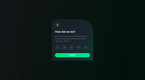
    šŸ‘¾ Hello, Frontend Mentor community. This is my solution for the Interactive Rating Component

    This challenge was quite hard, was my first real Javascript challenge ever. I took a lots of time trying to find out how to make the rating buttons connect to the submit button to display the output popup showing the selected number. I had look several tutorial videos to understand the JS structure so I follow a video from this channel in youtube TsbSankara - JavaScript - Interactive Rating Component. Once I did the basic challenge I created a modal screen to request the user to select a button before submit, for the second step I had to ask a friend @AdrianoEscarabote for help and after a lots of his patience and some explanations I get it.

    šŸŽØ I added some custom features:

    • šŸ‘Øā€šŸ”¬ Custom UI Design + Animations.
    • šŸ§šā€ā™€ļø Custom Modal Popup

    If you can add something or give me some tip. I'll be happy to hear any feedback and advice!

    Lucas šŸ‘¾ā€¢ 104,580

    @correlucas

    Posted

    @elaineleung live site updated and safe šŸ˜‚

    3
  • Lucas šŸ‘¾ā€¢ 104,580

    @correlucas

    Posted

    @fuzail13 Please remove this solution or update it with a code that's not a copy of my entire repository for this project.

    7
  • Lucas šŸ‘¾ā€¢ 104,580

    @correlucas

    Posted

    Brother, por favor remova esse projeto. VocĆŖ basicamente copiou o meu repositĆ³rio do Github, atĆ© as classes estĆ£o iguais. Isso Ć© contra as regras do FEM. Se vocĆŖ tivese usado um pedaƧo ou outro do meu cĆ³digo era ok, mas nĆ£o o cĆ³digo inteiro.

    Fazendo isso vocĆŖ nĆ£o ganha nada, porque vc basicamente nĆ£o fez o desafio e nĆ£o aprendeu nada, ou seja, Ć© inĆŗtil. VocĆŖ sĆ³ vai melhorar seu CSS e HTML se vc botar a cabeƧa pra pensar e resolver o desafio por si sĆ³ (esse no caso Ć© bem fĆ”cil).

    Tenta refazĆŖ-lo sozinho e vc vai ver o tanto que vc vai melhorar. AbraƧo.

    Aqui estĆ£o as regras do FEM caso vc nĆ£o saiba que Ć© errado copiar o projeto inteiro dos outros: https://medium.com/frontend-mentor/frontend-mentor-community-guidelines-44303cc38aa6

    1
  • @chukwudobe-Micah

    Submitted

    This Is my first intermediate challenge here and I'm very happy about it, achieved good results and the best part is that it felt a little simple! Please please please, check out the dark mode. Just switch your phone to darkmode to see the dark if you can (they're no buttons to switch to dark mode yet, I don't know js yet.šŸ˜…). I'm always open to reviews, advices and feedback, let me know what I did wrong. I'll appreciate šŸ¤²šŸ¾ Also, I had problems changing that white colour of the radio button I ended up leaving it like that, anyone has an idea of how I can do it?

    Lucas šŸ‘¾ā€¢ 104,580

    @correlucas

    Posted

    Hey @chukwudobe-Micah, congratulations on finishing this solution!

    I liked a lots the animations you've add once the page loads, really cool! Two things you can improve here its to add the second svg element in the right size (the rounded block as the purple one in the left) thats is missing and align the arrow button in the input text field. See the changes below:

    Make the arrow icon align to its circle element using flexbox

    button {
        display: flex;
        align-items: center;
        justify-content: center;
    }
    

    I was curious about the dark-mode so I've clicked everywhere in the page trying to activate it. This feature is already on? I want to see it =)

    Nice challenge and a lots of improvements since your first solution I saw here. Keep it up and continue to upload amazing content.

    Have a nice day!

    Marked as helpful

    1
  • @debriks

    Submitted

    Hi Guys! Hereā€™s my solution to this challenge. My JS is still very poor and even something as easy as a dropdown navigation is still hard for me. So I checked around on Frontend for a JS Code I could almost understand and I found the one of Adarsh (@adram3l3ch) that seemed to be quite efficient. I really want to learn new concepts in JS and I was very interested by the fact that he was using the ā€˜scrollHeightā€™ JS property to solve this challenge.

    For the CSS part, itā€™s getting better I think :)

    As usual, any feedback is more than welcome āœØ

    Lucas šŸ‘¾ā€¢ 104,580

    @correlucas

    Posted

    Nice solution Deborah! Perfect design and super responsive. I liked a lots how smooth is the interaction/transition with the dropdown menu.

    I think the dropdown box shadow is a bit too hard (maybe its the exact file from the Figma file, I don't know). Something I like to do for this kind of shadows to have it smoother is to decrease the opacity, increase the blur and use a color tone near blue instead of black. Like this value: box-shadow: 0 0 5rem 0px rgb(24 50 67 / 16%);. This is only a small detail, you don't really need to change it šŸ¤“

    Keep it up =)

    Marked as helpful

    1
  • Daniel Dekanyā€¢ 890

    @dknyd

    Submitted

    Hi Guys,

    Another of my earliest projects, but here I would have an actual important question:

    In the example picture, the image on the right has some kind of purple filter on it which I have no idea how to recreate, if you have any suggestion, please let me know. :)

    Trezmor

    Lucas šŸ‘¾ā€¢ 104,580

    @correlucas

    Posted

    šŸ‘¾Hello @trezmor, congratulations on your solution!

    Answering your question:

    To reach theoverlay effect on the *card image as the Figma Design its better you use mix-blend-mode.

    All you need is the div under the image with this background-color: hsl(277, 64%, 61%); and apply mix-blend-mode: multiply and opacity: 80% on the img or picture selector to activate the overlay blending the image with the color of the div. See the code bellow:

    img {
    mix-blend-mode: multiply;
    opacity:  83%;
    }
    

    Here's a good article explaining these effects with mix-blend-mode: https://developer.mozilla.org/en-US/docs/Web/CSS/mix-blend-mode

    āœŒļø I hope this helps you and happy coding!

    Marked as helpful

    0
  • Lucas šŸ‘¾ā€¢ 104,580

    @correlucas

    Posted

    Another amazing solution Deborah. I've done this challenge too months ago and I remember that is really tricky the phone section overlaping the text box, you did great here, congrats!

    One advice since you're increasing the difficult of your challenges, two challenges that are really cool and will challenge your css skills are Suite Landing Page and Art Gallery Website. I spent a lots of time on these and I can say you that you'll learn a lots there.

    Keep it up. Great content. =)

    Marked as helpful

    3
  • Adrianoā€¢ 33,950

    @AdrianoEscarabote

    Submitted

    šŸ‘Øā€šŸ’» Hello everyone. This is my solution for the Calculator app.

    This was a challenging project, I found some very different bugs. I managed to practice a lot of new things and I tried to make my code as clean and readable as possible!

    If you find something I can improve let me know!

    I added:

    • šŸ‘Øā€šŸ’» the user will be able to perform all operations through the keyboard!
    • šŸŽØ Store theme preference via localStorage!

    Feel free to leave comments on how I can improve my code.

    Thanks! šŸ˜Š

    Lucas šŸ‘¾ā€¢ 104,580

    @correlucas

    Posted

    Great solution as always! =)

    2
  • Lucas šŸ‘¾ā€¢ 104,580

    @correlucas

    Posted

    Congrats Sheldrick this is a great solution and the design you've applied is perfect I can see you paid a lot of attention to details. Keep it up, great one.

    0
  • Lucas šŸ‘¾ā€¢ 104,580

    @correlucas

    Posted

    šŸ‘¾Hello @markskwid, Congratulations on completing this challenge!

    Great code and great solution! Iā€™ve few suggestions for you that you can consider adding to your code:

    • The icon doesnā€™t have an important role when you think about semantics and the html structure. So you can add aria-hidden=ā€œtrueā€ to avoid it being found and read in the accessibility mode/screen readers. These are only decorative items.
    • To make your CSS code easier to work you can create a single class to manage the content that is mostly the same for the 3 cards (paddings, colors, margins and etc) and another class to manage the characteristics that are different (colors and icon), this way you'll have more control over then and if you need to change something you modify only one class.

    āœŒļø I hope this helps you and happy coding!

    1
  • Lucas šŸ‘¾ā€¢ 104,580

    @correlucas

    Posted

    šŸ‘¾Hello @Bingolast, congratulations on your new solution!

    Iā€™ve some suggestions for you:

    Something you can do is to improve your html markup using meaningful tags and replacing the divs. In this case, for example the main block/div that takes all the content can be wrapped with <main> or section, if you think about = the cards you can replace the <div> thatā€™s wrapping each card with <article> you can wrap the paragraph with the quote with the tag <blockquote> this way you'll wrap each block of element with the best tag in this situation. Note that <div> is only a block element without meaning, prefer to use it for small blocks of content inside bigger blocks wrapped with some better markup.

    This article from Freecodecamp explains the main HTML semantic TAGS: https://www.freecodecamp.org/news/semantic-html5-elements/

    šŸ‘Øā€šŸ’»Here's my solution for this challenge if you wants to see how I build it: https://www.frontendmentor.io/solutions/testimonials-grid-section-vanilla-css-focus-effect-custom-design-e5bIzU3vZN

    āœŒļø I hope this helps you and happy coding!

    0
  • Lucas šŸ‘¾ā€¢ 104,580

    @correlucas

    Posted

    šŸ‘¾Hello @Shokhjakhon01, congratulations on your new solution!

    Iā€™ve some suggestions for you:

    Your html is working but you can improve it using meaningful tags and replace the divs, for example the main div that takes all the content can be wrapped with <main> or section, about the cards you can replace the <div> that wraps each card with <article> you can wrap the paragraph with the quote with the tag <blockquote> this way you'll wrap each block of element with the best tag in this situation. Note that <div> is only a block element without meaning, prefer to use it for small blocks of content.

    This article from Freecodecamp explains the main HTML semantic TAGS: https://www.freecodecamp.org/news/semantic-html5-elements/

    šŸ‘Øā€šŸ’»Here's my solution for this challenge if you wants to see how I build it: https://www.frontendmentor.io/solutions/testimonials-grid-section-vanilla-css-focus-effect-custom-design-e5bIzU3vZN

    āœŒļø I hope this helps you and happy coding!

    Marked as helpful

    0