Skip to content
  • Unlock Pro
  • Log in with GitHub
Profile
OverviewSolutions
7
Comments
2147
Grace
@grace-snow

All comments

  • P
    Schindler Dumagat•340
    @schindlerdumagat
    Submitted 2 months ago
    What are you most proud of, and what would you do differently next time?

    This is the first time I have used vanilla JavaScript to add interactivity on my simple HTML and CSS project. Additionally, I was able to practice my HTML markup planning and expand my knowledge on both HTML elements and CSS properties.

    What challenges did you encounter, and how did you overcome them?

    One challenge that I have encountered is how I can properly use JavaScript to add interactivity to my project. In my first approach, I added some styling directly in my JavaScript code when the button is clicked. I have found out that it was a bad approach when I read some of the feedbacks received by others in this challenge. Afterwards, I have refactored my JavaScript code, remove all the direct styling logic and just use .add, .remove and .toggle methods instead to apply the class names with styles to elements instead. My readings about JavaScript also helped me with the challenge.

    What specific areas of your project would you like help with?

    Here are the things that I need help with:

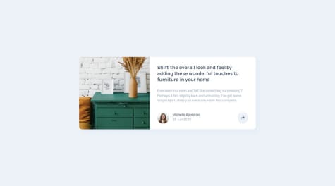
    • This project only comes with one card image as an asset that I can import. How do I make sure that my implementation on the image matches the design using only one image? Is it possible to match the design with one one image or do I need to export the images from figma that I need for each screen sizes? Currently, I haven't spent much time trying to align the image according to the design, I just have it displayed as a cover just like this piece of code:
    &__img {
        max-height: 12.5rem;
        width: 100%;
        object-fit: cover;
        border-top-right-radius: inherit;
        border-top-left-radius: inherit;
    }
    
    @media screen and (min-width: 48rem) {
        display: grid;
        grid-template-columns: 1fr 2fr;
    
        &__img {
            max-height: 100%;
            height: 100%;
            border-radius: 0;
            border-top-left-radius: inherit;
            border-bottom-left-radius: inherit;
        }
    
    • What do you think about my html structure for the profile section below? Have I made my HTML structure and the CSS styling for the section correct? I have used a dialog for the share popup and a button to toggle the popup. I have used some absolute and relative positioning to position those elements correctly.

    • What do you think about my JavaScript code? This is my first time using vanilla JavaScript so I really wanted to get some feedback out of it.

    Responsive Article Preview Component with Sass and JavaScript logic

    #bem#sass/scss#accessibility
    1
    Grace•32,130
    @grace-snow
    Posted about 2 months ago

    Hey, I saw your message asking for accessibility feedback on Discord.

    Here are a few issues I noticed:

    • There is no accessible name on the dialog. That's a WCAG failure under Name, Role, Value. If you ever add modals, try to remember to label them.
    • You should ideally implement the close on Esc behaviour on the non-modal dialog. See MDN docs: "A non-modal dialog does not dismiss via the Esc key by default, and depending on what the non-modal dialog represents, it may not be desired for this behavior." I think in this case it's desirable though.
    • The link labels shouldn't really say "Go to..." wherever. Ideally, they should be labelled as "[Name of platform] - Share". e.g. "Facebook - share". This makes it clearer where the link goes / its purpose, and will help people using voice control to activate these links.
    Marked as helpful
  • P
    Ishmael Sunday•250
    @okayishmael
    Submitted 4 months ago
    What are you most proud of, and what would you do differently next time?

    Incremental growth in problem solving skill

    What challenges did you encounter, and how did you overcome them?

    See Readme page here

    What specific areas of your project would you like help with?

    My project isn't broken in the live page but it is in the screenshot generator.

    Responsive Interactive Article Preview Component | HTML, CSS, JS

    2
    Grace•32,130
    @grace-snow
    Posted 4 months ago

    I recommend writing media queries in rem or em and not pixels. It's not essential but it can be helpful to ensure a site switches views at a good point when people have different font-size settings in their browser or device.

    Change your default text size in your browser settings and then resize the viewport a few times to see that this breaks for some people at the moment. This breakage is because of the pixel based media queries and possibly a few other places where pixel units have been used.

    If in doubt, rem is often a good unit to use anywhere you're setting media queries, max-width or setting sizes/spacings that you'd want to adjust along with someone's chosen text size.

    Marked as helpful
  • ortiz-antonio•270
    @ortiz-antonio
    Submitted 4 months ago
    What are you most proud of, and what would you do differently next time?

    I plan to break down my components further to improve reusability. I'm not entirely comfortable maintaining separate components for the success dialog and confirmation page rather than reusing a single component.

    What challenges did you encounter, and how did you overcome them?

    In this project, I'm experimenting with UnoCSS and design tokens while implementing a progressive enhancement approach for form validation. This involves starting with HTML5 native validation and extending functionality with JavaScript

    What specific areas of your project would you like help with?

    Any recommendations or suggestions would be greatly appreciated.

    Newsletter signup form: Eleventy webc, UnoCSS

    #accessibility#eleventy#cube-css
    2
    Grace•32,130
    @grace-snow
    Posted 4 months ago

    Hey, there are a few problems in this (mostly accessibility).

    • Remember fields that collect personal data must include the autocomplete attribute with an appropriate value.
    • The error is currently announced to screen readers all the time, even when not present. This is because you are not dynamically populating the text inside the linked error element. It should be empty by default and only have text inside when the error is shown visibly. OR, you can place the inside an extra inner element (e.g. span) that's set to display: none and unhide it when the error is shown visibly.
    • Personally I find it a poor experience for the input to be styled as if it has an error as soon as it is focused. Really validation shouldn't run until an onblur event occurs or even better an attempted submission.
    • After submission, it is not the email that I entered that's being shown on the thank you screen. That's a critical bug.
    • Nothing in the dialog is announced to screen readers. This content should either be within an aria-live OR focus should move to the dialog heading. Personally, I'm not sure I'dconsider this a dialog at all, as it is changing all screen content, not a modal dialog overlaying the screen.
    • On dismiss of the thank you screen, focus should move back to the start of the initial screen and the form be reset to its original state.
    Marked as helpful
  • Slideur•180
    @Slideur
    Submitted 7 months ago
    What are you most proud of, and what would you do differently next time?

    I managed to use JavaScript to make the FAQ work. But next time, I'd like to create a function to activate it and make the code shorter.

    What challenges did you encounter, and how did you overcome them?

    Create a JavaScript program to run the FAQ. I had to do some research to find a solution. The one I did the first time didn't work

    What specific areas of your project would you like help with?

    I'd like to improve my JavaScript skills. I'm having a lot of trouble writing programmes at the moment.

    Astro JavaScript Responsive

    #astro
    2
    Grace•32,130
    @grace-snow
    Posted 4 months ago

    I know you made changes but maybe my explanations weren't clear enough as some of this still doesn't look as expected (yet). It doesn't look like you've followed the pattern here https://www.w3.org/WAI/ARIA/apg/patterns/accordion/.

    For example:

    • aria-selected isn't the right one for this interface.
    • images should be decorative
    • a cursor has been added to everything that's implying everything is interactive, when only a few bits are.

    As a general rule, try to avoid setting inline styles with javaScript. Styling should be a CSS concern. Change the aria, and optionally a class using JSm then use that as the style hook.

    I wrote a blog about this same pattern that encourages people to use the aria-expanded value as the CSS selector to control visibility of everything else https://fedmentor.dev/posts/disclosure-ui/. You may find it helpful instead or in addition to the ARIA link I shared.

  • P
    M Rafay•140
    @the-Exalter
    Submitted 5 months ago

    Responsive Meet Landing Page using CSS Grid

    2
    Grace•32,130
    @grace-snow
    Posted 5 months ago

    Here's some feedback from things I notice

    • You need to learn how and when to write alt text on images. Craig Abbot has a great blog post about this if you look it up. For example "Logo" is not the name of this site, doesn't communicate the same as the logo.
    • are you sure about the difference between buttons and links? I wouldnt expect buttons for all of these.
    • this design shows only a header and main landmark. All content should be within landmarks, and there is no footer visible in this design.
    • there's no form, so that's not a submit button type.
    • capitalise text with css, don't do it in html.
    • try to avoid using the br elememt for line breaks. It would be better if the heading had a max width eg in ch units or rem.
    • if the numbers are being treated as meaningful they need to both be treated like that. If they are decorative they should be hidden. Be consistent with their treatment.
    • it's better for performance to link fonts in the html head instead of css imports.
    • get into the habit of including a full modern css reset at the start of the styles in every project you do. Look up Andy Bell's modern css reset.
    • use rem for max widths not px. Then layouts will scale correctly for all users including those who have a different text size setting in their browser or device.
    • try not to remove borders from buttons. That makes them hard to see in high contrast mode. Keep the border but make it transparent in colour or the same colour as the background.
    • use fr units for the grid. It's rare you'll want percentages.
    • the images are horribly distorted in that grid when I view on mobile. Make sure this doesn't happen. It may be you need object-fit on the images. It's also better as a general rule that grids are created as scaffolding and the images (or any other content) are placed inside the grid areas instead of being the grid areas. This will make sizing easier too.
    • you should be styling mobile first. I also think you're setting media queries in the wrong place. This should only need one media query. Read this article I wrote and see if it helps you: https://fedmentor.dev/posts/responsive-meaning/
    • try to avoid making css selectors complex unless you really need to. Try to use single class selectors as much as possible. This will lead to styles that are much easier to manage/maintain.
    • Note you are currently forcing all users to download all images because you're using background images and a single img element in that hero. It won't make a huge difference, but using the picture element would be slightly better for performance.
    • also consider how class names can be clearer / more usable. For example it would be common to have a .btn class that sets all button styles. Then if you have a button that's the same in all ways except colour, you have a .btn-secondary class that changes the colours. That alternative button can have both classes.
    Marked as helpful
  • AzumaCodes•90
    @AzumaCodes
    Submitted 5 months ago

    FAQ Accordion

    2
    Grace•32,130
    @grace-snow
    Posted 5 months ago

    Im afraid you need to rewrite this as already mentioned in other feedback. Try and use it with your keyboard for example and you'll see this is inaccessible.

    If you want to use JS, follow the aria authoring practices guide accordion pattern or my tutorial on building accessible disclosures https://fedmentor.dev/posts/disclosure-ui/.

    If you want to do a html-css only version, use the details and summary elements.

    Marked as helpful
  • Asnawi Yahya•40
    @tucill
    Submitted 5 months ago
    What are you most proud of, and what would you do differently next time?

    I am proud to be able to continue learning and developing myself

    I want to be more disciplined in managing my time so I can achieve many things

    What challenges did you encounter, and how did you overcome them?

    I have difficulty maintaining motivation when learning new skills.

    I set small, realistic goals, track progress, and seek out a supportive community. This helps me stay focused and motivated.

    What specific areas of your project would you like help with?
    1. Cross-Browser Compatibility
    2. UI Design
    3. Testing and Debugging

    Social links profile

    1
    Grace•32,130
    @grace-snow
    Posted 5 months ago

    Well done on this! I only see a couple of problems.

    1. The content an become badly cut off / overlapping for some users because you've limited the body height yo 100svh. Never do that. Use min-height instead so it is allowed to be taller than the viewport.

    2. Your attribution link is unreadable. Make sure all text content, in all states (including focus and hover on links) meets a minimum contrast ratio of 4.5:1 against its background.

  • P
    Josh C•110
    @joshcesana
    Submitted 5 months ago
    What specific areas of your project would you like help with?

    Should I be hardcoding the widths?

    Responsive product preview card

    #astro#tailwind-css
    4
    Grace•32,130
    @grace-snow
    Posted 5 months ago

    Well done on this solution, it looks pretty good! Only a few notes from me:

    • this is hitting all sides of my screen at the moment. Give the body or main a little padding in px so that can't happen.
    • Give this article a label as already explained in response to another comment. You can use aria-labelledby in this instance refencing the unique ID of the heading (product name) or use aria-label.
    • As already said in a separate comment, this should have a lower importance heading level like h2 instead of h1. I've written a post about headings in html that you may find beneficial: https://fedmentor.dev/posts/heading-order/
    • try to never have text in divs or spans alone. Pop those prices in a paragraph instead of div.
    • the icon inside the button must have an empty alt. This is important to understand when an image is decorative. Currently the img alt is changing the accessible name of the button (in a bad way!)
    • The product description should provide the same meaning as the image does, it mustn't just repeat the name of the product that's already in the text. Look up Craig Abbot's blog post about how and when to write alt text on images.
    Marked as helpful
  • Emmanuel Abiodun•10
    @Emax-commits
    Submitted 5 months ago
    What are you most proud of, and what would you do differently next time?

    I learnt how to make use of the object-fit attributes in css to scale an object to fill it's parent element, which i found difficult to achieve initially.

    What challenges did you encounter, and how did you overcome them?

    How to make an image fit well in its parent element, while maintaining its aspect ration.

    A Responsive QR code component which include both desktop and mobile

    2
    Grace•32,130
    @grace-snow
    Posted 5 months ago

    This has a lot of the common mistakes beginners make on these challenges. I’ll list them out and make sure you refactor it before moving on to any more.

    • all content should be within landmarks. The component needs to sit within a main and the attribution should be a footer.
    • this card has a heading. Use h2 not paragraph. I've written a post about html headings here: https://fedmentor.dev/posts/heading-order/
    • keep the html as simple as possible. This doesn't need a div inside the component or one wrapping the img.
    • learn how and when to write alt text on images. Craig Abbot has a great blog about this if you look it up. In this case the image is really important content so needs alt that says what the image is (QR code) and where it goes (to FrontendMentor.io).
    • when you import fonts from Google you need to include all of the provided code. There are two preconnect links missing.
    • get into the habit of including a full modern css reset at the start of the styles in every project you do. Look up Andy Bell's modern css reset.
    • Never limit the height of elements that contain text, including the body. Content is being cut off on some screen sizes because you have limited the height of the body to 100vh. Use min-height instead so the body is allowed to extend beyond the viewport height.
    • similarly, the component must not have a height. Think about how it would break if an author wrote a different amount of content, or a user changed the font size or family. This doesn't need any height or min-height. Let the browser do it's job and decide what height is needed based on the content inside.
    • the component shouldnt have a width either. Give it a max-width instead so it can grow up to a set limit but shrink narrower when necessary too. This max-width should be in rem so that it scales nicely for all users including those who have a different text size setting in their browser or device. Note the current solution is too narrow so ensure this rem max-width is a little bigger than what you have now.
    • don't use flex unnecessariky. It isn't needed on the component or image wrapper.
    • the image shouldn't have a width or height. All it needs for sizing is what's already included in the modern css reset I mentioned (max-width 100% and display block). You can give it an aspect ratio of 1 in this for a small performance boost (or use the width and height attributes in html so the browser knows its ratio). The reason this helps performance is because the browser will save space for the image as it loads in.
    • stick to single class css selectors as much as possible. Don't increase css specificity unless you really need to. That can lead to styles that are a nightmare to manage on larger projects.
  • Raymond023•290
    @Raymond023
    Submitted 5 months ago
    What are you most proud of, and what would you do differently next time?

    Using animation for the hidden side navigation.

    What challenges did you encounter, and how did you overcome them?

    Making a side nav bar and making it display differently on bigger screens

    What specific areas of your project would you like help with?

    Thorough improvement in app accessibility

    Responsive News Homepage

    #accessibility
    1
    Grace•32,130
    @grace-snow
    Posted 5 months ago

    Here's what I noticed...

    • All the content after the header should be inside main. That news section is not "complimentary", it is core page content, so it shouldn't be an aside.
    • The heading structure isn't right in this. It's saying "The bright future..." is the page title, then there is a section called "New" and then there are meaningless headings of "01", "02" and "03". This doesn't make any sense at all. Think through the meaning of the page. This is definitely a design that needs some visually-hidden headings to give it structure. For example, h1 - Tech News; h2 - Featured post; h3 - The bright future...; h2 - New; h3 - Hydroden vs...; The article titles should all be headings with links inside as they are headings for the paragraphs underneath them about the article. I've written a post recently about headings which may be beneficial: https://fedmentor.dev/posts/heading-order/
    • I can see you've given aria-labels to the various parts of the page but I don't think this is that beneficial in this design. Headings would be much more useful.
    • Th bottom section of popular posts looks like a numbered list in the design so that's what I'd expect in HTML.
    • Use the picture element for responsive images, not hiding and showing multiple img elements. Doing what you are doing now is terrible for performance, forcing users to download all images no matter what device they are using.
    • Is the first image alt a meaningful description? Should that be decorative? If it was to have a description it would be something like "abstract image of colourful wooden puzzle blocks in a complex arrangement".
    • The logo must be in the html.
    • The home logo link must have an accessible name. e.g. "World News - Homepage".
    • A button to toggle the navigation should ideally be the first element inside the nav element. This way when someone using assistive technology uses a shortcut to jump to the nav, they reach the right control.
    • I would label the open nav button with the word "menu" or "navigation" at the start so they are intuitive for voice control users. If someone said "click navigation" it should open that nav list, but currently they would have to say "click open" or "click open navigation" for it to work.
    • Usually overlays are done with a pseudo element on the body. As a general rule always try to avoid adding empty elements in HTML.
    • Personally I would treat this mobile navigation design as a dialog: i.e. I'd use the HTML dialog element for it and give the open nav button an aria-haspopup="dialog". This would handle all focus and accessibility for you. What you have at the moment is failing because it's trying to follow a disclosure pattern but hasn't used aria-expanded on the open nav button and doesn't close the nav automatically when focus or clicks/taps happen outside of it.
    • The nav breaks badly if users have a larger text size and view on small screens / on landscape because it's not possible to scroll within it. Make sure there is an overflow-y auto on that nav dialog. You could disable scrolling on the body on mobile when the nav is open if you like.
    • Never use pixels for line height. When users change their text size everything becomes very hard to read because text is all squiched up. Line height is usually unitless like 1.5.
    Marked as helpful
  • Raymond023•290
    @Raymond023
    Submitted 6 months ago
    What specific areas of your project would you like help with?

    Please look at the code and give me feedback on better accessibility techniques

    Interactive rating form

    #jquery
    1
    Grace•32,130
    @grace-snow
    Posted 5 months ago

    I'm afraid this needs rewriting. You must learn to use appropriate html, especially on forms.

    This is a form with a fieldset of radios. That fieldset must have a legend (or it can be a role radiogroup and use aria-labelledby or aria-label instead of legend).

    There should be no, click listeners anywhere in this. Just a form submit listener.

    Once that's all changed you'll need to change the styles and js. The good news is the javascript should be much shorter. It only needs a line to grab the rating value from the form and a line to hide/show the panels.

    Make sure the thank you is wrapped in an aria-live region or focus moves to it.

    And make sure decorative images have empty alt attributes.

    Marked as helpful
  • Creative-mindset21•30
    @Creative-mindset21
    Submitted 5 months ago

    Social Links Profile

    2
    Grace•32,130
    @grace-snow
    Posted 5 months ago

    I'm afraid this is overflowing my screen at the sides and making some common beginner errors we see a lot. Hopefully these points help.

    • Keep the html as simple as possible. Remember this is only a single card component that should sit within the main landmark on the page. That means it's a div or section with img, heading, paragraph, blockquote and list of links inside it. You don't need all the extra divs and sections. All that does is make the styling harder and bring no benefit.
    • the heading is the main heading for the page so I'd expect It to be a h1 in this instance.
    • the image description isn't bringing any benefit so I'd recommend treating it as decorative instead with an empty alt attribute.
    • get into the habit of including a full modern css reset at the start of the styles in every project you do. Look up Andy Bell's modern css reset.
    • the card mustn't have an explicit width. Give it a single max width in rem instead so that it can go narrower when it needs to (like on smaller phones).
    • make sure you're choosing units intentionally. I doubt you really want to use rem for the card padding (unless it was part of a clamp or min function with other units). Using rem means that padding will increase along with the user's text size setting in their browser or device, so you can end up with a very narrow area for the content. Using px for this padding would mean it is a fixed value so that wouldn't happen.
    • similarly, give the body or main a little padding on all sides so the card can't touch the screen edges.
    • there is no need for any media query in this. You can delete that.
    • make sure you're styling the links as you should be and not the list items. It might be fine but looked like the links may be small and not have the hover styles when I read the code.

    Overall the css just looks complicated for what is here. But I think that's because of the extra complexity added in the html. Once the markup is simpler the styles should become simpler too.

  • Leonardo•40
    @LeonCelestino
    Submitted 5 months ago
    What are you most proud of, and what would you do differently next time?

    I've been away from web development for approximately 8 months, which for sure made me lose a lot of my skills (I didn't have much though). I thought of trying this challenge because of its simplicity.

    I don't have much things on what to be proud besides the time that I was able to accomplish this task, which took me less than 1 hour.

    What challenges did you encounter, and how did you overcome them?

    I'm having lots of troubles with building accessible and responsive websites, I'm not sure on how accessible it is, but I was able to overcome the responsive part with the max() function for widths.

    What specific areas of your project would you like help with?

    Accessibility, naming, responsivity and code organization.

    Restarting at frontend with Social Links Profile Media

    1
    Grace•32,130
    @grace-snow
    Posted 5 months ago

    Here's some feedback I hope it helps. This looks good overall but there are issues that need improving.

    • it's nit good for performance to load 3 css files like this. Just have it in one.
    • it's better for performance to link fonts in the html head instead of css imports.
    • remove the section from the html. You don't need it and it brings no benefit.
    • this is a component that should probably sit within the main landmark, not be the main landmark. It's fine to use a div for the card inside main.
    • the image and intro really don't need wrapping in extra divs. It's not a problem, but You're just creating more work for yourself doing that.
    • the name is a heading, but the location is not. That's just a paragraph. Think about it, is "London" a heading for all the content underneath it? No. So it's not a heading. I wrote a post all about headings on FEDmentor.dev if you want to look it up.
    • personally I would have the quote in a blockquote element and place the list of links in a list not div.
    • the css looks fine overall, just a bit overcomplicated. You're using more selectors than necessary I think but some of that comes down to the overly complex html as already said. Once that is simplified the css can be simplified.
  • Victor•1,400
    @VictorKevz
    Submitted 5 months ago
    What are you most proud of, and what would you do differently next time?

    I am excited to have managed to tackle this challenge and implement all functionality, regardless of the difficulties I may have encountered during development.

    I underestimated the complexity of this challenge, as I initially implemented the desktop version, which was surprisingly easy as I used conditional rendering instead of routing. The tablet and mobile versions were the tricky ones and posed a challenge that forced me to use react-router for routing, as I noticed conditional rendering would have created an unreadable code.

    The current version is working as expected, and I look forward to hearing any feedback you might have on how I can improve my solution or anything I may have missed.

    I am very happy with my decision to get the Premium subscription because not only do the designs provide a clear guide on potential components you could build for reusability, but you also get a prototype that makes everything clear regarding how the software you are building is intended to behave.

    Happy coding

    Responsive | Interactive | Animated Notes App

    #framer-motion#react#material-ui
    2
    Grace•32,130
    @grace-snow
    Posted 5 months ago

    This looks great but I spy some accessibility errors looking at the form code like

    • unnecessary fieldsets with repeating legends/labels
    • unlabelled inputs
    • missing aria-live
    • aria-desciribedby referencing Ids that aren't rendered and visible yet. (They should reference the elements wrapping the conditionally rendered error text, not the element that's being conditionally rendered)
    • unnecessary aria-labels

    I'd also want to test what happens for users with a larger text size setting in their browser or device as there are a lot of px units being used in this...

    It seems like theres theming in there too but that's been done in quite a complex way. I'd expect to just update some custom properties at the root to update theme colours throughout. Worth exploring as a refinement.

    Marked as helpful
  • Achief Victor•80
    @Achief21
    Submitted 5 months ago
    What are you most proud of, and what would you do differently next time?

    i am most proud of using scss in my project it really helped to make my code code more efficient.

    What challenges did you encounter, and how did you overcome them?

    It would propably be the javascript to navigate throught the site with different background images.

    What specific areas of your project would you like help with?

    none.

    Responsive space tourism site.

    #sass/scss
    1
    Grace•32,130
    @grace-snow
    Posted 5 months ago

    It seems like you may have jumped ahead a bit in this challenge to be honest. There are quite a lot of foundations missing in the html like

    • invalid html with links and buttons inside each other
    • duplicate navs
    • clicks on non interactive elements
    • controls missing accessible names and state incormation
    • misordered headings.
    • alt text issues
    • missing tabs

    I recommend you do some more of the simpler challenges or follow the learning paths so you can build up all this knowledge and understanding progressively. Then you'll be better placed to refactor this one.

    Marked as helpful
  • P
    M Rafay•140
    @the-Exalter
    Submitted 5 months ago

    Responsive Four Card Feature Section using CSS Grid

    2
    Grace•32,130
    @grace-snow
    Posted 5 months ago

    I can spot some problems in this:

    • the alt needs to be empty on the icons because they are decorative
    • the mobile styles should really be the default styles. There's no need to define row heights in any screen size. It's actually very important to NOT limit the heights like that.
    • the grid only needs a max width in rem not a width.
    • the media query should be defined in rem or em not px so that the layout adjusts nicely for all users including those who have a different text size setting in their browser or device.
    Marked as helpful
  • Creative-mindset21•30
    @Creative-mindset21
    Submitted 5 months ago

    QR Code Component

    2
    Grace•32,130
    @grace-snow
    Posted 5 months ago

    This has quite a few beginner mistakes we see a lot. So rather than me repeat all the feedback for you here, I'm going to point you to some I've left on another's solution as a lot of that will be applicable: https://www.frontendmentor.io/solutions/qr-code-component-using-html-css-flex-eICDfhakO_

    You actually need less feedback than on that one, but hopefully it will still be a good learning resource for you.

    The really important things for you to grasp are why we include a modern CSS reset, why we don't set widths on elements, and how and when to write good alt text on images

    One extra point for you: Read about CSS specificity and why it's a really bad idea to nest CSS selectors and make them more specific than you need to.

  • Abdulsamad•160
    @Abdul-ade
    Submitted 5 months ago
    What specific areas of your project would you like help with?

    I hope my project preview stops jumping higher than it should. I do not really know how to make it appear inline with the solution.

    Product preview Card Website

    2
    Grace•32,130
    @grace-snow
    Posted 5 months ago

    I can see quite a lot of issues in this challenge but before going through them, particularly styling ones, I'll leave you with this post which explains what is needed in html: https://fedmentor.dev/posts/html-plan-product-preview/

    Make the changes to html first then I'll give feedback on styles.


    Also worth you reading: https://fedmentor.dev/posts/rem-html-font-size-hack/

    Marked as helpful
Frontend Mentor logo

Stay up to datewith new challenges, featured solutions, selected articles, and our latest news

Frontend Mentor

  • Unlock Pro
  • Contact us
  • FAQs
  • Become a partner

Explore

  • Learning paths
  • Challenges
  • Solutions
  • Articles

Community

  • Discord
  • Guidelines

For companies

  • Hire developers
  • Train developers
© Frontend Mentor 2019 - 2025
  • Terms
  • Cookie Policy
  • Privacy Policy
  • License

Frontend Mentor for Teams

Frontend Mentor for Teams helps companies and schools onboard and train developers through project-based learning. Our industry-standard projects give developers hands-on experience tackling real coding problems, helping them master their craft.

If you work in a company or are a student in a coding school, feel free to share Frontend Mentor for Teams with your manager or instructor, as they may use it to help with your coding education.

Learn more

Oops! 😬

You need to be logged in before you can do that.

Log in with GitHub

Oops! 😬

You need to be logged in before you can do that.

Log in with GitHub

Oops! 😬

You need to be logged in before you can do that.

Log in with GitHub

Oops! 😬

You need to be logged in before you can do that.

Log in with GitHub

Oops! 😬

You need to be logged in before you can do that.

Log in with GitHub

Oops! 😬

You need to be logged in before you can do that.

Log in with GitHub

Oops! 😬

You need to be logged in before you can do that.

Log in with GitHub

Oops! 😬

You need to be logged in before you can do that.

Log in with GitHub

Oops! 😬

You need to be logged in before you can do that.

Log in with GitHub

Oops! 😬

You need to be logged in before you can do that.

Log in with GitHub

Oops! 😬

You need to be logged in before you can do that.

Log in with GitHub

Oops! 😬

You need to be logged in before you can do that.

Log in with GitHub

Oops! 😬

You need to be logged in before you can do that.

Log in with GitHub

Oops! 😬

You need to be logged in before you can do that.

Log in with GitHub

Oops! 😬

You need to be logged in before you can do that.

Log in with GitHub

Oops! 😬

You need to be logged in before you can do that.

Log in with GitHub

Oops! 😬

You need to be logged in before you can do that.

Log in with GitHub

Oops! 😬

You need to be logged in before you can do that.

Log in with GitHub

Oops! 😬

You need to be logged in before you can do that.

Log in with GitHub

Oops! 😬

You need to be logged in before you can do that.

Log in with GitHub

Oops! 😬

You need to be logged in before you can do that.

Log in with GitHub

Oops! 😬

You need to be logged in before you can do that.

Log in with GitHub

Oops! 😬

You need to be logged in before you can do that.

Log in with GitHub

Oops! 😬

You need to be logged in before you can do that.

Log in with GitHub

Oops! 😬

You need to be logged in before you can do that.

Log in with GitHub

Oops! 😬

You need to be logged in before you can do that.

Log in with GitHub

Oops! 😬

You need to be logged in before you can do that.

Log in with GitHub

Oops! 😬

You need to be logged in before you can do that.

Log in with GitHub

Oops! 😬

You need to be logged in before you can do that.

Log in with GitHub

Oops! 😬

You need to be logged in before you can do that.

Log in with GitHub

Oops! 😬

You need to be logged in before you can do that.

Log in with GitHub

Oops! 😬

You need to be logged in before you can do that.

Log in with GitHub

Oops! 😬

You need to be logged in before you can do that.

Log in with GitHub

Oops! 😬

You need to be logged in before you can do that.

Log in with GitHub

Oops! 😬

You need to be logged in before you can do that.

Log in with GitHub

Oops! 😬

You need to be logged in before you can do that.

Log in with GitHub

Oops! 😬

You need to be logged in before you can do that.

Log in with GitHub

Oops! 😬

You need to be logged in before you can do that.

Log in with GitHub

Oops! 😬

You need to be logged in before you can do that.

Log in with GitHub

Oops! 😬

You need to be logged in before you can do that.

Log in with GitHub

Oops! 😬

You need to be logged in before you can do that.

Log in with GitHub

Oops! 😬

You need to be logged in before you can do that.

Log in with GitHub

Oops! 😬

You need to be logged in before you can do that.

Log in with GitHub

Oops! 😬

You need to be logged in before you can do that.

Log in with GitHub

Oops! 😬

You need to be logged in before you can do that.

Log in with GitHub

Oops! 😬

You need to be logged in before you can do that.

Log in with GitHub

Oops! 😬

You need to be logged in before you can do that.

Log in with GitHub

Oops! 😬

You need to be logged in before you can do that.

Log in with GitHub

Oops! 😬

You need to be logged in before you can do that.

Log in with GitHub

Oops! 😬

You need to be logged in before you can do that.

Log in with GitHub

Oops! 😬

You need to be logged in before you can do that.

Log in with GitHub

Oops! 😬

You need to be logged in before you can do that.

Log in with GitHub

Oops! 😬

You need to be logged in before you can do that.

Log in with GitHub

Oops! 😬

You need to be logged in before you can do that.

Log in with GitHub

Oops! 😬

You need to be logged in before you can do that.

Log in with GitHub