P
@perezjprz19

Hi Jessica! I think you did a great job with this challenge and you have very valid questions.
Here are my personal opinion regarding your questions?
sr-only class to it to hide it visually but available to screen-readers and web crawlers for SEO. I've seen some web apps that used that approach. The BBC web page is one that I've seen recently. Side note: Please don't use display: none; to hide elements that you want screen readers to detect.<p> and button will not touch.Thanks for reading my thoughts on your questions. Happy coding!
Hi Elvinas! I think you just encountered a collapsing margin issue on your web app. There's a blank space above and below your <body> element caused by margin-top from .logo and margin-bottom from <main>.
Quick fix for this issue is to use display: flow-root on your <body>.
If you want to read more about collapsing margin, this is going to be a good read from CSS-Tricks.
Happy coding!
Hi Faerk! How was your experience with BEM? I hope you had fun with this challenge.
The approach that I've thought of in this project is to use 2 primary containers. 1 at the top which contains 2 inner-containers side by side (I believe you had that as .header and .rate). You can use display: flex; to control the position of those two inner-containers. Then the 2nd primary container would be .comment at the bottom. Oh! and you can use the <footer> as a 3rd primary container if you opt to include the .attribution.
If ever you refactor your code and it works well for you, let me know. Cheers!
Hi Rogelio!
Nicely done! Nothing much to say but keep doing what you're doing.
Happy coding!
Hi Guillermo! How was your first challenge with FEM? I hope you had fun.
On using px for sizes, I normally just use rem for most sizes even padding and margin. Some uses em on the latter two but then again that comes down to your preference. I might use px for very small details like outline or borders.
Regarding accessibility issues, you may want to look into using container tags like <header> <main> <section> <article> and <footer>. MDN is always a good source.
Hi Shikhar! I hope you had fun with your first challenge on Frontend Mentor.
Regarding your questions:
How to lighten colors using HSL? The easiest would be to adjust the third value which pertains to lightness. HSL stands for Hue, Saturation and Lightness. There are other ways like filter: brightness() but the first option would be enough in most cases.
Font-size change when on mobile? In almost all cases, yes, unless specified by the design. You don't want to have large fonts on mobile where the user has to scroll more just to read a few lines of text. You did great in adjusting the font.
Regarding accessibility issues, you may want to look into using container tags like <header> <main> <section> <article> and <footer>. MDN is always a good source.
You did great! Putting what you learn from tutorials to solving frontend mentor challenges makes you improve your personal technique and approach on web development.
If you want to shorten your code a bit, you could use shorthands for margin and padding, or using flex-box to center items. Shorthands are great but you don't have to use them everytime. There are cases that shorthands could make your code too complicated and hard to debug. What those cases are... you'll learn on the journey to improving more. :)
Happy coding and happy new year!
Congratiolations in completing this challenge, Nate!
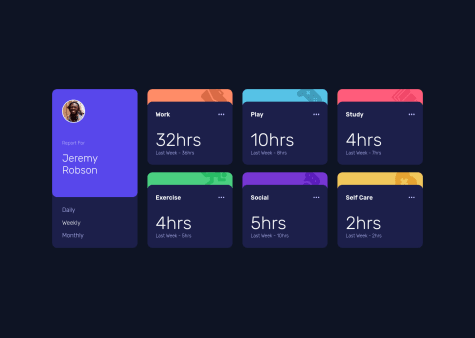
max-width. For simplicity, you can uniform it to min-width.$mobile: 500px, $mid-screen: 800px, ...).#title_card from the grid so it will only contain the 6 info cards. That should allow you to easily create transitions when the screen resizes (eg. 1 column on $mobile, 2 columns on $mid-screen, 3 columns on $full-screen)grid-gap by shortening it to gapI hope I was able to give you good feedbacks that could help improve this challenge. Happy coding and happy new year!
Hi Jaycee, regarding your border-radius problem, you can set it on the parent container. That would be on .class__container if I read your code correctly. In the event you encounter problems with contents going beyond your container, you may want to look into overflow: hidden;. Hope I was able to help you with that problem.
Happy coding!
Some additional container tags to suppliment @Aakash suggestions are <header>, <section> (section will require a heading tag inside: h1-h6) and <footer>.
Happy coding!
Hi Ronel, Congratiolations in completing this project! The site looks great on mobile and desktop view. Your code looks clean and understandable.
Just a few feedback on HTML that wasn't covered by the report generated by FEM regarding <small>. Although this is allowed, it goes against the principle of separation of concern. So even if it's allowed, taking SOC into consideration is always a good thing to bear in mind. Click here to read more about the <small> tag.
Regarding landmarks, you may want to use <header> to contain the logo and <main> for the rest. That should fix some of the landmark concerns on your page.
For JS, perhaps, create a return where if output is NaN, it won't change textContent or something similar.
Great work and Happy coding!
Awesome work! This is actually something that I am trying to re-create since it would be fun to make a real-world working app with this design.
Your code looks really neat and very nice to read; and learn from. If there's one thing I can think of improving is the time-frame inside UserProfile.js. It would be great if the <li> can change state so it is highlighted (color: #ffffff perhaps) when clicked for better user experience. Love the work still and will be reading through more of your code!
For extra validation on name, password, etc.:
You may want to dive in on Regular Expressions.
Here's an example on evaluating a name value if it has an invalid character
const notAWordCharacterRE = /[^a-z]/ig;
let nameValue = "name$";
let invalidNameFormat = notAWordCharacterRE.test(nameValue); // result: true for "name$"
if (invalidNameFormat) {
// code here for adding error message
};
Additional reading: Regular expression syntax cheatsheet
Regular Expressions or RegExp can be a bit overwhelming sometimes but it's going to be a great help moving forward.
Always be hungry for more learning and happy coding!
Great work! Your app was responsive and passes all the project's requirement!
On the question on custom error message, you can create a nested "if statement" or a "switch statement" that adds a more specific error message. I made a slightly similar error handling process on my project that focuses on the email. There are 2 possible error message on the email field; either empty or invalid email. Here's a link to the web app I made.
I hope that was of help. Happy coding!
The desktop view looks great and you used css grid very well. The mobile version is missing, though. In some cases (and some may argue - most of the time), building the mobile first can be better because it's easier to imagine how the elements will transition to its positon on desktop view.
Great work using flexbox on this project and a bit of grid work too.
There seems to a bit of problem with the hover state of the icons cause it's not activating unless you hover on it directly instead of relying on it's parent element.
You can remove the .icon:hover{ } style and inject the code block below, instead.
.border:hover .icon {
  color: hsl(300, 69%, 71%) ;
}
What happens there is that the .icon color will change if the user hovers on its parent element (.border). You can even move it up to the parent element above it, the <a> tag. a > .border > .icon.
I hope I was able to explain that clearly and it helps you moving forward.
EDIT: Markdown fixed.
Click on the SPLITTER logo at your own risk. :)