
@101Amine

romila
@romila2003All comments
- @romila2003
Hi @101Amine,
Congratulations for 🎉 for completing another challenge, the CSS grid looks great and is responsive. It is also great that you used the right semantic. There are some suggestions I want to give:
- I'm not sure if you know or did it by purpose but on top of the people's names, there are numbers e.g. '11111'
- In mobile screen (375px), the Jonathon, Klara and Jeanette cards look quite squashed however Daniel's and Patrick's cards look great. I would suggest making it so that there is just 1 column in mobile screen.
CSS Grid can be hard/difficult in the beginning however once you get used to it, it will come more naturally so it is great that you now understand the concept. Overall, great work and wish you the best for your future projects 👍.
Marked as helpful - @VittorioDL@romila2003
Hi Vittorio,
Congratulations for 🎉 for completing your first challenge, the API looks great and is functional. It is great that you used the right semantic and the
flexproperty to center the card. There are some suggestions I want to give:- Your button is missing the
typeattribute - Since you already gave your
.containeramax-width, you do not need to have a media query. Instead, you can give yourbodyamarginproperty to prevent the card touching the side of the screen e.g.margin: 0 10px; - Even though your API is functional on normal browsers, it won't work on Firefox without the clear cache e.g.
fetch(URL, {cache: 'no-cache'})
Overall, great work and wish you the best for your future projects 👍.
- Your button is missing the
- @mosElsh@romila2003
Hi Em-ee24,
Congratulations 🎉 for completing this challenge, your Time tracking dashboard component looks great, and it is great that you used CSS Grid to arrange the cards. I have some suggestions I want to address:
- Even though, it is great that you wrapped the main content within the
maintag, you should also wrap the footer within thefootertag e.g.<footer class="attribution"></footer> - Your images are missing the
altattribute which is essential for all images - I noticed that all of your CSS and JavaScript is within your HTML file. I would recommend you using separate files as it will be easier for organisation.
- In desktop mode, you can use the
flexproperty to center the card e.g.
body {
  display: flex;
  align-items: center;
  justify-content: center;
  min-height: 100vh;
  flex-direction: column;
}
Overall, great work and wish you the best for your future projects so keep coding 👍.
Marked as helpful - Even though, it is great that you wrapped the main content within the
- @BrunoAmadei@romila2003
Hi Bruno,
Congratulations 🎉 for completing this challenge, your API component looks great, and it is great that you used
flexto center the card. I have some suggestions I want to address:- It is best practice to wrap the main content within the
maintag which would ensure that your content is wrapped within the correct landmarks e.g.<main class="container"></main> - Since you have a
max-widthon your card, there is no need to use a media query. - Even though your API is functional on normal browsers, it won't work on Firefox without the clear cache e.g.
fetch(URL, {cache: 'no-cache'})
Overall, great work and wish you the best for your future projects 👍.
- It is best practice to wrap the main content within the
- @cutch14@romila2003
Hi David,
Congratulations 🎉 for completing this challenge, your FAQ component looks great, and it is great that you used flex to center the card. There are some issues/suggestions I want to address:
- It is best practice to wrap the main content within the
maintag which would ensure that your content is wrapped within the correct landmarks e.g.<main class="container"></main> - To fix the
backgroundissue, you can change the value ofheightto100vhso that it covers everything. Also, it is not good to give thebodytag, a fixedwidthproperty such as365pxor1440pxas this will affect the inner content as well. - I noticed that you took a desktop-first approach however I would strongly encourage you to use the mobile-first approach as it will help with responsiveness and rearranging/changing elements within your body. Also, it is best practice to do so.
- In the
sectiontag, you need to use at least 1 header (any betweenh2toh6) therefore, you should not nest yourimgtags within this semantic. You could use thepicturetag instead. - Regarding the functionality of your JS, it works however when you click on the same arrow again after it has already been clicked, the Q and A won't close.
Overall, great work and project and wish you the best for your future projects so keep coding 👍.
- It is best practice to wrap the main content within the
- @lalit-aditya@romila2003
Hi Lalit,
Welcome to the frontend mentor community and congratulations for 🎉 for completing your first challenge, the card looks great. I found some issues I want to address:
- It is best practice to wrap the main content within the
maintag which would ensure that your content is wrapped within the correct landmarks e.g.<main class="container"></main> - You are missing the
titletag within yourheadtag e.g.<title>QR code component</title> - Your
imgtag is missing thealttag. - Rather than using the
margin-topproperty to center the card, you can useflexproperty instead e.g.
body {
  display: flex;
  align-items: center;
  justify-content: center;
  min-height: 100vh;
}
Overall, great attempt and wish you the best for your future projects so keep coding 👍.
- It is best practice to wrap the main content within the
- @DaliborStolarski@romila2003
Hi Dalibor,
Congratulations 🎉 for completing this challenge, your Grid component looks great, and it is great that it is responsive. There are some issues/suggestions I would like to address:
- Even though it is great that you wrapped the footer with the right semantic, you should also wrap the main content within the
maintag e.g.<main class="container"></main> - When adjusting the screen size from mobile to desktop, I would suggest removing the
paddingproperty on the body and writepadding: unset;as this will cause the box to look very squashed. If you want to center the card in desktop, then I would suggest using theflexproperty instead e.g.
body {
  display: flex;
  align-items: center;
  justify-content: center;
  min-height: 100vh;
  flex-direction: column;
}
Your box-shadow looks quite strong therefore I would encourage you to change the value to something like this e.g.
box-shadow: 10px 10px 10px rgba(0, 0, 0, 10%);. Also, I would encourage you to use a differentbackground-coloras one of the cards is white therefore, it would kind of blend it to the background.Overall, great work and wish you the best for your future projects so keep coding 👍.
Marked as helpful - Even though it is great that you wrapped the footer with the right semantic, you should also wrap the main content within the
- @mazinger086What are you most proud of, and what would you do differently next time?
Well I did this challenge several years ago before they update Front end mentor web page to include the roadmaps, so i'ts quite difficult to describe how was it, for me I remembered that was fun and easy but web development changed a lot since those days..
What challenges did you encounter, and how did you overcome them?A piece of cake...
@romila2003Hi @mazinger086,
Welcome to the frontend mentor community and congratulations for 🎉 for completing your first challenge, the card looks great. There are some issues/suggestions I want to address:
- It is best practice to wrap the main content within the
maintag which would ensure that your content is wrapped within the correct landmarks e.g.<main class="container"></main> - You should also wrap the footer within the
footertag e.g.<footer class="attribution"></footer> - Rather than using margins to center the card, you can use the
heightproperty to allow theflexto work. e.g.min-height: 100vh; - Since this challenge does not require making any responsive changes, you can remove the margins.
Overall, great attempt and wish you the best for your future projects so keep coding 👍.
- It is best practice to wrap the main content within the
- @codewithmide@romila2003
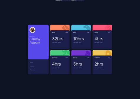
Hi Olumide,
Congratulations 🎉 for completing this challenge, your Time tracking dashboard looks great and is functional. Also, it is great that you used the right semantic for your code. It is great that you were able to do this from scratch without a tutorial. I have some suggestions I want to address:
It is best practice to wrap the footer within the
footertag e.g.<footer class="attribution"></footer>JS: Regarding your JS, you could use the
querySelectorAll()attribute by giving all of the hours, the same class and all of the last week hours, the same class, where you could insert the class into this attribute e.g.const numbers = document.querySelectorAll(".numbers"); const hours = document.querySelectorAll(".hours");From there, you can use a
forloop that will go through each box and insert the data in the right order e.g.const dailyBtn = = document.getElementById("daily"); dailyBtn.addEventListener("click", () => { for(let i = 0; i < numbers.length; i++) { numbers[i].innerHTML = data[i].timeframes.daily.current + "hrs"; hours[i].innerHTML = data[i].timeframes.daily.previous + "hrs"; }; });If you do not know what a
forloop is, I can give a brief explanation. Aforloop contains 3 things, the initial value, the end value and the steps from the beginning to the end. Initially, the value ofiis set to 0 and the final value ofiwill be less than the length of our.numberswhich is 6 in our case as there is only 6 boxes. For reference, incrementing numbers is when numbers go up by one and it keeps adding its previous number e.g. 0 + 1 = 1, 1 + 1 = 2, 2 + 1 = 3. In this case,istarts with 0 and will keep adding 1 to its previous self until it reaches the length of.numberswhich is 6. We includeiinto ournumbrs,hoursanddataso that the JSON data loops through the hours and last week hours, in our HTML and CSS.Sorry, if this sounds confusing and long however once you get the gist of it, it will be easier to consume. Also, it will be easier when dealing with large data and forms since you can just loop through the inputs.
Overall, great work and wish you the best for your future projects so keep coding 👍.
Marked as helpful - @NN-NT-TN@romila2003
Hi Tien,
Congratulations for 🎉 for completing another challenge, the Chart component looks great, and I like that you used Chart.js, I used it too. There are some issues/suggestions want to address:
- Rather than using the
marginproperties to center the card, you can use theflexproperty instead e.g.
body { display: flex; align-items: center; justify-content: center; min-height: 100vh; }- You can give the border-radius to each corner of the bars through using this code
borderSkipped: false, - When a user hovers over the bars, the color of the bars should give it a lighter opacity which can be done through using the
hoverBackgroundColorproperty. This can be placed under thebackgroundColorproperty.
Overall, great work and wish you the best for your future projects so keep coding 👍.
Marked as helpful - Rather than using the
- @vikkyava@romila2003
Hi vikkyava,
Welcome to the frontend mentor community and congratulations for 🎉 for completing your first challenge, the product preview card looks good, and it is great that you used the
flexproperty to center the card. There are some issues/suggestions I want to address:- I would highly recommend you following a mobile-first approach in future projects as it will be easier for responsiveness and changing/rearranging elements within your body. Also, it is best practice to do so. Therefore, rather than using
max-widthwithin your media query, you can use themin-widthinstead. Also, the value given to themax-widthin your code is quite small so I would suggest changing it to a bigger value such asmax-width: 800pxhowever when doing so, I noticed that there is a blue background. - In desktop mode, the size of the card is quite large, where it causes the user to scroll to see the whole card.
- It is best practice to wrap the main content within the
maintag which would ensure that your content is wrapped within the correct landmarks e.g.<main class="container"></main>
Overall, great attempt and wish you the best for your future projects so keep coding 👍.
Marked as helpful - I would highly recommend you following a mobile-first approach in future projects as it will be easier for responsiveness and changing/rearranging elements within your body. Also, it is best practice to do so. Therefore, rather than using
- @OlehLy@romila2003
Hi Oleh,
Welcome to the frontend mentor community and congratulations for 🎉 for completing your first challenge, the card looks good, and it is great that you used the
flexproperty to center the card. However, I found some issues I want to address:- It is best practice to wrap the main content within the
maintag which would ensure that your content is wrapped within the correct landmarks e.g.<main class="container"></main> - To give your code a cleaner look through less code, you can do something like this:
<main class="container">
   <img src="image-qr-code.png" alt="qr-code">
   <h1>Improve your front-end skills by building projects</h1>
   <p>Scan the QR code to visit Frontend Mentor and take you coding skills to the next level</p>
</main>
Overall, great work and wish you the best for your future projects so keep coding 👍.
Marked as helpful - It is best practice to wrap the main content within the
- @fawzab@romila2003
Hi Taiwo,
Welcome to the frontend mentor community and congratulations for 🎉 for completing your first challenge, the card looks great. There are some issues/suggestions I want to address:
- It is best practice to wrap the main content within the
maintag which would ensure that your content is wrapped within the correct landmarks e.g.<main class="container"></main> - Instead of using the
backgroundproperty, you can use thebackground-colorproperty used in thesectiontag onto the body. - I would highly suggest not to use too many margins and to center the card, you can use the
flexproperty instead e.g.
body {
  display: flex;
  align-items: center;
  justify-content: center;
  min-height: 100vh;
}
Also, you used a lot of tags which can be reduced significantly to look something like this:
<main class="container">
   <img src="image-qr-code.png" alt="qr-code">
   <div class="text-content">
      <h1>Improve your front-end skills by building projects</h1>
      <p>Scan the QR code to visit Frontend Mentor and take you coding skills to the next level</p>
   </div>
</main>
Since this project does not require making any responsive changes, you do not need to use media queries, instead you can use the
max-widthproperty instead e.g..container { max-width: 350px; width: 100%; } body { margin: 0 10px; }I included the
marginproperty on the body so that the card does not touch the side of the screen.Overall, great attempt and wish you the best for your future projects so keep coding 👍.
Marked as helpful - It is best practice to wrap the main content within the
- @raihannoorhasan@romila2003
Hi Raihan,
Congratulations 🎉 for completing this challenge, the card component looks great and it is great that you used the
flexproperty to center the card. There are some issues/suggestions I want to address:- Even though it is great that you used the
maintag to wrap the main content, you should also wrap the footer within thefootertag and nest it within the body but outside the main tag. - I would suggest you wrap your image within the
picturetag as thearticletag requires a heading (any header betweenh2toh6). - When using headers, it should be reduced by 1 however you used the
h2tag and then used theh5tag. An approach you could take, is use theh1tag for the title and then theh2tag for the 'Annual Plan' but change the font-size to be much smaller. - Your buttons are missing the
typeattribute
Overall, great work and wish you the best for your future projects so keep coding 👍.
Marked as helpful - Even though it is great that you used the
- @Alcandris@romila2003
Hi Alcandris,
Congratulations 🎉 for completing this challenge, the CSS Grid component looks great and is responsive. There are some issues/suggestions I want to address:
- It is best practice to wrap the main content within the
maintag which would ensure that your content is wrapped within the correct landmarks e.g.<main class="container"></main> - You should also wrap the footer within the
footertag e.g.<footer class="attribution"></footer> - The buttons have a hover effect that is shown in the design provided with the starter-pack. Also, the buttons are missing the
typeattribute.
Overall, great work and wish you the best for your future projects so keep coding 👍.
Marked as helpful - It is best practice to wrap the main content within the
- @SatellitePeace@romila2003
Hi Nneoma,
Congratulations 🎉 for completing this challenge, the FAQ component looks great and is responsive. Also, it is great that you used the correct semantic for the main content and took a mobile-first approach since this is best practice. There are some issues/suggestions I want to address:
- You should also wrap the footer within the
footertag e.g.<footer class="attribution2></footer> - I would not recommend using the
sectiontag for the image, instead you should use thepicturetag as this is semantically correct. - Since you used the
articletag to wrap the Q and A, you need to use at least 1 heading (any betweenh2toh6). In your case, you can use the header for the question and theptag for the answer. - Regarding your question with the background, you just have to remove the colors that you repeated like this:
body {
   background: linear-gradient(hsl(273, 75%, 66% , hsl(240, 73%, 65%) );
}
Overall, great work and wish you the best for your future projects so keep coding 👍.
Marked as helpful - You should also wrap the footer within the
- @MohamedHossamCode@romila2003
Hi Mohamed,
To answer your question, I would strongly suggest taking a mobile-first approach instead of a desktop-first approach as it will be easier for responsiveness and it is also best practice to do so. Therefore, rather than using
max-widthwithin the media query, you can use themin-widthand make responsive changes after a certain width.Also, it is best practice to wrap the main content within the
maintag which would ensure that your content is wrapped within the correct landmarks e.g.<main class="container"></main> - @BLADEHEDA@romila2003
Hi @BLADEHEDA,
Congratulations for 🎉 for completing this challenge, the Article preview component looks good and it is great that you used the right semantic. There are some issues/suggestions I want to address:
- I noticed that you took a desktop-first approach however I would strongly suggest you follow a mobile-first approach instead as it is easier for responsiveness, and it is also best practice to do so.
- The
font-familycan be found within the style-guide that is given to you when you download the starter pack. - Instead of using
position: absolute;to center the card, you can use theflexproperty instead e.g.
body {
  display: flex;
  align-items: center;
  justify-content: center;
  min-height: 100vh;
  flex-direction: column;
}
To make the share-icon functional, you can use the
togglefeature within JS. The toggle feature is like an on/off switch that will show the icon when click and then close the icon when clicked again.Overall, great attempt and wish you the best for your future projects so keep coding 👍.