


pabarcag• 210
@pabarcag
Submitted
This is one of the most complex challenges when starting with css and grid. Any feedback is welcome.
Looking to hire developers?
@zeerobit
@pabarcag
Submitted
This is one of the most complex challenges when starting with css and grid. Any feedback is welcome.
@zeerobit
Posted
Well done completing your first grid challenge. I got a few pointers:
alt and that's bad for accessibility.Happy coding !!!
@ritik48
Submitted
This project made me learn Grid Layout more thoroughly. Though it was little difficult for me to understand the grid's different properties still I am really glad that I took this project and completed it.
@zeerobit
Posted
well done on completing this challenge, however i have a few remarks:
figure, figcaption and blockquote which are more suitable semantics for this challenge. Basically each card should be wrapped with the figure tag instead of div, the photo along with the name and title should be wrapped in figcaption and the paragraphs in blockquote. display: grid;
grid-template-columns: repeat(4, 1fr);
column-gap: 1.2rem;
grid-template-areas:
"card1 card1 card2 card5"
"card3 card4 card4 card5 ";
}
hope this helps, happy coding
@Jorgus1710
Submitted
A fun project that really made me explore in depth what exactly pseudo classes are (::before & ::after), as well it gave insight on how to use position: relative and absolute. I'm not going to lie, achieving the hover state on the main image was far more difficult than I had initially anticipated. It took me 2 days of trial & error, as well as learning to finally achieve the desired result.
Question(s):
When hovering over the main image, you can see the translucent cyan overlay goes a bit beyond the lower border of the actual image or the image wrapper. Its not by much, and certainly I can get away with this result as is - but I'd love to have insight as to why this is happening.
For the hover states on the main image I used position absolute & relative to center the "eye" SVG icon to its parent wrapper. As well for the cyan overlay which is translucent, I used an empty div in the parent container of the main image, to which I then applied a ::before pseudoclass. If anyone has an alternative or ideally more simplified method of achieving these hover affects please let me know.
@zeerobit
Posted
Great job completing this challenge.
1- in regards to your first question you can fix that by adding display: block; on the .main-img class. You should use max-width and not width on images, so it should be max-width: 100%;
2- Another way you can center the icon-view is to remove the pseudo element completely, add the icon-view image inside of the .overlay div then use position absolute to move it on top of the .img-wrapper. use flexbox to center the icon-view . Remove the properties you have under .hover-img and simply add display: block; max-width: 100%;
3- The images are supposed to be interactive thus you should wrap them in anchor tags.
4- no need to add alt description for the 2 images since they're decorative images, add aria-hidden:"true" to hide them from assistive technology
5- Use rem instead of px since it's not scalable
6- The creator section could be wrapped in figure and figcaption for better semantics
7- the .attribution should be wrapped in footer
Hope these help, if you have questions feel free to ask. Happy coding !!!
Marked as helpful
@marthaeason
Submitted
Any advice is appreciated, especially with my flex-box as it is one of my first experiments learning this!
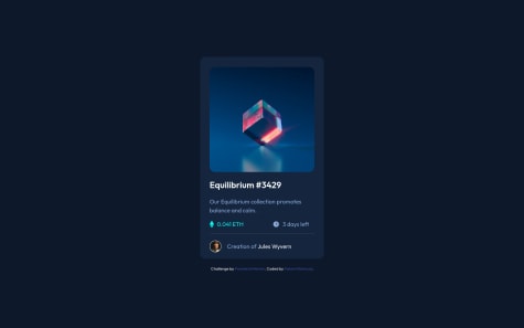
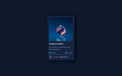
I can't figure out how to get the NFT Card image to change its state for :hover. - any tips on accomplishing this? I tried overlaying the aqua background color with opacity and z-index but that didn't work. Thank you!
@zeerobit
Posted
Hi Martha, here are a few pointers:
<div class="img__container">
        <a href="#">
          <img src="images/image-equilibrium.jpg" class="eq__img" alt="" aria-hidden="true" />
        </a>
        <div class="overlay">
          <a href="#"><img src="images/icon-view.svg" alt="" aria-hidden="true" / class="icon-view"></a>
        </div>
</div>
.overlay:hover {
  opacity: 1;
  cursor: pointer;
}
max-width: 100%; and display: block; and not a set width and heightHope these help, Happy coding !!!
Marked as helpful
@AdamElitzur
Submitted
Hi guys, for some reason, when the screen gets too small, the text doesn't wrap, and it just gets cut off. Any suggestions? It might be something with the margin, I'm just not sure what the best way is to do this. Thanks!
@zeerobit
Posted
Good work completing this challenge.. The card size is too big for mobile view, add a max-width in your media query to make it smaller .
@natashajvandam
Submitted
I ended up using a media query to adjust how two of the testimonials take up space in the grid. When the screen is wide, they span two columns, when the screen is small they span two rows. Is there a better way to use grid to naturally do this?
Additional tips on how to make the responsive-ness more smooth are also welcome.
@zeerobit
Posted
Good work completing this challenge. Your grid template columns value is what's causing the issue you're having, here are a few pointers:
grid-template-columns: repeat(auto-fit, minmax(240px, 1fr)); to `grid-template-columns: repeat (4, 1fr);margin: 8vw 0; from .grid then from your .content class change justify-content: space-between; to justify-content: center;.grid {
grid-template-columns: 1fr;
}
#Daniel {
grid-column: 1;
}
#Patrick {
grid-column: 1;
}
#Kira {
order: 2;
}
figure to wrap the content of each card, figcaption to wrap the names, title and blockquote to wrap the paragraphs. You can read more about it hereHope you find these helpful, happy coding!!!
@meghanleia
Submitted
How do people approach getting the correct dimensions/proportions for the various elements (containers, buttons, etc.)? I struggled with getting the sizing and proportions correct, and would appreciate any feedback on that.
@zeerobit
Posted
Good work completing this challenge.. to get the exact sizing you need the pro subscription in order to get the sketch and figma files otherwise you can install a browser plugin called PerfectPixel which can help you with the sizes. While looking at your solution i noticed a couple of things:
top: 4rem; margin: auto; from the container then on the body selector add min-height: 100vh; display: grid; place-content: center; you will need to adjust the background image as wellmax-width: 100%; instead of width also add display: blockHope you find these feedback helpful, Happy coding !!!
Marked as helpful
@rica999
Submitted
Hi...a new challenge completed. Any sugestion is good received. Thanks. Good Luck everyone.
@zeerobit
Posted
Good work completing this challenge, it looks good. Here are a few pointers:
figure to wrap the content of each card, figcaption to wrap the names, title and blockquote to wrap the paragraphs. You can read more about it hereHappy coding !!!
Marked as helpful
@tassieoshiro
Submitted
The part I have more difficulty with was trying to center the background waves on the center, but it was a fun project to build. Any advice on how to execute the project would be appreciated. Thanks!
@zeerobit
Posted
Good work completing this challenge.. however when viewing it on my laptop part of the card is cut off since i'm unable to scroll due to the overflow: hidden; property you added to the body. Adding this property to the body removes the scrolling bar which can cause issues when viewing this page on certain screen sizes such as my laptop .
Happy coding !!!
Marked as helpful
@Sonu-Dutta
Submitted
@zeerobit
Posted
Good work tackling and completing this challenge, here are a few pointers:
figure to wrap the content for each card, figcaption for the author section and blockquote to wrap the paragraphsHope this helps, happy coding !!!
Marked as helpful
@CarlosTudeich
Submitted
Hi! thank you for seeing my soulution. I'm open, and please tell me how to do it better!
@zeerobit
Posted
Good work completing this challenge, couple of pointers:
background-color: rgb(0, 255, 247, 0.4); hence 0.4 is the opacity value, then use flexbox on the ".overlay" to center the icon-view image . Add opacity: 0 in the overlay div to make the background-color and the icon-view invisible then for the hover effect add 'opacity: 1`Hope this helps, Happy coding !!!
Marked as helpful
@florianstancioiu
Submitted
@zeerobit
Posted
Good work completing this challenge, it looks good. I'd also like to point out that this challenge should be done with css grid so maybe you can come back to it later once you learn grid . By the way, i noticed you uploaded the default readme file in your repo, this readme file simply contains instructions/guidelines on how to approach this challenge so you should either rename it or move it to another folder. The README-template.md is the one you need to edit then rename it to README.md to upload to your repo.
Happy coding !!!!
@FahimMahmudJoy
Submitted
I really had a hard time with the overlay image and had to resort to absolute and relative positioning along with flexbox. Is there a better way to achieve overlay using only flexbox? I admit that I had to resort to some hack-y approaches, specially for the overlay image and getting it in center. Any thoughts are most welcome!
@zeerobit
Posted
Good work on completing this challenge, here are a few pointers:
width: 18rem; from ".main-logo" instead make it max-width: 100% so the image can scalepadding: 0.5rem 0; to something like `padding: 1.5rem;' and that will keep the content from hitting the cornersheight: 100% , switch the background-color to rgb so you can add the opacity value to get the transparency effect, it should be like this background-color: rgb(0, 255, 247, 0.4);display: flex then add align-items: center; justify-content: center; Hope this helps, Happy coding!!!
@AditNovadianto
Submitted
I will be happy to hear any feedback and suggestion
@zeerobit
Posted
Good work tackling this challenge and completing it, here are a few pointers:
max-width: max-content; i noticed you used it a lot instead of defining the width sizeHope these help, happy coding 😎
Marked as helpful
@Sonu-Dutta
Submitted
@zeerobit
Posted
Congrats on completing this challenge, looks good. Couple of things i'd like to point out:
justify-content: space-around to space out the items insidetext-align: center; in your ".button" class to center the text inside, also add a little bit of vertical padding to make the button a bit biggerHappy coding !!!
Marked as helpful
@rayir03
Submitted
Beginner
@zeerobit
Posted
Well done completing this challenge.. check the link to your github repo i think it's broken i can't open it.. Few points i'd like to share
-wrap the nft image, the title and the creator name in an anchor tag since they're supposed to be interactive elements
under the nft image, add another div with the class name "overlay" add the eye image inside of it then use position absolute to place it on top of the nft-img , change the background color from hsl to rgb so you can add the opacity value to get the transparent effect , it should be like this background-color: rgb(0, 255, 247, 0.4);
use more html semantics to wrap your content, example you could use the main tag for ".container" and figure/figcaption tag for ".avatar-container"
Hope this helps, happy coding!!!
Marked as helpful
@Ma1021
Submitted
There are two questions I would like to ask while completing this challenge:
Flex box was used for putting the footer in the bottom. I created a body::before and uses space-between to centralize the card and place footer in the bottom. It worked well in desktop version, but in mobile version, the card shrink into the size that could not hold all the content. I finally hard coded the height of the card to solve the problem. Are there ways to auto expand the height of the card?
I used two div to add color filter to header image.
html: <header class="image"> <div class="layer"> </div> </header>
css:
  header{
        flex: 0 0 auto ;
        width: 50%;
        background-image:url("./images/image-header-desktop.jpg");
        background-size: cover;
        background-position: center center;
        position: relative;

        .layer{
            width: 100%;
            height: 100%;
            background-color: $soft_violet;
            opacity: 50%;
        }
    }
But the color looks so different due to the change of opacity, are there any ways to deal with changing the background image color?
Thank you!! Any other feedback are also welcomed!
@zeerobit
Posted
Congrats on completing this challenge. Few points i'd like to share:
body::before to center the card since you already have flexbox on the body selector, simply add align-items: center; and change justify-content from space-between to centermix-blend-mode: multiply; to your class .layer then change the opacity to 75%. You can read about blend-mode here mix-blend-modeHope this helps, you may ask if something is unclear. Happy coding !!!
Marked as helpful
@henmachuca
Submitted
Struggled a bit with the position in the pricing table. Any feedback would be much appreciated.
@zeerobit
Posted
Well done on completing this challenge, few things i noticed:
Happy coding!!!
Marked as helpful
@zeerobit
Posted
Well done with this challenge .. i think you could apply the 2 circle images on the body using pseudo element instead of adding them in the html, also i believe they should be bigger and positioned offset of each corner on the body ..
Overall looks good, happy coding!!!
@MaianneThornton
Submitted
This is my first challenge, and I found the challenge very engaging and fun!
Special shoutout to @PhoenixDev22 and @zeerobit for their helpful comments 🙂
Any suggestions on my code would be greatly appreciated. Thank you!
@zeerobit
Posted
Congrats on completing your first challenge and for being your first you've done well however there are still some things that need improvements:
Hope this feedback helps, Happy coding !!!
Marked as helpful
@valli450
Submitted
Hey everyone, I will be happy to hear any feedback!
@zeerobit
Posted
Congratulations on completing this challenge, hope these suggestions can help improve your codes and Happy coding
@rsrclab
Submitted
Please feel free to provide feedback on my code. That will lead me to more perfect way. Thank you ~
@zeerobit
Posted
Looks good.. only thing i'd suggest is to replace the px for rem mostly for the width, padding, margin and font-size since px is not scalable
Happy coding !!!
Marked as helpful