
@Aadv1k

Davide
@Da-vi-deAll comments
- @Da-vi-de
Hi, it's good to see you tried to make it work, this project was my first one and i thought it was easy but it's not at all. So, in order to make it work you need Javascript, JS is needed not only for that, the component is called "interactive" because it changes content when you move the bar! The slider should have a mouse event like so:
slider.addEventListener('mousemove', function() {
 const activeSlider =  slider.value;
 const sliderColor = `linear-gradient(90deg, rgb(165, 243, 235) ${activeSlider}%,
 rgb(234, 238, 251) ${activeSlider}%)`;
 slider.style.background = sliderColor;
});
As you can see,
-
first you need to get the value, the value is an attribute that resides in your slider range in html file, like so
<input type="range" min="0" max="100" value="50" step="25" > -
i saw your code and you miss the step attribute which is important when you need to make the slider interactive.
-
then you need to set the color so that it changes when you move it and that will be the background.
-
Yes, the slider behave differently across browsers but recently i've found a nice article that teaches how to make a custom range input that looks consistent across all browsers! Here's the link: article link range input
If you are interested in knowing more you can see my solution where there's the most important JS part needed to make the component interactive! Hope it helps, keep coding!
Marked as helpful -
- @dkhenrique@Da-vi-de
Hi, congrats, it's a really nice result for this challenge. Good use of semantic HTML. It's nearly perfect, i noticed the instagram card misses that peculiar angle. You need a pseudo element and positioning, i did it this way:
.instagram {
    position: relative;
}

.instagram::before {
    position: absolute;
    content: '';
    width: 100%;
    height: 4px;
    top: -1px;
    left: 0;
    background: var(--instagram-color;)
    border-top-left-radius: 5px;
    border-top-right-radius: 5px;
}
The cursor doesn't need to be pointer, it would be great if there was the hover effect on cards.
Good job, keep coding :-)
Marked as helpful - @nenamartinez@Da-vi-de
Hi Elena, it's not a bad result for this challenge but it will be nice after making some changes in your code.
-
First thing, i'd recommend checking the report and try to resolve those issues. I try to guide you for better understanding:
-
The
altattribute must always be included in images (except decoratives images, the attribute can be left blank) tags. -
The issues about landmarks is because your HTML is not semantic, that means it can't work properly with assistive technology. You should read about landmaks by clicking the link
Learn morebut i tell you what you miss in your code. -
<main></main>element rght after thebodytag, read about it here -
The
h2heading needs to be ah1instead! Heading elements should be in a sequentially-descending order, there always must be ah1heading. -
The attribution goes in
<footer></footer>element. -
The
paddingproblem you referred is casued by a wrong approach, which is not mobile first. You used a media query that indicates a width smaller than600pxin which you applied just thepaddingbut the rest of the code is for desktop, you need to resize your entire card for a small screen. This doesn't happen when the workflow is mobile first because you start working for the smaller device width, you can surf the web and you'll find tons of articles tutorial etc.. -
By the way, that little horizontal scroll bar is there because the card width is larger than the mobile width, the CSS property
overflowcontrols the scrollbar behavior when it's set tohiddenyou don't see scrollbars anymore.
Hope it helps a little, keep coding :-)
Marked as helpful -
- @CaioRoman@Da-vi-de
Hi Caio, it's a nice result as first challenge, well done!
-
Good use of semantic HTML except at the beginning after
bodytag, the container shouldn't besectionbutmaininstead.sectionis not semantic and it's not the right region landmark for containing big code blocks. -
On mobile there's a horizontal scrollbar, you can get rid of it by adding
overflow: hiddento yourbodyin CSS.
Keep coding :-)
Marked as helpful -
- @AlanBoulesteix@Da-vi-de
Hi, i've been there so i know the struggle! I suggest you to follow one of the best instructor, Kevin Powell, here is the link to one of his free videos where he explains clearly the main concept of mobile first approach! You can start from there, for more insight about it or any other subject you can also follow FEM slack channels where you can learn more from the community!
- The result is not bad but i'm sure it will be nice after making it full responsive. My tip is, if you don't work with you dev tool open, start asap. In order to do that you need to open the dev tool by right clicking the mouse and select inspect and then click the two mobiles icon on the right, set the width to 350px, start from there, once you're done start adding media queries when you see your UI changes like so
@media all and (min-width: ...) { }Keep in mind that you need to make a decent/good/as perfect as you can job for three main devices: mobile, tablet, desktop.
Hope it helps a little, keep coding :-)
- The result is not bad but i'm sure it will be nice after making it full responsive. My tip is, if you don't work with you dev tool open, start asap. In order to do that you need to open the dev tool by right clicking the mouse and select inspect and then click the two mobiles icon on the right, set the width to 350px, start from there, once you're done start adding media queries when you see your UI changes like so
- @ttakeyaya@Da-vi-de
Hi, it's a very nice result for this challenge that looks super easy to implement but i rember it has tricky parts! Well done.
- The only thing i noticed, you skipped the tablet version, maybe because you didin't see the design fot it but that doesn't mean going straight from mobile to desktop, it simply means that there's nothing to add, usually tablet version is more like the desktop one.
Keep coding :-)
Marked as helpful - @nayanabhatm@Da-vi-de
Hi Nayana, the overall result is nice, it looks good on desktop but i can't say the same for mobile screen.
-
Experimenting is always a great thing because it means you are curious and you want to understand deeply what you do. This is the kind of attitude that allow you to grow, well done :-)
-
Now i tell you what i learned (and i'm still learning) about positioning! Basically position absolute, relative, block are not longer in use when the main goal is to make something responsive, so a good question to ask to yourself (before starting the project) would be: Do the items need to be responsive? If so, then the best choice is to apply flexbox or grid technique! Rarely you need positioning items with float etc.. But it happens! The main focus though it must be responsiveness. The problem in your implementation is also the workflow, it's not mobile first! I suggest you to change approach, you will understand the benefit of doing so!
-
Honestly it's the first time i saw variables written that way, i'd rather write variables for
--font-size. Usually larger projects have lots of different measures. Personally i wouldn't do the way you do, it's very time consuming.
Hope it helps a little, keep coding :-)
Marked as helpful -
- @yunusanr@Da-vi-de
Hi, in your case you could delete
border-top, in HTML add a<hr>tag right here:<p class="city">London</p> <hr> <div class="social">then you can style it like so
hr {
    padding-right: -3em;
    padding-left: -3em;
    border: 0 none;
    height: 1px;
    background-color: choose a very light grey color
    color: choose a very light grey color
}
you have
padding: 3emin class.contentif you want an extended line you need to take that padding (left and right) off! It should work.- A little caveat: You see in use negative value, this is one of the few case where it can be used. Generally using negative values is not good practice! Be aware of it.
Try in your text editor the above code, hope it helps, keep coding :-)
- @Tuason066@Da-vi-de
Hi, great result on this challenge, full responsive; in my opinion you used correct semantic HTML elements.
- I find your code well organized but i would leave some blank space especially when there are wrappers such as
<div></div>,<main></main>etc... Of course that's a small project but for a larger code base it's better when the code is legible! With that being said, well done!
Keep up the good work :-)
Marked as helpful - I find your code well organized but i would leave some blank space especially when there are wrappers such as
- @ravenloue@Da-vi-de
Hi, it looks good, good result on this challenge! The root of the problem for what i see is the absence of semantic HTML, that's the reason you have those issues, i try to explain something.
- The first issue: "Document should have one main landmark". That means you always need an element that represent the navigational region such as: header, main, nav, footer. In your code after
<body>opening you have 2<img>tags, starting right away like this it's not a good practice, you should open a<main></main>element afterbodyand wrap all the code up to<footer>element, like so:
<body>
    <main>

   all your code

</main>

     <footer>
      footer code
</footer>
</body>
The
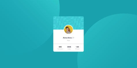
mainelement contains the card which is the only thing in the page, so it's the main content; the footer though is not part of the main content because<footer></footer>has a specific meaning in a web page, typically contains information about the author of the section, copyright data or links to related documents. I guess by now you're starting to understand what a navigational region is.- The second issue repeated more times: "All page content should be contained by landmarks". It's similar to first issue but in my opinion is even more serious! Unfortunately your website can't be accessed by a screen reader because it expects to find semantic elements not only
<div></div>elements which are used mostly for styling purpose! For example i saw the last part of the card is kinda messy in HTML, you wrapped all individual headings in divs whereas you could use an appropriate element like an<article></article>and group together what it needs to be together, like so:
<article>
   <h3>80k</h3>
  <p>followers</p>
</article>
I saw you used
<h1><h1>heading, i used<h3></h3>instead becauseh1can't be reused and heading have a discending order in the page.- I strongly recommend a pragmatic approach. Practicing and reading, baby steps, there's so much to know and learn! One of the best reference is mozilla docs.
Hope it helps, keep coding :-)
Marked as helpful - The first issue: "Document should have one main landmark". That means you always need an element that represent the navigational region such as: header, main, nav, footer. In your code after
- @Ibkodus116@Da-vi-de
Hi, nice result on this challenge, it looks good either mobile and desktop with no media query. Well done!
- The only thing i noticed is the attribution. The
font-sizeshould be smaller and it should be position at the bottom edge of the page. I'd also recommend checking the report and try to resolve those issues, some of them are quite important for accessibility!
Keep coding :-)
Marked as helpful - The only thing i noticed is the attribution. The
- @angelostd@Da-vi-de
Hi, good result on this challenge. Well done!
- After coding mobile version you just need to add media queries
min-width: ..., that's it! You wrote the last media querymax-width: 900pxin which there's thebackground-image, you could do it at the beginning, what you've done doesn't really make sense because it's like saying "make changes when the width is smaller and equal to 900px" but you already took care of that, so you can delete it and move that code in your firstbody. The first media query is right!
Hope it helps a little! Keep coding :-)
Marked as helpful - After coding mobile version you just need to add media queries
- @mizek1@Da-vi-de
Hi, it's a nice result but i would make the card for desktop version bigger ,
font-sizeseems a bit small at that width. Also if you want to become a pro in the future get used to separate HTML and CSS. The style should be in its own filestyle.css. Keep coding :-)Marked as helpful - @TiredQuan@Da-vi-de
Hi, nice result on this challenge, well done. I tried on both Chrome and Firefox. No problem either browsers! They look the same.
- There's no need to write the same
media-query5 times, just one time and put everything there, that's it!
Happy coding :-)
Marked as helpful - There's no need to write the same
- @anhoang241998@Da-vi-de
Hi, it's a good result but it could be perfect, there's just a problem with the responsiveness of the website.
-
First thing first i encourage you to change approach and start the mobile version, that's the professional and modern way of working. I believe you work with the dev tool set on responsive mode, just determine the width you want to work at, for example
350px, build your project and then add media queriesmin-width: ...trying to respect devices screen size! -
I didn't do this challenge but i guess the image shouldn't be cropped because it's the desktop version, you change it too early, so i think it's better keeping the column and resize it for tablet width.
Hope it helps, keep coding :-)
Marked as helpful -
- @Briancarlo24@Da-vi-de
Hi, good result on this challenge. Almost perfect!
- I saw the comment "Desktop design" but the media query is
min-width: 375px, it's too early making desktop design at that width. You should have tried a different strategy so that it would look good on a tablet as well. When there's no tablet design it means there's nothing to change nor to add! If i open the website at768px(common tablet size) it doesn't show all the card properly, two of them are cut, because you already coded desktop design!
Keep coding :-)
Marked as helpful - I saw the comment "Desktop design" but the media query is
- @Faerk77@Da-vi-de
Hi, nice result on this challenge, well done!
-
HTML seems perfect, CSS not really! There's no need to repeat the media query over and over, there are two ways for writing media queries: Either you add them at end of each class or you add them at the end of the file. I'd rather write them at the end of the file, it's more organized, i don't get confused and i foucs much better at tasks!
-
I've also noticed you don't follow mobile first approach, i encourage you to do that, starting from small to large width screen, use
min-width: ..., that was a very small project but you may go through very hard times for bigger designs!
Hope it helps a little, keep coding :-)
Marked as helpful -
- @annab6@Da-vi-de
Hi, the card for desktop version seems a bit small but it's a good result on this challenge. Well done!
- I saw you use the
borderproperty, yeah maybe it can't be managed too much. When i need a very thin line i use<hr>tag but be careful because it's a bit tricky, if you set margins or padding in a card you need negative margins (either left and right) so that you are able to extend it! Anyway, try this snippet of code in your text editor (don't change your code, the line looks good) it might comes in handy in the future.
hr {
    border: 0 none;
    height: 1px;
    background-color: choose a very light color;
    color: same as background-color;
}
Happy coding :-)
Marked as helpful - I saw you use the