Skip to content
Explore
For companies
Unlock
Pro
Log in
with GitHub
Profile
Overview
Solutions
20
Comments
0
David Maillard
@DavidMaillard
Follow
All solutions
designo-multipage-website
David Maillard
•
375
Submitted over 3 years ago
2 comments
1 like
product-feedback-app
David Maillard
•
375
Submitted over 3 years ago
1 comment
5 likes
rock-paper-scissors-game
David Maillard
•
375
Submitted over 3 years ago
0 comments
2 likes
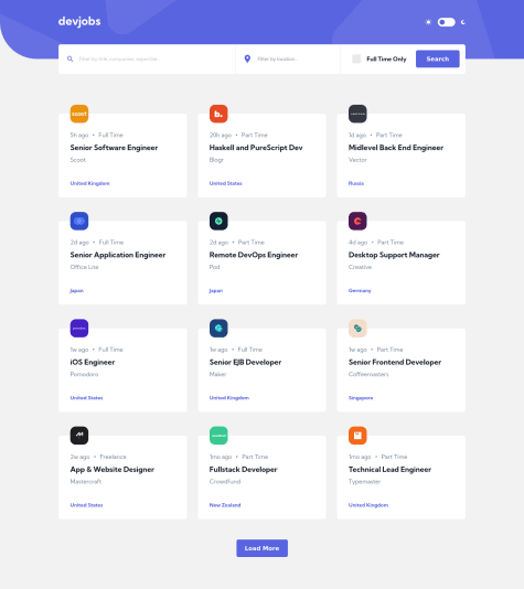
Devjobs web App
David Maillard
•
375
Submitted over 3 years ago
2 comments
10 likes
REST Countries API
David Maillard
•
375
Submitted almost 4 years ago
0 comments
2 likes
Sunnyside LP
David Maillard
•
375
Submitted about 4 years ago
1 comment
3 likes
Huddle Landing Page
David Maillard
•
375
Submitted about 4 years ago
0 comments
3 likes
Ping Single Page
David Maillard
•
375
Submitted about 4 years ago
1 comment
2 likes
Price Component
David Maillard
•
375
Submitted about 4 years ago
1 comment
2 likes
Intro Component / Signup Form
David Maillard
•
375
Submitted about 4 years ago
1 comment
1 like
Coming Soon Page
David Maillard
•
375
Submitted about 4 years ago
3 comments
4 likes
My first Grid Experience !
David Maillard
•
375
Submitted about 4 years ago
3 comments
5 likes
Article preview component
David Maillard
•
375
Submitted about 4 years ago
0 comments
2 likes
Social Proof Section
David Maillard
•
375
Submitted about 4 years ago
1 comment
1 like
FAQ Accordion Card
David Maillard
•
375
Submitted about 4 years ago
0 comments
1 like
A big work of responsive :)
David Maillard
•
375
Submitted about 4 years ago
1 comment
1 like
Card component with Flexbox
David Maillard
•
375
Submitted about 4 years ago
2 comments
1 like
Flexbox and background images with min()
David Maillard
•
375
Submitted about 4 years ago
0 comments
1 like
Load more
Oops! 😬
You need to be logged in before you can do that.
Log in
with GitHub
Oops! 😬
You need to be logged in before you can do that.
Log in
with GitHub
Oops! 😬
You need to be logged in before you can do that.
Log in
with GitHub
Oops! 😬
You need to be logged in before you can do that.
Log in
with GitHub
Oops! 😬
You need to be logged in before you can do that.
Log in
with GitHub
Oops! 😬
You need to be logged in before you can do that.
Log in
with GitHub
Oops! 😬
You need to be logged in before you can do that.
Log in
with GitHub
Oops! 😬
You need to be logged in before you can do that.
Log in
with GitHub
Oops! 😬
You need to be logged in before you can do that.
Log in
with GitHub
Oops! 😬
You need to be logged in before you can do that.
Log in
with GitHub
Oops! 😬
You need to be logged in before you can do that.
Log in
with GitHub
Oops! 😬
You need to be logged in before you can do that.
Log in
with GitHub
Oops! 😬
You need to be logged in before you can do that.
Log in
with GitHub
Oops! 😬
You need to be logged in before you can do that.
Log in
with GitHub
Oops! 😬
You need to be logged in before you can do that.
Log in
with GitHub
Oops! 😬
You need to be logged in before you can do that.
Log in
with GitHub
Oops! 😬
You need to be logged in before you can do that.
Log in
with GitHub
Oops! 😬
You need to be logged in before you can do that.
Log in
with GitHub
Oops! 😬
You need to be logged in before you can do that.
Log in
with GitHub
Oops! 😬
You need to be logged in before you can do that.
Log in
with GitHub
Oops! 😬
You need to be logged in before you can do that.
Log in
with GitHub
Oops! 😬
You need to be logged in before you can do that.
Log in
with GitHub
Oops! 😬
You need to be logged in before you can do that.
Log in
with GitHub
Oops! 😬
You need to be logged in before you can do that.
Log in
with GitHub
Oops! 😬
You need to be logged in before you can do that.
Log in
with GitHub
Oops! 😬
You need to be logged in before you can do that.
Log in
with GitHub
Oops! 😬
You need to be logged in before you can do that.
Log in
with GitHub
Oops! 😬
You need to be logged in before you can do that.
Log in
with GitHub
Oops! 😬
You need to be logged in before you can do that.
Log in
with GitHub
Oops! 😬
You need to be logged in before you can do that.
Log in
with GitHub
Oops! 😬
You need to be logged in before you can do that.
Log in
with GitHub
Oops! 😬
You need to be logged in before you can do that.
Log in
with GitHub
Oops! 😬
You need to be logged in before you can do that.
Log in
with GitHub
Oops! 😬
You need to be logged in before you can do that.
Log in
with GitHub
Oops! 😬
You need to be logged in before you can do that.
Log in
with GitHub
Oops! 😬
You need to be logged in before you can do that.
Log in
with GitHub
Oops! 😬
You need to be logged in before you can do that.
Log in
with GitHub
