@eenaree

Rayane
@RayaneBengaouiAll comments
- @RayaneBengaoui
안녕하세요 Nari Lee,
Congrats for completing this challenge ! 🙂
I'd like to suggest :
-
Add some CSS transition to make your hover animations smoother. For example It could be something like
transition : all 0.3s easewhere "all" is the CSS property you want to animate. This article is great also to understand how and when to use ease effects (especially ease-in and ease-out) : https://css-tricks.com/ease-out-in-ease-in-out/ -
I would personally try to break down the Calculator component into smaller pieces to make it simpler to read. Here I can see multiple useEffect hooks, thus they could be separated into other components that only do only 1 thing.
-
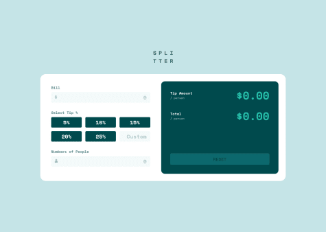
It's great that you took the time to handle non authorized values such as 0 persons or 0 dollars, but to push it even further you could handle the situation when there are too many people compared to the bill amount. If I put 3$ with 1000 persons the tip amount and total are equal to 0.
Otherwise, well done for the challenge and it's also responsive, which is great !
Have a nice day ! 🌞
-
- @MehmetCanBOZ@RayaneBengaoui
Hello Mehmet Can BOZ,
Congrats for completing this challenge ! 🙂
I'd like to suggest :
-
I don't think you are using the correct font from the design (Kumbh Sans)
-
Some text colors/weights are a bit off compared to the design
-
I would add
object-fit : coverto your slider image to make sure the image isn't stretched. -
When an image is opened from the slider, I think you should make the background darker for a better contrast.
-
On the mobile menu, I would add
cursor : pointerinstead of text here.
Have a nice day ! 🌞
Marked as helpful -
- @ApplePieGiraffe@RayaneBengaoui
Hello APG ! 👋
I'm a bit late on this one but as everyone already said this looks AMAZING and as always, the animation is so smooth 🤩.
I wasn't ready to see me on the scroll back haha, nice easter egg, thanks a lot ! 😊
Have a nice day ! 🌞
- @Lusk1nha@RayaneBengaoui
Hello Lucas Pedro,
Congrats for completing this challenge and trying out React! 🙂
For a little project like this one, it's quite heavy, but when you'll do bigger projects with React you'll see how enjoyable is it to re-use components and manage state ! 😉
Here I would just suggest to use
mix-blend-mode: multiplyon your image rather thanfilterto mix it with the purple background and thus get closer to the design.Overall, well done for the challenge and happy coding ! 😃
- @kadheryna@RayaneBengaoui
Hello Kadheryna,
Congrats for completing this challenge ! 🙂
I'd like to suggest :
-
Your
background-sizeproperty is invalid. Instead of havingbackground-position: top-left, bottom-rigth;, it should bebackground-position: left top, right bottom;. There was a typo on "right" and there is no need to add "-" between values. -
Add
min-height : 100vhto yourbody. It will make sure that your body covers the entire viewport, thus, your second background image can position bottom right correctly. -
Modify the
font-weightproperty of your<h1>and the text in the reviews to match better the design. -
Use the
max-widthproperty on your boxes so that they don't overscale on big screens.
Overall, well done for the challenge and happy coding ! 😃
-
- @josuke0227@RayaneBengaoui
Hello Josuke,
Congrats for completing this challenge ! 🙂
It looks super nice ! I really like the animations on scrolling, I saw you used AOS, I've never tried it before, is it great ?
I also love the way your form inputs behave with the label moving to the top ! How did you make this effect ? I'm curious about that ! 😁
Have a nice day ! 🌞
- @rhonall@RayaneBengaoui
Hello Rhona,
Congrats for completing this challenge ! 🙂
I'd like to suggest :
-
Add
border: solid 1px transparentto your anchor tag to fix the "resizing" effect on your container during hover. You can read an article on how the box model works in CSS with content, padding, border and margin to understand better why it behaves like this. -
You have a vertical because your
.containeris declared with a margin of 2rem while it is already 100% of the height. So you should remove this margin, but then, there is still a little bit of scrolling. It's because there is a default margin to elements in CSS, thus, yourbodyhas a default margin of 8px. To fix this, just addmargin: 0to your body and the Y scroll should be gone.
Overall, well done for the challenge and happy coding ! 😃
-
- @ethabhijit@RayaneBengaoui
Hello Abhijit Paul,
Congrats for completing this challenge ! 🙂
I'd like to suggest :
-
Rather than playing with opacity of the image, here, the
mix-blend-mode: multiplyproperty will help you to get closer to the color of the design. -
I think that adding
line-heightto your <p> tag also would be great to add spacing between lines.
Overall, well done for the challenge and happy coding ! 😃
-
- @TrakaMeitene@RayaneBengaoui
Hello TrakaMeitene,
Wow ! Already another challenge completed ! 🙂
In the FAQ section I have to click twice to get the answer displayed. The first click toggles a
display: noneand the second thedisplay: block. Maybe it should be inverted ?Also, for some media queries, the cube is floating in the middle of the container and sliding on the X axis. Lastly, I think the font weight should be lighter to match the design.
Overall, well done for the challenge, image positioning is not an easy one on this challenge.
Happy coding ! 😃
EDIT : I just checked you JS code. First it's better to make a separate file for the JS to keep things clean.
- @tylerthietje@RayaneBengaoui
Hello Tyler,
Congrats for completing another challenge ! 🙂
In addition to the great feedback of @tediko, I would suggest to add more padding to your buttons to match better the design and
font-family: inheritto override the default font.Also, I would change the break point on the media query as the content overflow the screen between 500px and 1100px.
Overall, well done for the challenge and happy coding ! 😃
Have a nice day 🌞
- @tediko@RayaneBengaoui
Hello tediko !
Nice to hear that you found comment helpful ! 😄
I really like all the animations you did on your solution, it looks super cool ! 🤩
I will definitely study your code, your Sass structure looks really clean and I didn't know about Intersection Observer API.
Have a nice day 🌞
- @brasspetals@RayaneBengaoui
Hello Anna,
Once again you came with a nice idea on animations 🙂
I really like the use of cubic bezier as a timing function to get this "coming back" effect at the end of the animation 😍
Just on your SASS part, instead of using @import with SASS, it's recommended to use @use because the first one is now deprecated.
You can find more information on the SASS official documentation (https://sass-lang.com/documentation/at-rules/import) where it's well explained. Also here is a great video of Kevin Powell that shows how to use it (https://www.youtube.com/watch?v=CR-a8upNjJ0).
Happy coding ! 😃
- @EN-M@RayaneBengaoui
Hello E.N.M,
Congrats for completing this challenge ! 🙂
I'd like to suggest :
-
To place your boxes, use a display flex or grid instead of trying to position them manually with
transform: translate(). If you use flex, you could flex your section and then have 3 children containers, with the middle containing 2 boxes that hasdisplay: flexwithflex-direction: column. With grid, you could use a 2 rows 3 columns grid and then usetransform: translateY()to put side boxes in the middle. You can look my solution if you are curious about how I did it with flex but I hope this explanation could inspire you. -
I would reduce a little bit the width of the boxes to match better the design.
Overall, well done for the challenge and happy coding ! 😃
-
- @Afshar07@RayaneBengaoui
Hello Amir Afshar,
Congrats for completing this challenge ! 🙂
I would like to suggest :
-
Add
background-repeat: no-repeatandbackground-size: coveron your header to make the background fill the entire container and avoid duplication of the image. -
Add something that shows it's processing during the loading time for the user experience. On my solution I used a classic spinner, but also something else.
-
Handle invalid input. You could use a try/catch or even a Regex to filter invalid inputs and display an error message to the user.
-
On mobile view, move the Zoom in/out buttons to the bottom because it's hidden between the info container. If you are blocked, I've made it on my solution to this challenge. Also, you can read the official documentation of leaflet where they explain it.
-
Add some more padding and spacing to match better the design.
Overall, well done for the challenge and happy coding ! 😃
-
- @saravdberg@RayaneBengaoui
Hello Sara,
Congrats for completing this challenge ! 🙂
Your solution matches well the design and responses well on screen resizing.
I would like to suggest :
-
Take a look at semantic HTML tags for better readability. Instead of using elements only, there are plenty of other tags that describe your code better.
-
On tablet view (~940px) the text of the class
p-blue-boxis smashed on the border. So you could handle it in your media query.
Overall, well done for the challenge and happy coding ! 😃
-
- @meijerestelle@RayaneBengaoui
Hello Estèlle,
Congrats for completing your first challenge ! 🙂
For rounding the corners I think you could proceed this way :
-
Remove these margins and border-radiuses from the cards.
-
On your body, add
min-height: 100vh,display: flex,flex-direction: column,justify-content: centerandalign-items: center. It will center your container in the middle and make sure your body covers the entire viewport. -
On your container , remove
min-height: 100vhbecause you want your body to cover the viewport, not the container. Also you can remove bothwidth: 960pxandmin-width: 100vwbecause you declared a fixed width on your flex items (230px) so the container will be too wide and thus, we won't see the corners. -
Last, add
border-radius: 15pxto your container and alsooverflow: hiddenin order to see the border radius.
Let me know if it helped and if you have any questions.
Overall, well done for the challenge and happy coding ! 😃
-
- @adilsongb@RayaneBengaoui
Hello Adilson Gabriel,
Congrats for completing this challenge ! 🙂
It looks great and it responds nicely on screen resizing (which is not easy on this challenge with these images 😁)
Well done for the challenge and happy coding ! 😃
- @olgak169@RayaneBengaoui
Hello OK169,
Congrats for completing this challenge ! 🙂
I would like to suggest :
-
Add
box-shadowproperty on your containers. I'm not sure about this point, but it seems to have a little shadow on the design image. -
Handle cross browser compatibility for the slider input. For me, it works well in Firefox, but in Chrome and Edge the value of the slider goes to 100 instead of 81.5.
Overall, well done for the challenge and happy coding ! 😃
-