
@oseji

Abhik
@abhik-bAll comments
- @abhik-b
Hello Ose , Your solution looks great on large screen & nice use of tailwind , well done 💯
Just some opinions :
- Give your
.invisible-containerthisposition:absoluteso that main does not shift when you click on a dropdown link - Check this video for responsive navbar in mobile
- To add animation to features & company , since you are already using
.hiddenclass , give sometransform:translateY(20px);opacity:0;to hidden class. What will happen is as soon as hidden class is removed from 1 of the ul , the transform & opacity will become default. Also add some transition to the ul
Hope this help 🤞& Please keep Coding such nice solutions 🥳
Marked as helpful - Give your
- @mohamedyasser27@abhik-b
Hello Mohamed , Your solution looks great & it is very responsive . Great Job done 💯
Just a opinion : Yes you are right , you do not need resize observer. Instead you can use responsive css media queries. What I did was :
- create a div
.slider-container& made itposition:relative. - Then created a
labelwithwidth :90%;so the label always has 90% width of the parent - Then created a input & hid it's appearance (you have also done the same. However I did not give any position to input , instead I gave it a bg color just like the original design
- Then I created a
.slider-handlespan &.slider-fillspan. As the name says 1 is for showing the custom fill & other for custom handle. - Then for large screens I used the css media queries to increase the handle size.
Here is my code
Hope this helps 🤞 & Please keep coding this nice solutions 🥳
Marked as helpful - create a div
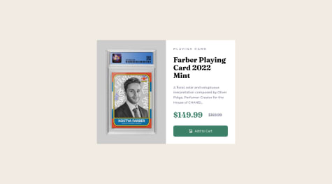
- @kostyafarber@abhik-b
Hey Kostya 👋
Your solution looks fantastic . I liked the concept of you as a product card 😁 Your react component
previewis great & the structure you used to name the classes seems good.Just a opinion : adding some padding to
.rootdiv will give some spacing to the card in mobile screens.Fantastic job , keep up contributing such amazing solutions 🥳
Marked as helpful - @apuntesnavarrete@abhik-b
Hello Erik 👋
Your solution looks excellent 🥳 The animations are great , shadows to the images are great & your site is responsive as well. Great job done
Just a observation : When I click on left button slider animations are great but when I click on right button slider animations are not as great as left one.
Other than that Great job , please keep contributing such amazing solutions. 😃
Marked as helpful - @kara-harshit@abhik-b
Hey Harshit 👋
Your solution looks nice & your tailwind usage seems great ! Though it would have been nice if it was responsive for mobile screens but anyway nice try.
Just some opinions :
- remove
"frombody" - for the entire chat messages div , you don't have any classes. If you use
flex flex-col gap-3then for eachchatleftclass you don't need to give bottom margin & overall the code would be organized.
Keep doing these projects & Your skills will much better !! Happy Coding 😃
- remove
- @Lekanjoy@abhik-b
Hello Alabi 👋
Your Solution looks very nice !!! It is very responsive & it's interactivity seems amazing to me. Great Job 👍
Just some opinions :
- If the
.boxhas a fixedmax-widththen on large screens it will look more nice. Example :max-width:550px - if the
.billinghasjustify-content : space-evenlyinstead ofjustify-content : space-betweenthen the transition from large screen to mobile screen looks slightly better
Your solution is very close to original design , Nicely Done !! Please Keep Coding such amazing solutions
Marked as helpful - If the
- @arevalosebastian@abhik-b
Hello Sebastian , Your solutions is fantastic & it is very responsive also. Well Done 🥳🥳
Just a opinion is if you give
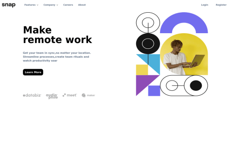
bottom: 0px; right: 0px;totooltipclass for small screens then it will stay responsive . Other than that great job and please keep contributing such amazing solutions 🤩👍 - @nicolasgonzalez98@abhik-b
👋 Hello Nicolas , Your solution looks nice 😃
- I think if you use
imgtags in html instead ofbackground-imagein CSS for the girl image then it will look even nicer & solve the problem. - for double bg image ( I assume the background image you are referring to) you can use
background-size:containinside main to make it look nicer - I really think you should use
media-queryfor responsiveness & stay away for viewport unitsvwfor width & height of simple elements like card
Other than that overall it looks nice so Please keep solving challenges & happy coding 🥳👍
Marked as helpful - I think if you use
- @SuhodolecA@abhik-b
👋 Hello Anton , I see you you spent your time creating a perfect solution , Very well done 🥳👌 Your solution is very responsive , works & looks very well. Please keep coding such fantastic solutions 🤩👍
- @chiamaka-ugwu@abhik-b
👋 Hello Chiamaka, Your solution is great & responsive enough . Good job 👍 I am just sharing some of my opinions that might make it look nicer.
- use
object-fit: cover;to img to make the image look responsive & nice - in
card-containerinstead ofwidth:30%usemax-width:400px(use value of your own choice) can make the card look nice & responsive for large screens.
Other than that your solution is nice , Well Done & please keep coding amazing solutions like this 😃👍
Marked as helpful - use
- @aleksFedotov@abhik-b
👋 Hello Aleksandr , Your solution is fantastic & the animations are 🔥🙌 . I also liked the hover effect on dice button. Great job , Well Done & Please keep coding such amazing solutions 🤩👍
Marked as helpful - @Yash-devasp@abhik-b
👋 Hello Yash ,Congratulations on completing your 1st challenge. Your solution is fantastic & it is very responsive 🤩👌
Some of my opinions I am sharing with you :
- give
margin: 0;to*{ }to remove unwanted margin from all elements - remove the
heightfromcard& givegap:1emto make the card look more like the design - your
box-shadowis very nice
Very Well Done 🤩 & Please keep coding such amazing solutions 🥳👍
- give
- @GitNutts@abhik-b
👋 Hello Jordan , So nice to know that you are feeling great completing this challenge. It looks absolutely perfect to me & it is highly responsive as well. Great job well done 🥳
Please keep contributing such amazing solutions 🤩👍
- @Jay-0331@abhik-b
👋 Hello Jay , Your solution seems perfect to me & it works perfectly . Only opinion I am sharing with you is for small screens (
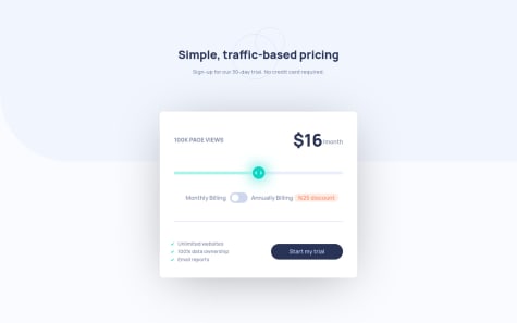
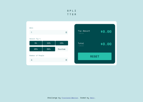
(min-width: 426px) and (max-width: 1024px)) if you set amax-widthto the calculator container then it can look nicer. Other than that great job , well done🥳🥳🥳 Please keep coding such amazing solutions 🤩👍Marked as helpful - @Kamasah-Dickson@abhik-b
👋 Hello Kamasah , Your solution is wonderful & responsive . Even I am working on this challenge & now I can look to your solution as a reference well 🤩
Only opinion I am sharing with you is that for the
.circleinput checkbox you can make it a circle by giving the below styles to make it look even nicer.width: 16px; appearance: none; //this is very important otherwise checkbox won't use any other css styles height: 16px; padding: 4px; border: 2px solid hsl(289, 100%, 72%); border-radius: 9999px;Then finally give some gap to
.price-1&.price2to give some spacing & it will look appropriate. Overall Great job well done🥳👍 & please keep coding such nice solutions 👍Marked as helpful - @remusbuhaianu
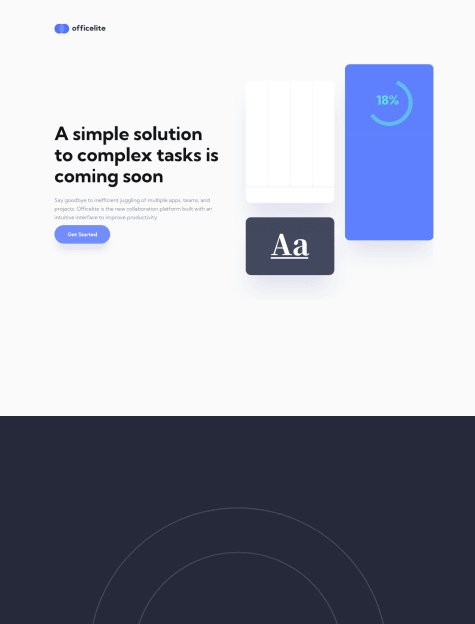
Officelite Coming Soon - Svelte + Routing | TS | SCSS | GSAP
#gsap#sass/scss#svelte#typescript#accessibility@abhik-b👋 Hello Buhaianu , Your solution is Excellent , the animations are just top-notch 🙌 & it is very responsive. Well Done & please keep contributing fantastic solutions like this to inspire us 🥳👍
Marked as helpful - @L0rdix@abhik-b
👋 Hello Amir , Congratulations on completing your 1st project. The solution is amazing & it works correctly Well Done 🤩🤩🤩 Only opinion I will share is remove margin for left & right from
.sec_container& please add another media query for min width 500px then give margin for left & right this can make it more responsive. Other than that you did a Great Job, Please keep contributing wonderful solutions like this 🥳👍Marked as helpful - @JearlDev@abhik-b
👋 Hey Joshua , Your solutions seems perfect to me, Fantastic Job Well Done & please keep contributing such amazing solutions 👍
Marked as helpful