
@Mathitarazonad

Cristina
@cr1deg0All comments
- @cr1deg0
Hi Mathias
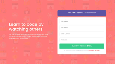
Your solution looks good, I specially like that you've introduced a media query for medium screen sizes. However the design comparison screenshot above looks odd. Perhaps because of the way you've centered the content on the screen, instead of using "padding" in your ".main-container" you could try: body { display: flex; justify-content: center; align-items: center; height: 100vh; } Hope it helps! Cristina
Marked as helpful - @nemesisaquib@cr1deg0
Hi Nemesis
Your solution looks great, well done! If you want to improve it, you could look into the accessibility and html issues in the report; perhaps replace the "section" tag by a "main" one and "h2" by an "h1".
You could also look into using rem/em units for padding and margin, rather than px.
Cheers
Marked as helpful - @zizi-ayman@cr1deg0
Hi Zizi,
Awesome solution, it's such a great idea to use css grid for this design.
img { display: block; max-width: 100%; } normally helps to work with images. In your solution you can set width: 40px; or similar to control the size of the headshots.
I've noticed your content is not vertically centered on the page. To solve this you could use body { display: flex; flex-direction: column; justify-content: center; height: 100vh; } Hope it helps!
Marked as helpful - @KKS1991@cr1deg0
Hi Kevin,
Good solution, well done!
It looks like your <p> element has some bottom margin applied to it, you can try by adding:
.signup-proposal-txt { padding: 1rem 0; margin: 0; }
You may want to have a look into the desktop version media query. You currently have the breakpoint as min-width: 1440px and it seems too tight, as the page is loading with the mobile layout for me (browser window size just short of 13.3inch). I would try something smaller, perhaps min-width: 1000px;
Hope it helps!
Marked as helpful - @hnasser44@cr1deg0
Hi Hassan
The error icon is an svg, rather than inserting it as an image in the html document you can try by adding a css class via javascript to the input element when validating the form. You can define error.svg as background image in the class and control the size and position within the input element with the background properties.
The background images are failing to display because are missing quotes in the code: background-image: url("image.png");
I've noticed also that you have imported the fonts in Italic, perhaps this is what it's preventing the styling of the heading and text.
I hope it helps!
- @hudarashid@cr1deg0
Hi Huda, looks very good! A few things you may want to revisit to make it even better:
- the Learn More button for the Luxury cars is a bit off compared with the other two.
- have a look into the accessibility issues in the report.
- you could round the corners of the card with border-radius: 12px;
- the background colour is more greyish in the design.
Cheers, Cristina
Marked as helpful - @hemantsirsat@cr1deg0
Hi Hemant,
It's a good solution, well done! I few things that you may want to revisit:
- it looks like your background gradient is going in the opposite direction to the design.
- you could increase the line spacing in the FAQ answers to make them easier to read.