
@imadvv

Mohamed ELIDRISSI
@elidrissidevAll comments
- @elidrissidev
Hey Imad 👋
Hope you're doing well. You did a great job on your solution! I usually see some common mistakes in most solutions, but not this one!
Here are my notes:
-
type="submit"is meant to be used with buttons inside a<form>, in this case there is no form so I'd suggest you set it totype="button". -
The "Why Us" section is meant to be a list of features of this fictional website, therefore I think a
<ul>will be more semantically correct instead of a<p>. -
Some page elements are styled with their class names whereas others are styled by their tag name, this makes the CSS difficult to read as you'll need the HTML as a reference. Consider leaning more towards classes to style your elements, as they are re-usable and they make your code easier to understand.
-
The
chunit has some specific use cases, but generally I'd stay away from if not needed and just use other units likerems orems.
Hope this helps you, if you have some questions feel free to reply. Good luck!
Marked as helpful -
- @Naveen39O@elidrissidev
Hey Naveen 👋,
Great work on your solution, keep on going!
I have some feedback for you, first is an accessibility one:
- The dice button doesn't have any descriptive text inside. For accessibility reasons, buttons and links must always have some text inside that describes their action, in the case where it's not a part of the design, consider making the text visually hidden.
- The dice image is mainly for decoration, and when you add a proper title ☝️, there will be no need for accessibility software to announce the
alttext, in this case, you can make it empty so that it's not announced.
This one is coding-style related:
- Try to keep things consistent in your code so other people find it easier to read. For example, you have some random spaces in your JSX between the attribute and value. In general, try to follow the common conventions, in this case, no spaces between attribute and its value in JSX.
This one is related to React:
- Know when and what to separate something to its own component. For example, you have created an
Advicecomponent, but it only contains anh1and the rest including the button is in theAppcomponent. What I would do in this case is extract the whole card to theAdvicecomponent. - I would also recommend separating data fetching logic to a custom hook. For example, you can create a hook called
useAdviceand inside of it you would put the state and the fetching function, you would then return those to be consumed by the component. e.g:
function useAdvice() { const [advice, setAdvice] = useState(null); const [isLoading, setIsLoading] = useState(false); const [error, setError] = useState(null); const fetchAdvice = () => { setIsLoading(true); axios.get("https://api.adviceslip.com/advice") .then((res) => { setAdvice(res.data.slip); setIsLoading(false); setError(null); }) .catch((error) => { console.log(error); setError(error); setIsLoading(false); }); } return { advice, isLoading, error, fetchAdvice } }- I would remove the hard-coded advice that's shown initially on page load, instead you can replace it by a
useEffectwith an empty dependency array that will fire when the component mounts and fetch the initial advice from the API.
Phew, that was a lot 😅. Hope it helps, Good luck!
Marked as helpful - @skuenzi@elidrissidev
Hey Sara 👋,
Congrats on finishing your first challenge!
To address your questions:
- There is a workaround to the focus issue, and it's the
:focus-visiblepseudo-class, quote from MDN docs: The :focus-visible pseudo-class applies while an element matches the :focus pseudo-class and the UA (User Agent) determines via heuristics that the focus should be made evident on the element. (Many browsers show a "focus ring" by default in this case.)
But keep in mind that this is not supported in Safari, so you'd want to have a fallback style using the regular
:focusas mentioned in the link.- For code organizations, I usually use a bundler such as Parcel, that way I can organize my files under
srcfolder and also get to use modern javascript features. When ready to deploy, Parcel compiles everything together under adistfolder by default which you can configure to be the root folder used when deploying to a service (I know vercel and netlify have it, not very sure about github pages).
I hope this answers your questions, feel free to ask if you have more and good luck!
- There is a workaround to the focus issue, and it's the
- @Mahmoud-Elshaer-10@elidrissidev
Hello Mahmoud 👋 You've done a great job with your solution, It looks good on all screen sizes and design comparison shows only very little differences!
Here are some things to improve:
- Consider taking a look at the Report page of your solution when you submit it, it will help you identify problems and fix them.
- Your page lacks a level-one heading (
h1). It is very important for SEO and even accessibility reasons to have one in every page of any site. In cases where the heading in not part of the design (like here), you can include it but make it visually hidden. Additionally, because you're usingarticletag for the reviews, this element requires a heading inside, so you can make all the review titles anh2. Remember to always follow heading levels on your page from 1 to 6, don't skip them! - The text of the reviews is quoted from their authors. So wrapping the text of the reviews inside a
blockquoteelement is more correct semantically. - This one might be a bit more of a personal preference, but I'd lean to using classes more and avoid selecting elements directly in CSS, this makes styles easier to read and more re-usable.
This is all the feedback I have, I hope it was helpful. Good luck!
Marked as helpful - @frances-m@elidrissidev
Hey Frances! Hope you're doing great. First, I just wanna say congrats because you did an amazing job at making this as pixel-perfect as it can be! Unfortunately, regarding your question I cannot provide much help, personally I don't remember I had an issue like that but I could be wrong. Though I have some suggestions regarding your solution:
- Always make sure your
aandbuttonelements have text inside them that describes where that link takes to or what that button does. In your solution for example, the social share buttons should probably be links btw because they will redirect somewhere, but should also have text inside them rather than just images. In this case the design does not show the text, so you can use the "visually hidden technique" which hides the text visually while still making it readable by screen readers. - For the social icons, I saw you're using
filterto change the color of theimg. It looked a bit confusing at first, so one way I'd do it is to inline thesvgin your HTML. That way you can setfill="currentColor"and they'll inherit the parent element'scolorvalue so you can change it with ease.
That was all I have, I hope it was not overwhelming. Good luck!
- Always make sure your
- @flp-pcll@elidrissidev
Hey Felipe, great work on this solution!
Here are my suggestions:
- Just in case you don't know, you can build the whole accordion without a single line of JavaScript using
<\details\>and\<summary\>elements. - The way you've built the accordion works perfectly. Here's a good read about creating accessible accordions
Good luck, and keep it up!
Marked as helpful - Just in case you don't know, you can build the whole accordion without a single line of JavaScript using
- @aig0041@elidrissidev
Amazing work Aliaa! Not bad for a first challenge. Keep it up!
For the images problem, it's because of the URL you're using:
http://127.0.0.1:5500is a URL only accessible on your machine when you were running the http server (Using Live Server Vscode extension?).file:///Users/...is a URL used to access files on your local filesystem (Mac in this case) and is again specific to your system and won't work elsewhere.
So the fix for this is to use a relative URL, in your case it's gonna be
./images/<image name>.As for the rest I only have 3 suggestions:
- Every html page should have a level 1 heading
h1that describes the main content of the page. - Consider using semantic html elements instead of generic
divs where appropriate, for example the "Cancel" text can be inside aaor abuttonelement because it conveys that it can interacted with. - Check the accessibility report page for more.
Good luck to you!
Marked as helpful - @tix04@elidrissidev
Great start Jaonary! Definitely not bad for a first challenge. Keep it up! Here are some suggestions for you:
- Avoid using pixels, especially for things like
font-size,margin,padding,width,heightetc. Reason being is that they don't scale with your browser's font size setting. To verify this, try increasing your browser's font size from 16px to something like 20px and do a comparison between your solution and this site. See how in your solution nothing changes, while in frontendmentor the page sort of zooms in a bit? There will be special occasions where this won't matter, but as a general advice I will suggest that you look intorems andems. - Decorative images that don't add anything to the page content can have an empty
alttext as per the W3C Web Accessibility Initiative:
Decorative images don’t add information to the content of a page...In these cases, a null (empty) alt text should be provided (alt="") so that they can be ignored by assistive technologies, such as screen readers.
- A very small detail but I'd add a
cursor: pointerto the "Proceed to payment" button to give the feedback that it's clickable.
That's all I have. Good luck to you!
- Avoid using pixels, especially for things like
- @nomatter-py@elidrissidev
Great work overall, like @hardy mentioned just try to use less intensive shadows by increasing alpha value in shadow color and increasing the blur. Additionally I have a couple of suggestions:
- The "Why Us" section is a list of reasons to choose this fictional service. So it makes sense to use a more semantic element,
ul. It looks ugly by default but you can always style it according to the design. - In your CSS, I see you're using a mix of a responsive unit (
rem) and absolute unit (px) which is something you'd want to avoid because absolute units do not scale with the browser's font size setting, you can learn more about responsive units in this article.
Good luck, and keep up the good work!
Marked as helpful - The "Why Us" section is a list of reasons to choose this fictional service. So it makes sense to use a more semantic element,
- @brkcln@elidrissidev
Hey Burak! Great work on this challenge, keep going! Here are some advises on things to improve:
- In the design, the "Claim Your Free Trial" button has a shadow from the inside. You can achieve this in CSS by using
inset:box-shadow: inset 0 -0.25em 0 rgba(0, 0, 0, 0.1) - For the "Claim Your Free Trial" button, you've made the text all uppercase in your HTML. This means that screen reader software will spell it out letter-by-letter as if it was an acronym. In this case, it's better to style the button with
text-transform: uppercaseto make it uppercase visually. - Form validation works, but only shows one error at a time. I have a solution for this challenge where I'm using JavaScript's Constraint Validation API which I think will help you a lot, feel free to check it out.
- Additionally you can do some tweaking on the font sizes and spacing to make it look closer to the design.
I hope this didn't overwhelm you. Good luck!
Marked as helpful - In the design, the "Claim Your Free Trial" button has a shadow from the inside. You can achieve this in CSS by using
- @Frontend-Wizard@elidrissidev
Hey! Great job with this one! I actually have 5 things 😅:
- Avoid skipping heading levels, you went from
h1toh4. You should always go from 1 to 6. You can always style them differently if they don't match your design. - I would wrap
<div class="attribution">inside afooterelement since it's more meaningful. - For the illustration image, since it's purely for the look, I would keep
altempty to make it clear for assistive technology that it's a decorative image so they won't read the alt text. - Consider using classes to style your HTML elements instead of directly referencing them, it's reusable, more readable and overall a better practice for bigger projects.
- I would stay away from absolute units like pixels because they're not responsive and don't scale when browser's font size increases/decreases.
I hope this didn't overwhelm you. Good luck!
Marked as helpful - Avoid skipping heading levels, you went from
- @alegrimminck@elidrissidev
Looks very close to the design, great job!
I do have some suggestions for you:
- When you submit a solution, try to take a look at the reports page as it helps you identify accessibility and semantic issues with your HTML.
- Speaking of semantics, you could have used some semantic elements instead of generic
divs. E.g: You could wrap.attributionwith afooterelement, and you could also make.cardamainelement or wrap it in one. These are called landmark elements and they help create a hierarchy of the page for things like screen readers. - Avoid skipping heading levels. You've used an
h1for "Order Summary" but you skippedh2and used anh3for "Annual plan". Heading levels help define a content hierarchy for your page, always go from 1 to 6. - Since you are practicing BEM methodology, I saw that you were using long class names for nested elements, you could simplify it by flattening it: http://getbem.com/faq/#css-nested-elements
Good luck!
- @FloPereira75@elidrissidev
Great job overall Florian! I have only one note regarding the units, I see you're often using
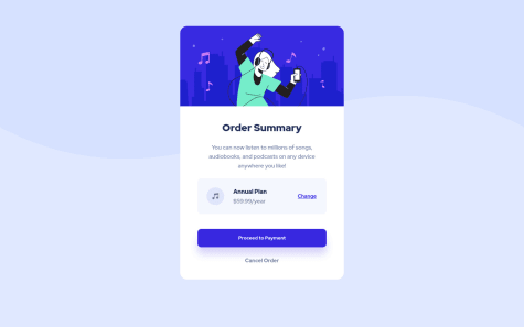
%andpxwhich works but isn't very responsive. Try increasing the font size of your browser and see if the page will adapt to the new size, most elements won't. Consider usingrems andems instead for the future, and if you need examples feel free to check some solutions of mine that demos this. Good luck!Marked as helpful - P@sorengrey@elidrissidev
As mentioned already by fellow members there are some issues with the semantics. You also should always consider having one
h1on every page that describes its content. For example this page can have the "Order summary" text be inside anh1as it perfectly describes the main purpose of this page, you can then style it differently to match the design. I'll also advice to check the report of your solutions as it helps you find issues like these. Good luck!Marked as helpful - @dusanlukic404@elidrissidev
Good job Dusan! I have a few suggestions for you:
- First I recommend to indent your html properly so that other people can read it easily.
- I also suggest to take a look in "Accessibility Issues", it can help you find issues with your solutions.
- I see you've gone from using an
h1to using anh3, skippingh2. Heading levels help set a content hierarchy for your page, so it is better that you follow them from 1 to 6. - For the "Why Us" section, the content is a list of reasons why choose this fictional service. Since it is a list, I would have used the semantic
ulelement, instead of just a paragraph with line breaks, then you can style it to match the design. - Last thing, I noticed the extra space below the top white section, which can be fixed by removing the
height: 80%from.containerto make the card's height adjust to fit the content.
Good luck!
Marked as helpful