@xZAYEDx

Nguyen Nguyen
@jesuisbienbienAll comments
- @jesuisbienbien
Hi Zayed,
Congrats on completing this challenge. Though, I believe there're a few things you need to fix:
-
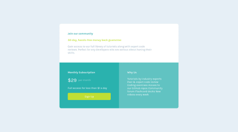
There's something wrong with the submit button and the illustration. On desktop, the illustration is underneath the submit button, and vice versa for the mobile view. They should be a few rem apart instead of lying on top of e/o.
-
When you submit a blank input, the error message is supposed to say "Whoops! It looks like you forgot to add your email". You can find the instruction under the README.md file.
-
When I submitted an incomplete email (i.e. mail@mail ), it's supposed to be error but it turns blue instead.
-
The submit button should have a box-shadow.
If you have any questions, let me know. I also completed this challenge recently. You can check it out under my profile.
Happy coding :D
Marked as helpful -
- @Prince-Ranaa@jesuisbienbien
Hi Prince-Rana,
-
You have a few accessibility issues that I recommend you fix. Remember to wrap everything in <main>.
-
Your response isn't good right now. The page on mobile view got cut off at the top and bottom. I guess it maybe due to using absolute positioning. I used grid and flex for my solution. Here's what I did for my solution. Nguyen's solution
-
In the Why Us section, you should use <ul> for the information. Right now, they're treated as a paragraph so it doesn't break into a new line when it needs to.
-
I recommend you start using the toggle device toolbar, it's very helpful when you want to check how your site looks like in different dimensions. Youtube - toggle device toolbar
Hope this helps.
Nguyen
-
- @Arjunjv@jesuisbienbien
Hi Arjun,
I took some time to look at your codes. Nicely done! I'd suggest you use display: flex to center your component. What I did was: 1- I removed the margin and margin-top in your container 2- I added this in the body:
body {
 height: 100vh;
  width: 100vw;
  display: flex;
  justify-content: center;
  align-items: center;
  flex-direction: column;
}
Now things should be centered vertically and horizontally.
I also recommend that you add some padding on both sides of the header and paragraph. Also, make sure to wrap the component in <main> tag.
Hope this helps. Happy coding!
Marked as helpful - @JesterFigueiredo@jesuisbienbien
Hi Jester,
Good job on completing this challenge. There are a few issues that I'd like to suggest:
1- I'd suggest you create a media query for mobile view. There should be padding in the container so everything doesn't lie too close to the edge. Also, maybe smaller font-size for heading and paragraph.
2- Using inline styling is okay, though I created a class .hidden and add that class to the part that you want to hide and remove it otw.
.hidden {
display: none;
}
3- The paragraph should have a line-height so it spaces out a little.
4- I suggest that you add a transition on the button on hover so it looks smoother.
I had also finished this challenge. You can check out my solution here
Hope this helps.
Happy coding :D
- @GabrielSnows@jesuisbienbien
Hi Gabriel,
Your solution looks very nice. Love what you did with the box-shadow. All the transitions on the buttons are smooth. I noticed that it's bigger comparing to the design and it's not scaled down on mobile designs. There's a toggle device toolbar under the developer tools that you can use to check what your solution looks like on different kinds of devices. I'd recommend you use it for responsiveness. I'm sure both Chrome and Firefox have it. (The icon looks like a phone and tablet)
FYI, in order to make your solution look as close to the designs as possible, I usually use paint tool to get the approximate measurements.
Also, here is my solution to this challenge if you want to check it out. Solution
Hope this helps.
Nguyen
Marked as helpful - @AThees@jesuisbienbien
Hi Alvaro,
Your solution looks great. My suggestion is to add cursor:pointer and transparent background for the buttons on hover.
Here is what I did for my solution:
 &:hover {
      cursor: pointer;
      color: var(--very-light-gray);
      background-color: transparent;
      border: solid 3px var(--very-light-gray);
      transform: all 0.3s ease;
    }
You can also view my code here
I hope this helps.
Nguyen
- @franciscoprado4@jesuisbienbien
Hi Francisco,
Your solution looks great. However, on mobile view, the .title-text is too big that it pushes the image up. Hence, the image is partly cut-out. I've tested out different font sizes for the title-text and it seems 1.8rem would look closest to the design.
.title-text {
font-size: 1.8rem;
}
If you're using Chrome, in developer tools, there's a tool that you can use to check your website under different types of devices and viewports - toggle device toolbar (it looks like a phone and tablet). I believe it looks the same in Firefox too.
I hope this helps.
Jenny
- @federico-madrid@jesuisbienbien
Hi Federico,
Your website looks great. One thing I'll add to your code is the overflow property. Your website right now have a scroll bar on the right, which isn't necessary. To get rid of that, just add to the body:
overflow:hidden;
Hope it helps.
- @lulzz@jesuisbienbien
Hi Lulzz,
I noticed that your background image on the right is still a bit high comparing to the design. THis is what I did for the position to make it look closer to the design background-position: right 52vw bottom 35vh, left 48vw top 52vh;
Hope this helps.
- @franciscoprado4@jesuisbienbien
Hi Francisco,
Your website looks great! Regarding the sizes, I usually use paint to measure the sizes of the design and go from there.
Hope this helps. Happy coding!
Marked as helpful - @AliciaT08@jesuisbienbien
Hi Alicia,
I took a look at your code and there are a few suggestions I'd like to make in the hope of improving your codes.
-
SVG image: you can link them using img tag so your html look cleaner
-
If you set the body width: 100vw, and the width of the card to be 275px, and get rid of the .cube-pix-card width, your component will be smaller, look closer to the design.
-
The attribution: Since this page isn't responsive, I used position fixed/absolute for the attribution to stay in the middle at the bottom of the page. what i did was: position: absolute; bottom: 0;
Hope this helps. Happy coding!
Marked as helpful -
- @agusthas@jesuisbienbien
Great job! It's beautiful.
- @yhas14@jesuisbienbien
Great job! Not sure if you used these fonts on purpose or not, but you can find the fonts in the style-guide.md file in your folder. If you did it on purpose, please disregard my comment haha. Your website looks great nonetheless. Keep it up!
- @ekrzak@jesuisbienbien
amazing work!
- @teej0103@jesuisbienbien
Your website looks great! It's well-centered and look clean. 10/10 <3
- @jesuisbienbien@jesuisbienbien
Nevermind on the second question 😅 . I just noticed the background comes with the image. Sorry, it's my first coding challenge so I'm kinda lost.