


@balarajukalisetti
Submitted
How to set all grid elements in equal size and shape when "input field" is in the grid elements. How can we increase the height of calculator in desktop view.
Looking to hire developers?
@Galielo-App
@balarajukalisetti
Submitted
How to set all grid elements in equal size and shape when "input field" is in the grid elements. How can we increase the height of calculator in desktop view.
@Galielo-App
Posted
div hell, you should learn about semantic HTML
@MelvinMelonGit
Submitted
Hi there! Thanks for viewing my solution :)
I have a few questions:
1 - I spent most of my time struggling to fit the image into the card itself. May I know when do I use "auto", "inherit", or use a hard-coded value for the length or width of an image - (in order to fit it into the parent div)?
2 - I treated the avatar image, text and arrow as a single flexbox container. Is there a way I can align the avatar text without using a negative margin?
3 - How may I improve my code?
Thanks for replying!
@Galielo-App
Posted
Hello Melvin.
Awesome build, here the answers to your questions:
max-height: 100%. The inherit keyword specifies that a property should inherit its value from its parent element. If the parent element had a different value, your code would look totally different.class="avatar" create another div an put inside the h2 and the img. This should work perfectly.Happy coding and please upvote my comment :)
@lawrecks
Submitted
What do you think about this? Where do you think I need to improve on?
@Galielo-App
Posted
Hello Ugo!
Awesome build, just a few tips:
background-repeat: no-repeat; background-size: cover;. This will stop your background from repeating and will make sure that your background is the same size as your screen without stretching it, it's contained automatically.ul on id="todoList" and for all the children use li.class="to-do", this is making your main content look very small on smaller screens. I suggest using 550px instead of 35%.Please upvote my comment if I was helpful and happy coding :)
Marked as helpful
@MojtabaMosavi
Submitted
This one toke a bit more time than I expected but this happens always. I would really appreciate it if you share your toughts about any of the following qestion.
I dicided to exclude the hero section from the main, is doing so in any inappropriate or bad practice ?
Should all the typografi for components be written in the same file as for the rest of the page ?
In the testimonials section, the first testimonial has quoate icon on top of it the needs to be partially underneth the testimonial, I tried with z-index but for some mystrious reason it didn't work, how can it be fixed ?
What tool do you use for measuring font-size in you projects ?
You guys who always get the measurment aspect of the design right, I would appreciate if you share some of your tips/tricks.
Happy coding :)
@Galielo-App
Posted
hello!
Sure, here are my opinions:
  <header></header>
  <main>
    <section></section>
    //all of your sections should go inside a <section> nested inside main
    <section></section>
  </main>
  <footer></footer>
::before with position: absolute (make sure the parent element is position: relative).Please upvote my comment and happy coding :)
@bastiman85
Submitted
Any feedback is welcome. Especially the JS.
@Galielo-App
Posted
Hello, Sebastian!
Awesome build, just a few things about your js:
forEach and map, look at this example://your for loop
for (i = 0; i < radios.length; i++) {
radios[i].addEventListener("change", openPledge);
}
//with forEach
radios.forEach(radio => radio.addEventListener("change", openPledge))
Trust me, this will make your code easier to write, read and maintain.
openMenu() and a closeMenu(), u can use toggle and have a compacted, quality code. Look: function handleMenu() {
document.querySelector(".nav-list").classList.**toggle**("open");
document.body.classList.**toggle**("overlay");
mobileMenu.childNodes[0].src = "./images/icon-close-menu.svg" ? "./images/icon-hamburger.svg" : "./images/icon-close-menu.svg";
}
For any question or suggestion feel free to ask :)
Upvote my comment if I was helpful and happy coding :)
@Auro-93
Submitted
Hello everyone! This is my second Frontend Mentor challenge. I'm a beginner, so any suggestions or comments are welcome! Thanks so much!
Edit: I can't understand why only the first section of my solution appears in the "Design Comparison". In the preview of the site, however, everything seems to work correctly.
@Galielo-App
Posted
Hello Aurora!
Awesome build, just a few tips for the javascript:
form.addEventListener('submit', () => ...), this will execute the code only when the form is submitted. function validateField() {
const pattern = (regex here)
const inputValue = input.value
inputValue.match(pattern) ? validField() : notValidField()
}
//then you create these functions that will render error and stuff
For any question or suggestion feel free to ask :)
Upvote my comment if I was helpful and happy coding :)
@EehabArbash
Submitted
Hello, For this challenge, I may not have solved it pixel to pixel, but I've added some CSS animations to spice things up, please tell me what you think and what I can improve. Thanks.
@Galielo-App
Posted
Hello!
Awesome build, just a few tips:
.filters-bar-list, .jobs-list, and job-filters).For any question or suggestion feel free to ask :)
Upvote my comment if i was helpfull and happy conding :)
@ApplePieGiraffe
Submitted
Hello, everybody! 👋
This is my 30th solution on Frontend Mentor! 🎉 (And my first Guru level challenge submission.) 😎 This was definitely a tricky challenge, but I got to learn and try out many new things! 😀
I used React and Next.js to build the site, styled-components to style it, Formik (and Yup) to handle the forms in this challenge, and Framer Motion to add some page transitions and animations. 😄
There were quite a few things I had to learn in order to complete this challenge, and I'm not sure if I did them all correctly. 😥 Looking back, there are a few things I wish I would have differently, but it's a learning experience! 🙂
If anyone could share some resources on how to manage and organize larger projects like this, I'd really appreciate it! 👍 Lots of resources that I find only focus on specific things (like creating a popup or using certain features of a tool) and not so much how to approach and think about an entire app. 🙃
If you'd like to learn more about my project, see the README in my Git repo (where I also list a few quirks in my solution).
Feedback welcome and appreciated! 😊
Happy coding! 😁
BTW, click on the sidebar avatar for the attribution.
@Galielo-App
Posted
Hey ApplePieGiraffe!
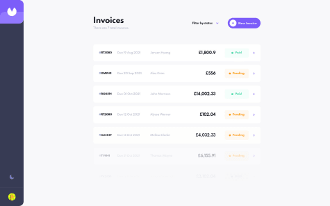
I'm working on the same project and I will submit it in a few days. Your build is awesome, it's very responsive and reactive. However, using react dev tools, I saw that a lot of re-renderings happening on your application, mostly from components on your Invoice page. So I started looking at your code and I saw that you're not using memo or useCallback on your functions and components. What's happing is that every time the state of your parent element changes, all the components are going to re-render again, even if they don't need to re-render. If possible, I would like to copy your repo and create a solution for this problem. Let me know if I can, and maybe, we could work together to solve this problem!
Thanks for your time and happy coding :)
@imjackfrost1997
Submitted
It takes me 2days to build this website using CSS Grid and Flexbox at the same time I'm practicing and experimenting on that properties any feedback will be appreciated thankyou ;)
@Galielo-App
Posted
Hello Jack!
CSS Grid and Flexbox are awesome features. But remember:
Happy coding and please upvote my comment if I was helpful :)
@Enoah35
Submitted
Attempted 3 times. Two attempts, I have started from desktop design and then use @media query for mobile. But I could not figure out some of the elements to appear as shown in the screenshot. So on my last attempt I started making from mobile layout which I found much easier for this project.
Used Flexbox for the testimonial and the rating sections. But the layer itself has been made using Grid. Checked with my mobile the webpage and it is responsive. Included screenshots for the Desktop and Mobile version using Firefox snapshot.
As usual any comments, advices, critiques is welcome!
@Galielo-App
Posted
Hello Ushiyama!
Awesome build, but I would change somethings:
margin: 20px; inside the .social-panel .happy coding and if I was helpful please upvote my comment :)
@vishalsingh6350
Submitted
everything is working as intended but on mobile phones the drag and drop functionality is not working for some reason....it would be awesome if anyone can help me with this thing
@Galielo-App
Posted
hello, awesome build!
I would suggest you save your data in the local storage, so when you refresh the page you still have your todos. Maybe this article will help you.
Happy coding and if i was helpful please upvote my comment :)
@alimansoor-create
Submitted
Hey!
How did you guys tackle the problem of moving the profile image up and making it overlap with the background pattern? I used transform: translateY() but it seems very finicky.
Is there any better solution, using perhaps different markup, or maybe a better CSS layout?
@Galielo-App
Posted
Hello Syed.
Sure, the cleanest way is using a negative margin value. margin-top: -52px; This should work for you.
Happy coding and please upvote my comment if I was helpful :)
@GaldinoMat
Submitted
I am getting used to CSS Grid, and I've found out that it helps us a lot when we have non-liear designs to follow. I hope I can get used to it as much as I am with Flexbox.
Any feedback is greatly appreciated!
@Galielo-App
Posted
wow, your javascript is so clean!!!!!! I'm going through advanced javascript right now and I learned a new way of validation from you. Using regex and match to then activate a function is an awesome idea. Good job!!
@AsmaaMK
Submitted
I'm happy to hear your feedback.
@Galielo-App
Posted
Hello Asmaa,
Amazing job, but here a few things:
cursor: pointer to make sure the user knows that it is clickable.transition: color 0.3s ease, background-color 0.3s easehappy coding and to support me please upvote my comment :)
@Sven72
Submitted
Hi all, I am interested in:
@Galielo-App
Posted
hello Sven!
here a few things:
<div id="divider" class="visible_divider"></div>, don't remove it! just add visibility: hidden; opacity: 0; and you're done.happy coding and if I was helpful please upvote my comment.
@Martingf56
Submitted
This is my solution, I have a question which is a better metric for padding. Rms or percentages?
@Galielo-App
Posted
Hello Martin,
Never use percentages for paddings, it's just uncontrollable and you will struggle a lot with it. Use percentages on widths or heights.
REM or EM, that's the question, I personally think it's better to use EM when you need padding inside a button, in this case, I would go with EM. But if it's the padding of a card or an input, then I would go with REM.
Happy coding and please upvote my comment if I was helpful ;)
@yornellas
Submitted
General feedback, please
@Galielo-App
Posted
Hello Yolanda,
Awesome build, but I would change some things:
style.css you wrote align-items: center; and justify-content: center; but you have a display: grid. That's incorrect because align-items: center; and justify-content: center; are a display: flex; property, and not a grid one.max-width: 1150px so it will not expand through the entire screen. but then it will not be centered, so add a margin: auto as well. display: flex;
align-items: center;
justify-content: center;
flex-direction: column;
min-height: 100vh;
happy coding and if i was helpful please upvote my comment :)
@Beretus
Submitted
I will be grateful for any feedback.
@Galielo-App
Posted
Hello Mateus, I would change a few things in your code:
@media (max-width: 445px) .rate {} put the width at 100%, and in your @media (max-width: 445px) .review you should put the width at 100% as well.happy coding and please upvote my comment if i was helpful :)
@tomthestrom
Submitted
What do you think about absolutely positioning within the elements in the <section class="today">? Should have done it w flexbox?
Regarding BEM, it would have been more ideal to use a shared class between the cards in the general overview and the cards for today.
Anyway, first challenge completed.
@Galielo-App
Posted
hello Tom,
well, you can do it with position absolute, but there is a better option. look at this example:
<article class="media-today">
    <div class="uppear-area>
          <h3 class="media-today__heading">Likes</h3>
          <object class="social-icon" type="image/svg+xml" data="images/icon twitter.svg">
            Icon Facebook
          </object>
    </div>
    <div class="bottom-area>
         same thing here
    </div>
 </article>

.media-today {
    display: flex;
    flex-direction: column;

    .upper-area {
        display: flex;
        justify-content: space-between;
        align-items: center;
    }

   .bottom-area {
       same thing
    }
}
happy coding and if i was helpful please upvote my comment :)
@Ashishkumar1676600
Submitted
One slight error suggest any solution..
@Galielo-App
Posted
hello, explain the error please :)