
@tucecifci

Yari Morcus
@YariMorcusAll comments
- @YariMorcus
Hi Tuğçe,
First of all, you did a great job at replicating the challenge.
I do however have some tips for you to become even a better Front-end developer.
Feedback and tips
- Your share container causes an overflow of the body on mobile. As a result, a horizontal scrollbar appears. One way to solve this is to show the share container underneath the author container (in your case, the
div.footerelement). The challenge however indicates that it is acting as an overlay over the author container. - I wouldn't be using an
imgas a button by attaching JavaScript to it. Instead, I would be using thebuttonelement to which you can add theimgelement, or add the image with aCSS background image. Your image buttons are not accessible for keyboard navigation at the moment (you can try this yourself by pressing thetabkey). In other words: people who are not capable of using the mouse due to a handicap (such as dexterity problems) cannot use your buttons. I do not want to exaggerate, but this is a serious issue concerning Web Accessibility.
I hope you can do something with the feedback I gave you. Do not see this as something you should do right now. You can also decide to apply it for a later project. I'm just pointing some things out that I noticed.
If you have any questions, you can let me know and I will try to respond as quickly as possible.
And last but not least, keep building awesome projects :D
- Your share container causes an overflow of the body on mobile. As a result, a horizontal scrollbar appears. One way to solve this is to show the share container underneath the author container (in your case, the
- P@giovanigomez1@YariMorcus
Hi Giovani,
There is no need to use JavaScript if you can avoid it. By implementing the dropdown menu with CSS only, you made sure that even people who do not have JavaScript for whatever reason can still use your menu.
Your users will thank you for that ;)
- @avinno@YariMorcus
Hi Aaron,
First of all, I think you did a great job coming up with a solution for this challenge. It looks exactly like the design, it is functional and also responsive.
There is one thing I noticed and that is the following.
I can press the submit button without selecting a number. This results in the message
You selected out of 5(missing the number). You could give it a default rating number (which you should not do in a real application unless clearly indicating what this number will be), or you could also disable the button and enable it when the user selected a rating.It appears you get to choose haha.
I hope you can do something with this feedback. If you still have questions, let me know.
If I made a mistake somewhere in this post, feel free to correct me and keep building awesome things :D.
Marked as helpful - @SuperJulia2024@YariMorcus
Hi SuperJulia2024,
First of all, I think you did a great job coming up with a solution for this challenge. It looks exactly like the design and is also responsive.
Here is my answer of your question about margin-tops and bottoms. I currently do not have time to also answer your second question about pixels and (r)em. I will come back to this solution to answer this question as well as soon as I got more time (and if I did not forget it 😳).
- I read somewhere (and I kind of share the same opinion) that you should always apply a margin bottom to elements. This has to do with a concept called
'margin collapsing'. If you start mixing margin tops and bottoms of elements and you do not understand this concept, then it can become quite hard to calculate the real distance between elements. This is because those margin tops and bottoms start to collide with each other. For example: if you apply a positive margin-bottom of 10px to element a, and a positive margin-top of 20px to element b, the real distance between element a and b will be 20px (not 10). This is ofcourse a simple example but in a real big project this can become quite complex (and frustrating if people start mixing them). I personally only use a margin-right and left on a complete container to push it away from other surrounding containers (a container that is completely independent from others (Containers like these should be marked with<article>(here you got a free tip haha))). Concerning your solution: I personally would have placed themargin-bottom: 1.8remof.current_priceon the container with.price.
Other feedback I would like to give you.
Feedback
- Create a hover state for your
'Add to Cart'button with enough contrast between the enabled state and hover state. This gives the user a distinct indication that they are hovering over an interactive element. You can achieve this with an overlay with a lower opacity than your current background color (to make sure people are not distracted).
I hope you can do something with this, but if you still have questions, let me know. Don't see it as something you need to do, but rather something for later (you are always free to correct your solution).
If I made a mistake somewhere in this post, feel free to correct me and keep building awesome things :D.
Marked as helpful - I read somewhere (and I kind of share the same opinion) that you should always apply a margin bottom to elements. This has to do with a concept called
- @tuliovini13@YariMorcus
Hi Túlio,
First of all, I think you did a great job on the challenge. The component is responsive and almost looks like the design (you forgot to add a white background to the
result2 section).The only thing I noticed beside the above is that your favicon is not working (due to an incorrect path, you can see this in the JS console).
To give you an answer to your question
You can change widths more easily by not only using percentages (which you have done already), but also by using CSS Grid Layout.
Alternative method with Grid Layout
- On larger screens (use a media query for this): on
div.card, usedisplay: gridinstead offlex, and usegrid-template-columns: 1fr 1fr;. This creates a grid formatting context (grid container) in which you can create your custom layout. In this case, a two column layout. The two column layout is then achieved withgrid-template-columns: 1fr 1fr;, which basically says: create two columns of the same size. 1fr 1fr is here equal to 50% 50%. - Remove
width: 100%on bothsection.resultandsection.result2. - Remove
width: 500pxon<main>and putmax-width: 500px;ondiv.cardinstead. I also advice this when you use flexbox. The main reason for it is because it is a componen, which should be able to be reused on multiple pages (without settingwidth: 500px:on<main>all the time, because this can break your entire layout if you have other things on the webpage as well (but this is something for later on).
If you do the above, you will see that it will give you the exact same result.
I you want to learn more about Grid, then you can follow a crash course (Traversy Media) if you'd like.
Flexbox variant (which you currently use)
Instead of putting
width: 100%;on bothdiv.resultanddiv.result2, you could have placedflex: 1;on bothdiv.resultanddiv.result2.Flex: 1; says: create two flex items of the same size (50% 50% because you have two flex items in your
div.card container(flex container)).I hope you can do something with this, but if you still have questions, let me know. Don't see it as something you need to do, but rather something for later (you are always free to correct your solution).
If I made a mistake somewhere in this post, feel free to correct me and keep building awesome things :D.
Marked as helpful - On larger screens (use a media query for this): on
- @kareemIsWebDevelper@YariMorcus
Hi Kareem,
Even though you had it difficult to make the website fit on both mobile and desktop, I must say that it still looks pretty good.
The best way to solve this problem is by following the 'mobile first' principle. In short: you create your design for mobile first, then tablet, and then desktop. With this approach, you use the
min-widthmedia feature rule within @media (@media (min-width: 768px)e.g.).Another tip I have for you is to define your layout structure first, and when everything works correctly, you add the visual parts to your box (background color etc.). What I always do is adding a border around all my boxes, make sure the layout is correct, and then remove the border (which was temporarily used to identify the boxes).
Other tips
- Try to use a little more of the semantic HTML elements HTML5 offers you for structuring your document. You can think of <article>, <section> and <header>. When you start using these semantic HTML elements more, you make your component even more accessible for people who use assistive technologies (such as screen readers), because theses HTML elements are recognized better than using the common 'div' or 'span' for example.
- For your 'Add to Cart' button: use the
<button>element. One of the reasons for this can be found above this point, but the other one is because you cannot place focus on the button (which can be done with keyboard navigation (tab key)). - Try to bring a little order in your stylesheet. Your element, class, and id selectors are all mixed up. A common practice is to place the generic styling (element) selectors at the top of your stylesheet, the more specific (class) selectors underneath it, and then the id selectors. Another way to organize your CSS is to bring order to your CSS declarations. A handy website I use as a reference is codeguide.co.
I hope you can do something with the tips I gave you. Don't see it as something you need to do, but rather something for later (you are always free to correct your solution).
If I made a mistake somewhere in this post, feel free to correct me and keep building awesome things :D.
Marked as helpful - @carllouislabutong@YariMorcus
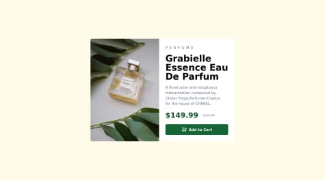
Hi @Carl,
First of all, congratulations on completing this challenge! I have been taking a look at your component and must say that it looks good.
I do have some feedback I want to share with you.
Visual
- Just like you already mentioned (in some way), I noticed that your component is not responsive between breakpoint 375px and 528px. A horizontal scrollbar is shown, and both your title, old price, and button are overflowing its container.
Tips
- Try to use a little bit more of the semantic HTML5 elements, such as <main>, <article> and <section>. This is important for assistive technologies because it communicates better what the role of a specific element is. A div or span for example, does not communicate any meaning or role, which is important for people using these technologies.
- You can use
<button>as an icon button. This point also relates to point one above (do not forget to define an accessible name if you do so). - Some classes contain one or two whitespaces in front or after of the name. You should remove them for neatness.
- Try to define a more descriptive name for your images. This is important for search engines so they can understand better what an image is about.
img-46292547.jpgas an example doesn't say a lot about what it can be (does it represent a car, food, or an animal?). As an example you could name your imagegrabielle-essence-eau-de-parfum-bottle.jpg.
Things you did good (may also be said)
- You are using utility classes as should (they only do one thing).
- Your design looks good on both mobile, tablet, and desktop (disregard the breakpoints for this moment).
- You added a hover state to your button (a simple thing, but plenty of people forget it or the color used isn't visible enough).
I could give you some more feedback and tips but I think this should do it for now.
However, I hope you can do something with the feedback and tips I gave you. If you have any more questions, feel free to ask me.
If I made a mistake somewhere in this post, feel free to correct me and keep building awesome things 😄
- @ejikemechiozoadiro@YariMorcus
Hi @chiozoadiro,
First of all, congratulations on completing your first challenge! I took a look at your design, and it looks pretty good.
However, I do have some feedback I want to share with you so that you can become even a better developer than you already are.
My feedback is divided into sections to make it more clear.
Mobile
- Your component should be a little wider. If you do this, your text will align better according to the design both on mobile as desktop. Besides that, the width of your component will be both the same on mobile and desktop (you do not have to adjust anything specific for desktop).
Tips
- You can center any component horizontally and vertically by doing the following (assuming that the page only contains a component). Place
min-height: 100vh;,display: grid;andplace-items: center;on<body>. If you do this, you do need to remove the div with idforest-ext-shadow-host(just as a sidenote: I do not see any CSS attached to this id, so I think you might forgot to remove it?). - Always place the
widthandheightattributes on<img>, and use the pixel values of the width and height of your image (the size you are going to use). This gives as a result that your page will load faster, the page won't jump when suddenly an image loads in (very frustrating for users), and your page will act smoother. - I saw you have been using rem values for your widths, margins, paddings and font-sizes, and used
font-size: 62.5%on<html>. If you want to make it easier for yourself to calculate your em and rem values, then you should replace62.5%with10px. If you want to use em and rem values, the only thing you have to do isfont-size (or width size) / 10 = your em/rem value. This will make it a lot easier for you instead of using a percentage on your root element (<html>).
Things you did good (may also be said)
- Even though the width of your component should have been a little wider, you still did a great job on making it look as close as possible to the design.
- You placed the specific part of your content within
<title>upfront (I hope that I am saying this correctly haha). - You implemented BEM correctly.
- You have been using the color models consistently (HSL in this case).
I hope you can do something with the feedback and tips I gave you. If you have any more questions, feel free to ask me.
If I made a mistake somewhere in this post, feel free to correct me and keep building awesome things 😄
Marked as helpful - @MIBENIN@YariMorcus
Hi @Mibenin,
First of all, congratulations on completing this challenge! I took a look at your design, and it looks pretty good.
However, I do have some feedback I want to share with you so that you can become even a better developer than you already are.
My feedback is divided into sections to make it more clear.
Mobile
- I think you forgot to add whitespace on both the left and right sides of the card component. It is currently clung against both sides.
- The 'Proceed to Payment' button should be a little higher according to the design.
- The text within the 'Proceed to Payment' button should have a larger font size.
Desktop
- Your 'Change' button has been made up with
<a>. You should be using<button>instead according to the <a>: The Anchor element page on MDN. The anchor element is something you should only use when you navigate to a real hyperlink (which wouldn't apply in this case, because if it was a functional application, it would probably bring up a dropdown menu). - Your 'Cancel Order' button has been marked up with
<p>. You should be using<button>instead, because the latter conveys important information to assistive technologies such as screen readers. You did use<button>for the 'Proceed to Payment' button, so that is good. - The text color of the 'Cancel Order' button does not change on hover, and
cursor: pointer;is not shown either. This has probably to do with the prior point. - The 'Cancel Order' button should have
font-weight: 700;if I am seeing this correctly in the design (it is a little thicker than the 'You can now listen to.....' text). - You have both a horizontal and vertical scrollbar on desktop view. Is there a reason why you applied
overflow: scroll;to.container?
I also want to give tips to you based on looking at your code.
- Try to be as specific as you can be in the lang attribute on
<html>. In this case:lang="en-us". This is important for not only search engines but also browsers. Search engines for example, know what language your document is in and in which language your page should be ranked. Browsers on the other hand, know better what dictionary has to be applied to make sure the right grammar and spelling checks are applied. - The content within
<title>should always read from specific to general. In this case, that would be "Order summary card | Frontend Mentor". This is important for SEO reasons, because search engines always truncate text that is longer than a specific amount of characters (I thought this was between 155 and 160). In this case it is a short title so it should not cause any problems, but try to make it a habit. - Try to use a little bit more of the semantic HTML5 elements, such as
<main>,<article>and<section>. This is important for assistive technologies because it communicates better what the role of a specific element is. A div or span for example, does not communicate any meaning or role, which is important for people using these technologies.
I could give you some more feedback and tips but I think this should do it for now.
However, I hope you can do something with the feedback and tips I gave you. If you have any more questions, feel free to ask me.
If I made a mistake somewhere in this post, feel free to correct me and keep building awesome things 😄
Marked as helpful - @Myntsu@YariMorcus
Not a problem!
HTML
The good thing is that you at least thought about using the semantic HTML5 elements (at least you know that they exist) haha.
You shouldn't be too worried about your CSS getting too long. It is better to create classes for certain styles (like you already mentioned), than using inline styles. These classes are also called 'utility classes', or at least if you only bound one property to an element using the style attribute.
As a sidenote: I just noticed that your
width: 16remon the div with class.cardcould have been placed in the.cardclass itself.What you could have done with your image is using the img selector in your stylesheet, and place
width: 100%; height: auto; border-radius: .7em;in it. If you style elements like this, it is also called 'defining global (or generic) styles'. But in normal cases you would have a utility class forborder-radius: .7em;, unless you want that border-radius to be applied to all the images.CSS
About your CSS: that sounds familiar haha.
Mobile-first
I didn't know that Bootstrap had tools to fix mobile incompatibilities (I do not use it that much). I guess I learned something new here as well haha, thanks!
I just noticed that I forgot to mention in my first comment that I highly recommend you to follow that principle, if you are building (large) websites/webpages (not just a single component, like you did now).
If you are not using the mobile-first principle for (small) components, then I am not going to make a problem out of it (or not at all actually, because you have the freedom to make that decision yourself haha). Small components are indeed easier to adjust for smaller screen sizes, but (large) websites/webpages are another story.
To answer your question "why Mobile first": I found an article that explains the advantages and disadvantages for you: What Are the Advantages and Disadvantages of Mobile-First Design? (opens new tab)
My advice is to just try it out for your next challenge to get the hang of it. Trust me, it is not as hard as you think it is (especially for small components). With the mobile-first principle, you only use the
min-widthmedia feature (within your media query) and notmax-width.I hope you can do something with my answers, but feel free to ask questions if you still have them.
- @Myntsu@YariMorcus
Congratulations on completing this challenge Myndi!
I took a look at your solution, and I need to say that it looks pretty good! I can see that you took the time to create your component as close as looking to the designs that where given to you. This is not something I see from all people, so you should be proud on yourself!
Of course I do have some feedback for you, which I have been dividing into sections for more structure.
Section: HTML - feedback
-
Try to be as specific as possible in your
<html lang="en">attribute. So in this case, I would use:<html lang="en-us">. This is important for not only search engines, but also assistive technologies such as screen readers and browsers. Browsers use this tag to make sure it is using the correct dictionary in order to apply the right grammar and spelling (yes, there is a difference, you can consult the article of The Cold Wire for more information). Screen readers, for example, use this tag to apply the correct pronunciation of words. -
Try to use the semantic HTML 5 elements instead of the common block-level element called
div. A div (just like a span) does not convey any information to search engines and assistive technologies about what the content really is (unless you use ARIA, but that is something you should not be concerned with at the moment). What I did was the following: I added<main>as a direct child of<body>to indicate that this is the main content of the page. Within<main>, I added<article>to indicate that the QR code component standalone content is (it is content that you can share with others, without needing to provide them with other content on the page, in order for them to understand it). Within article I placed<header>to indicate that<img>is the header image of the component. As a sibling of<header>, I used<section>.<section>indicates that a group of content shares the same functionality (in this case, the heading and paragraph). I have to point out here that it might vary from other people. The main idea here is that you try to ask yourself what the purpose and functionality is of specific content. Based on this, you choose the corresponding semantic HTML 5 element. -
Try to avoid the use of the style attribute on elements. It is a bad practice because you are polluting your HTML file with CSS. You always should separate these technologies (HTML, CSS, and JavaScript) as much as you can). If you are going to use the style attribute, this makes it harder for other developers to read and edit your code, but also creates semantic problems, because you need to edit your HTML constantly to change the style of an element. Also, you cannot reuse styles such as a class in CSS (unless you do copy paste, which you should not be doing).
Section: CSS - Feedback
-
I see you are using
background-image: url('');andjustify-content: center;withinbodyelement selector. Is there a reason why you are using this? Or did you forget to remove it? If it is not serving a purpose, then I recommend you to remove it. Unnecessary styles always make your stylesheet unnecessarily larger, and developers have more code to read (even code that does not do anything). You even do yourself a favor with this haha. -
I see you are using a comment called
/* display: inline; */within.card-header. I think you forgot to remove it.
Section: CSS - What you did good
-
You are consistent with the color model you use (in this case, the HSL color model). Some people tend to use color names, hex, HSL, and RGB all at the same time.
-
You are using relative units (
vh,emand%) within CSS, which is always good from a responsive design perspective. -
You are using clear and descriptive class names.
Something else I do want to share with you, which I think is very important, is the one below.
I noticed in
style.cssa media query with the media featuremax-width. I am not sure whether you made your design for mobile first, but always try to follow the 'mobile first' principle. This means that you should always design (develop) for mobile devices first, then tablets, and then laptops and desktops. If you are going the other way around, you might end up with (a lot of) frustration, because it becomes harder to make your website display correctly on smaller screens (trust me, I have been doing this in the beginning, and you really do not want to be there).I hope you can do something with the feedback I gave you. If you have any more questions, feel free to ask me.
If I made a mistake somewhere in this post, feel free to correct me and keep building awesome things :D.
Marked as helpful -
- @snowbot22@YariMorcus
Congratulations on completing this challenge Kevin!
I have been taking a peek at your solution, and everything looks very well designed! There are, however, a couple of small things I do want to share with you.
These points are related to making your design look a little more like the mobile design given to you.
- The padding of your section with class .card should be a little larger. I have been trying to figure out the right value, and this should be approximately 2.5rem.
- The title (your
<h2>) should be a little bigger. You should increase the font size to 2.3rem. - The
font-weightCSS property in file _typography.scss on line 8, contains an invalid value. You used the value oflight, but I think you meantlighter. The CSS declaration is now invalid due to this mistake. - You should decrease the font size of the
.card__reviewclass from 1.8rem to 1.7rem. In combination withfont-weight: lighter, the text looks a little more according to the design. - The text in
<p>(0.041 ETH) should be a little smaller. I have been trying to figure out the right value, and this should be approximately a font size of 1.7rem The text in<p>(3 days left) and<p>with class .card__div--2__review should not have a font-weight of bold (if I am seeing this right in the design). If you changed the font size of prior point, you should also set the font size on both<p>elements to 1.7rem for consistency.
The following point is related to your hover state of the image:
- You should change your
opacity: 0.7toopacity: .5(.5 is the same as 0.5). This way, the cube in the image can be seen a little easier (such as seen in the design).
I also took a look at your CSS, but I am not seeing anything that you should pay attention to.
I hope you can do something with the feedback I gave you. If you have any more questions, feel free to ask me.
If I made a mistake somewhere in this post, feel free to correct me and keep building awesome things :D.
- @aevim@YariMorcus
I took a look at your result, and it looks good.
However, I do have some feedback points, which I want to share with you (it is up to you what you do with it):
Critical feedback
- I can submit your form without selecting a number.
This action brings me to the
rated.htmlpage, which gives me the following message:You selected null out of 5. This shouldn't happen in a real system, so this is something I would definitely change (like disabling the button if the user did not select a number. In this case, don't forget to enable it again haha).
Other feedback according to the design
- The padding on the top, right and left should be a little larger.
- The padding on the bottom should be a little less (if I am seeing this right in the design).
Other tips
- I see you created a hover state for your links in your footer, but not a visited and activated state (which should exist as well according to Web Accessibility).
- I personally would place
<small>within<footer>, to better indicate to assistive technologies (such as screen readers) that the text belongs to a footer (unless there is a reason why you don't want to convey it as footer text). - I always learned to use CSS background images for decorative images (in this case, the
icon-star.svg). There is a side note here, and that is the following: if you do want to use HTML images for decorative images, then leave the alt attribute empty. Screen readers will otherwise read this out to their users, and this might confuse them because it doesn't offer any real value for these people. - Always supply a raster image as a fallback for your vector graphics, in the case the user disabled images, or the browser does not support an SVG. Otherwise, nothing will be shown to the user.
I hope you can do something with the feedback points and tips I gave you, but don't see it as something you need to do, but rather something for later (you are always free to correct your solution if you want).
If I made a mistake somewhere in this post, feel free to correct me and keep building awesome things :D.
Marked as helpful - I can submit your form without selecting a number.
This action brings me to the
- @AbdullahAjayi@YariMorcus
I took a look at your solution, and have a couple of feedback points and tips I want to share with you. I do need to say up front that it might be a lot to digest, but I am doing this to not only help you out, but also to share information about things I learned from others.
Feedback points
-
I am able to submit a rating, even if I did not select any number. In a 'normal' rating system this would not be allowed, because normally you cannot submit your review form, without not giving up a rating number. Unless the system doesn't require you to supply a rating number, but in this challenge it does (or at least, that is how I read it in the challenge description).
-
I always learned not to write a word in uppercase, when you want to show it in uppercase to your users. This has more to do with Web Accessibility because screenreaders might read it in the wrong way. My advice is to always use
text-transform: uppercase;.
A couple of tips
I do have a few other tips for you as well:
-
Always supply a raster image as a fallback for your vector graphics, in the case the user disabled images, or the browser does not support an SVG. Otherwise, nothing will be shown to the user. I noticed that you did not supply text within the alt attribute, and that is good (because it is decorative)!
-
Try to use a little more of the semantic HTML elements HTML5 offers you for structuring your document. You can think of <article>, <section> and <header>. When I did this challenge, I used <article> for both the rating card and thank you card, <section> to indicate it is a specific section within article (section offers the same functionality), and <header> to enclose any titles or introduction content. When you start using these semantic HTML elements more, you make your component even more accessible for people who use assistive technologies (such as screenreaders), because theses HTML elements are recognized better than using the common 'div'.
-
Do not use of @import statement within your stylesheets. They create a new HTTP request, which in return results in slowing down the speed of your website (when the user requests to open your webpage). I do need to say that in this case, it doesn't really matter, because it is just one of them, and the website doesn't use a lot of resources. But I do recommend not to use them when you use more of them, especially when creating a big website. Just as a sidenote: speed is an important metric for search engine optimization (SEO), and also user experience.
-
Don't try to repeat your CSS (follow the DRY principle). It makes it harder to maintain, and unnecessarily increases the size of your file (again, this has to do with the speed of your website).
I saw that body main, .star, .rating-star-component and .thankyou-page-wrapper use the following CSS declarations:
display: flex;
justify-content: center;
align-items: center;
In this case, I recommend you to group all of the above named selectors together, and apply above CSS declarations to it:
body,
main,
.star,
.rating-star-component,
thankyou-page-wrapper {
    display: flex;
    justify-content: center;
    align-items: center;
}
When you have to update one of the CSS declarations, it will all be adjusted automatically for the other selectors (you spend less time repeating the same action).
Other things I want to say
The responsiveness of your interactive rating component is something I tested as well, and that seems to be fine (which is very important nowadays).
I hope you can do something with the feedback points and tips I gave you, but don't see it as something you need to do, but rather something for later (you are always free to correct your solution if you want).
If I made a mistake somewhere in this post, feel free to correct me and keep building awesome things :D.
Marked as helpful -