


Janos Takacs• 230
@JT1974
Submitted
How much do you break your code into smaller files/components? Is it worth to bother with too many components on this level of complexity? Reviews of my solution and code are greatly appreciated. Thx
Looking to hire developers?
@renras
@JT1974
Submitted
How much do you break your code into smaller files/components? Is it worth to bother with too many components on this level of complexity? Reviews of my solution and code are greatly appreciated. Thx
@renras
Posted
I usually break the page down into components when the code gets too long as it's easier for me to manage. Usually my jsx has like a maximum 100 lines of code. But only the ui elements and others that will be re-used will be stored in the components folder. The other page components I just store it in a page folder like pages/home so that you wouldn't have to deal with a lot of unnecessary components in the components folder
Marked as helpful
@PaliTriesToDesign
Submitted
I learned a lot building this project!
If you look closely to the triangle in the mobile menu you can see that it is not perfectly aligned to the right border. Any suggestions?
Also, what JS animations could I use for a web page like this one?
Thanks!
@renras
Posted
I was able to recreate what you were trying to do in this codepen: https://codepen.io/renras/pen/bGaZPJx,
Or you could just put them in a parent container and do display: flex instead of using the ::after approach.
Marked as helpful
@muyiwa99
Submitted
One of my image gallery layouts seem to display a gap for the mobile section when testing on chrome, but not on Firefox. Any tips on this would be greatly appreciated.
@renras
Posted
width for containersmax-width, min-width and percentages instead.flex {
display: flex;
flex-wrap: wrap;
.flex-children {
flex: 1 1 0;
}
}
.grid {
grid-template-columns: repeat(4, auto);
}
Marked as helpful
@misiucodes
Submitted
Hi FEM community,
Who thought what looks like a simple landing page could be so difficult! Some of the areas I struggled with that I would love advice/words of wisdom on are:
Thanks all,
newbie coder
@renras
Posted
Try wrapping your nav inside a div and apply the positioning on that instead and add overflow: hidden on the nav;
<main style={{position: relative}}>
 <div style={{position: absolute}}>
  <nav style={{overflow: hidden}}></nav>
 </div>
</main>
I successfully recreated the animation you're trying implement here in this codepen: https://codepen.io/renras/pen/XWVooXg
@rawatdev
Submitted
When I resize my window from large to small, then its navbar goes from desktop position to mobile position above the screen, which i don't want to see while resizing otherwise its working fine. How to solve this issue ?
@renras
Posted
You can make a separate nav for mobile and desktop and make use of display: none. This will reduce complexities in your layout. Otherwise, make your transition more specific by targeting only the property you want animated.
@Holymarz
Submitted
The footer links (facebook, instagram etc) could not highlight when hovering, I'm guessing because it's an image, any advice on how to highlight an image?
For the menu I wasn't sure on how to get that pointing like corner on the upper right corner, so I just settle with a regular box, any tips on how I can make that?
@renras
Posted
You can put your icons in a container like a button and put a hover effect on that container instead. It's also fine if icons don't have a hover effect, most sites are like that.
Regarding your question about the the menu, the easy way would be making a triangular div and place it above your menu. Here's a useful link: https://css-tricks.com/snippets/css/css-triangle/
I believe you can also make use of clip-path. It's more complex than the first option but actually worth learning as it provides more flexibility and is often used in complex layouts.https://developer.mozilla.org/en-US/docs/Web/CSS/clip-path
Marked as helpful
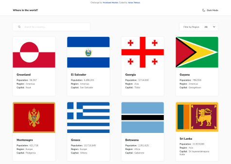
@GloriaSekyere
Submitted
I found this one exciting! This is my first advanced project. I struggled with styling the Filter by region select input so I have left it for now. Here are some additional features I added:
I am still a beginner in React and jumped a lot of challenges to this one so any feedback on the code and practices are welcome.
Also, can someone explain to me when to use useHistory and when to use <Link /> in routing?
Thank you!
@renras
Posted
Link doesn't trigger a full page refresh compared to using an a tag which would reset the application state. Normally, you'd always want to use Link for navigating throughout different pages in your application. I believe useHistory is used for programmatically redirecting users to a different page where you can't use Link. Like inside a code block:
const history = useHistory();

const register = async () => {
 await register(user).then((username) => {
  history.push(`/profile/${userName}`);
 })
}
Marked as helpful
@murytarlah
Submitted
I had a bit of difficulty with the filtering section but thanks to stack-overflow, I was able to find a solution Question: I re-render the countries grid view every time a key is pressed in the search input button looping through 250 each time. I feel this is bad practice but can't think of a better way to go through this, any help would be appreciated
@renras
Posted
You could make use of debounce and throttling.
Here's a good youtube video to start with: Learn Debounce And Throttle In 16 Minutes by Web Dev Simplified
Also, I think it's better if you can merge your filter methods into one function. That way, the country and region will be in sync with each other.
@ILikeCode1
Submitted
My biggest project yet. I got the html and css under control but im stilll new to js. Im in needs of tips on how to fix mobile nav showing up when its not supposed to.
@renras
Posted
Add media query to mobileNav also and set display to none.
mobileNav.style.display = "none";
mobileMenu.style.opacity = 1;
In your script.js, you have these lines of codes outside your function. I believe you can remove these and set the default styling in your css instead.
@surfruit
Submitted
Need help with responsive, also I don't know how to remove margins from header+main+footer. How to change svg color? How to calc width and height of 4 images before footer. thnx
@renras
Posted
There are a lot of things to improve on this project but here's a few to start with.
Just nest the margin and padding inside the * selector also since it applies to all html element.
*,
*::before,
*::after {
    font-family: 'Poppins', sans-serif;
    box-sizing: border-box;
+ margin: 0;
+ padding: 0;
}
Your body has a max width making your page not extending on larger screens. You can apply this to the elements inside instead.
body {
    color: black;
  - max-width: 1440px;
}
Your images are overflowing because they have a fixed width. What you can do is to apply properties like width:100%, max-width and min-width instead.
img {
 + width: 100%,
 + height: auto,
}
You can apply this concept on your containers too.
You can change the color of the svg directly on the file by changing it's fill attribute. If I want two of them but different color I just make another copy.
Goodluck!
Marked as helpful
@titocs
Submitted
i dont know why the Trash Button cannot be targeted by event.target so it cannot be clicked? also, feedback are open :) Thanks
@renras
Posted
Your trash button has a child element in it which is targetted instead. Try using e.currentTarget instead because it is attached to the one with the event listener. But still it wouldn't work because the event is firing from the document which you have another event listener attached to which also gets fired. Instead of adding another event listener of the same type to the same element just merge them so It'll be easier to debug.
@basemosman2
Submitted
I am testing my knowledge of vanilla JS, for that reason I forced myself not to use any framework for this challenge. I would like to receive feedback on things that can be improved. Thanks in advance.
best wishes
@renras
Posted
few things I think it can improve on:
let selectedThumbnail = selectedImg.slice(0,selectedImg.indexOf('.jpg'))+'-thumbnail.jpg';
I believe what you are trying to achieve here can be done using string.replace instead and is faster than slice.
function activethumbnailImg(thumbnailImgs,mainProductImg){

    thumbnailImgs.forEach((img)=>{
        img.addEventListener('click',(e)=>{
            thumbnailImgs.forEach((img)=>{
                img.parentElement.classList.remove('active');
            });
            let imgName = `images/image-${e.target.dataset.name}.jpg`;
            mainProductImg.setAttribute('src',imgName);
            e.target.parentElement.classList.add('active');
        });
    });
}
you are nesting a foreach inside a foreach which runs kinda slow. I believe this can still be optimized using event delegation instead and traversing
Marked as helpful
@fadelun
Submitted
i tried this challange with React js first time but i'm not competent of react js,please if you have feedback or advice tell me to improve my skill thanks
@renras
Posted
refrain from using dom methods as it defeats the purpose of react
when it comes to toggling classnames you can use a ternary operator inside a string literal instead.
const [showModal, setShowModal] = useState(true);

<Modal className=`${showModal ? 'block' : 'hidden'}` />
@paulpdoa
Submitted
I'm done with the frontend design together with changing of themes but I'm still having a problem with JavaScript side. I hope I can go back to this problem and finish everything to make it all working :). Please comment on how I can improve my JS programming :D Thanks everyone
@renras
Posted
Keep your code dry.
In your keypad component, these buttons can be mapped instead.
const clickHandler = () => {
  //put logic here
  //use if else to add logic depending on the type of button
}

//render
{buttons.map(button => {
 return (
   <Button onClick={clickHandler}></Button>
)
)}
// classnames
<div className={
        theme === 1 ? "flex justify-center w-full h-screen theme1-bg" :
        theme === 2 ? "flex justify-center w-full h-screen theme2-bg" :
        "flex justify-center w-full h-screen theme3-bg"
       }>
// you can refractor this into
<div className={
   `flex justify-center w-full h-screen
   ${themebg}
`
you can make a separate state for theme-bg depending on the current theme
Marked as helpful
@SheGeeks
Submitted
I would love to learn about ways to reduce having so many JavaScript event handlers for all the interactions in this challenge and whether having so many can cause performance issues.
Any additional feedback is also appreciated and welcomed!
@renras
Posted
You can look into using event delegation where you put an event listener only to the parent.
Too much event listeners are only bad depending on the function inside it. Most of your functions run in O(n) time or less which is good.
Marked as helpful
@KhizarSa
Submitted
Hi guys, I have work hard on this project and i know i've written alot of inefficent code. I would love to get your guys feedback do checkout the website and code. Thank you.
@renras
Posted
I noticed that you added an event listener to resize. Be careful with this as it actually keeps on running and might affect the performance of your site. With background image, you can change the url using media queries instead. Make your resize event listener run fewer times as needed by event throttling etc. Also, you can look into using a resize observer instead. Images also have a srcset property which you can use. It automatically chooses the optimal image depending on screen size.(Though I never really figured out how to make it work.)
Marked as helpful
@nawfelsekrafi
Submitted
Please press f11 or activate full screen view to have the optimal experience ❤ Any feedback please ! Happy coding frontendss 😛!
@renras
Posted
Hi! I love your work. The responsiveness is solid.
Few things I think it can improve on:
I'd love to see you actually put animations/effects to this project.
Marked as helpful
@xs30snw
Submitted
Just completed this challenge, maybe I could refactor source or improve styles.
How good do you think my implementation is?
@renras
Posted
Hi, great work! I like how your theme switcher works.
Few things I think it can improve on:
@stephmunez
Submitted
Hi all!
I just finished another challenge.
This one is fun to build. I had a quite difficult time in hiding the slide-in navbar for mobile and figured it out by hiding the over flow on the x-axis and setting it auto on the y-axis as to not clip the remaining content. Also I harnessed the power of using the viewport width in scaling the width and padding of multiple elements 😂
I added some effects (setting the bg-color to black for contrast) on the navbar when scrolling by using the window.scrollY property and offsetHeight of the nav through an event listener.
As always, feedback is super welcome and appreciated! Do let me know of any issues you may find :)
Happy coding!
@renras
Posted
Great Work!
Things I think it can improve on:
you can set the display to none to hide elements. Then use media query to show it on desired viewport.
also good to check if your site looks okay on all viewport sizes.
problem with your scroll event listener is it keeps running and might affect performance. Try to find a way where it will run fewer times than needed. I use an intersection observer api instead.
@Sig-giovanni
Submitted
Please am open to feedback on the functionality of the calculator
@renras
Posted
The operators doesn't seem to be working.
@dombrga
Submitted
It was the most difficult challenge I did so far here. I would appreciate any comments you have especially about the use of position properties in the header, I think this part is messy and also the part of the testimonials. Also would like to ask for any feedback on my use of css classes. Thank you!
@renras
Posted
Great work!
Things that it can improve on:
try to implement active classes on nav items when clicked
I think it's good practice to nest your navigation links inside a list item in an unordered list : ex: <nav> <ul> <li> <a>About</a> <li> <li> <a>Services</a> <li> </ul> <nav>
cool trick with absolute positioning is that it will position relative to the parent if you set the position of its parent to relative
I always found naming css classes hard, and is something I develop by looking at others' work. I'd start by naming sections/divs like "image-container" or "hero-section" etc..
your layout breaks at like 1450px
Marked as helpful
@nehanalinik
Submitted
Can anyone tell me how to not allow overflow:hidden to the box image in the desktop view?
@renras
Posted
You have overflow property set to hidden on your "images" class. You can nest the box inside your main container instead if you're trying to overlap it.
Marked as helpful
@stfnpczk
Submitted
Those background images gave me some headache, had to tweak and change it a bunch. I’m curious to hear from you about code style and best practices. Cheers !
@renras
Posted
Great work!
Things I'd improve on :
add a fixed height to the main div so it doesn't keep moving when you open/close an accordion
animate the accordion
Marked as helpful
@frontendnus
Submitted
I worked on this project for one day. I am happy to receive feedback from you. Although here I am a little confused by how to change the color of the SVG extension. Therefore, for the footer logo, I changed the color using Figma and for the social icon on the footer, I didn't use the assets provided but took it via iconscout. Does anyone know how to change the color for SVG?
@renras
Posted
You can change the color of the svg by replacing its 'fill' attribute directly in the svg file. I haven't really found any simpler way than doing this.