
@Aysha-py

Sandro
@sandro21-glitchAll comments
- @sandro21-glitch
Hi There
including the Bootstrap framework via its CDN in your HTML file is a common and convenient way to add Bootstrap to your project. It allows you to access the Bootstrap styles and functionality without having to download and host the framework files yourself. This approach is widely used and generally considered a good practice.
As for using the built-in fetch function in JavaScript within an event listener, it's a valid approach for making HTTP requests and retrieving data from a server. The fetch function provides a modern and flexible way to work with asynchronous data fetching. It returns a Promise that resolves to the response from the server, which you can then handle accordingly.
- @OzmanGh@sandro21-glitch
Hi Othman
Here are some suggestions to improve the code
Use CSS reset to standardize the default styles across different browsers.
Use CSS variables for color values, so that it's easier to change the color palette in the future.
Consider using CSS Flexbox or CSS Grid for layout, especially if you plan to have more elements in the future.
Using absolute positioning to center an element has some limitations, such as not being flexible with the size of the parent container. An alternative solution is to use Flexbox or Grid layout for centering elements.
With Flexbox, you can center an element both vertically and horizontally using the following CSS:
.container { display: flex; align-items: center; justify-content: center; height: 100vh; /* or any desired height */ }.centered-element { /* styles for the centered element */ }With Grid, you can center an element in a similar way:
.container { display: grid; place-items: center; height: 100vh; /* or any desired height */ }.centered-element { /* styles for the centered element */ }Happy Coding
Marked as helpful - @Leandr0SmS@sandro21-glitch
Hi Leandro
Here are some suggestions to improve the code
You can use CSS to ensure that a background image fills the full screen, regardless of screen size. Here's an example:
body { background-image: url(your-background-image.jpg); background-size: cover; background-repeat: no-repeat; background-position: center; height: 100vh; }In this example, background-size: cover makes sure the background image covers the entire screen, while background-position: center centers the image within the screen. The height property set to 100vh sets the height of the body to 100% of the viewport height, so the background image covers the entire screen.
Happy Coding
Marked as helpful - @DAVIDS2405@sandro21-glitch
Hi David
Here are some suggestions to improve the code
You can use CSS resets to avoid unexpected default styling.
Add font-size and font-weight to the body class to provide a better overall consistency in the design.
You could use CSS grid or flexbox for the layout to make the design more responsive and flexible.
To center the card with Flex, you can use the following CSS
body{ display: flex; align-items: center; justify-content: center; height: 100vh; }If you want to place the card in the center with absolute position, you can use the following example:
.card{ position: absolute; top: 50%; left: 50%; transform: translate(-50%, -50%); background:rgb(255, 255, 255); max-width: 30.0rem; border-radius: 1.5rem; overflow: hidden; }you can learn Flexbox and CSS Grid on the following resources:
MDN Web Docs , CSS-Tricks , W3Schools , FreeCodeCamp
Happy Coding
- @Mr-jaw@sandro21-glitch
Hi Name
Here are few suggestions to improve the code
Add aria-labels to the buttons to improve accessibility. For example, you can add aria-label="Submit rating" to the submit button.
Use const instead of let when declaring a variable that won't be reassigned.
Add comments to explain what the code does.
Happy Coding
- @josr13@sandro21-glitch
Hi Joseph
The choice between using article or section tags versus div tags depends on the purpose of the content being marked up.
The article element represents a self-contained composition in a document, such as a blog post or a forum post, that should make sense on its own.
The section element represents a standalone section of a document, such as chapters, headings, or any other thematic grouping of content.
If the content within the main tag is a self-contained composition or a standalone section, it would be appropriate to use either the article or section elements, respectively.
If the purpose of the content within the main tag is more structural in nature, it may be more appropriate to use a div element.
Happy Coding
- @Abdokhalil11@sandro21-glitch
Hi Abdokhalil
Here are a few suggestions for improvement
Use semantic HTML elements: Consider using semantic HTML elements such as header and footer to improve the accessibility of your code.
Make class names descriptive: Consider using class names that accurately describe the purpose of the element, such as card-header instead of photo.
Add alt text: Make sure to add descriptive
alttext to the images in the code.Add hover effects for the card: To make the card more interactive, you can add hover effects to change the background color or add an animation effect on hover.
Happy Coding
Marked as helpful - @ruanalexandreS@sandro21-glitch
Hi Dev_Ruan_Alexandre.S
Here are some suggestions for your code
Use semantic HTML elements: You can improve the accessibility of your code by using semantic HTML elements (e.g. header, article, nav, etc.). In this case, you could wrap the heading and description in a header element and the "Order Summary" section in an article element.
Consider using CSS classes with descriptive names: This can make your styles more readable and maintainable. For example, you could use class names like "hero-img" instead of "img".
To make your code more scalable and to reduce the chance of conflicts, consider using CSS class names that are specific to the component and avoid using tag selectors.
Happy Coding
Marked as helpful - @OwerAndres@sandro21-glitch
Hi Ower
Here are some suggestions for your code
Use semantic HTML tags: Instead of using div tags, you can use appropriate semantic HTML tags like header, section, and footer for the different sections of your code.
Consider using a CSS reset to ensure that all browsers display the elements in a consistent way.
Use rem units for font-sizes instead of px, so that your text resizes proportionally with the user's browser font-size setting.
Use class names that are more descriptive, for example, instead of "general", you can name it "card-container".
Use CSS shorthands for multiple properties with the same value, for example, instead of "margin-top: 5%; margin-bottom: 15%", you can use "margin: 5% 0 15%".
Happy Coding
Marked as helpful - @sniper23403@sandro21-glitch
Hi MOHAMED
Here are a few suggestions for your code
Use semantic HTML tags such as header, section, and footer, instead of just a main tag to give structure to your HTML.
Use meaningful class and id names, like "order-summary-container" instead of just "container".
You could use CSS variables for storing common values like colors and fonts, which will make it easier to maintain and update your styles.
For the button, you could consider using a pseudo-element for the button text to avoid the need for an additional p tag.
Overall, the CSS is well-structured and follows a consistent style, with appropriate font sizes, colors, and spacings for various elements.
Happy Coding
Marked as helpful - @Ninunutsi@sandro21-glitch
Hi Nino
Here are some tips to improve your code
Use semantic HTML elements: You can use HTML elements like header, nav, section, etc to give meaning to your code and make it more accessible to users.
Use descriptive class and id names: Instead of using generic names like box, content, input, etc, you can use descriptive names like rating-container, rating-text, rating-input, etc.
Consider using CSS variables for values that are used multiple times throughout your code, such as colors.
Use appropriate font-size values for different devices, such as using 'em' or 'rem' instead of 'px'.
Use const instead of let for values that won't change in JavaScript.
Happy Coding
Marked as helpful - @eddy-t@sandro21-glitch
Hi Eddy
Use semantic HTML elements where appropriate, such as header, main, and footer for their respective sections.
Use descriptive and meaningful class and id names, such as img-card instead of just img.
Use CSS variables for repeated values, such as the background color and font family, to make it easier to maintain and change styles in the future.
Consider using CSS flexbox or grid for positioning elements instead of using floats.
Use descriptive class names, such as ".card-header" or ".card-body", to make your CSS code easier to read and understand.
Remove unused CSS styles to make the code cleaner and faster.
Use media queries to adjust styles for different screen sizes to ensure the layout is optimized for different devices.
Use shorthand properties, such as "margin: 10px" instead of "margin-top: 10px; margin-bottom: 10px; margin-left: 10px; margin-right: 10px;", to make the code more concise.
Happy Coding
Marked as helpful - @amelia2802@sandro21-glitch
Hi Amelia
Here are a few suggestions for improvement your code
Use CSS reset to standardize the default styles across different browsers, this can help you avoid cross-browser compatibility issues.
Consider using CSS variables to store values that are reused throughout the code. This makes it easier to maintain and update the styles.
Consider using CSS Flexbox or CSS Grid for better layout control and improved responsiveness.
Happy Coding
Marked as helpful - @sandu-motelica@sandro21-glitch
Hi Sandu
Here are a few suggestions for improvement on your code:
Consider using CSS variables to store values that will be reused throughout the code, such as colors or font sizes.
Use CSS Flexbox or Grid to control the layout of the elements and make it easier to adjust the layout in the future.
Flexbox:
You can use the CSS Flexbox layout to center a div both horizontally and vertically. For example:
.parent { display: flex; align-items: center; justify-content: center; height: 100%; }.child { width: 300px; height: 200px; }Grid:
You can use the CSS Grid Layout to center a div both horizontally and vertically. For example:
.parent { display: grid; place-items: center; height: 100%; }.child { width: 300px; height: 200px; }Consider using a CSS reset to standardize the default styles across different browsers.
Make sure the font-family is imported or available to avoid unexpected results in different browsers.
Happy Coding
Marked as helpful - @akhilchary08@sandro21-glitch
Hi akhilchary
Here are a few suggestions for improvement on your code:
Use semantic HTML elements where appropriate, such as <header>, <nav>, <main>, <article>, <aside>, and <footer>.
Provide alternative text for the
<img>elements using thealtattribute, to make the content accessible for people using screen readers.Use CSS variables to store values that are used repeatedly throughout your styles, such as colors or font-sizes. This will make it easier to make global changes to your styles.
Try to avoid using inline styles and instead use CSS classes for styling.
Use descriptive and meaningful class names, such as .advice-card instead of .main to make your code more readable and understandable.
Use CSS Flexbox or Grid for layout instead of position absolute where possible, as they are more versatile and easier to use for most layout tasks.
Happy Coding
Marked as helpful - @kareemIsWebDevelper@sandro21-glitch
Hi Kareem
Here are a few suggestions for improvement your code
Use proper indentation to make your code more readable and easier to maintain.
Instead of using inline styles, you can write your styles in a separate CSS file and link to it in your HTML file.
Use semantic HTML elements:
Consider using semantic HTML tags like header , section , article , footer instead of div for better accessibility and structure of your code.
Using pixels (px) in CSS is a common practice for setting element sizes, font sizes, and other layout-related styles. However, using px can cause issues with accessibility and responsiveness, as the sizes set in px will not change based on the size of the viewport or the device being used.
a better idea for a responsive and accessible website design is to use relative units like percentages (%), viewport units (vw, vh), or em/rem units. These units are relative to the size of the viewport or font size, respectively, and provide a more flexible and scalable approach to layout.
Happy Coding
Marked as helpful - @erkatia@sandro21-glitch
Hi Erkatia
Here are a few suggestions for improvement your code
Use semantic HTML elements:
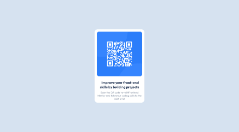
Instead of using a div with a class name "container", you can use a section element to wrap the QR code and text content, as it is a stand-alone content block that has a distinct purpose.
Add alt text to the QR code image:
For accessibility purposes, it is important to add a descriptive alt text to the QR code image. This will be read by screen readers to provide information to visually impaired users.
Consider using a CSS reset or normalization stylesheet: This will help ensure that the styles of your website are consistent across different browsers.
Use CSS variables:
Consider using CSS variables to store values that are used multiple times in the stylesheet, such as font family, font size, and colors. This makes it easier to update the styles across the whole stylesheet if needed.
Minimize the use of absolute positioning:
absolute positioning can make it difficult to maintain the layout of a page. Consider using other layout techniques, such as flexbox, to achieve the desired layout.
Consider using rem units for font sizes: rem units are relative to the root element (HTML), and make it easier to maintain consistency in font sizes across the page.
Happy Coding
Marked as helpful - @godforyou@sandro21-glitch
Hi godforyou
here is a common method to center a div both vertically and horizontally in CSS:
.center-div { display: flex; align-items: center; justify-content: center; height: 100vh; }The display flex makes the div a flex container and align-items: center centers the div vertically, and justify-content: center centers the div horizontally. height: 100vh sets the height of the div to be 100% of the viewport height.
Note:
If you want to center the div only horizontally, you can use display: flex and justify-content: center.
If you want to center the div only vertically, you can use display: flex and align-items: center.
here are some helpful resources to learn about the display: flex property in CSS:
CSS-Tricks: A Comprehensive Guide to Flexbox
Mozilla Developer Network (MDN): Flexbox:
Happy Coding