@theritikshah

Yashasvi Singh
@aUnicornDevAll comments
- @aUnicornDev
Hi Ritik,
The solution looks great on Desktop and Tablet mode ✨✨✨.
The responsiveness can be improved between 770-1150px. The cart dropdown overflows the viewport when opened in this range..
- @veronisab@aUnicornDev
Hi Veronica,
Great solution 🔥🔥!!!
Just a few points...
The selected rating does not go back to normal when I select another rating. You can do this by removing the "selected" class from all the buttons first, and then adding the "selected" class on the clicked element.
The hover on Rating does not change the font color to white.
- @rachanahegde@aUnicornDev
The font-family for the links(change, proceed payment and cancel) can be set to "Red Hat Display" to match the design.
Not an overuse of ''DIVS" but some extra "buttons" that could have been just replaced with divs(plan-btn) or a tags(cancel-btn). Semantically speaking, buttons should be signifiers that something can be clicked.
Marked as helpful - @michellewongi@aUnicornDev
You have
border-bottomfor the underline so it will take the complete width of the text. For variable widths, you can use::afterpseudo element.You can also change
.hamburgerposition fromfixedtoabsolute, because the fixed hamburger appears even after scroll.You should set a fixed max-width on the
.containerso that it does cover the whole screen on bigger viewports.Marked as helpful - @Jugo-JS@aUnicornDev
Looks good on desktop as well as mobile...
Just around 1200px to the mobile breakpoint.. things are a little squeezed and start overlapping/overflowing. You can look into that area..
Marked as helpful - @olgak169@aUnicornDev
Great work man. ✌✌✌
This is by far the best solution for this particular challenge that I've seen.
Just a minor issue is that when changing the tip, the counter starts from undefined to and reaches upto the final calculated value. It's barely visible because of the speed of the counter but i thought I should mention it.
Few improvements apart from this challenge would be to have a default tip and an active state for the bill input field after website load.
- @anas-cd@aUnicornDev
Okay so I looked into the issue regarding the radio buttons, tweaked some properties and may have found a fix.
Use a border
.selectionContainer_background .selectionContainer .rewards .csections .radio__control {
    border: .125em solid #bdbdbd;
//other properties
}

.circule{
height:23px;
width:23px;
//other properties
}
This might center things exactly. Also, there can be an issue that will be resolved by removing the
transform: translateY(1px);Marked as helpful - @michaelakleer@aUnicornDev
Set a max-width to your
.card-container.The site looks good on both 1440px and 375px but is not fully responsive in the tablet sections. Also in these sections you will find the image is not covering the whole section of the container so you can try and use
background imagesto fix those issues.Marked as helpful - @ISnowFoxI@aUnicornDev
When typing a large amount(>99), the total/person amount is not completely visible due to overflow..
Everything else seems good and Thank God you have used a default Tip(5%) selected before hand. One minor improvement you can do is just turn the state of Bill amount input field to active.
Marked as helpful - @Guin-@aUnicornDev
Hey,
The site perfectly matches on 1440px so kudos on that.
But if we move to a larger screens or smaller screens, the site isn't fully responsive because you have a breakpoint on 1024px and a
min-width:1440pxOn mobile view, use
background-position:centerwithbackground-image:url(...)because the images(hero, transform etc.) are pushed down - @tttinh@aUnicornDev
Few things to point out,
1.Don't go to mobile view so early, you can shrink to upto 1000px and then go mobile
2.You probably used
outlineproperty on hover because you didn't want the content to move the layout which would have happened in case you used border property.But the outline does not create a rounded hover but a rectangular one.
A fix to that is.. use
box-shadow: inset 0px 0px 0px 2px #fff;instead of a border or outline..Marked as helpful - @sivakumarkatari2020@aUnicornDev
The site is not mobile responsive.. so you can work on that.
Also, set a max-width on your items as everything is stretched out on bigger viewports.
- @jchapar@aUnicornDev
The height of 100vh on
.columnslimits sets a fixed height on columns grid and therefore the attribution is placed right next to the end of the 100vh of the grid.Try using a smaller height viewport and you will notice that the attribution sits just after a smallest vertical scroll.
Remove that height.
That also does not fix the issue because the first card will go above the screen which is even more confusing.
And that is caused by another 100vh given to the
.container. Because you have centered the flex within a 100vh, such misalignment occurs.Remove both the 100vh and this will work fine.
- @ratan17@aUnicornDev
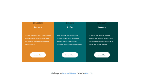
You have used position: absolute; on the
Learn Morebutton with a bottom:5%.This takes the button out of the normal flow of the card and fixes the button on the card. Changing the height of the button will not affect the height of the
.itemsSo, the content that remains in the card is just the SVG, the heading and the paragraph and the button is placed in the 5% padding given to
.itemsWhen on smaller viewport, the value of 5% decreases, whereas the the dimensions of the button remain the same.
Head over to my solution if you like, I've used flex in the card itself.
Marked as helpful - @3vilBonobo@aUnicornDev
You card does not have a fixed height to begin with. All the content in the cards and the padding, margins etc. of that content make up the height of the card.
Due to different content in the
<p>tag as you said, the height of the card varies.One solution to this is
Use a fixed height card.. And set flex on the card in the column direction. Then you can use the padding to position the elements in the cards. Can set padding/margin to auto if you want to use variable padding/margin.
Marked as helpful - @xup6u600504@aUnicornDev
These 3 items are flex items... and you always want to keep them in a single row. So get rid of flex-wrap as that will push a single item out of the row as it does in viewport <1420px.
For rounded columns, you can use one of the below
    border-radius: 10px 0px 0px 10px;
}
.column3{
    border-radius: 0px 10px 10px 0px;
}
.flex-container>*:first-child { border-radius: 10px 0px 0px 10px; } .flex-container>*:last-child { border-radius: 0px 10px 10px 0px; } - @Smita-14@aUnicornDev
Set a max-width on the container as it stretches out on bigger screens.
Everything else looks good.👍
Marked as helpful - @ratan17@aUnicornDev
On smaller screens, the buttons are overlapping the content of the card because of the absolute positioning given to them.
Instead, use flex on the
.itemsclass so that you can position them in accordingly.Set a max-width to the cards as they keep on stretching on bigger screens.
Marked as helpful