


@LexTarasov
Submitted
I'ts okey to use rem for everything?
Looking to hire developers?
@graficdoctor
@LexTarasov
Submitted
I'ts okey to use rem for everything?
Check this Kevin Powell video: Are you using the right css unit and have a browse through his more recent vids.
@markvarga21
Submitted
rem relative units of CSS?It has nothing to do with using rem. As you're supposed to be using them when you want to make things responsive.
This seams to me to be the culprit: width: 17svw; on your #qr. Which on smaller screens you give a 75vw. This means on tablets and smartphones, the qr will take up about 75% of the screen width. But on desktops, it will shrink down to 17%.
What you need to do here is, give your div id='qr' a max-width. There is various ways you could write this, but an example could be:
* {
	box-sizing: border-box;
	margin: 0;
	padding: 0;
}

#qr {
	width: 95vw;
	max-width: 350px;
	margin: 0 auto;
}
Here we tell the div you need to be 95% of the viewport, until your maximum 350px wide.
Are you familiar yet with how the box-model works in css? CSS Box Model And what the purpose is of this code I added:
* {
	box-sizing: border-box;
	margin: 0;
	padding: 0;
}
Also, don't use div to write headings or text. There are html-tags especially for text. HTML Text Formatting
Marked as helpful
@Joel12r
Submitted
Things I found difficult
Questions
Answer to your question: don’t put all your li-content in a span. Just wrap a span around the words that need to be bold. All the rest of the text can just be inside the li: ´<li><span>Total: </span>Approximately 10minutes</li>´ If nothing needs to stand out, don’t use span. It is ok to have text inside an li-element. Also in the <ol>, there is no need to type the numbering yourself. It happens automatically.
This is a helpful article: https://css-tricks.com/everything-you-need-to-know-about-the-gap-after-the-list-marker/
Marked as helpful
@Mukulvjain1
Submitted
Need help please check while it swtched to media query the gap incrses what to doo Open for any feedback to improvise
Desktop looks good. Mobile is where things really go wrong. I remember myself struggling quite some with this exercise, so don't feel down for not entirely achieving the result. It's part of the learning process.
It seems to me you got yourself in a lot of trouble with the extensive use of setting widths and heights using %. Are you familiar with working with flex or grid?
As for the image, you have been given 2 images: one for mobile, one for desktop. You need to use those. Have a look here to understand how te be using them: Responsive images
I don't understand why you set this width & height on your container. If you're going to use full-width, you don't need to specify it, as your webpage will always take up full-width. The height might be more usefull on your body or html-element, if you're using it to center your container.
.container {
  width: 100vw;
  height: 100vh;
}
Also specifiying height on your main, seems overkill. A flex-element will always take up all the space it needs. And it's very rarely necessary to set a height.
Are You Making These CSS Height Mistakes?
One of the most common CSS issues people run into
Try again. Look into how using flex or grid. Whether it's necessary to set width and height. And have a little round of applause for yourself when things look good. Happy coding!
Marked as helpful
@Ezra003
Submitted
Responsive web design.
Not knowing the right questions to ask when solving problems.
Making the border for the main content look exactly like in the design.
Hey, what you did looks good. Though when you finish an exercise, fill out the readme-file as instructed. It's important to create a habit from the beginning, as readme-files are vital later on in your career.
<div>s in your html, beside the <Main> (which has no need to be capitalized). If working with text, use the correct html-tags. As it's important to write your html readable for screenreaders. It's vital to use semantic html correctly.
(HTML tags for text)[https://flaviocopes.com/html-text-tags/]cursor: pointer on the hover-state of .course. You can move that to .course itself.cursor: url(/assets/images/cursor.png), pointer; (The assets folder won't open on GitHub so I can't see what you're linking to)margin: 100px 545px 100px 545px; on your <main> you were trying to center main in the middle of the page?
(How to center a div horizontally)[https://www.youtube.com/watch?v=ULVu2VNM_54]There's room for improvement, but this sure already looks good. It shows you have an eye for design vs. code. Have a look at what could be improved here and move on. There's lots more fun projects waiting for you. Happy coding!
I am not sure if the usage of display:block was the right option or I should better use the css grid.
Hi, this actually looks good. I've been going through your code and will point out some peculiarities I found.
On body you set a font-family: Inter, but declare later on a different font for your h1 and p. Since they are the only text-elements, why wouldn't you declare font-family: 'Outfit', sans-serif; on your body?
Also, why did you set font-size:90%;? But on h1 you set font-size in px. As for font-sizes, most commonly people use rem-values. This is a responsive unit, that allows the user who's adapted its displat size, still see the font-size as intended. This 90% kind off does that, but it's not the correct unit to use here.
Kevin Powell - Are you using the right CSS units?
Try to be consistent. Your main has a padding:16px; while on your h1 you write padding:1.1rem; Just write it as rem/em everywhere.
I don't see an issue with you having used display: block. The item sits fine in the middle of the page.
I'd see, all good besides a few minor issues.. But this looks promising. Keep coding and enjoying.
Marked as helpful
@Pepeleeno
Submitted
Direct me to be a better developer by giving some tips if I did something improperly, please :)
Code looks decent and clean. Very well organised and easy to read. Your page however completely breaks up on tablet-size. Elements go of position, background-image overlaps the text,...
One advice to prevent this in the future: go for a mobile-first approach. It's a lot easier and it makes more sense when you're moving in your code from mobile to desktop, you always add stuff. You keep an overview. When you go from desktop to mobile, you don't only need to delete stuff, but also rearrange code. Giving yourself a lot more issues to solve.
Marked as helpful
@NewCoderEx
Submitted
Good day! This is my very first challenge that I made. I am expecting that there will be lots of mistakes on this code so I hope you can help me improve. Thank you!
Good job for a first challenge. Even though this looked rather simple, there were some tricky parts. I noticed you left them out. The hover on the image and all the other hover-effects.
The hover on your h2 and span can be done by the pseudo-selector :hover. The hover on the image would be more complex. Check other solutions to see if you understand how it's been done. There's various ways, so I don't want to push only one solution.
There are some things you need to be carefull with. You've used a h2, h3 and h4. Be aware there is people who acces websites with screenreaders. They will always prioritize h-tags. It's better here to have all (maybe apart from the h2) written as p. Add classes or use selectors like p span to declare them. Read into accessibility and HTML-semantics.
You also didn't declare font-sizes. Which is ok to so do here, but do it in your next project.
As for the naming of your classes. Think about how this little design would be part of a big website. If you begin calling your images first-photo, second-photo, you'll be struggling once the projects get bigger. Class-names should be logical and preferably reusable. In this example we're building an NFT-card. So call first-picture, for instance NFT-artwork. This also makes it easier for other developers to read your code. When using logic names, the code becomes easier to read.
Marked as helpful
@MakMao
Submitted
This looks good. It's responsive and flows nicely. Only remark I have is that the text-alignment and font-weight in desktop-view is not identical to the design. If only you would adjust that, this would look perfect.
It's however a bit tricky to be using row-reverse as a flex-direction. What if the css fails to load, would it still look ok? No big deal here, but could be in future projects. Just something to keep attention to.
Happy coding!
Marked as helpful
@AndreiM987
Submitted
I could not round the border top of svg image, instead i convert the svg to jpg and apply css: border-top-left-radius: 10px; border-top-right-radius: 10px; Do you know how to do that?
Since you set a border-radius on your .container, you can just use overflow: hidden on the .header
.header {
  overflow: hidden;
}
Marked as helpful
@thainadlopes
Submitted
What could be the possible improvements?
This looks good! It functions, the code is easy to read. There's not much to be added.
max-width instead of width.cursor: pointer; to the button.Keep going. This looks promising. Happy coding.
Marked as helpful
@YaswanthVarma362
Submitted
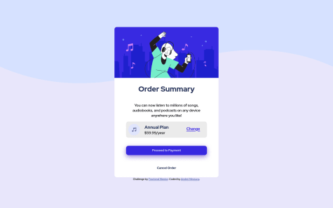
I positioned the entire box in center by calculating pixels and adjusting by changing every time, please help me on how to do it. I tried placing "Change" button in right center of the "Annual Plan" and "$59.99/year" but "Change" is coming either in any line but not in middle, help me in how to do it. I am new so don't know much about shadow a little help for proceed to payment shadow will be helpful. Thank you.
Hi. By looking at your question and code I can tell you don't know flexbox yet. Every question you have about positioning would be solved by just using flexbox. [More on centering divs] (https://levelup.gitconnected.com/5-ways-to-center-a-div-using-css-fcd790524708) I will make a few suggestions for the rest of your code.
.background-image you limit the size of your webpage as this acts as some sort of container. It's possible you could actually even delete this <div> and set the background-image on your body.body {
margin: 0;
background-color: hsl(225, 100%, 98%);
text-align: center;
font-family: "Red Hat Display", sans-serif;
font-weight: 500;
color: hsl(224, 23%, 55%);
background-image: url(../images/pattern-background-desktop.svg);
}
.btn and give 'cancel' a second class .btn-cancel. Also give the buttons a display: block when they need to span all across the box. See also how I added auto to the margin to help center the buttons.<a class="btn" href="">Proceed to Payment</a>
<a class="btn btn-cancel" href="#">Cancel Order</a>
In css this would eventually give you this:
.btn {
  background-color: hsl(245, 75%, 52%);
  width: 75%;
  color: white;
  border-radius: 8px;
  display: block;
  margin: 10px auto;
  padding: 13px;
  text-decoration: none;
  cursor: pointer;
}
.btn:hover {
  background-color: hsl(225, 100%, 94%);
  color: hsl(223, 47%, 23%);
}
.btn-cancel {
  color: hsl(224, 23%, 55%);
  background-color: hsl(225, 100%, 100%);
}
.btn-cancel:hover {
  background-color: hsl(225, 100%, 94%);
}
Have a look at this and see how far it will get you. Happy coding!
Marked as helpful
@Obtez
Submitted
Biggest issue I had was getting the fonts right (which I still didn't) as well as the shadow of the Payment Button.
This actually looks quite good. Maybe the font-size in the button could be a bit smaller, but I see no issues. Well done!
Try to go for a mobile-first approach next time. You won't see the benefits of it yet, but once the projects get bigger, you'd be happy to have to write less code compared to when working desktop-first. Also be aware that iPhones have a width of 320px. And the new Samsung even has 280px. So setting your max-width on 375px is leaving out quite some users to enjoy the responsiveness.
Oh yeah, don't set the font-size on :root. In terms of accessibility this is bad. There is people that adjust their browsers so they can read better. By adding the font-size on :root you overrule their settings. Same with body. Try setting them as rem-values on the p-element.
The width on body is not necessary.
Looking forwards to see more of your work. Happy coding!
Marked as helpful
@UnderdogScripter
Submitted
Please critique my HTML structure so I can improve it, thanks!
True, don't minify your code before review. There's here no need to. It just makes it harder for us to read.
Just use something like Prettier in your IDE.
@YasinAdan
Submitted
Not the most efficient way to complete this project was confused about the colors so I used whatever came to mind.
If you're lost about the colors, check the assignment. It's all in there.
Font doesn't seem to load properly either. You're using a Google Font here, so it would probably better to use fonts like this:
@import url('https://fonts.googleapis.com/css2?family=Red+Hat+Display&display=swap');
The width in the container, should become max-width. Otherwise it won't scale down when in responsive mode.
If you'd set the .button to display: block, you don't need to set a width. It will stretch the entire width of the parent.
@B0R155
Submitted
The background image won't apply to the whole page, like it's indicated in the file, so i put a background color instead.
Edit: -Fixed background image issue -Changed button background color -Fixed accessibility
The background-image doesn't load because you didn't set your path right.
Try this: background-image: url("../images/pattern-background-desktop.svg");
You need to escape the css-folder and dive into images, hence the 2 ..
Marked as helpful
@KC-Naveen
Submitted
This is the first time i have tried developing a web page. I have basic HTML and CSS bootstrap components. I have only achieved 50% of the functionalities.
Hi, could you deploy your website or either provide us with the correct link? We can't see the site in action.
@Asif-lopz
Submitted
I have some struggles in doing live site preview But solve it, Thank you.
Just a quick reminder that the first page of a website is called index.html. Yours is intex.html.
The fonts don't load. Your @ import url is wrong. Did you copy the url in the browser or did you select the fonts you needed? Google Fonts always suggest which links to use to import fonts. If you don't know how to, have a look here
By adding a width to your body-element, your page will always be 1440px, no matter how big the browserwindow is. The body actually should fill the entire browserwindow, so if you want to set widths or heights, they're usually always 100vw or 100vh. In your example, you should remove the width and set a max-width instead of width on .box. Also remove height. There is no reason to set a height. Same goes for the media-query.
This is odd.
.information * {
  margin: 0;
  padding: 0;
}
It's totally ok to reset your css, but do it the proper way. At top of your css-file by only using *.
* {
box-sizing: border-box;
margin: 0;
padding: 0;
If you know how to use flex-box, use flex-box to split the component in two, rather than using float and fixed sizes for your .box, .main, .image. Also here, no need to set a height. It just fills itself. While you're at it, also use flexbox to center your .box instead of using transform.
Try to bundle similar code. Instead of
h1 {
  color: hsl(0, 0%, 100%);
  font-family: 'Inter', sans-serif;
}
h2 {
  color: hsla(0, 0%, 100%, 0.993);
  font-family: 'Inter', sans-serif;
}
do
h1, h2 {
  font-family: 'Inter', sans-serif;
}
</div> at the end.It will break your code, but I think it would be a good excercise to rethink your approach. Use less fixed widths and heights. It's even recommended to not use heights unless it's really necessary, since it will create overflows. Since I see some flexbox in your writing, it would be better to use flexbox more widely rather than float and fixed widths. It makes it easier for the website to be responsive. It's also always better practice to start developing mobile first. It will save you quite some coding at some time, since it's inside html-language to be responsive. It is us, by writing css, that break the site from being responsive.
Marked as helpful
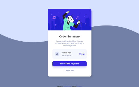
@tab21
Submitted
Please provide feedback
I also wanted to know how to make my CSS code neater or is there any rule in it like in html we indent?
Hey there, this looks rather good. You almost nailed it but bumped into a few issues in regards to accessibility, semantic html and some css-mistakes.
h4. Which is wrong for a few reasons. Because you used it inside a span, because 'annual plan' isn't a title, and because you didn't respect the hierarchy of an h1 first. Though, in this exercise, write<p>
<span class="annual-plan__title">Annual Plan</span>
$59.99/year
</p>
As for span: The <span> tag is an inline container used to mark up a part of a text, or a part of a document.
background-image: url("images/pattern-background-mobile.svg");
background-size: contain;
background-position: top;
background-color: hsl(225, 100%, 94%);
No need to put the 'proceed to payment' inside a div. But add in css a display: block;
Typing error in your css for .payment: margin: 0 30px 20px;;
Bundle code. For .payment and .cancel you wrote text-decoration: none;. You could actually add this to a when you are declaring your typography.
In you solution min-width equals max-width. Which is not really good. This is not how to set breakpoints. Part of the solution is to start mobile first and then move on to desktop. As for the max-width, even if they in the assignment say 'minimum size is 375px', there are still phones who go smaller. iPhone SE for example has a 320px-width and is still widely used. To set the min-width, try to guess yourself where it would be more beautiful for the mobile-image to change into the desktop-image. I chose, in my solution, a min-width of 650px. ex.
@media screen and (min-width: 650px) {
body {
  background-image: url('./images/pattern-background-desktop.svg');
  background-size: contain;
  background-position: top;
  }
}
As for writing a more neat code, there are no real rules in css besides: 'respect the cascade', 'code that is similar can be put together (like the text-decoration)' and as you move on, you will learn about variables and such that make code look 'neat'. But yours looks good. It's tidy, concise and good to read. Keep going!
Marked as helpful
@arishem51
Submitted
Github pages isn't working
You've put your index.html inside a folder. Github can't read the index.html when it is inside a folder. Actually no website can read an index.html if it is inside a folder. It needs to be outside the folder. Javascript, CSS and images, they can be in a folder.
Marked as helpful
@Asmae-Amahrouk
Submitted
This challenge really helped me to learn Media Query uses .... ready to receive your advice and observations.....
Hi, you didn't upload your images correctly, so the links don't work anymore.
It's better practice to not set your fontsize in body as px. There is people that don't see well and adjust their fontsize in their browser. If you as a developer set a font as 15px, they will loose their settings and won't be able to view your work.
The design looks good. Not too much issues going on, except when viewed on some sizes, your text-cards are smaller of bigger than the star-cards. That looks a bit odd. Also your text doesn't always start at the same line. (see image) Everything should be outlined. It's better to have a <div class="container"> where you can position all the other elements on the same line using padding. What you should also do is set a max-width in that .container. Otherwise your page stretches all across the browser when someone views it on a big screen. A max-width would usually be about 1400px or 1140px, depending on the design or what you're creating.
I personally think you also added too many media-queries. Try to minimize them. And also make sure the design looks good on the smallest phone.
This is surely a good begin. Happy coding!
Marked as helpful
@douchebaggg
Submitted
This is my first project challenge I'm confused a little about media query in CSS. Can you give some advice about this ? I accept all feedback for next project
Hi, That's already a lot better. That weird 'jump' doesn't happen anymore. You know that you can drop the media-query with max-width? It works without it aswell. Try also to combine similar code:
.container > p,
.imgcontent > h4 {
 font-size: 0.875rem;
}
Besides, you're using calc for your font-size. This is a well-known trick that's being used to not have to write a media-query for changing the font-size. Just write in your body and it will work throughout the entire page.
body {
  font-family: 'Red Hat Display', sans-serif;
  font-size: calc(60% + 0.8vmin);
  text-align: center;
  font-weight: 500;
  background-image: url(./order-summary-component-main/images/pattern-background-mobile.svg);
  background-size: contain;
  background-repeat: no-repeat;
  background-position: center top;
  background-color: hsl(225, 100%, 94%);
  background-attachment: fixed;
}
A lot of the code in your min-width-media-query is identical to the other code. You don't need to write the same code twice. Once you declared something to be a certain colour or font-size, it will continue to be this, unless you overwrite the code. In your code you declare background-color twice. You don't have to.
Also, by writing something like this in your .container:
margin-top: 5rem;
margin: auto;
or this in your .plan:
margin: auto;
margin-right: 4rem;
you overrule the margin setting. Like I said before, CSS is about Cascading, the last line overrules the previous line.
Marked as helpful
@nirbhay12345
Submitted
Give me your best shot at what went wrong
Change all the id's into class. id's are mostly being used when you either need to give an element a higher specificity, or when working with javaScript. “id” is unique in a page and can only apply to at most one element, while “class” selector can apply to multiple elements.
HTML id Attribute: The id attribute is a unique identifier which is used to specify the document. It is used by CSS and JavaScript to perform a certain task for a unique element.
HTML class Attribute: The class attribute is used to specify one or more class names for an HTML element. The class attribute can be used on any HTML element. The class name can be used by CSS and JavaScript to perform certain tasks for elements with the specified class name.
Same for the camelCasing you do in your id's. camelCasing is usually also limited to javaScript, in order to have a visual difference in the code.
As far as your code go, I like it. Though, I see that you set the min-width to 375px as is being suggested in the task, but there is still many phones which work on smaller screens, like the iPhone SE. So, maybe set your min-width a bit smaller.
Marked as helpful