Skip to content
  • Unlock Pro
  • Log in with GitHub
Profile
OverviewSolutions
13
Comments
119
Alex
@AlexKMarshall

All comments

  • Annas-khan•120
    @Annas-khan
    Submitted about 1 year ago
    What are you most proud of, and what would you do differently next time?

    I was able to code most of it on my own didn't need much help.

    What challenges did you encounter, and how did you overcome them?

    Challenges faced -

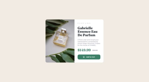
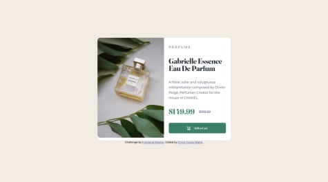
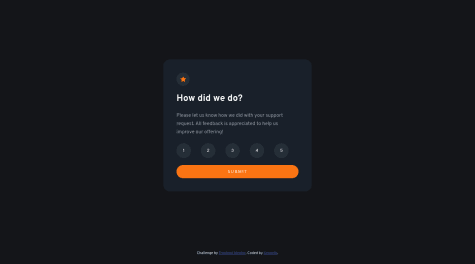
    1. not able to quite spread the image in the div container as shown in the preview photos
    2. Had problem commiting changes in github
    What specific areas of your project would you like help with?

    with the css part

    QR code page using Flexbox

    3
    Alex•2,010
    @AlexKMarshall
    Posted about 1 year ago

    Ok, lets break this down into HTML and CSS, HTML first

    • Every site must have a <main> element, which contains all the main content for the page, but excludes content that repeats across multiple pages, such as the site header, footer and main navigation.
      • As this is is a single component challenge, and doesn't have any headers, the whole component should be inside <main>. You have a div with a class of main, but a div on its own is not a semantic element, so replace that with <main>
    • You have unnecessary elements. This challenge only really needs (inside of <main>) a single div for the card component itself, and then an <img> a <h2> and a <p> inside that. All the extra wrapping divs are unnecessary and cause extra noise and styling difficulties
      • Always try and use the minimum number of elements, only add any extra ones if you really need them
    • the <br> is especially unnecessary because it's causing the styles to break too. There's almost never a need to use the <br> element and definitely not in this challenge

    Now the CSS

    • The main problem here is inappropriate units. You generally want to avoid vh or vw as it gives you very little control. For instance what does 83vh mean? 83% of the height of the screen - but how high is that? Your screen is likely different to mine, everyone's is different. So is that an appropriate size? Unlikely
      • The best thing to do is not provide a size at all. The browser will calculate sizes automatically, and they will always be responsive. This is the case for heights. You never want to specify a height. What would happen if a content editor decided the paragraph was going to be twice as long? Your component would now be too short and would break. So, instead, always let the browser calculate height.
    • But, sometimes we have to give some indication of size to match the design. Here, if we didn't do something about the width, the component would stretch the whole width of the screen. And on large screens we don't want that. But, we shouldn't set width - again, if we set a value for that, but the user's screen is smaller, the component will overflow the screen and break.
      • So, instead set a max-width (and make sure it's in rem). That way, the component doesn't get too big on large screens, but can still shrink smaller on small ones
    • Centering the component on the screen. You've almost got that right - you have display: flex; align-items: center; justify-content: center; - that's good. That gets your component centered horizontally. And it would center it vertically too, but you'll notice it didn't, and so you've tried to correct for that with some top margin. But, that was the wrong fix
      • The reason it wasn't centered vertically is because the height of the page only takes up as much space as it needs for the content, so there's no extra height for it to center in. So, you need to increase the height somehow. This is one of the only use cases for vh units. You need the page to be at least 100vh. So set min-height: 100vh on <main>. But make sure it's min-height not height. Otherwise, content may get cut off on very small screens. You want the height to be able to expand bigger than the screen if it needs to
    • Font size. This must never be in px. Users must be allowed to change the browser font-size in their settings. Many people need larger fonts to make it easier to read. If you set fonts in px you remove their ability to do this. So, instead always use rem
    • Always use a CSS reset at the start of your CSS. There are a few browser defaults that are unhelpful when styling sites. A rest will correct some of these to more sensible values. Particularly for images. You can use this one https://www.joshwcomeau.com/css/custom-css-reset/
    • The difference between margin and padding. Margin is for a space between one element and its sibling. Padding is for the space between the border of an element and its children.
      • So, the gap between the heading and the paragraph should be margin, not padding
      • And the card container should have some padding (because right now, the text can touch the edge of the card, and it shouldn't)
    Marked as helpful
  • Magda Kokot•1,425
    @magdakok
    Submitted about 2 years ago

    Multi-step form [React, Typescript, React Hook Form, CSS Modules]

    #react#typescript#accessibility
    1
    Alex•2,010
    @AlexKMarshall
    Posted over 1 year ago

    This is looking very good. Functionally it all works well. I love the whimsical but still very clear focus states, and the keyboard navigation on the custom radio group is all good

    You've said styling wasn't your focus so I won't spend too long on it, but when I load the site (or hard refresh) I get some layout shift (the content seems to jump up twice before settling on its final location). My guess is this could be caused by the useMobile hook - useEffect runs after paint, so could cause jumps if any layout depends on it. You could try replacing it with a useLayoutEffect which runs before paint. Even better would be to avoid this hook completely and do things entirely in CSS, that'll remove any possibility of the wrong value being computed. I get a similar layout shift on the confirmation page too, though here I think the image not having enough reserved space may have been the issue.

    In terms of the typescript this looks ok, there's just a few comments I'd make:

    • Rely on inference where possible, it's less to type and avoids the possibility of lying to the compiler. Some particular cases of this I saw were in array map functions. You shouldn't need to add types to the callback, they should already be inferred. If they aren't, it's because the original array hasn't been typed correctly, and that's where the fix should be
    • Keep types close to where they are used. This is a bit more of a preference thing, but having a types file or folder, particularly for types that are only used in a single place, hides things too much in my opinion. If you need to declare a type, declare it inline, or directly above the function that needs it. If you need to use it somewhere else too, export it from that file. Reserve a global types folder/file for truly generic type utilities or something that really isn't related to anything specific. I would expect there to be few of these.

    For the React code there isn't anything wrong here as such. However, for my tastes the code has been abstracted too much. The result is some components that handle many different things, and as a result need to receive 10-20 props. This has a two-fold effect. First, I find it makes the code quite hard to reason about. It also makes the components very coupled. If you want to change something in this code (maybe add a new page to the form) that change will have to touch many many files. And will involve re-testing the existing pages.

    It's hard to give a small piece of advice here, and as this works you may want to ignore this anyway. But, I'll try and put together a few thoughts:

    • Avoid too many props. Props aren't bad, but, if you're finding you have to have 5, 10, even 20 props to a component, especially if some of those props seem unrelated to each other, I think that's an indication that using composition would be preferable
    • Keep hooks near the components that use them. This is the same as my advice for the types. Things like the useCurrentStep hook - this is very coupled to the app component. It can live in the same file, that way there's less jumping around the code-base when trying to figure out what a particular component does. You may find you don't even need it to be a custom hook at all.
    • Don't make components do too much. The UniqueSteps component is too complex for my tastes. It tries to handle every page of the form and the confirmation page. Instead, I would prefer to keep the step logic in app, and render a separate component for each step. Those components can then be responsible for their own instances of useForm and encapsulate all their form logic, only exposing an onSubmit and initialValues to app which can manage the global form state (but none of the validation)
    • Be careful with data-driven ui. I like the idea behind the data.json. This could be a really neat way to have forms that are customisable by content editors from a CMS. However the current implementation doesn't really go that far. While all the data is in a json file, the UniqeSteps and other components still have to know about what's in that json file. In my opinion this has now split the places that I need to read to understand the logic, without providing benefit. Personally, I would delete the data file and manually write the jsx out in each form component. Long jsx is preferable to logic that is too spread-out.

    I hope some of this is helpful and not too vague. If you've got any questions or want me to go a bit deeper on any of this I'd be happy to.

    Marked as helpful
  • Grace•32,130
    @grace-snow
    Submitted about 2 years ago

    My first React and Tailwind challenge

    #accessibility#react#tailwind-css
    2
    Alex•2,010
    @AlexKMarshall
    Posted about 2 years ago

    This is great. And for a first project with React, it all looks idiomatic to me. I certainly agree that form validation can be a bit of a rabbit hole. Using React Hook Form here was the sensible option.

    For matching off against individual parts of the password validation, I think the way to do it is to break up the regex. Have one regex for each criterion, and use that inside a custom validator function. This is with the caveat that I have yet to try it myself.

    Another alternative would be to use a schema library like Zod. That way you can define all your rules, and the failure messages associated with each, in the schema. Then pass the schema to RHF in one place rather than wiring up all the field validators separately. If you were building an app with a lot of forms, I would definitely recommend this. Though for a single form the extra bundle-size might not be worth it.

    A couple of other things I noticed while digging through the code:

    Composition

    In general all the components are nicely composable - accepting children. In the page intro component though there's a mix of a heading text prop, plus children. My personal preference is to avoid those kinds of text props in React. Mainly because it becomes more difficult to pass markup into them. If, for instance, you wanted to wrap a specific word in the heading in a span, you now have to pass in a fragment which feels awkward. I would probably export a PageIntroHeading from the same file and use that to wrap up the h1 styles and let the consumer pass it in

    <PageIntro>
      <PageIntroHeading>Learn to code...</PageIntroHeading>
      <p>See how other dev...</p>
    </PageIntro>
    

    Tailwind class strings

    In the form component, you've extracted the input styling into its own string to be reused in the various fields. I would try to avoid that. Unless you explicitly add config to target named variables, I believe the tailwind compiler will struggle to properly purge unused class names, as it will just look through the jsx for the className prop. That said, it looks ok in the deployed site, so Tailwind may have made the compiler more intelligent at spotting classes wherever they are used.

    I personally would prefer to extract a styled <Input/> component that packages up the class names instead. Or you could use @apply and create a component class for it. At work we tend to do the former so there is only ever one way that a component can be styled, but both are valid options.

    Visually hidden

    One more small thing. You might want to accept an additional as prop in the VisuallyHidden component. That way you can pass in either a div or a span, which would mean this can be used in places where one or the other of those would be invalid HTML. E.g. if you needed to wrap a <p>

    function VisuallyHidden({as = 'span', children}) {
      const Element = as
      return <Element className="sr-only">{children}</Element>
    }


    In general, I try to avoid as props. They can make the components much more complicated. Especially if you try and do tricks like make your buttons work as links etc. But I think here is a good use case for them.

    Marked as helpful
  • Nicholas Nall•140
    @nnall
    Submitted over 2 years ago

    QR Component (v3)

    #accessibility
    3
    Alex•2,010
    @AlexKMarshall
    Posted over 2 years ago

    Well done for submitting your first challenge. It looks good, there are just a few things that would be worth sorting out. It will be helpful to get into these good habits when first starting out, as they become much more important as projects get more complicated.

    • Never set width or height on the body. You've set both of them: width: 100vw; height: 100vh;. The width is unnecessary here. The body will always take up the full width of the viewport unless you make it do something else. In addition, 100vw doesn't take into account things like scrollbars or device notches, so will often cause overflow. As it is both unnecessary and occasionally dangerous, just remove it.
    • You will probably want a min-height: 100vh here in order to vertically center the card. But make sure it is min height, not just height. By using height you make content get cut off if the screen is shorter or the content longer than you planned. Min height avoids that problem
    • Don't use width anywhere really. You have set width: 340px on your main element here. But what if the available space is less than that? You'll get overflow. Instead, use max-width which will allow things to shrink if necessary. In general, never use width or height other than for very small things like fixed-sized icons.
    • Use a CSS reset. It's not super important for this challenge, but having at least box-sizing: border-box on all elements will make things more predictable. Here you've set it to inherit which isn't a particularly useful option.
    • Make sure to understand the difference between padding and margin. Padding is the space between the edges of a box and its content. Margin is the space outside an element. Here you need padding on the <main> element as it needs to push its content away from the sides rather than margin on the children. Margin can be used to create vertical space between the children, or if the space is equal you can use gap on the parent instead, it's simpler to maintain.
    • Don't set spacing in percent. You have things like margin: 4% - aside from generally avoiding margin, where you do need to use it, use a predictable unit like 1rem. Using percentages will make things much harder to reason about when many elements are interacting with each other.
    • You have unnecessary spans inside your heading. I suspect you've done that to force a line-break. Don't do that, let the lines break where they naturally do given the space they have available.
    • Your heading should be a <h1>. Headings must go in order like a table of contents.
    • You'll want your image to be display: block to avoid the line height issues caused by the default display: inline. This would generally form part of the CSS reset
    • font-size: 1.08rem seems an odd choice. 1rem would be fine (and is the default)
    • To reiterate, remove the width: 80% on things like the paragraph and the attribution. It's unnecessary, the spacing should be determined by the padding on the parent.
    • Install Prettier in your code editor and make sure it is set to format on save. There are a lot of formatting inconsistencies in the code. When your code gets longer and more complicated this will make it far more difficult to read, so let an automated tool solve this for you.
  • Linas•20
    @paulauskas-linas
    Submitted almost 3 years ago

    Interactive rating component in plain HTML, CSS, JS

    1
    Alex•2,010
    @AlexKMarshall
    Posted almost 3 years ago

    Hey there, great effort on this. The styling looks good, and it works fine with a mouse.

    However, it doesn't work with a keyboard. There are just a few things needed to fix that. Good job on using radio buttons for the form. But, you've used display: none, which hides them from a keyboard and screen reader. Instead, use a technique to hide them visually, but keep them accessible https://piccalil.li/quick-tip/visually-hidden/ - and then, make sure to add a :focus-visible indicator (probably a bold ring around the label), so you can see where you are when using the keyboard.

    For the form submission, make sure to use the submit event on the form, not the click event on the button. This will make the form work with the return key and a mouse. You can also use the FormData class to get the data from your form, rather than having to make a loop through the radio buttons.

    const formData = new FormData(formElement)
    const rating = formData.get('rate')
    
    Marked as helpful
  • Joaquin•70
    @joaquinrftech
    Submitted almost 3 years ago

    NFT preview card component

    1
    Alex•2,010
    @AlexKMarshall
    Posted almost 3 years ago

    For the hover effect, you need to think about what that means. Generally, having something highlight on hover implies that when we click on the thing, something will happen. Typically that will either be navigating the user to a new page, or executing some kind of action (submitting a form, opening a modal dialog etc).

    In this case you don't have to code that interaction itself, but you do need to have a clear idea in your head what you think it should do. In my mind, clicking on the image in this design would open up a bigger version in a modal. But navigating to a full detail page for the image would be an equally valid decision.

    So now the important thing is what to do in the HTML to make this correct. If clicking on something navigates us to another page, that means we have to make it a link. So it needs to be wrapped in an anchor element <a href="/some-url"> . If clicking it causes some other action, that means it's a button, so it must be wrapped in <button>. If you don't do that, then the hover effect just becomes some meaningless decoration, which is not what we want on the web. So then once you have the HTML right, for whatever you've decided is the appropriate behaviour, then you can do some styling. Whether you've chosen a button or a link, the CSS will be the same.

    a.main-photo:hover {
     /* some styles */
    }
    

    or

    button.main-photo:hover {
      /* some styles */
    }
    

    That will deal with the hovering. But, that's only for people that navigate with a mouse. Lots of people can't, or choose not to, so we need to handle keyboard navigation as well. For that we can use the :focus-visible pseudo class. Sometimes the hover effect and the focus effect should be different. Here I think it makes sense that it's the same, so your CSS would become

    a.main-photo:hover, a.main-photo:focus-visible {
      /* interaction styles */
    }
    
  • tomatas95•50
    @tomatas95
    Submitted almost 3 years ago

    Basic HTML & CSS commands such as div and margins

    1
    Alex•2,010
    @AlexKMarshall
    Posted almost 3 years ago

    Hey there, your site deployment has not worked. This is because you have a nested folder inside your github repository. Github pages is looking for an index.html file at the root of your project. If you move all of the files out of that nested folder into the top level, everything should work then.

  • Tim•300
    @timmld
    Submitted almost 3 years ago

    Basic Product Preview Card Component

    1
    Alex•2,010
    @AlexKMarshall
    Posted almost 3 years ago

    Hey, it looks like your live site url isn't working. This is because you have a nested folder inside your repository, and your work is inside that. Move all the files from there to the top level of your repo, and everything should work fine then.

    Most build tools including github pages are looking for an index.html file at the root of your project.

  • Christ Kevin Touga Watat•270
    @Christ-Kevin
    Submitted almost 3 years ago

    product preview using HTML, CSS flexbox and advanced selectors

    1
    Alex•2,010
    @AlexKMarshall
    Posted almost 3 years ago

    This is looking very good, there's just a few things that would be worth taking a look at

    The add to cart button:

    • you've used a div wrapping an anchor tag that has the add to cart text in it. So, while the hover effect covers the whole div, the clickable target doesn't. A user would only be able to click on the text.
    • this should really be a button. In html anchors are navigating to another location, and buttons are for executing some other action like a form submission or triggering some javascript. Here adding to cart is an action, not a navigation

    The perfume ribbon text:

    • You've written P E R F U M E directly in the html. A screen-reader will read that as individual letters, not a word
    • Instead, write Perfume in the html, and then use css text-transform and letter-spacing properties to style it like the design

    The prices section:

    • You've used flexbox here, but have had to use 4 non-breaking spaces to create the gap between the prices
    • use gap instead for more flexibility
    • In addition, on very tiny screens, or high zoom levels, you get overflow here. To avoid that add flex-wrap: wrap so it can wrap onto a new line if there's not enough space for it to fit in one line

    The image:

    • this is part of the product card, so should go inside <main>
    • you've used object-fit: fill, so at a couple of screen-sizes the image stretches out of its aspect-ratio. To avoid that use object-fit: cover

    In general though these are mostly fairly minor points that are easily fixed.

    Well done for making it very responsive, avoiding almost all overflow, writing good alt text for the image

    Marked as helpful
  • Ivo•240
    @ivcp
    Submitted almost 3 years ago

    Interactive rating component with React, CSS modules

    #react
    1
    Alex•2,010
    @AlexKMarshall
    Posted almost 3 years ago

    Well done on this. It's pretty close.

    Good choice to use radio buttons for the input, but there's a small problem. When you use display: none on them, then they are not able to be focused, so you can't use this with a keyboard.

    Instead, use some kind of visually hidden technique on them instead, so they're still accessible to screen readers and keyboards. Here's an example https://piccalil.li/quick-tip/visually-hidden/

    Marked as helpful
  • P
    Leonard•1,025
    @leoikeh99
    Submitted about 3 years ago

    Audiophile e-commerce website (NextJs + StyledComponents + Formik)

    #next#styled-components#react
    1
    Alex•2,010
    @AlexKMarshall
    Posted almost 3 years ago

    From a visual perspective, this does look very good. The site responds very well to different screen sizes, and zoom.

    However, there are some very serious accessibility problems that make this completely unusable for anyone using a keyboard or assistive technology like a screen-reader

    • Never add onClick handlers to things that aren't a <button> - your quantity inputs, the +/- spinners and the cart button itself are all unusable
    • The cart modal is missing all elements that make a modal work. It doesn't trap focus, prevent scrolling behind, or make the rest of the site inert. I'd suggest using a 3rd party tool for dialogs to avoid these problems. Reach UI, HeadlessUI and RadixUI all have good ones
    • The checkout button, arguably the most important button on an eCommerce site doesn't have a visible focus indicator
    • You have motion animations all over the place, but you don't switch them off for people with prefers-reduced-motion - this is a serious problem for people who can be made dizzy or to feel sick from these kind of animations. Also for people who just want to switch them off because they find them annoying
    • Your images seem to all be set as background images. Particularly for a product image, it's critical that they have suitable alt text, so these must be real images in the dom, not just CSS backgrounds. They're not just for decoration
    Marked as helpful
  • Ranjana Mukhia•150
    @ranjanamukhia
    Submitted almost 3 years ago

    qr-code-component-main

    2
    Alex•2,010
    @AlexKMarshall
    Posted almost 3 years ago

    This looks good to me. The one thing I'd change is to add some padding to the .card

    That way you can remove the max-width from the text and the image, and a few of the margins.

    In general, if you're looking to keep the children away from the sides of a parent, you want padding on the parent. It's the more common spacing property to use. Margin would come into play when adding gaps between siblings, like between the image and the heading, and the heading and the paragraph text. This can be achieved with a margin-top and margin-bottom on the heading

    Marked as helpful
  • Raphael Pang•40
    @tengxuanp
    Submitted almost 3 years ago

    Interactive Rating Component

    #react
    1
    Alex•2,010
    @AlexKMarshall
    Posted almost 3 years ago

    Hey there. The problem you have described is likely because you have defined your Button component inside the body of the Rating component. This is invalid React code, because the component definition will get re-created every time Rating re-renders, causing all sorts of unexpected behavior.

    The quick fix is to move the definition of Button to the top level of the file.

    However, for full accessibility, this should be a <form> with <input type="radio"> inside it. Doing it that way will allow the browser to properly communicate that this is a form, and it has something inside it that you can only select one of. You can also get rid of the useState because the form will manage its own uncontrolled state.

    Marked as helpful
  • Miguel Chavez•210
    @toonchavez8
    Submitted almost 3 years ago

    Interactive rating component with animation

    #sass/scss
    1
    Alex•2,010
    @AlexKMarshall
    Posted almost 3 years ago

    Hey there, the styling of this looks very nice, and it looks good on a small screen. The animation is a nice touch.

    Did you try testing it with a keyboard though? It doesn't work for anyone that isn't using a mouse, unfortunately.

    To fix that you'll want to look into using <form> and <input type="radio"> elements. As a bonus, doing that will allow you to remove almost all the javascript, and rely on pure HTML and CSS for almost everything.

    Marked as helpful
  • Thomas Hertog•805
    @thomashertog
    Submitted about 3 years ago

    interactive rating component

    1
    Alex•2,010
    @AlexKMarshall
    Posted about 3 years ago

    Hey there. In terms of accessibility, when you build something interactive (like this is). You must test it with a keyboard. Ideally, test it with a screen reader too, but a keyboard will get you a lot of the way there.

    If you try and use this with a keyboard you'll see it doesn't work. It's not possible to focus on the rating values and select one, you can only press the submit button.

    You're not that far off. You're using the right element <input type="radio"/>. But because you've set it to display: none it becomes inaccessible. You'll need to use a method to hide it visually, but keep it accessible for screen readers and keyboards - here's one way you can do it https://www.a11yproject.com/posts/how-to-hide-content/

    In terms of the javascript, the only thing I'd suggest is that you attach your event listener to the form's submit method, rather than the button's click. Other than that it looks nice and clean

    Marked as helpful
  • Oluwatoni Odetola•320
    @ToniHunter274
    Submitted about 3 years ago

    Interactive Comment Section

    #accessibility#backbone#bootstrap#bulma#bem
    1
    Alex•2,010
    @AlexKMarshall
    Posted about 3 years ago

    Your index file has an extra . in the filename. I suspect that may be breaking your deploy

    Marked as helpful
  • Sourabh•420
    @SOURABH358
    Submitted about 3 years ago

    Interactive rating component solution

    #react
    1
    Alex•2,010
    @AlexKMarshall
    Posted about 3 years ago

    Hey there, the styling of this looks very nice, and it looks good on a small screen.

    Did you try testing it with a keyboard though? It doesn't work for anyone that isn't using a mouse, unfortunately.

    The reason this doesn't work with a keyboard is that you've used non-interactive elements for things that a user is supposed to do things with. The rating buttons are just <div> elements here. Anything that a user should interact with needs to either be a link, a button, or form control. Those elements have accessibility built-in. Using a non-interactive element won't work, even if you put an onClick handler on it.

    The easy fix for this is to make those ratings radio buttons instead. Something like:

    <fieldset>
      <label>
        <input type="radio" name="rating-group" value="1"/>
        <span>1</span>
      </label>
      <label>
        <input type="radio" name="rating-group" value="2"/>
        <span>2</span>
      </label>
      etc
    </fieldset>
    

    By doing that you'll get built-in keyboard support. And you won't have to do stuff in the javascript to style them as you can get which button has the :checked state directly in the CSS.

    Marked as helpful
  • Ken•140
    @kenneth0417
    Submitted about 3 years ago

    Interactive Rating Component solution

    #sass/scss
    1
    Alex•2,010
    @AlexKMarshall
    Posted about 3 years ago

    Hey there, this looks good, and is nice and responsive on smaller screens.

    However, it's not a very accessible implementation. Try to use this with a keyboard and you'll see what I mean.

    The reason this doesn't work with a keyboard is that you've used non-interactive elements for things that a user is supposed to do things with. The rating buttons are just <li> elements here. This means you have to add extra javascript to handle interactions, and it's very easy to miss all the things needed to make this work with keyboards, screen-readers etc.

    The easy fix for this is to make those ratings radio buttons instead. Something like:

    <fieldset>
      <label>
        <input type="radio" name="rating-group" value="1"/>
        <span>1</span>
      </label>
      <label>
        <input type="radio" name="rating-group" value="2"/>
        <span>2</span>
      </label>
      etc
    </fieldset>
    

    By doing that you'll get built-in keyboard support. And you won't have to do stuff in the javascript to style them as you can get which button has the :checked state directly in the CSS.

    Marked as helpful
Frontend Mentor logo

Stay up to datewith new challenges, featured solutions, selected articles, and our latest news

Frontend Mentor

  • Unlock Pro
  • Contact us
  • FAQs
  • Become a partner

Explore

  • Learning paths
  • Challenges
  • Solutions
  • Articles

Community

  • Discord
  • Guidelines

For companies

  • Hire developers
  • Train developers
© Frontend Mentor 2019 - 2025
  • Terms
  • Cookie Policy
  • Privacy Policy
  • License

Frontend Mentor for Teams

Frontend Mentor for Teams helps companies and schools onboard and train developers through project-based learning. Our industry-standard projects give developers hands-on experience tackling real coding problems, helping them master their craft.

If you work in a company or are a student in a coding school, feel free to share Frontend Mentor for Teams with your manager or instructor, as they may use it to help with your coding education.

Learn more

Oops! 😬

You need to be logged in before you can do that.

Log in with GitHub

Oops! 😬

You need to be logged in before you can do that.

Log in with GitHub

Oops! 😬

You need to be logged in before you can do that.

Log in with GitHub

Oops! 😬

You need to be logged in before you can do that.

Log in with GitHub

Oops! 😬

You need to be logged in before you can do that.

Log in with GitHub

Oops! 😬

You need to be logged in before you can do that.

Log in with GitHub

Oops! 😬

You need to be logged in before you can do that.

Log in with GitHub

Oops! 😬

You need to be logged in before you can do that.

Log in with GitHub

Oops! 😬

You need to be logged in before you can do that.

Log in with GitHub

Oops! 😬

You need to be logged in before you can do that.

Log in with GitHub

Oops! 😬

You need to be logged in before you can do that.

Log in with GitHub

Oops! 😬

You need to be logged in before you can do that.

Log in with GitHub

Oops! 😬

You need to be logged in before you can do that.

Log in with GitHub

Oops! 😬

You need to be logged in before you can do that.

Log in with GitHub

Oops! 😬

You need to be logged in before you can do that.

Log in with GitHub

Oops! 😬

You need to be logged in before you can do that.

Log in with GitHub

Oops! 😬

You need to be logged in before you can do that.

Log in with GitHub

Oops! 😬

You need to be logged in before you can do that.

Log in with GitHub

Oops! 😬

You need to be logged in before you can do that.

Log in with GitHub

Oops! 😬

You need to be logged in before you can do that.

Log in with GitHub

Oops! 😬

You need to be logged in before you can do that.

Log in with GitHub

Oops! 😬

You need to be logged in before you can do that.

Log in with GitHub

Oops! 😬

You need to be logged in before you can do that.

Log in with GitHub

Oops! 😬

You need to be logged in before you can do that.

Log in with GitHub

Oops! 😬

You need to be logged in before you can do that.

Log in with GitHub

Oops! 😬

You need to be logged in before you can do that.

Log in with GitHub

Oops! 😬

You need to be logged in before you can do that.

Log in with GitHub

Oops! 😬

You need to be logged in before you can do that.

Log in with GitHub

Oops! 😬

You need to be logged in before you can do that.

Log in with GitHub

Oops! 😬

You need to be logged in before you can do that.

Log in with GitHub

Oops! 😬

You need to be logged in before you can do that.

Log in with GitHub

Oops! 😬

You need to be logged in before you can do that.

Log in with GitHub

Oops! 😬

You need to be logged in before you can do that.

Log in with GitHub

Oops! 😬

You need to be logged in before you can do that.

Log in with GitHub

Oops! 😬

You need to be logged in before you can do that.

Log in with GitHub

Oops! 😬

You need to be logged in before you can do that.

Log in with GitHub

Oops! 😬

You need to be logged in before you can do that.

Log in with GitHub

Oops! 😬

You need to be logged in before you can do that.

Log in with GitHub

Oops! 😬

You need to be logged in before you can do that.

Log in with GitHub

Oops! 😬

You need to be logged in before you can do that.

Log in with GitHub

Oops! 😬

You need to be logged in before you can do that.

Log in with GitHub

Oops! 😬

You need to be logged in before you can do that.

Log in with GitHub

Oops! 😬

You need to be logged in before you can do that.

Log in with GitHub

Oops! 😬

You need to be logged in before you can do that.

Log in with GitHub

Oops! 😬

You need to be logged in before you can do that.

Log in with GitHub

Oops! 😬

You need to be logged in before you can do that.

Log in with GitHub

Oops! 😬

You need to be logged in before you can do that.

Log in with GitHub

Oops! 😬

You need to be logged in before you can do that.

Log in with GitHub

Oops! 😬

You need to be logged in before you can do that.

Log in with GitHub

Oops! 😬

You need to be logged in before you can do that.

Log in with GitHub

Oops! 😬

You need to be logged in before you can do that.

Log in with GitHub

Oops! 😬

You need to be logged in before you can do that.

Log in with GitHub

Oops! 😬

You need to be logged in before you can do that.

Log in with GitHub

Oops! 😬

You need to be logged in before you can do that.

Log in with GitHub

Oops! 😬

You need to be logged in before you can do that.

Log in with GitHub