Skip to content
Explore
For companies
Unlock
Pro
Log in
with GitHub
Profile
Overview
Solutions
18
Comments
3
Jason Greenwald
@jaycgreenwald
Follow
All solutions
Random advice generator using API call and Sass
#bem
#sass/scss
Jason Greenwald
•
200
Submitted almost 3 years ago
1 comment
6 likes
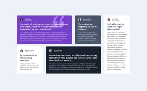
Testimonials grid using SCSS and BEM
#bem
#sass/scss
Jason Greenwald
•
200
Submitted almost 3 years ago
1 comment
10 likes
Prodcut Card using grid, flex, REM
#bem
Jason Greenwald
•
200
Submitted about 3 years ago
2 comments
5 likes
Landing page using grid and flexbox
#bem
#accessibility
Jason Greenwald
•
200
Submitted about 3 years ago
1 comment
4 likes
Responsive landing page using SCSS, Grid, Flexbox, and JS
#bem
#sass/scss
Jason Greenwald
•
200
Submitted almost 3 years ago
0 comments
5 likes
Intro component with input validation
#accessibility
#bem
Jason Greenwald
•
200
Submitted almost 3 years ago
1 comment
5 likes
Article preview component with tool tip using JavaScript
#bem
Jason Greenwald
•
200
Submitted about 3 years ago
1 comment
4 likes
Responsive FAQ now with accordion action!
#accessibility
#bem
Jason Greenwald
•
200
Submitted about 3 years ago
0 comments
5 likes
Interactive Rating Card using Flexbox, JavaScript
Jason Greenwald
•
200
Submitted about 3 years ago
3 comments
8 likes
Social proof page with Grid and Flexbox
#bem
Jason Greenwald
•
200
Submitted about 3 years ago
1 comment
7 likes
Responsive landing page using Grid and Flexbox
#bem
Jason Greenwald
•
200
Submitted about 3 years ago
2 comments
5 likes
Four card feature section - Grid, CSS variables
#bem
Jason Greenwald
•
200
Submitted about 3 years ago
0 comments
2 likes
Single Price Grid Component
#bem
Jason Greenwald
•
200
Submitted about 3 years ago
0 comments
2 likes
3 Column Preview Card Component
#bem
Jason Greenwald
•
200
Submitted about 3 years ago
1 comment
6 likes
Stats-Preview-Card-Component
#bem
Jason Greenwald
•
200
Submitted about 3 years ago
0 comments
3 likes
NFT Preview Card using BEM and Flexbox
#bem
Jason Greenwald
•
200
Submitted about 3 years ago
1 comment
8 likes
Order Summary Component
Jason Greenwald
•
200
Submitted about 3 years ago
3 comments
8 likes
QR Code Component
Jason Greenwald
•
200
Submitted about 3 years ago
1 comment
4 likes
Oops! 😬
You need to be logged in before you can do that.
Log in
with GitHub
Oops! 😬
You need to be logged in before you can do that.
Log in
with GitHub
Oops! 😬
You need to be logged in before you can do that.
Log in
with GitHub
Oops! 😬
You need to be logged in before you can do that.
Log in
with GitHub
Oops! 😬
You need to be logged in before you can do that.
Log in
with GitHub
Oops! 😬
You need to be logged in before you can do that.
Log in
with GitHub
Oops! 😬
You need to be logged in before you can do that.
Log in
with GitHub
Oops! 😬
You need to be logged in before you can do that.
Log in
with GitHub
Oops! 😬
You need to be logged in before you can do that.
Log in
with GitHub
Oops! 😬
You need to be logged in before you can do that.
Log in
with GitHub
Oops! 😬
You need to be logged in before you can do that.
Log in
with GitHub
Oops! 😬
You need to be logged in before you can do that.
Log in
with GitHub
Oops! 😬
You need to be logged in before you can do that.
Log in
with GitHub
Oops! 😬
You need to be logged in before you can do that.
Log in
with GitHub
Oops! 😬
You need to be logged in before you can do that.
Log in
with GitHub
Oops! 😬
You need to be logged in before you can do that.
Log in
with GitHub
Oops! 😬
You need to be logged in before you can do that.
Log in
with GitHub
Oops! 😬
You need to be logged in before you can do that.
Log in
with GitHub
Oops! 😬
You need to be logged in before you can do that.
Log in
with GitHub
Oops! 😬
You need to be logged in before you can do that.
Log in
with GitHub
Oops! 😬
You need to be logged in before you can do that.
Log in
with GitHub
Oops! 😬
You need to be logged in before you can do that.
Log in
with GitHub
Oops! 😬
You need to be logged in before you can do that.
Log in
with GitHub
Oops! 😬
You need to be logged in before you can do that.
Log in
with GitHub
Oops! 😬
You need to be logged in before you can do that.
Log in
with GitHub
Oops! 😬
You need to be logged in before you can do that.
Log in
with GitHub
Oops! 😬
You need to be logged in before you can do that.
Log in
with GitHub
Oops! 😬
You need to be logged in before you can do that.
Log in
with GitHub
Oops! 😬
You need to be logged in before you can do that.
Log in
with GitHub
Oops! 😬
You need to be logged in before you can do that.
Log in
with GitHub
Oops! 😬
You need to be logged in before you can do that.
Log in
with GitHub
Oops! 😬
You need to be logged in before you can do that.
Log in
with GitHub
Oops! 😬
You need to be logged in before you can do that.
Log in
with GitHub
Oops! 😬
You need to be logged in before you can do that.
Log in
with GitHub
Oops! 😬
You need to be logged in before you can do that.
Log in
with GitHub
Oops! 😬
You need to be logged in before you can do that.
Log in
with GitHub
Oops! 😬
You need to be logged in before you can do that.
Log in
with GitHub
