
@ApplePieGiraffe

Jen
@En-JenAll comments
- @En-Jen
Wowww I'm blown away by your creativity 🤯 Like who would think to include avatars of FM members as an easter egg? It works so well and is so clever though! This really makes me want to play around with ScrollTrigger now! Thanks so much for sharing your beautiful solutions with the community 🙌 Absolutely amazing job, keep it up!!
- @astroud@En-Jen
Hey Aaron, really well done!!😊 I went ahead and bookmarked it so I can study it more and learn from it. I really like the country card loaders that are displayed during the initial API call and the sound effect on toggle between light and dark mode is a really nice touch 👏
One suggestion I have is maybe have more of the country card loaders during the initial API call so that there aren't any big blank spaces on the screen without loaders if the user is viewing it on a wider desktop.
Also, it looks like you're doing quite a bit of prop drilling with the prop handleSearch (it's passed to FilterableCountryList, then FilterControls, then SearchBar before it's actually used) Could you declare that function in the SearchBar component so that it lives in the component that actually uses it? You could use Redux to manage the state and access
countryFilterin App.jsx and then dispatch the action to change the state from SearchBar.jsx. I realize learning Redux may seem daunting but it's worth it!Overall super awesome job and keep up the great work!! 💪
- @ospop@En-Jen
Hey there, just came to check out your solution to this challenge after seeing that you left feedback on mine 😊 Really nice job on it! I love the little coffee cup favicon you included and the order summary message before the user selects any options. The detailed README is also really nice to see 👏 One thing I noticed is a bug when the user doesn't select the coffee subscription options in the order that they appear on the plan page. I tried selecting them out of order and then even when I had made a selection for every question, the button to open up the modal was still disabled. Something I would consider doing for future projects is to break up your scss into more files (organized by page, components, etc.) so that you don't have over 1000 lines of code in one big scss file. Overall you did a really nice job on this challenge! Keep up the good work 💪
-Jen
- @RayaneBengaoui@En-Jen
Hey Enayar, just want to return the favor and leave you a comment on your solution 😊 Absolutely amazing work, everything looks and functions beautifully and your use of animations is really impressive!! I loved the animations so much that I've been learning all about Framer Motion since I first peeked at your solution. Really the only suggestion I have for an improvement is to make the Designo logo in the footer into a link that routes to the home page like you've done for the Designo logo in the header.
- @MiaSinger@En-Jen
Hey Elisabeth, nice job on this challenge!! It definitely took me forever to position the images too, so not sure if I'll be much help in that regard. Looks like your accordion is working well and it's responsive. I also like the animation you included for the box image.
I noticed that the text color isn't changing when the user hovers over the questions in the accordion. It looks like you just used the wrong CSS selector for that declaration. Instead of
button:hover {
    color: $hover-color;
  }
it should be
.faq-button:hover {
    color: $hover-color;
  }
It would also be nice to have the cursor set to pointer on the questions in the accordion. I'd also recommend changing your media query to a bit of a wider screen width because at 1000px width, the box image is getting cut off a little on the left side.
Happy new year and happy coding! -Jen
- @GiovanniRanzato@En-Jen
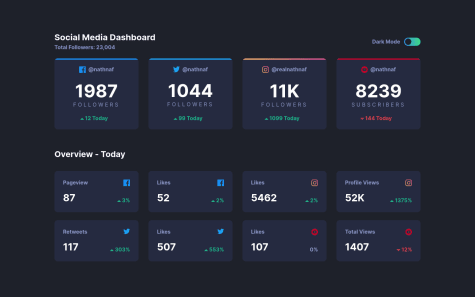
Really nice execution!! It looks very close to the design, is responsive, and the theme switcher works great. The hover states on the cards also look really nice. The only things I would really suggest would be to vertically-center the dashboard within the viewport height. Also the design shows that when on the light theme when you hover over the switcher, the pill-shaped part of it should turn to the linear-gradient. The design also shows that the 'Overview - Today' heading should be a gray color on the light theme. Keep up the great work!!
- @hectoraldairah@En-Jen
Hey there, nice job on your 2nd FM challenge!! It looks really nice on both desktop and mobile and the theme switcher works really well. I just have a few minor suggestions for you.
-
It would be nice if on tablet screen widths if the cards were laid out in two columns instead of having the columns jump from four to one at 1220px.
-
In the design it shows that when you hover over the switcher in light mode, the pill-shaped part of the switcher should change to the linear-gradient.
-
The design also shows that on hover all the cards should show a pointer cursor and change their background color slightly.
Other than that everything looks great!
-
- @Davros2014@En-Jen
Hey David, well done on this challenge 👏 It looks pretty close to the design, is responsive, the theme switcher works, and you included hover states on the cards. Your CSS is also organized nicely. I just have a few suggestions for you:
-
It would be nice if the switcher worked if the user clicked on any part of it, not just the circle part of it.
-
The design shows a hover state in light mode for when the user hovers over the switcher. The pill-shaped part of it should turn to the linear-gradient.
-
The layout starts to get a little wonky between 1000px and 1200px screen width because the large cards aren't centered with the small cards.
-
It would look nice if at tablet screen widths you had the cards laid out in two columns instead of jumping from four columns to one column at 1000px.
-
- @jv18creator@En-Jen
Hey Jeet, if you're looking for a tutorial on how to make light theme/dark theme switchers, check out this YouTube video. It's not for this exact challenge, but I was able to use the methods from this video in my solution 😊
https://www.youtube.com/watch?v=D1yg4T37qYo&list=LLKDQrHVty6w7L57Hy56PXRA&index=1&ab_channel=WEBCIFAR
- @juanmavelez@En-Jen
Hey Juan, nice job! Looks close to the design, it's responsive and the theme switcher works nicely 👏 I just have a few suggestions for you.
-
You're missing the hover states for the cards. The cards should change colors slightly and the cursor should be a pointer.
-
The Overview - Today heading should be a gray color in light mode
-
It would be nice to have the cards laid out in two columns for tablet screen widths. You can create two equal width columns like this:
grid-template-columns: repeat(2, 1fr); -
In your HTML you have
<p>F O L L O W E R S</p>. Instead of putting it in all caps and with spaces between the letters in the HTML, it's better practice to style it that way in CSS. -
You can keep all your CSS in one file with media queries for different screen widths instead of splitting them into separate files for desktop and mobile.
Happy coding!!
-
- @sankaragomathym@En-Jen
Wow, excellent work Sankara 👏 Looks incredibly close to the design and I love the animations. Scales up and down really nicely and your code is really organized and readable. The only suggestion I really have is to consider using min-width media queries in future projects. It can often lead to less CSS code and has the benefit of loading in fewer styles for mobile users, which can be a nice performance gain. I was resistant to coding mobile-first for a bit, but tried it out on a few smaller projects and now I really like it 😊
- @Mostafa-T@En-Jen
Hey Mustafa, nice work on this challenge. It's responsive and the form validation for the email input works when the user submits the form with no input. One improvement you could make would be to expand your email validation to include instances when the user inputs strings that are not valid email addresses. I did this by using a regular expression https://stackoverflow.com/questions/46155/how-to-validate-an-email-address-in-javascript
Another suggestion is to add some more whitespace on mobile screen widths. It could use more of a margin between the image and the heading as well as some more padding on the left and right sides of the hero-content. Happy coding!
- @GiovanniRanzato@En-Jen
Hey Giovanni, really nice job with this challenge! I really like the animations and the hover state on the buttons and it looks really close to the design :) I just have a few suggestions for you:
-
I would try to stray away from using id's as your CSS selectors and instead try to always use classes. You can read more about the rationale for that in this article (https://paulcpederson.com/articles/css-for-people-who-hate-css/)
-
It would be nice to see some change in the size of the elements/layout for tablet widths. At just under 1200px screen width, it looks like there is too much whitespace.
-
You might consider adding a max-width to the container because at large desktop screen widths, the text and the image get really far apart.
-Jen
-
- @faraz343@En-Jen
Hey Faraz, nice job! Your solution looks pretty close to the design and the functionality of the slider works well. Here are some suggestions I have for you:
- For cleaner code, it's best to write your JS in a separate file instead of writing it directly in your HTML file.
- Try using more semantic HTML tags like
<p>or<blockquote>instead of just<div>. - Try to avoid using the
<br>tag in your HTML and instead try positioning elements in CSS with flexbox or CSS grid. - Your avatar image gets really stretched out at many different screen widths. One way to avoid that is by giving either the width or the height of an image a value and then setting the other measurement to
auto.
Happy coding! -Jen
- @Chanblues@En-Jen
Hey Biswanath. Your solution looks really nice on desktop screen widths between about 1300px and 1750px. The layout breaks above that width as well as between 768 to 1300px. It would also be nice to add a pointer cursor on the buttons on hover. Happy coding!
- @eyobofficial@En-Jen
Hey Eyob, overall it looks like a really clean solution 💪 Feel free to check out my solution for how to code the little downward-facing arrow below the social media icons. I did it in CSS with the
::afterpseudoclass. It would look something like this:.share-tooltip::after { content: ''; width: 0; height: 0; border-top: 12px solid $color-gray-darkest; border-left: 12px solid transparent; border-right: 12px solid transparent;Then you would just position it with absolute positioning. Hope that helps!
- @emestabillo@En-Jen
Hi Emmillie, really nice solution!! Basically pixel perfect 👌 Really nice, organized, readable code too. I'll have to study more of your projects to learn some things from you! I just have one super minor suggestion for something you could fix. It looks like on a small mobile screen size like an iPhone 5, the attribution overlaps with the content on the page.
- @ksenius@En-Jen
Wowwww, absolutely incredible solution 🤯 I'm definitely going to study your code very carefully. It looks like I could learn a lot from you. I agree with @magdakok that your attention to detail and surprising features are really impressive. Hope to see more amazing solutions from you and best of luck to you with your interview prep, portfolio, and job hunt!